TechRadar Verdict
A great ebook reader with a natural touch interface, and that's small and light.
Pros
- +
Great price
- +
Crisp, clear screen
- +
Intuitive interface
- +
Great store and software
Cons
- -
Less elegant
- -
More expensive
- -
Some interface elements not totally touch-friendly
Why you can trust TechRadar
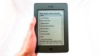
The Kindle Touch is the latest Amazon ebook reader to launch in and outside of the US and the first to sport a touch-sensitive display.
The latest batch of Kindles has actually been a bit slow to filter out to the UK. We got the new £89 Kindle fast enough, but the Kindle Fire has been totally absent anywhere outside the US since its launch, and it's only now that the Kindle Touch and Kindle Touch 3G have arrived.
The £89 Kindle was a simplified device, losing the keyboard and 3G access to keep its size, weight and price down. The Kindle Touch is a little more flexible, even though it's arguably simpler still. There's only one obvious button on it now, below the screen, like the iPad, but it does come in a 3G version for £169 (which is what we have here for review), or a Wi-Fi only model for £109.
The interface is controlled entirely by touch, with new finger-friendly menus on offer. When you're reading, different parts of the screen offer different options when you tap them – most of the screen is dedicated to turning the page forward one when you tap it, but the far left takes you back, while the top of the screen brings up the menu buttons.
Instead of tapping, you can use gestures anywhere on the screen. Swiping your finger right to left will move you onto the next page, while going the opposite way takes you back. Swiping upwards takes you to the next chapter, downwards takes you to the previous chapter.
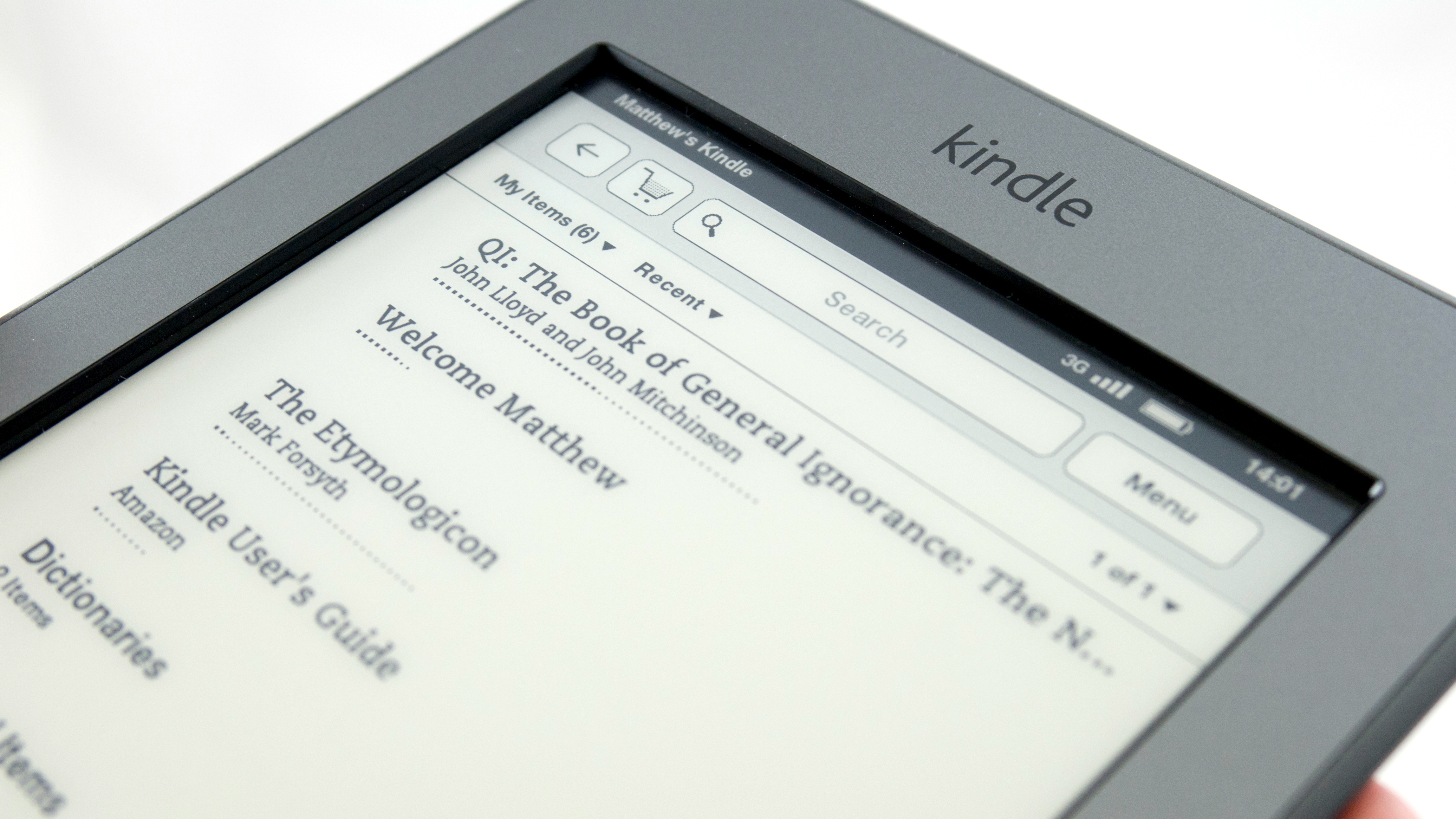
Despite the addition of the touch interface, the screen hasn't really changed. It's still a six-inch, 600 x 800 E Ink display, with 16-level greyscale. It's no Retina display, but its crisp and clear nevertheless, and is even an improvement on other models, which we'll go into on the next page.
The Kindle Touch models come with 4GB of memory, with around 3GB of that being available for storage (Amazon says it's good for about 3,000 books) – double what's on offer in the £89 Kindle.
The addition of touch controls, 3G and extra storage hasn't come without comprises, though. The Kindle Touch weighs 213g, while the 3G version weighs 220g – a good 30 per cent heavier than the 170g Kindle. They're still very light compared to the likes of the iPad or Asus Eee Pad Transformer Prime, of course.
The Touch models are also thicker, coming in at 10.1mm compared to the £89 Kindle's 8.7mm. In fact, it's larger in every way: the Touch is also slightly wider and taller than the cheaper Kindle.

But the extra weight and size does come with one other major advantage: with wireless off, the two Kindle Touch models are rated for two months of battery life at 30 minutes of reading per day, or three weeks with wireless on. The £89 Kindle manages only one month with wireless turned off, though it matches the three weeks with wireless on.
So, a touch interface, longer battery life, optional 3G, more storage, more money, more weight and added thickness… does it balance out into a better Kindle?

