TechRadar Verdict
Pros
- +
Looks great
- +
Control Center is ace
- +
Makes everyday use easier
Cons
- -
Odd design choices
- -
Siri still frustrates
- -
Maps!
Why you can trust TechRadar
iOS 7 has had something of a bumpy ride since its launch in September: the new interface appalled many, and despite several subsequent point releases iOS 7 still included significant bugs including frequent and irritating crashes in Safari.
Where previous iOS updates were largely a case of install-and-get-on-with-it, iOS 7 takes a bit more getting used to.
The good news is that iOS 7.1 has quashed most of the issues including the Safari show-stopper, and it's also addressed some of the more glaring issues with Apple's mobile OS.
Interface changes
Let's name the elephant in the room: Windows. In some instances iOS 7 reminds us of Windows Vista, especially in apps such as Maps and Videos where the background shows through the interface chrome, and in others it reminds us of Windows Phone in its use of white space and text.
There's a touch of WebOS in there too, especially in the new multitasking view.
The big questi
on isn't what it looks like, though. It's whether it works well, and I'd answer that with a qualified yes.
While iOS 7 is often a little bright for our tastes - using Safari on an iPad in a dark room after a long day is really quite unpleasant, and a lock screen with four swipeable areas hardly screams simplicity - the majority of the changes are for the better.
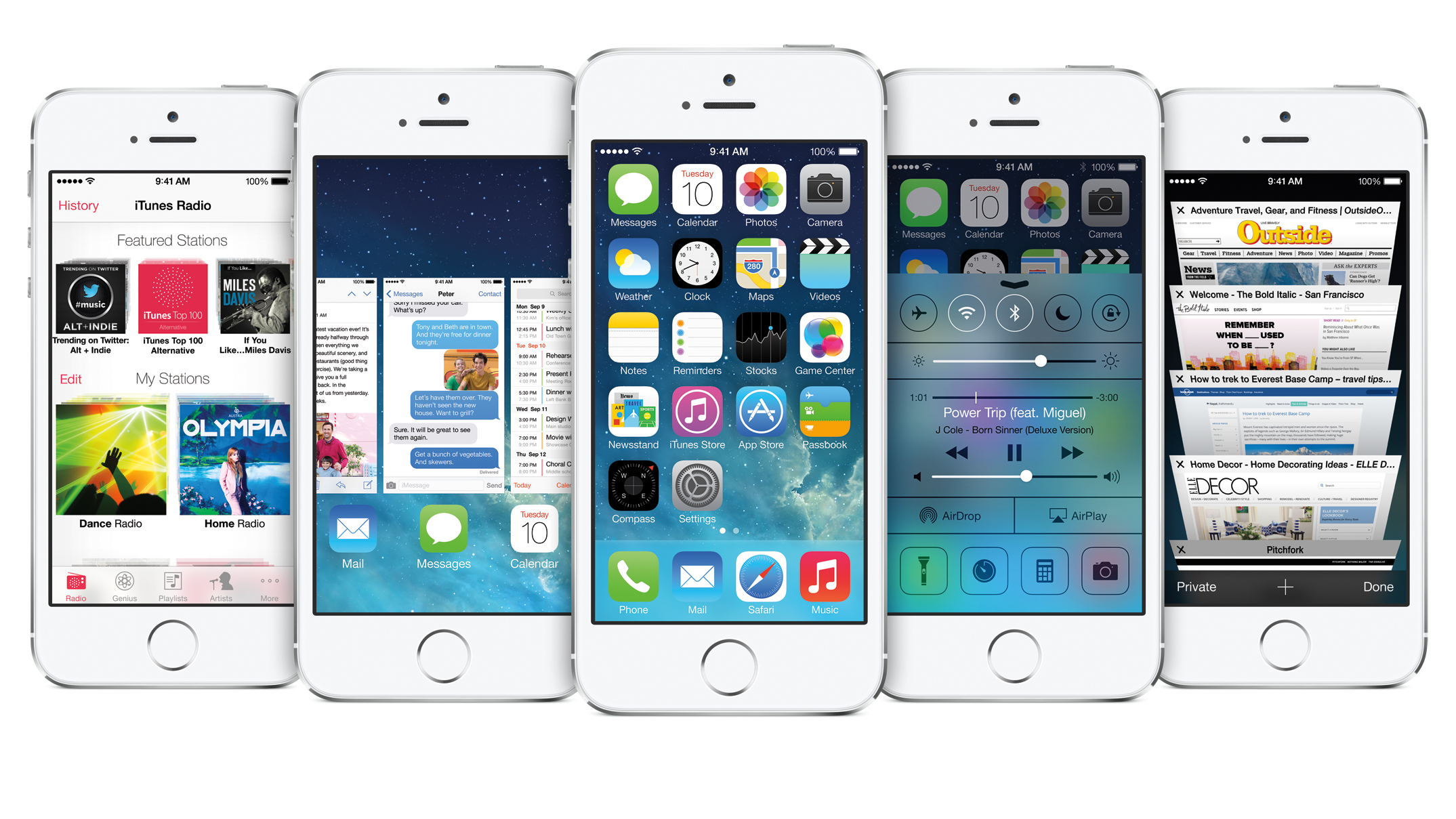
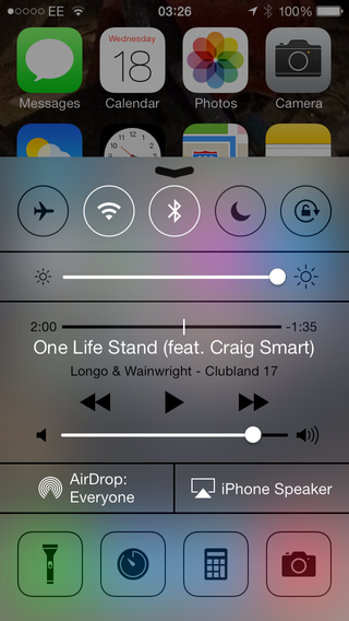
The things I liked about the original iOS 7 remain in iOS 7.1: the Control Center, which you swipe up from the bottom of the screen, provides instant access to Airplane Mode, Wi-Fi, Bluetooth, Do Not Disturb, rotation lock and features including AirPlay, AirDrop, camera, calculator, clock and the LED light.
It sounds cluttered but isn't.
Yes, Android's had similar options for ages but you're not going to hear any iOS 7 user demanding Apple drop it because someone else did something similar first.
If you find it gets in the way of your favourite apps, you can limit Control Center to the home and lock screens only.
Apple has tweaked some of the interface in iOS 7.1. The phone dialler has been redesigned, the call options look simpler when someone calls you, the slide to unlock feature has been made more striking and obvious and the keyboard text is thicker.
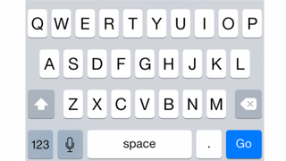
It's no more accurate than before - maybe it's just me, but I find myself relying on autocorrect much more in iOS 7 than in iOS 6 - and it introduces what wags on Twitter called Schrodinger's Shift Key, which makes it impossible to work out whether you've pressed Shift or not.
Some of the changes are more subtle. Animations are smoother, the icons in the weather app are solid instead of outlines, and the Music app has been tweaked to make it less stark than before.
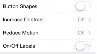
Text buttons now get (optional) button shapes too, making it clear what you can tap and what you can't. The overall feel is still very minimalist, but it's a little less stark than before.
The iOS 7 calendar remains an acquired taste - it's a little too stark for these eyes - but the lack of a combined month/list view has been addressed in iOS 7.1, with a toggle that turns the combined view on or off.
iOS 7 didn't just upset some users: it made them feel physically ill. Not everybody wants an operating system that zooms and pops all over the place, and the Reduce Motion option makes iOS 7.1 a considerably calmer experience.
You can reduce the transparency of the interface, darken colours and make iOS 7's white backgrounds a little less bright.
New gestures
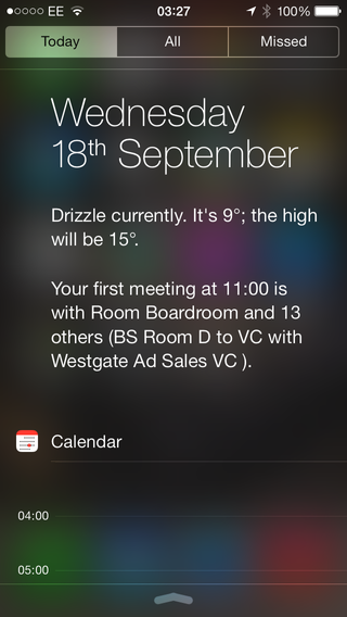
Where upwards swipes bring up Control Center, downwards ones give you the new Notification area.
This is divided into three (swipeable) sections: Today, which summarises your calendar and tells you what the weather's doing; All, which records background app updates, push notifications and so on; and Missed, which as you might expect details any alerts you haven't acknowledged.
I'm not finished with swiping yet: you can also use backwards swipes to move backwards in apps that support the gesture, so for example you can swipe backwards in Safari or in Settings.
Such swipes take you back to the starting point of the selected app, but they won't boot you out of the app if you swipe backwards one step too far.
With multitasking, double-tapping the Home button brings up the apps list as before, but this time it has WebOS-style thumbnails. You close an app by flicking it away and shouting "begone!", although the shout isn't compulsory.
App Folders are prettier and roomier, and Spotlight has changed too: you no longer swipe from left to right to invoke it; you pull the home screen down instead.
The home screen gets some goodies too. It and the lock screen can use dynamic or static wallpapers, and they can use panoramas too (although that feature didn't work for us). Wallpapers also benefit from a subtle parallax effect, so if you move the phone the wallpapers appear to move.
The rest of iOS 7 emphasises simplicity, so for example the stitched leather is gone from Calendar and Notes don't pretend that they've been written on yellow legal pads.
Sometimes it can be a little too stark - Calendar in particular feels like someone's thrown a whole lot of differently-sized Helveticas into a blizzard - but flattening and simplifying iOS does make it feel much more modern, consistent and efficient.
Writer, broadcaster, musician and kitchen gadget obsessive Carrie Marshall has been writing about tech since 1998, contributing sage advice and odd opinions to all kinds of magazines and websites as well as writing more than a dozen books. Her memoir, Carrie Kills A Man, is on sale now and her next book, about pop music, is out in 2025. She is the singer in Glaswegian rock band Unquiet Mind.
