Why you can trust TechRadar
There are dozens of features in Windows 8, like the native support for mobile broadband. That means as soon as you plug in a 3G dongle it's ready to work and it will connect far more quickly and it's marked it as a 'metered connection' so background tasks like Windows Update don't get to use up your data allowance. You can set that by hand if you use a mobile hotspot.
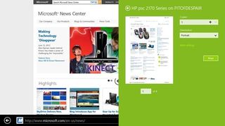
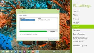
Windows 8 comes with support for far more printers, right out of the box – not by shipping ever more drivers to fill up your drive space but by creating a printer framework that can work with more printers - and a new, faster print architecture. Printers that usually ask you to install a hefty desktop application – which you can't do on Windows RT – should give you at least basic printing using the built-in class drivers. Printer makers can produce 'modern' style apps for checking the ink level of changing paper settings, but when you just want to print, you shouldn't get umpteen dialogs popping up.
Other changes are under the hood, like built-in support for USB 3; as far as you're concerned USB 3 devices just work, but the PC maker doesn't have to build in a special driver for that.
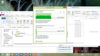
One of the things Windows 8 is slightly faster and definitely cleverer about is copying files. If you're copying enough files that you have to wait for it to finish, you can pause and resume copying, and you get one copy dialog for all the file copies you have in progress. A mini graph shows you how the copying speed is changing.
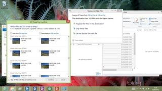
Microsoft has made several changes to the interface you see when you're copying a file with the same name as one in the folder you're putting the file in over the development of Windows 8, responding to feedback. What you end up with is a two-stage dialog.
You can replace or skip all the files at once or decide one by one from a list of thumbnails with the date and size (the larger or newer file gets marked in bold); choose the checkbox for the file you want to keep, choose both to keep both. It's a lot clearer than the same option in Windows 7, say.
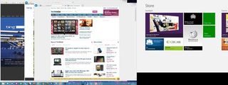
Windows 8 really shines on multiple monitors. You get the best experience if your screens have the same resolution and are at the same height, because then you don't have to worry about a windows that's full screen on one screen being the wrong size on the other screen, and windows that sit across the two screens line up properly.
If you have screens of a different resolution, the desktop background won't be automatically stretched across both, but you can turn that on by hand. Even with very different resolutions on our two test screens, working with multiple monitors was intuitive and powerful.
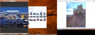
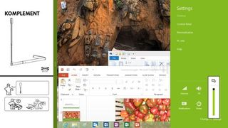
You can treat two (or more) screens as one big screen and drag windows around. When you move a desktop app to the second window its icon moves to the taskbar there, so you can work with it more easily. Although Aero Snap still only works with the outer corners, the hot mouse corners work on both monitors so you can get the charm bar or switching pane on either screen.
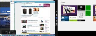
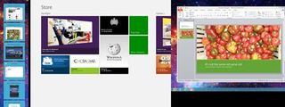
Press the Start button and the Start menu appears on one screen; any 'modern' style apps you open will open on that screen – but you can drag them onto the other screen. That lets you have the desktop full screen on one monitor and another screen dedicated to the Start screen and 'modern' apps, which stops them feeling intrusive.
You can still snap two 'modern' style apps beside each other on one screen, but you can also have a 'modern' app snapped next to the desktop which stretches over one and a bit screens. Just drag the windows around to get them in the arrangement that works best for you.
Mary (Twitter, Google+, website) started her career at Future Publishing, saw the AOL meltdown first hand the first time around when she ran the AOL UK computing channel, and she's been a freelance tech writer for over a decade. She's used every version of Windows and Office released, and every smartphone too, but she's still looking for the perfect tablet. Yes, she really does have USB earrings.
