Early Verdict
Pros
- +
Images spring to life
- +
Go straight to most of the good stuff of FB without the app
- +
Fun while also functional
Cons
- -
Get ready for all Facebook, all the time
- -
Gesture commands take time to master
- -
Still have to go to Facebook app to access your profile
Why you can trust TechRadar
Let's be frank: people probably use Facebook more than any other application on their phones.
In fact, Mark Zuckerberg, CEO of the social network, had some figures to back that claim up. According to Zuck, 20 percent of people's phone time is spent trolling Facebook. Throw Instagram in the mix, and folks spend more than 25 percent of their phone time looking at something owned by Facebook.
Based on the apparent transfixion of users on the service and backed by a principle to build phones around people first and not apps, Facebook has created Home, an overlay comprised of a several apps that deliver a deeper Facebook experience unachievable through a standalone app.
"We're not building a phone. We're not building an operating system, but we're building something that's a whole lot deeper than just an ordinary app," Zuckerberg said.
Home is a launcher as well, one that lets you spring a few Facebook-created features into action while keeping your other apps in the picture, albeit in the background.
While the goal seems to be as many Android devices as possible, the initial roll out will include the Galaxy S3, Galaxy S4, HTC One, One X+ and the Galaxy Note 2. Having Ice Cream Sandwich or higher is a must, as is the latest version of the Facebook and Messenger apps plus the Facebook Home app.
Of course, you can avoid all that extra work buy picking up the HTC First, which comes set up with Home.

Home doesn't just bring you to Facebook, it turns your device into a Facebook-content blasting machine. We got to check it out on both a First and a Samsung Galaxy S3, though Zuckerberg and Co. were keen to point out Home's potential for tablets, which will come to fruition at a later date.
The two biggest components of Home are Cover Feed and Chat Heads. Cover Feed takes over a phone's lock and home screens with a steady stream of Facebook updates coming from your friends. Chat Heads, which we'll break down in a bit, is a way to keep your FB buddies with you no matter what you're doing on your device.
Cover Feed
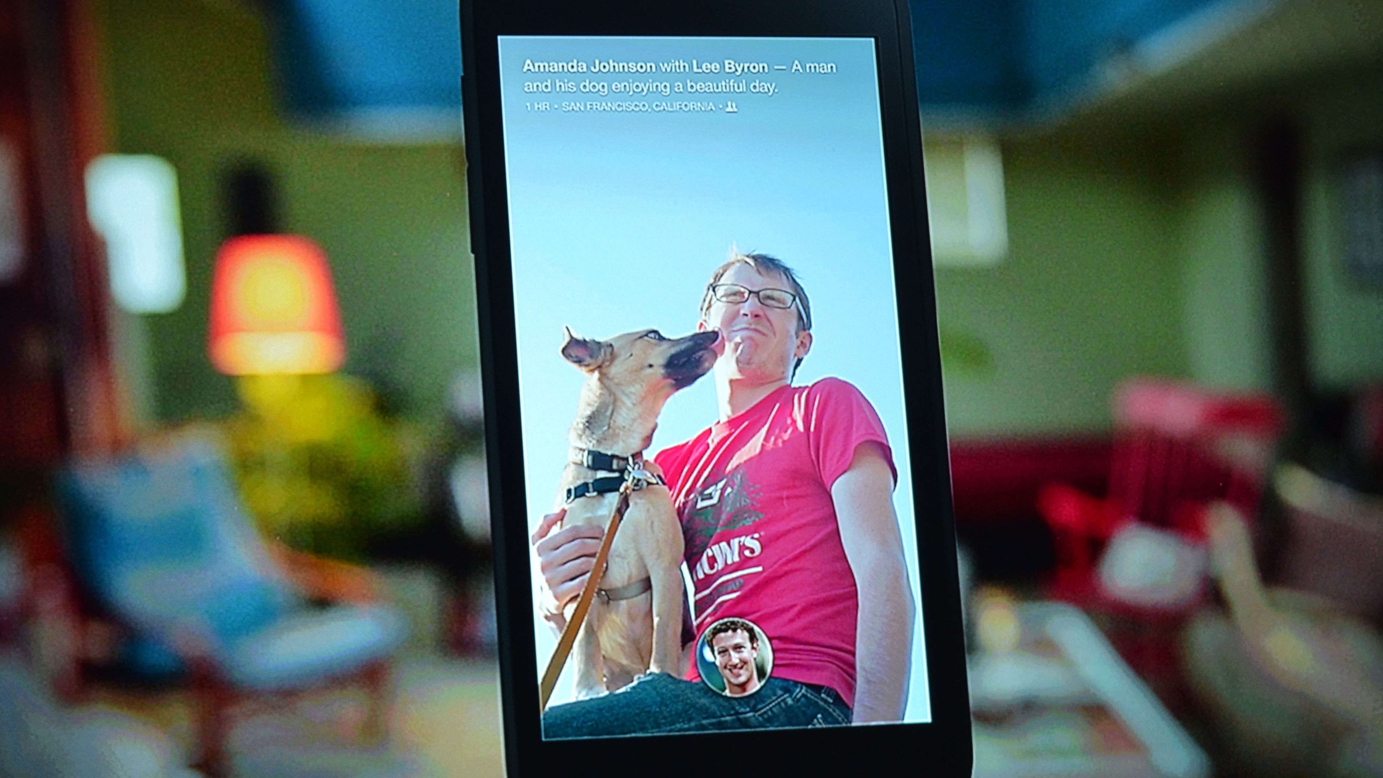
Zuckerberg called the home screen "the soul of your phone," and Facebook clearly put its top designers to task to create one that's simple and lovely. On the surface, Cover Feed is very well designed and aesthetically spot-on. You can't really go wrong with photos you'd otherwise view surrounded by black boxes now spilling into every corner of your screen.
By holding an image down, users can bring the image into full view - it will shrink but you'll get to see the whole picture, not just the zoomed in part that shows up on your homescreen.
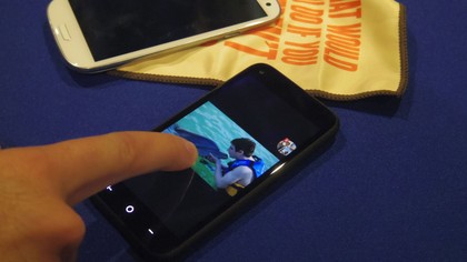
The Cover Feed stream isn't dissimilar to a slideshow screensaver you'd have running on your laptop or desktop, though Feed includes status updates, photo captions and icons to like and comment. You can, of course, pull up comments of those who've already left a post. A double click will let you like a post as well, while you can swipe to flip to another image.
When you get a notification, a white bar with text and the profile picture of the poster zips onto the screen. This could be a like on a photo you posted, a news alert or a missed call. As you can imagine, the more notifications you get, the more things get cluttered. Facebook's come up with a touch and swipe function that let's you get rid of all your notifications at once. Simply press on one notification and all will pinch together. Swipe to the side, and voila, hasta la vista notifications.

Adam Mosseri, director of product at Facebook and lead designer of Home, said that the idea behind Home was to let users reach out and touch an icon on your screen to make something happen - swipe a story, press a photo, etc.
"We wanted everything to be very tactile and springy," he told TechRadar after Home was announced. And it seems Facebook has achieved that.
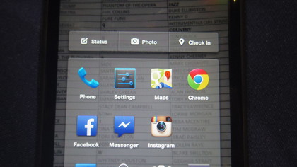
It takes a few tries to remember that swiping up on your profile picture (located at the bottom of the screen) opens the app launcher. However, once you've got it, you really can tap and swipe to not only access your other apps, but do Facebook-specific functions such as like, comment and message friends.
Another aspect of Cover Feed worth noting here is the profile image on the bottom of the screen. This is your profile picture, though oddly enough it doesn't take you to your Facebook profile.
What it does do is help you navigate to either Messenger, the app launcher and the last app you used. You can bobble your head about, flicking it whichever way you need to access where you need to go.
One last thing before Chat Heads: The app launcher has a bar along the top to let you access your status, take a photo with Facebook Camera, or check in. All it takes is a press on an app to move it about, or a swipe upward to an "x" bubble to get rid of it. Though as you can see, even while you're navigating to your other applications, Facebook is a constant presence.
Chat Heads
Chat Heads, besides managing to be both a goofy and clever name simultaneously is a messaging feature that works for both Messenger and SMS.
Essentially, when one of your friends texts or messages you, their bubble-headed image plops onto the screen with that familiar red number at the top.
Click on your friend's face, and a drop-down message screen opens, letting you read and respond to the message. You can have a number of heads floating at once, all of which will clump together and can be moved around the screen to wherever you deem convenient.
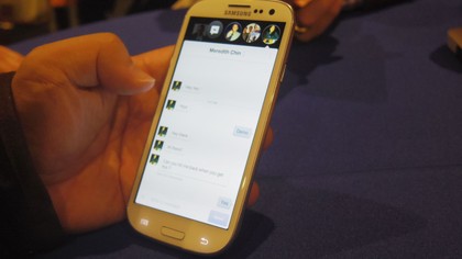
Click on one, and all heads will space out, letting you check in with whichever convo you want. Tire of the talk, and you can drag the bubble to the bottom to eliminate the conversation.
Early verdict
Facebook Home is sharp, fun and functional, and it'd be almost perfect if it wasn't so deeply dependent on Facebook.
By that we mean that the images are great to look at and the constant flow of them is better than a stationary background, but then you're always tied into the likes, comments and overall presence of your Facebook account.
For those who don't mind that, Facebook Home will be a boon of interesting information and nice things to gaze upon while eliminating the need to go to your standalone Facebook app to interact with your digital social circle.
However, if you like having your Facebook life separate from the other functions of your phone, then Facebook Home may be hard to swallow. Chat Heads follow you into any app, and although Zuckerburg and his employees gushed about it being the most delightful messaging system they've ever used, we could see the novelty wearing thin.
As customizable as Facebook has tried to make the feature, unless you turn it off in your settings, Home is a constant companion. It will boil down to personal preference, but we don't see ourselves rushing to download Home when it becomes quasi-available April 12.
Michelle was previously a news editor at TechRadar, leading consumer tech news and reviews. Michelle is now a Content Strategist at Facebook. A versatile, highly effective content writer and skilled editor with a keen eye for detail, Michelle is a collaborative problem solver and covered everything from smartwatches and microprocessors to VR and self-driving cars.
What is a hands on review?
Hands on reviews' are a journalist's first impressions of a piece of kit based on spending some time with it. It may be just a few moments, or a few hours. The important thing is we have been able to play with it ourselves and can give you some sense of what it's like to use, even if it's only an embryonic view. For more information, see TechRadar's Reviews Guarantee.
