Hack the OS X Dock to make it less ugly
Five-step guide to making the Leopard Dock more usable
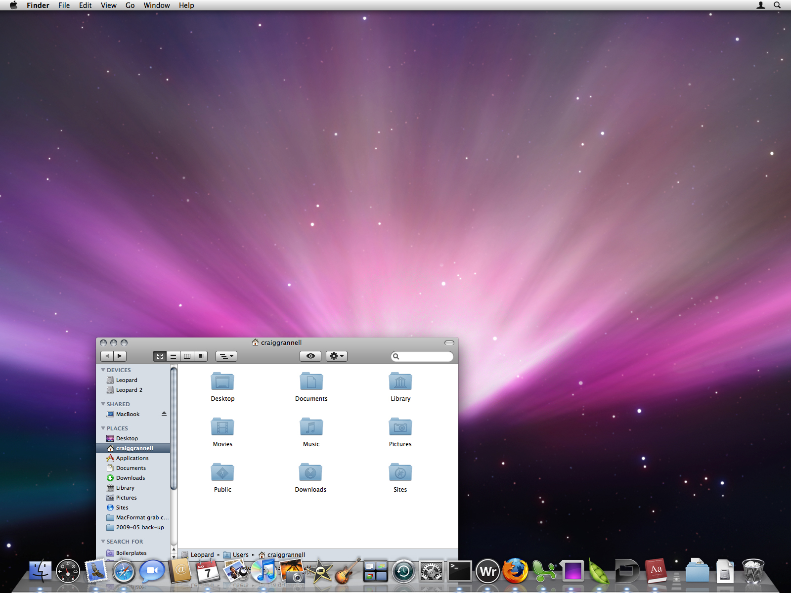
The Mac OS X Dock is hardly Apple's crowning glory.
It disobeys Fitts's law, confuses newbies with the way its shortcuts model works, and has more quirks than an art student.
In Leopard, it's worse, the Dock adopting a hideous reflective 'glass' style (far be it for our cynical nature to suggest that was a clear 'it has to look new in screen grabs' decision) and Stacks, with each stack annoyingly showing icons found in the relevant folder, but no other labels.
But all is not lost! With five minutes of quickfire hacking, the Dock can be made 83% less ugly and 47% more usable, according to the latest clinical trials!
1. Remove the clutter
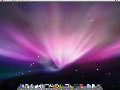
Stop using the Dock for app shortcuts - instead launch apps using Spotlight. Close all your apps and drag them all out of the Dock, so it merely becomes a means of finding out which apps are open, and a method for switching to them or triggering actions via Dock menus.
2. Smash the glass
Get daily insight, inspiration and deals in your inbox
Sign up for breaking news, reviews, opinion, top tech deals, and more.
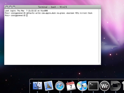
When the Dock's pinned to the left or right screen edge, it has a 2D theme that's not too shabby. You can force the Dock to use this look when at the bottom of the screen by firing up Terminal and entering the following command: defaults write com.apple.dock no-glass -boolean YES; killall Dock
Alternatively, put on your 'lazy hat' and use the excellent DockDoctor widget (click '2D dock' and 'restart').
3. Enhance the Dock's usability
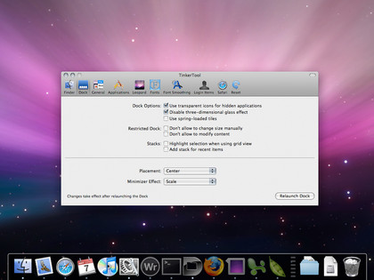
Grab a copy of the spiffy TinkerTool, fire it up and access the 'Dock' section. Check 'Use transparent icons for hidden applications', select 'Scale' from 'Minimizer Effect' and click 'Relaunch Dock'. In future, icons of hidden apps will be semi-transparent in your Dock, making them easier to spot. Also, window minimisation to the Dock will be faster.
4. Improve your Stacks
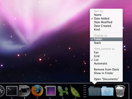
We're on the home stretch now. Make your stacks less rubbish by Control-clicking them and setting 'Display as' to 'Folder' and 'View content as' to 'List'. Stacks will now display their folder icon and provide a hierarchical, navigable menu when clicked.
5. Remove the Dock's border
Although the 2D Dock border looks OK on the default Leopard background, it's a distraction when lighter desktop images are used. However, it can also be banished.
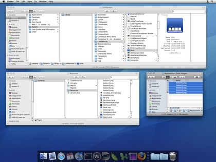
Navigate to /System/Library/CoreServices, Control-click on Dock and select 'Show Package Contents'. Inside Dock, navigate to Contents/Resources, and copy the five 'bottom' PNGs to a folder elsewhere on your hard drive. Keep a safe back-up of this folder, and then trash the original PNGs from the Dock app (you'll have to type in an administrator's password to confirm this).
Next, drop in the five 'bottom' images from this ZIP file. Restart the Dock (via the widget mentioned in step 2, or 'killall Dock' in Terminal) and your borderless Dock will appear.
Note that this last step should be fine, but err on the side of caution when mucking about with system-level stuff and back-up your system first.
All done!