TechRadar Verdict
Once again Apple brings out its best tablet to date – it needed something a little extra to push it to five stars, but it's definitely the market leader
Pros
- +
Superb screen
- +
Slick gaming
- +
Simple interface
Cons
- -
Can overheat
- -
Apps take up too much space
- -
No expandable storage
- -
Thicker than iPad 2
Why you can trust TechRadar
The iPad is dead, long live the iPad... although only an incremental upgrade, the new iPad 4 has been released to usurp this model.
However, at only £359 the iPad 3 is still on sale and still offers a strong experience with the latest version of Apple's operating system, iOS 6.
However, the iPad 3 is a device that from the outside looks remarkably like the iPad 2 but with an overhaul on the innards.
The question most people ask us when it comes to the third iteration is: what's different from the old one?
Well, in this case it's pretty easy: there's a Retina Display that makes everything looks superbly crisp, an updated A5X processor bringing quad-core graphics and a 5MP camera on the rear with a VGA sensor on the front.
Oh, and the iPad 3 was also the device that brings iOS 5.1 to the masses (well, it's also on the likes of the iPhone 4S and iPad 2 as well, but hey, we're not reviewing those today.)
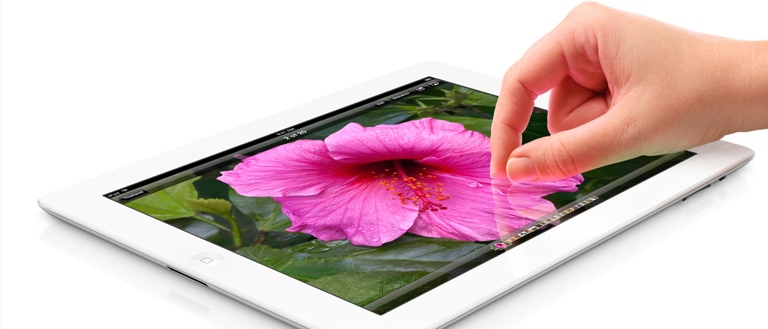
The design of the iPad 3 isn't really anything different from the original duo from Apple's tablet range. Actually, while we're thinking about it, it looks almost identical to the iPad 2 – to the point you'd struggle to tell them apart when turned off.
However, in the hand, there's a little bit of a difference, especially when it comes to the weight. The new iPad is nearly 60g heavier than the previous iteration, and while it's not terrible, it does add a little arm strain during a marathon movie session.
Retina Display
Before we get onto all the normal insight over the frame of the new iPad, it's worth talking about the main feature: the Retina Display.
Apple has packed a huge amount more pixels into the 9.7-inch screen - 1536 x 2048 to be exact. However, despite the fact that the Cupertino brand makes a big thing about the 330 PPI density of the iPhone 4, we're looking at a screen that's technically a lot less sharp than its smartphone brethren - around 264PPI.
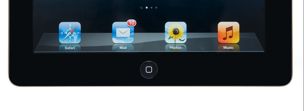
Apple has got around this fact by stating that the screen is meant to be held at 15 inches from the face, rather than the 10 inches the iPhone is supposed to from your eyes, and as such the sharpness is the same.
Given the fact the term 'Retina Display' really isn't a legally binding term, we don't care. What matters is the effect - and it's one of the most impressive we've seen on a tablet to date. If someone took an iPad, printed out a really hi-res image of an iOS system and stuck it on the front, we'd struggle to tell the difference - it's superb, and even squinting up close you'll be hard pushed to notice any pixelation.
The colour reproduction will also appeal to many, as it's pretty close to reality - it lacks the punch of the Super AMOLED HD screens seen on the likes of the Samsung Galaxy Note for instance, but it will depend on personal preference as to whether that's a good thing.
We like the vivid colours of Samsung's screens, but we know plenty of people that loathe them too.
The main thing is things like internet browsing; photo viewing and movie sessions are all much, much improved over the iPad 2, and is one of the main reasons to pick up the iPad 3.
Check out how the iPad 3 display got on when it went head-to-head with the Asus Transformer Pad Infinity in our video below.
Design
The iPad 3, as we said, is only marginally thicker and a little heavier than the iPad 2, and if you pick it up with no knowledge of the former, you'll likely be mighty impressed.
The rest of the design is premium too - given you can be paying a fair whack for a top end model, it needs to seem like a worthwhile investment, and it does.
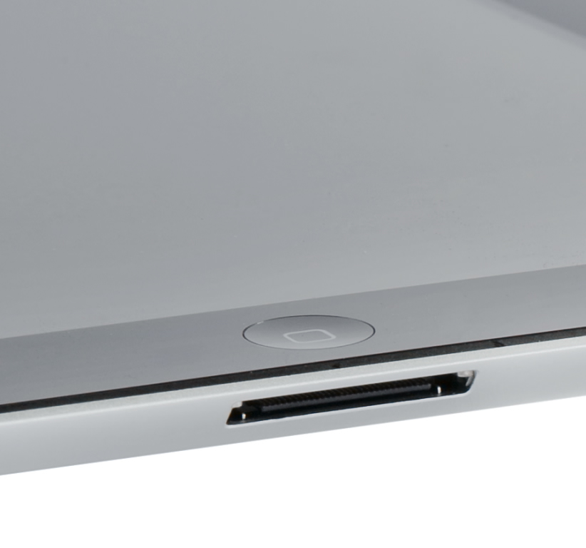
The curved edges, the oleophobic scratch-proof glass and the aluminium chassis are all the kind of thing that some Android tablets have tried to ape and failed. Of course, many will prefer the feather-light frames of some of the Samsung models but, like the screen, it really comes down to personal preference.
The buttonry on the iPad 3 is pretty sparse though - we're talking four buttons and that's your lot.
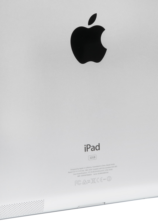
The iconic home button is back once again, despite rumours of its demise, and is easy to reach and hit within the thick bezel.
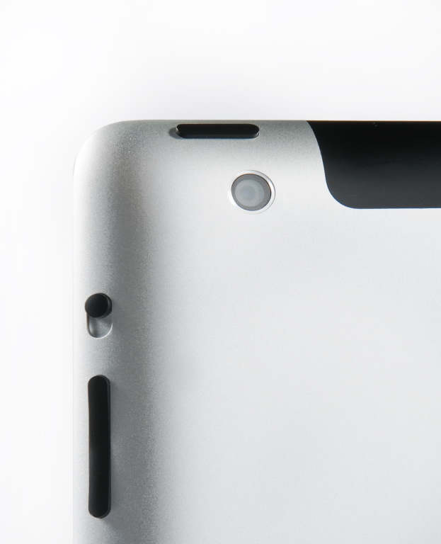
The rest of the buttons are all clustered tightly together in the top left-hand corner of the device, with the rocker/volume key, the mute/orientation switch and power/lock key all within an inch of one another.
As you can see, Apple has been pretty efficient with the button placement, with all of them performing more than one function. And they say the iPad can't multi-task... tsk.

Gareth has been part of the consumer technology world in a career spanning three decades. He started life as a staff writer on the fledgling TechRadar, and has grew with the site (primarily as phones, tablets and wearables editor) until becoming Global Editor in Chief in 2018. Gareth has written over 4,000 articles for TechRadar, has contributed expert insight to a number of other publications, chaired panels on zeitgeist technologies, presented at the Gadget Show Live as well as representing the brand on TV and radio for multiple channels including Sky, BBC, ITV and Al-Jazeera. Passionate about fitness, he can bore anyone rigid about stress management, sleep tracking, heart rate variance as well as bemoaning something about the latest iPhone, Galaxy or OLED TV.
