TechRadar Verdict
Pros
- +
Siri now properly useful
- +
Great in-car navigation
- +
Do Not Disturb is a boon
- +
Huge privacy improvements
Cons
- -
All iOS devices aren't equal
- -
Some mapping problems
- -
Street View's gone
- -
Sub-par store overhauls
Why you can trust TechRadar
Updated: Our iOS 6 review has been overhauled to include the iOS 6.1 software updates.
On the surface, it might not look like much has changed with iOS 6 and the subsequent minor iOS 6.1 updates. However, Apple has added a number of new features over iOS 5, along with continuing in its mission to eradicate Google from the system by default. Apple's YouTube app has gone (Google has since released its own on to the App Store) and Maps now runs with Apple power rather than Google juice.
Elsewhere, the OS is more social (Facebook now joining Twitter in being baked in), Siri's been improved, and countless tweaks (some fairly major from a usability standpoint) are in evidence in the likes of Mail, Safari, Phone and the iOS stores.
Oh, and Apple finally added a clock app to the iPad, which resulted in a legal spat with the Swiss railway network service. It seems not only Samsung is in the photocopying business.
iOS 6 ditches support entirely for the original iPad, but is nonetheless compatible with a surprisingly wide range of devices; iPhones back to the 3GS are supported, as are both the fourth- and fifth-generation iPod touch.
However, the older the kit, the less of iOS 6 you actually get. Some of the big features - Siri, turn-by-turn navigation, panoramic photos and FaceTime over 3G - aren't available for the iPhone 3GS or iPhone 4.
The iPhone 3GS doesn't even get Safari's offline Reading List feature, and Siri's not available for the iPad 2.
So is it worth the upgrade? We've installed iOS 6 (and iOS 6.1) across multiple iOS devices to find out. Our test kit is an iPhone 4, an iPhone 4S, an iPod touch (fourth-generation), an iPhone 5, an iPad 2, and a new iPad (courtesy of Vodafone).
There are more new features than you'd think, even when you don't get all the new features.
The iOS 6 interface
A common criticism of iOS is that Apple never radically updates it. Tech pundits in particular often use words like 'tired' and 'dated' to describe the operating system, suggesting it would be better if you could weld Android-like widgets to it, or if every home screen icon was more akin to a hyperactive child begging for attention, as per Live Tiles on Windows 8.
iOS 6 is typically Apple in being purely iterative. You get the familiar grid of icons on each home screen, and the screens can be swiped between.
Double-clicking the Home button reveals the multitasking tray, which also houses media controls, the rotation lock and an AirPlay button. Swipe left from the first home screen and you access Spotlight, Apple's system-wide search.
So far, so iOS 5, and that level of familiarity will either be warming or maddening, depending on your persuasion. Regardless, it's definitely very usable, even if configuration options on offer are few in number and rapid-sorting settings are non-existent.
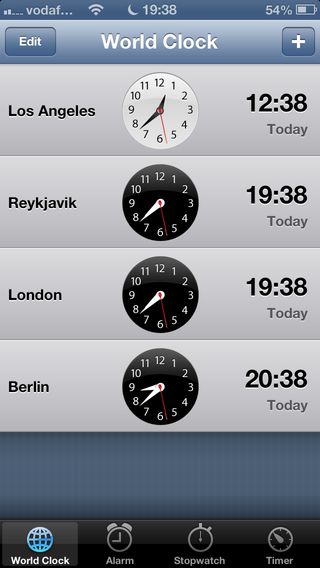
However, there have been some small adjustments. The status bar now changes colour on a per-app basis, in an attempt to blend in. This is more visually appealing but muddies the water when it comes to alerts that were once made in part through a change in colour of said status bar.
Better amendments are the new audio controls on the Lock screen and Spotlight search results now displaying the name of an app's containing folder. Apple's penchant for cropping text labels remains frustrating, though, and is increasingly common throughout the OS.
Love Fortnite Festival? Grab this quality rhythm game controller at a heavily discounted price for Presidents' Day
This little Nespresso machine is so cheap for Presidents' Day, I wish I didn't already own one
Presidents' Day sales have the bite-sized CRKD Neo S controller close to its lowest-ever Amazon price
Most Popular


