Why iOS 7 and OS X 10.9 signal a reinvigorated, confident Apple
OS udpates showcase how this version of Apple thinks

"A picture is worth a thousand words" is an overused phrase, but one with more than a kernel of truth.
With that in mind, how much can an entire visual language tell us about an object, or provide insight into its creators? In Apple's case, with its revisions to iOS and to OS X, plenty.
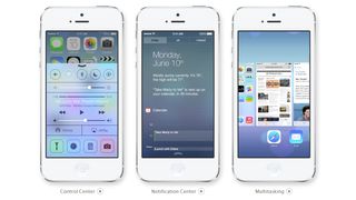
At WWDC's 2013 keynote, Apple unveiled the long-rumoured, radical iOS overhaul. Apple's mobile operating system retains links to its past, but the difference is stark: it is to iOS 6 what OS X was to Mac OS 9 - familiarity amidst sweeping change. Additionally, we saw peeks of the revamped OS X, changes to which were subtler.

Aesthetics are subjective. Depending on who you talk to, Apple's revisions are the best or worst things they've ever seen, wildly daring or oddly conservative, innovative or derivative, or somewhere between those extremes.
Yet whatever you think of them from a subjective standpoint, they showcase how this version of Apple thinks, how it differs from its rivals, and how it's unafraid to break from its own past.
On both the Mac and mobile sides of things, textures were primarily notable by their absence. Jokes were made about having 'run out of felt' regarding the now relatively stark Game Center, and similarly about the lack of wood and leather textures in iBooks and Calendar.
Apple showed in both OS X and iOS a newfound desire for coherence across an entire operating system. This is something that's arguably been missing since at least the days of Mac OS 8, shortly before brushed metal reared its ugly head, leading to Apple's unhealthy obsession with using real-world analogues in its applications.
Get the best Black Friday deals direct to your inbox, plus news, reviews, and more.
Sign up to be the first to know about unmissable Black Friday deals on top tech, plus get all your favorite TechRadar content.

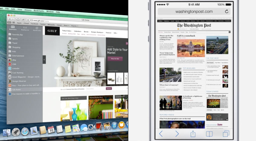
But there was another major change that made Apple's revamps stand out: Apple is seemingly no longer trying to force the same visual language across OS X and iOS.
Calendar and Safari look radically different on each system, even if they share data and certain concepts, such as Safari's iCloud tabs and Reading List.
Perhaps this is a sign Apple recognises iOS doesn't need visual cues from the desktop in order for users to understand how to use certain apps; regardless, it points at Apple now valuing usability and appropriateness over unnecessary cross-platform visual consistency.
By contrast, Microsoft, despite having arguably led the way in terms of stripped-back touchscreen interfaces, continues to believe the best approach is to smash two disparate systems together - a situation Apple was perhaps in danger of heading towards itself.
Newfound confidence
Thinking freely, it's possible to consider Apple's new visual language as metaphor for the company's collective state of mind. There's Apple's existing care about fine details, but also a greater interest in efficiency and the aforementioned fixation on coherence, presumably driven by Jony Ive. There's also a playfulness and a desire for intrigue in iOS that had been lacking as the platform became - in many people's eyes - stale.
But mostly, there's a newfound confidence. This is an Apple that makes lighthearted jokes of its prior obsession with textures.
It's unafraid to make radical change, when it feels the time is right, trusting in the usability of the final product to retain users when some familiarity (be it textures on OS X or various interface elements on iOS) is lost.
It's arguable an ability for major change has always been within Apple, but of late the company had seemed tentative, cautious of stepping out from under the shadow of its founder and also the huge impact Scott Forstall made in terms of how its software appeared.
These updates, then, represent a company refresh, not just a splash of new paint on some operating systems. Apple feels new and reinvigorated, throwing off the shackles of its recent past. What's important now is Apple rapidly iterate, using this newfound momentum to push on to greater things, lest it again find itself charged with treading water.
With iOS 7 now on the scene, does Android have something to fear? Find out what we think:
Most Popular


