Build the best Linux desktop
There's never one desktop that appeals to everyone but here's some of the best to customise
Like all things Linux and open source, users are spoilt for choice when it comes to selecting a desktop environment (or DE). But this choice that many perceive as freedom, others may also see as a little bewildering and confusing.
Right after making the soul-shaking decision of switching operating systems and installing an unknown system – by hand no less – a new Linux user is then greeted with weird sounding desktops to choose from with names like Gnome (a mini-desktop perhaps?), KDE (Isn't that a double-glazing firm?) and Xfce (No idea). What veteran users herald as Linux's crown jewels, to the innocent newcomer it's like stumbling into a sci-fi convention where everyone is discussing a new TV series that you've never heard of but apparently it's been around for years.
Not only is there no consistent Linux 'look', the idea of a desktop environment as a separate entity from the operating system sounds foreign to most mainstream users coming from Windows or Mac.
Another concept they have to get used to is that unlike the proprietary OSes, the desktop furniture on a Linux desktop isn't set in stone. Some environments are just shells that ship as a collection of components that you are meant to build and rearranged.
Don't get us wrong. None of this is a bad thing. Choice and flexibility are the cornerstones of the open source ecosystem. But spare a moment for the average desktop user just warming up to Linux. They come from a constrained environment and are baffled by the plethora of choices on offer. Many end up making the wrong choice and get turned off and abandon their open source expedition.
Which is why we're aiming to help select the best desktop environment that will suit each user, their workflow and minimise any learning curve. There's something for seasoned Linux users as well. Get a bird's eye view of what other camps are up to and decide if they've progressed enough to warrant another try as your desktop.
Ubuntu Unity
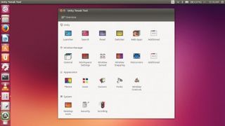
The Unity desktop is best experienced as part of Ubuntu. It has a unique layout with the vertical Launcher and the Dash being the two most prominent features. Unity also includes the Heads Up Display (HUD), which is an innovative take on the application menus. Using HUD helps avoid you the trouble of looking for options embedded deep within nested menus.
Get daily insight, inspiration and deals in your inbox
Sign up for breaking news, reviews, opinion, top tech deals, and more.
Unlike some of the other desktops, Ubuntu doesn't offer many configuration options to tweak the desktop. All of the distro's settings are bundled into the System Settings option accessible via the gear & spanner icon in the Launcher.
The default Unity experience is the result of extensive usability research by Canonical. Which is why you get such a limited set of options to customise the various elements. But this limitation has given rise to a number of third-party customisation tools, such as the Unity Tweak Tool - which enables you to fine-tune the interface so that it works exactly how you want it to. It's available in the official Ubuntu repository, so you can install it using the Ubuntu Software Center. Then there's the Appearance section, which, like built-in settings, enables you to switch between themes.
Additionally, you can also change other elements inside the theme, such as icons, cursors and font. If you are uncomfortable with the placement of window control icons in Unity, head to the Window Controls section and change the alignment to Right which moves the buttons to their usual locations. If you juggle between several windows, you should also enable the menu button from this window. The button adds options to move a window to another Workspace.
Multitaskers can also enable hot corners and configure them to show all Workspaces as well as display thumbnails of all open windows. Another usability tweak is the ability to switch focus to a window simply by moving your mouse to that window which saves you the effort of clicking on the window. For this, head to the Additional option under the Window Manager section. You can also tone down some of Unity's more resource sapping effects, such as the background blur.
Gnome 3.10
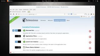
The Gnome desktop has gone through a plethora of design changes over the years, but none has been as fundamentally different as Gnome 3.
The Gnome 3 desktop contains more or less the same elements as Ubuntu's Unity but presents them in a different way. There's the Activities Overview, which is similar to Unity's Dash. However, the Gnome Activities includes a Launcher-like Favourites bar which you can use to pin frequently used apps.
In the centre you get a preview of all open windows, which takes up the majority of space.
To the right is the Workspace Switcher, which always shows the current Workspace and an additional one. If you add windows to the second Workspace, a third will automatically be added. At the top is a search box that will match strings to apps and documents on the local computer as well as online services.
In fact, one of the highlights of Gnome 3 is the tighter integration with online services. The Gnome Online Accounts let you sign in to your online accounts and enable services you wish to share data from into offline apps. It supports a variety of popular services, including Google Docs and Flickr.
KDE 4.12
KDE will look and feel familiar even to users from non-Linux operating systems. The layout and behaviour of the desktop and the Kickoff app launcher will certainly help users feel at home with it. But KDE is unlike the other desktops that have a consistent look. KDE ships with different interfaces or Views designed to make the best of the available desktop real-estate for regular screens and netbooks and doesn't force the user to stick to either.
The default layout is the Desktop View, which encourages you to place widgets on the desktop. With the Folder View, you can place files and folders on the desktop. The Search and launch View is designed for devices with a small screen or a touchscreen.
One of the most useful features that debuted with the KDE 4 release is Activities. Using this feature, you can create context-aware activities, such as a Social activity that signs you into all your instant messaging accounts and displays updates and feeds from various social networks. Many KDE distros ship with just the default activity, called the Desktop Activity. However, you can fetch more activities from the internet and build on them to suit your workflow.
There's no end to KDE's customisation options. It might seem daunting to a new user, but you don't need to set up or review each and every option before using the desktop. Customising KDE is an on-going process and not a one-time affair. The desktop is designed to grow and mutate as per your usage requirements.
Cinnamon 2.0
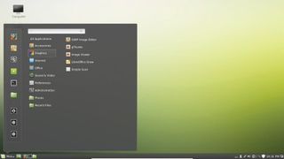
Cinnamon is the other desktop environment that adheres to the standard desktop metaphor. It came into existence as a result of the community's dissatisfaction with Gnome 3 and Unity. This is the default environment shipped on Linux Mint which also spearheads its development and it's standard-fare with an icon-laden desktop with a panel at the bottom, which shows notifications alongside a list of open windows and the applications menu in the traditional bottom left-corner of the screen.
The Cinnamon applications menu is a refresh of the standard application menu. Unlike Unity and Gnome, however, Cinnamon's menu doesn't take up the whole screen. It extends the categorised text-driven layout of the traditional menu with usability features borrowed from other environments, such as the Favourite Apps bar.
The environment also has snazzy desktop features curated from other desktops. It has widgets that you can place on your Panel as well as the desktop. There's also an Exposé-like overview of the open windows across Workspaces that is revealed by the top-left hot corner.
Cinnamon is one of the reasons behind Mint's success. The distro was willing to go the extra mile to accommodate users who were turned off by the new iteration of Gnome and Unity desktop. While Cinnamon lacks the customisation of KDE, it does offer more options. It's intuitive to use, though, which is why it's offered as an option by a number of leading distributions, such as Mageia, Fedora and OpenSUSE.
With almost two decades of writing and reporting on Linux, Mayank Sharma would like everyone to think he’s TechRadar Pro’s expert on the topic. Of course, he’s just as interested in other computing topics, particularly cybersecurity, cloud, containers, and coding.
Most Popular

