7 iconic Commodore Amiga magazine covers
Comm-adore
Introduction
Amiga Power, ST Amiga Format and Amiga Format were just some of the magazines that successfully captured the excitement and possibilities around Commodore's Amiga in the late '80s and early '90s.
The Amiga's relative affordability (compared to IBM-compatible PCs and Apple computers) meant that people could get into personal computing for the first time, and in the absence of the internet, magazines were a go-to source for anything that was worth doing on one.
To celebrate the Amiga's 30th birthday, we've put together 7 magazine covers that perfectly captured the computer's fun and quirky personality. Even though some got it slightly wrong, you can't knock them for effort.

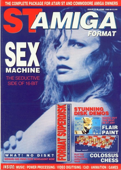
1. Sexy 16-bit ST
Women on the front cover of tech magazines? Some things never change. ST Amiga featured this particularly smouldering shot on the front cover of Issue 13 in 1989, accompanied by the word sex (in big, capped-up letters - obviously). With more than a (perhaps unintentional) hint of James Cameron's Terminator about it, here's a front cover that's as awful as it is hilarious. On the other hand, like the Amiga itself, it probably should be applauded for trying something new. Probably.
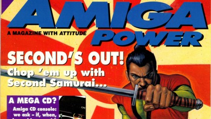
2. Far Eastern promise
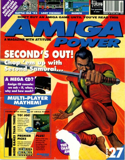
What screams fun more than a Japanese samurai with a massive katana, set against a Rising Sun Flag background? Nothing, that's what. Side-scrolling hack 'n' slasher First Samurai was a smash hit on the Amiga, and anticipation for a sequel reached fever pitch in 1993. Amiga Power ensured you wouldn't miss this particular issue on the newsstand by giving its front cover big, bold colours - much like the game itself.

3. Purple Haze
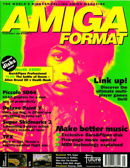
The Amiga was a highly capable music recording tool, and was even used by actual money earning musicians such Max Tundra, from Camberwell in the UK. Nothing captures the process of recording music in your bedroom quite like a psychedelic image of Fender-wielding guitar legend Jimi Hendrix, who might well not have had a permanent bedroom. Or an Amiga, come to think of it.
4. Musing Molyneux
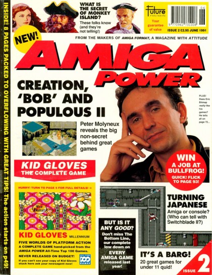
Remember when developers were deemed cool enough to grace the front covers of magazines? While he exists as as fairly contentious figure in the gaming world today, the God of God games Peter Molyneux was a, er, God-like figure back in June 1991. Many of the Amiga's best games were coded by individual developers much in contrast to the billions earning studios of today, and Molyneux's musing pose screamed one thing: the rockstar-like developer on our front page could be you.

5. On the dot
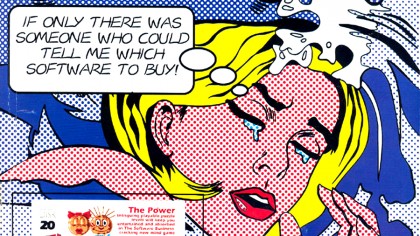
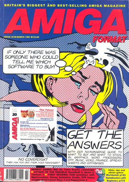
Commodore's 16-bit Amiga computers had stunning graphics for the time. It was one of the first personal computers to catch the imaginations of gamers animators, designers and graphic artists thanks to its 4096-strong colour palette. A display mode called Hold and Modify (HAM) even allowed all of them to be shown at once to spectacular results. Despite featuring a front cover that would probably be deemed sexist today, the front cover of Amiga Format's March 1991 made brilliant use of '60s-style 'dot' art to grab your passing eye. Whether it was created on an Amiga or not is another matter.
6. Rainbow Islands
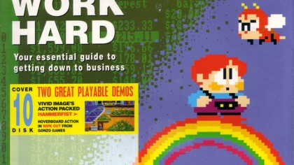
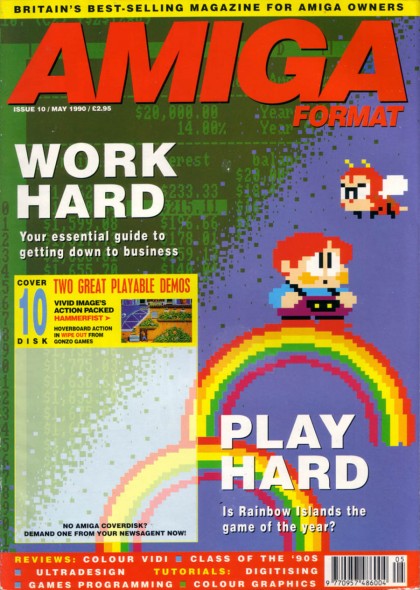
It took a while for computer magazines in the late '80s and early '90s to realise that shoving as many elements on the front cover didn't always look great. Amiga Format nailed the simple approach with this cover from May 1990, which featured one of the characters from the classic platformer Rainbow Islands. Drawing you in so that you had to find out more, it begged the questions: why is that child stood on a rainbow, and is that mono-browed bee angry at him, or something else? They were questions that had to be answered.
7. Scary cartoons
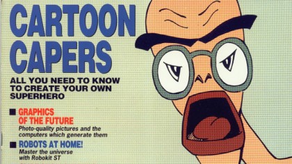
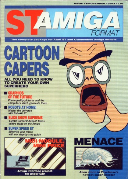
Cartoons reached their peak in the '80s on the back of the Flintstones, Tom and Jerry, Garfield & Friends, Scooby-Doo, Transformers, Ghostbusters and Thundercats - the list goes on. The Amiga's relative affordability meant that people could get into animation for the first time. The cartoon character on ST Amiga Format's November 1988 cover looked nothing like the superhero alluded to on the cover - but its attention grabbing nature, made up of one part creepy and two parts weird - made it a winner.

Sign up for breaking news, reviews, opinion, top tech deals, and more.
You are now subscribed
Your newsletter sign-up was successful
Join the club
Get full access to premium articles, exclusive features and a growing list of member rewards.
 Become a TechRadar Insider


