TechRadar Verdict
OS X El Capitan takes the foundation set in place by Yosemite and builds upon it ever so slightly. There are no revolutionary new features or redesigns to be found here, but the tweaks and polish make it a solid update worth grabbing.
Pros
- +
Multitasking improvements
- +
Refreshed Notes app
- +
Snappier performance
Cons
- -
Clumsy Split View controls
- -
Modest app updates
Why you can trust TechRadar
It's much better to think of El Capitan as an OS X update that adds some spit and polish to its predecessor, OS X 10.10 Yosemite, while also providing some convenient tweaks and features. And despite some minor pain points, Apple has succeeded in that respect.
If you're wondering whether you should make the leap from Yosemite to OS X 10.11 El Capitan, the answer is ostensibly yes. That being said, let's take a deeper look at Apple's latest, including its highs and lows, to see why you should consider the upgrade.
Latest news
With OS X 10.11.6 purportedly the last update for El Capitan, you may have expected macOS Sierra to have left it in the dust when it arrived on September 20, and you'd be right if Apple has anything to say about it.
In early October, the company started seeding macOS Sierra as an automatic download, though you can go into your settings and hang onto OS X El Capitan – if you so prefer. Among the benefits of upgrading is the Photos app, overhauled to keep your memories better organized, while Siri has been added to challenge Microsoft's own virtual assistant.
Unfortunately, Mac sales are down along with the overwhelming majority of the PC market. This is due in part to a lack of refreshed hardware including the MacBook Air 2016 and MacBook Pro 2016 models expected to be announced later this month in line with macOS Sierra’s 10.12.1 update.
Interface
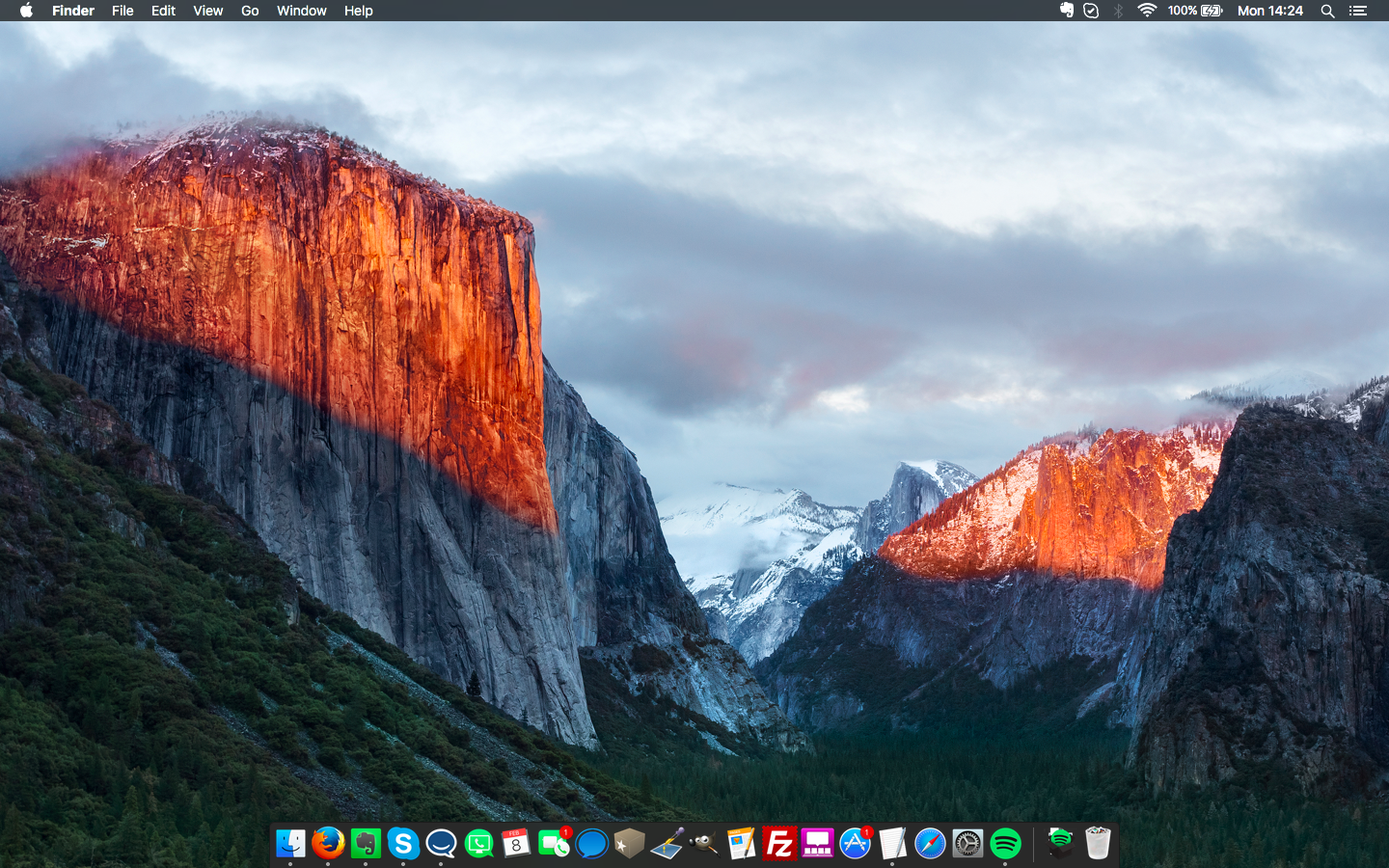
Upon first booting your Mac back up after installing OS X El Capitan, you're not going to notice many visually apparent changes. El Capitan largely carries over the same flat, iOS 7-inspired design cues that arrived with Yosemite, and, frankly, that's a good thing.
You are likely to see to changes if you're astute and do a little poking around. The first, and most aesthetically pleasing change is the adoption of a new system font. Yes, after initially switching to Helvetica Neue in Yosemite, Apple has once again switched things up with its own, specially designed font called San Francisco that also appears in iOS 9 and on the Apple Watch. Overall, this is a welcome change that only further unifies the Apple ecosystem.
The second main interface element change you're likely to notice also happens to be one of convenience. Now, if you're struggling to find your mouse cursor, simply wiggling the mouse back and forth will cause the cursor to temporarily inflate in size. It's an extremely minor detail, but it's a nice change that keeps with Apple's focus on the little things in El Capitan.
Split View and Mission Control
General interface sameness notwithstanding, Apple has managed to bring some pretty major changes to multitasking in El Capitan. On the minor side of things, the new Mission Control features few tweaks that clean things up a bit.
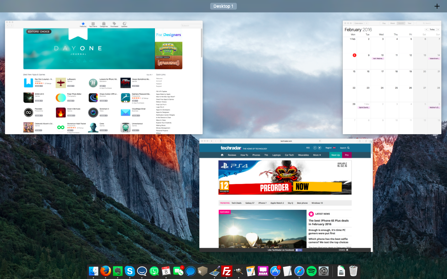
Now, when you swipe up with three fingers on your trackpad, you'll notice that Mission Control's overall view of your open windows is more spread out. The multitasking feature no longer overlaps windows, which could make it a bit easier to spot the window you want at a glance.
Meanwhile, the Space Bar at the top of Mission Control now features labels, rather than thumbnails by default. Thumbnails aren't totally gone, however, as hovering over the labels will give you a peek at the thumbnails. And as an added bonus, you can now drag windows up to the Space Bar to create new desktops.
None of the Mission Control changes are what I'd consider essential, but they aren't off-putting either. Where multitasking has really taken off, however, is with the new Split View.
Anyone who has used a Windows PC in the last half-decade will be familiar with Split View. The feature essentially lets you more easily manage side-by-side windows on your desktop with a couple of clicks, rather than going through the cumbersome process of manually resizing each window.
There are a couple of different methods for accessing Split View. The first involves clicking and holding on the green full-screen icon in the upper-left corner of a window. One side of your screen will then turn blue and you can then drop the windows on that side. After that's done, OS X will show you other open Split View-compatible apps that you can then drop on the other half of the screen.
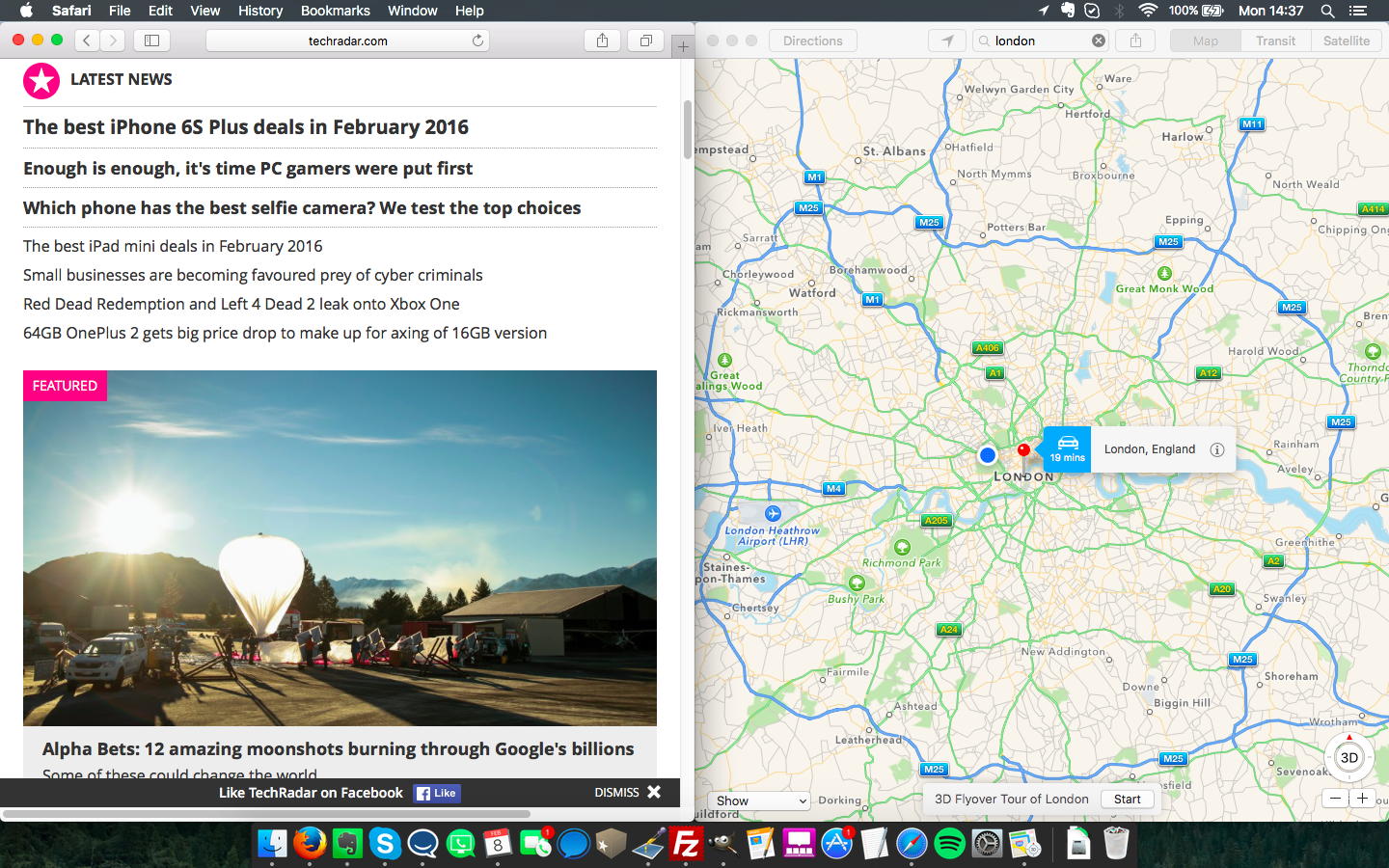
The second method involves the Space Bar in Mission Control. If you have an app already expanded to full screen, you can swipe with three fingers to open Mission Control. From there, you can drag a compatible app up to that desktop in Space Bar to add it in Split View.
Overall, Split View is a fantastic step forward for multitasking on OS X. However, already being familiar with Microsoft's implementation of Snap in Windows, I do have one misgiving about Apple's methods. Just getting apps into Split View feels like it takes too many clicks, and I would have liked to see Apple move more towards a "drag-and-snap" method. That being said, it's still a great feeling to know I don't have to manually fiddle with a window's size and position to work on two things at once.
Spotlight
Another area receiving some big love in El Capitan is the improved Spotlight Search. We saw Spotlight get a touch-up in Yosemite, but El Capitan works to bring it in-line with its counterpart on iOS.
Spotlight in El Capitan can now pull from more sources for data, bringing you weather, stock, and sports information directly to the Spotlight Search box with a click on the menu bar.
Perhaps the largest change to Spotlight, however, is the addition of natural language recognition. Essentially, this means you can ping Spotlight with complex queries like "emails from Bill in June" or "documents I edited last week." This also extends to Spotlight's new web sources, allowing you to enter phrases like "what's the weather in Cupertino."
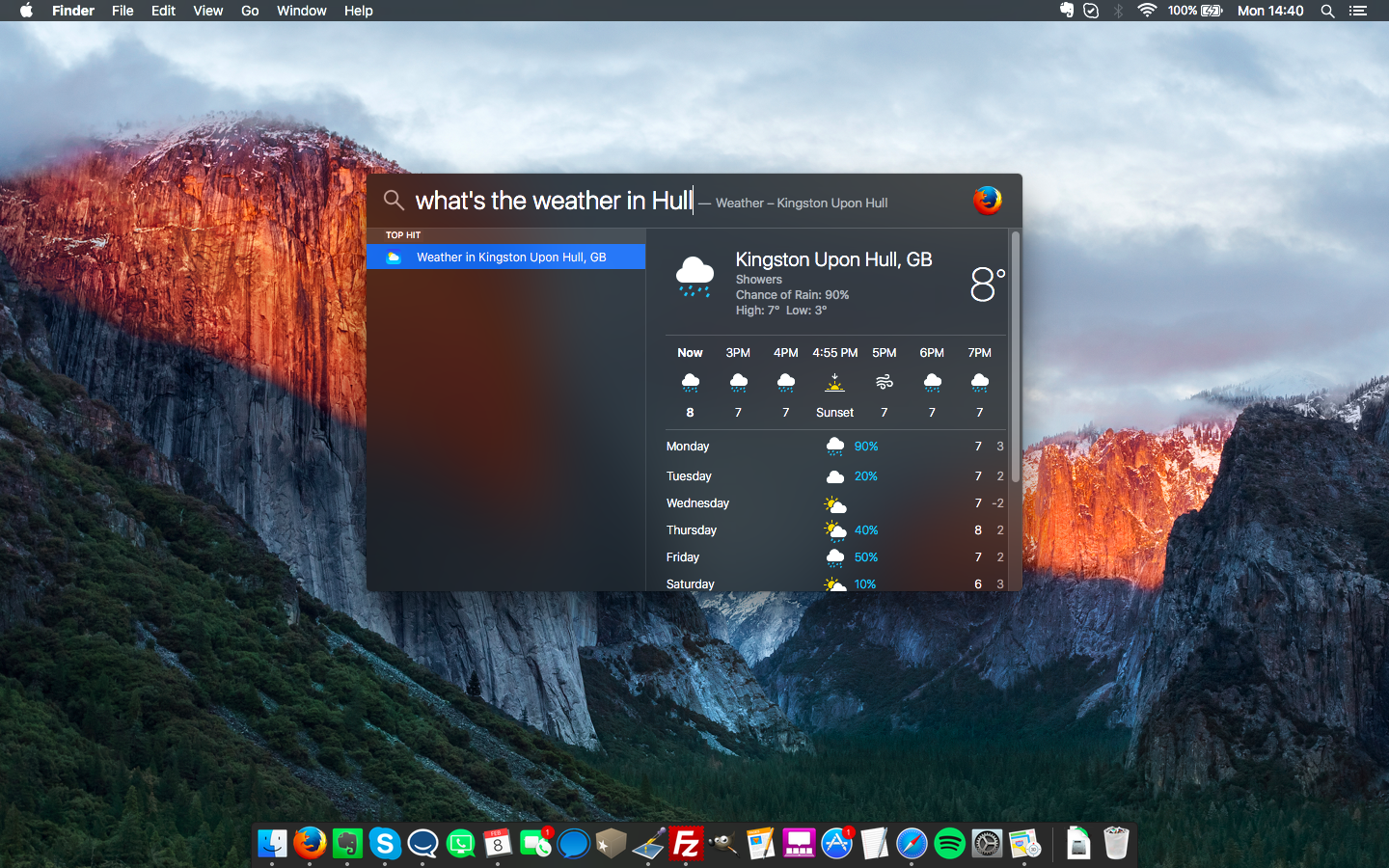
There's no doubt that the Spotlight Search's new smarts are a vast improvement over its previous iterations, but I found the natural language input to be a bit finicky with how I worded things at times. Additionally, while Apple has brought Spotlight a little bit closer to its iOS counterpart in El Capitan, I can't help but feel it's high time to go all-in and bring Siri to the desktop. After all, what's more natural than simply asking a question with your voice?
Notes
The diminutive Notes app has perhaps seen some of the biggest changes of any stock app in El Capitan. Whereas Notes was previously a pretty barebones affair, it is now expanded with the ability to add new types of content, more ways to format your notes, and more.
Users now have the option to add videos, PDFs, and Maps locations to notes, making it that much easier to flesh out your ideas. In tandem, Apple has expanded Notes to be an option in the Share Sheet across many of its own apps – something developers also have access to – so pulling that content in is a smooth as a couple of clicks.
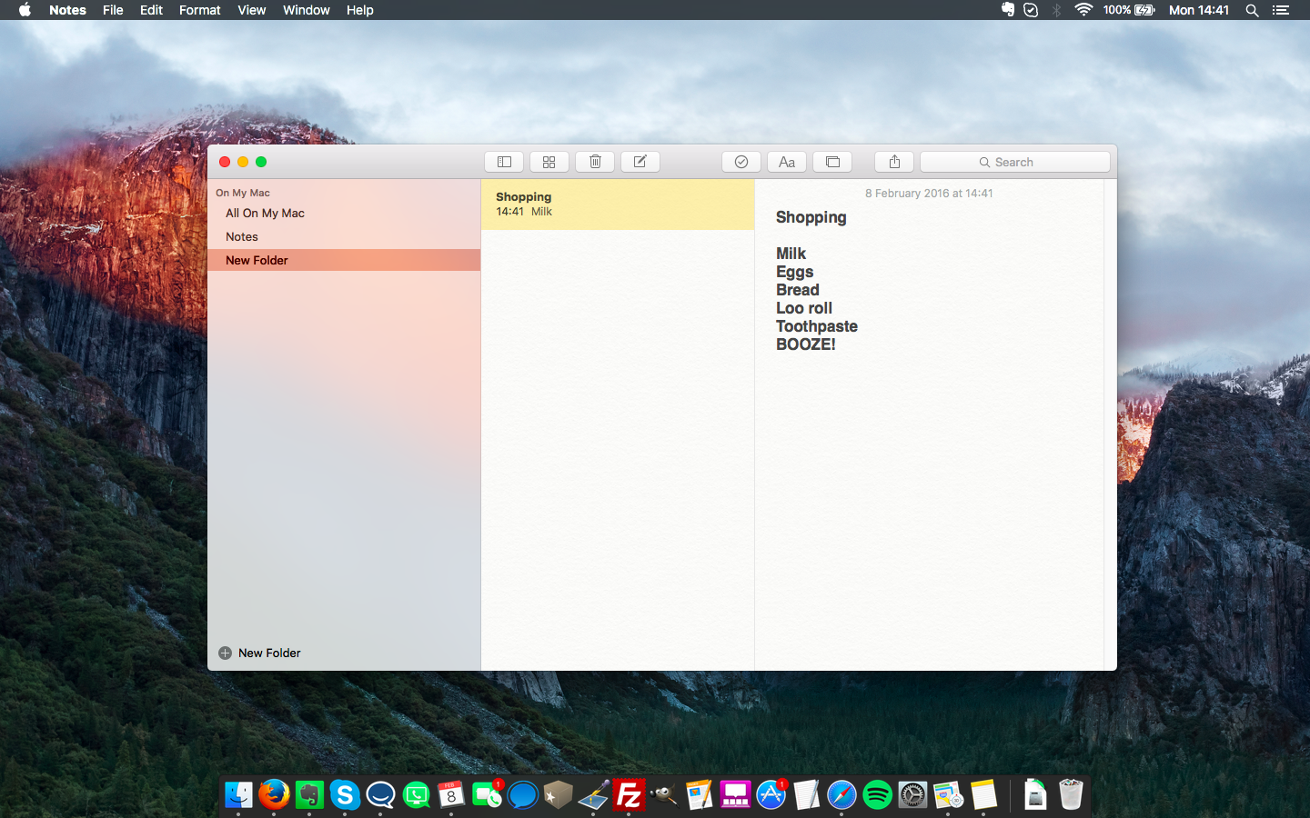
To keep track of these elements, the Notes app now includes an attachments browser, which provides a running list of media elements you've attached over time. Combine that with the ability to finally add proper checklists (as in, you can actually check items off), as well as the addition of a third "categories" pane, and it's hard to complain about this update. Some users will still flock to third-party solutions like Evernote and Wunderlist for their needs, but the stock Notes app is now much more viable.
First reviewed: September 2015
Gabe Carey has also contributed to this review
Though its changes are minor (on par with the rest of the OS), Safari has caught up with the competition in some respects as well. First and foremost is the addition of site pinning, which can really help out if you find yourself frequenting the same group of sites on a daily basis.
To use site pins, you control-click the tab for a particular site and click the "Pin Tab" menu option. From then on, no matter what else you do in your browser, that site will be loaded up and ready to go in a miniature tab on left of the tabs bar. For those of us that rely on constantly checking specific pages, whether it be Gmail or Facebook, for our workflow, pinned tabs add a bit of convenience.
More minor, but no less useful, is that tracking down a rogue sound clip or video that starts playing in one of potentially dozens of open tabs is now much easier. Similar to Chrome's implementation, Safari now displays a tiny speaker icon on any tab that is playing sound. To put an end to the noise, you simply click the icon and the tab is now muted. Finally, Safari now sports compatibility with Apple's AirPlay. With this, you can now cast videos to your Apple TV while getting a bit of work done on your Mac.
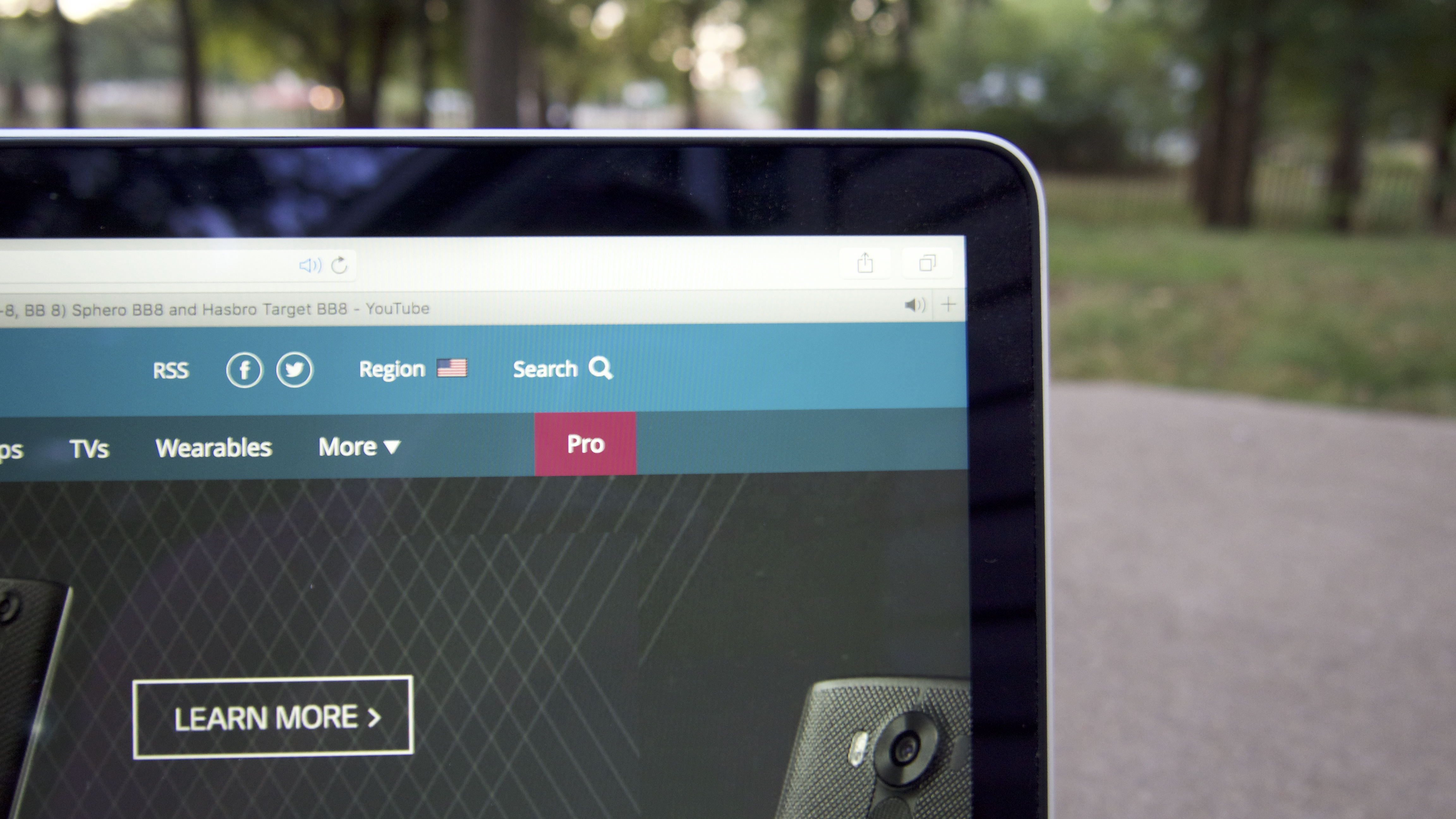
Combined with Safari's already great speed on OS X, these are all solid improvements that could make the browser worth another look for those that are tired of Chrome's constant assault on both battery and memory. However, if you're tied to Chrome's larger extension library, you may not be sold.
Mail has also picked up some nice enhancements, but it's still far from the type of redesign that would make customers rush back to the oft-maligned email client.
Perhaps the most prominent change in Mail is that it now supports gestures not dissimilar to those that appear in its iOS cousin. You can now use a two-fingered left swipe to delete an email, while a right swipe will open up options to mark an email as read. I was already used to this behavior with my go-to third-party client, Mailbox, so the transition was easy and welcomed.
Mail also now features tabs for your drafts while in full-screen mode, which makes working through multiple threads at once less of a chore. Also appearing in the revamped Mail are some new smarts that will automatically detect times and dates, giving you a quick-access link to your calendar in response. The same applies for phone numbers and addresses, with Mail prompting you to easily add such information to your contacts. It's the type of thing that initially evokes an approving shrug of the shoulders, but becomes invaluable the first time you use it to add a meeting or due date to your calendar.
Maps
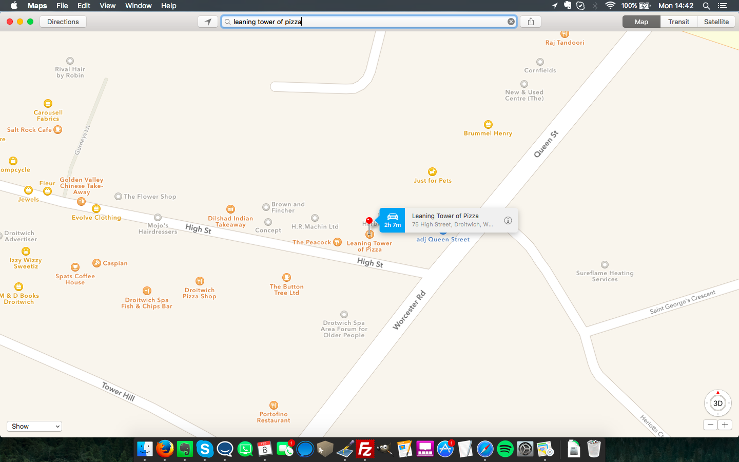
You're allowed to sing your praises from the rooftops on this one: transit maps are finally here. Okay, so it's a much bigger deal on iOS 9, since that's on the device in your pocket at all times, but it's no less intriguing a prospect on a Mac.
True, the transit directions are only available for a handful of cities in the U.S. and Europe at the moment, along with hundreds in China, but more will be added as time goes on. The feature works as you'd expect, allowing you to enter start and end points, then showing you which subway or bus line to take and where to switch. Even better is that Handoff allows you to easily plot your course on your Mac and then send it off to your iPhone before you head out the door.
How to master OS X 10.11 El Capitan
If you've already upgraded to El Capitan, our how-to guides are here to help you get the most out of it. In our latest guide, we show you how to selectively delete files tossed into the OS X trashcan.
- 56 OS X El Capitan tips and tricks
- Use Split View
- Pin sites in Safari
- Use the Mac OS X Dock on all monitors
- Download and perform a clean install
- Delete files faster on a Mac
- Pin sites to Safari
- Overhaul the Today View
OS X El Capitan doesn't represent a sweeping departure from the foundation set by Yosemite by any means, but, overall, that feels okay for an update following on the heels of the overhaul we saw in 2014. There are certainly some areas where I would have liked to see Apple push further, but El Capitan feels like a solid spit-and-polish type of update.
We liked
Despite its somewhat clunky implementation, Split View is a welcome, sorely needed addition. The ability to easily get a couple of apps side-by-side for an intense multitasking session means there is no need to fiddle with manually resizing and placing windows in just the right spot. Similarly, Spotlight Search is now handier than ever, and I'm looking forward to seeing how Apple improves on not only the natural language detection, but the sources Spotlight draws from as well.
And while none of the app changes may seem striking or revolutionary, they add up to form a nice package that brings Apple's offerings closer in-line with third-party options. The sheer quality-of-life improvements brought to Safari in the form of pinned tabs and tab muting are particularly noteworthy. Add in a revamped Notes app that has me questioning my loyalty to Evernote, and the updates feel solid all around.
Finally, there's performance to consider. Apple has clearly done a bit of work under-the-hood to speed up OS X, and it's noticeable from the get-go. Apps load and switch more quickly, and there's a definite feeling of freshness when you load El Capitan for the first time. Perhaps best of all, El Capitan still retains compatibility with a massive list of Macs going back to 2007, so nearly everyone can get in on the action.
We disliked
Despite its utility, Split View feels cumbersome compared to Microsoft's implementation in Windows. Anyone that has used Snap on Windows 7, 8 or 10 is likely familiar with the simple click-and-drag gesture used to invoke it, and Apple would have done well to take a cue from Microsoft in this department. The time spent waiting after you initially click on the full screen icon feels wasted, and the process overall simply doesn't feel as modern as it could be.
Ultimately, I would have liked to see Apple go further with its apps as well. Outside of the refreshed Notes app, the other changes feel like a game of catch-up. Safari will certainly see more use thanks to its added features, and its memory and battery consumption are second-to-none on the Mac, but I'm still not convinced it's enough to cause users to switch from alternatives. Similarly, I don't see Mail's changes as being enough to cause those tied to their Gmail tab to give it a second thought.
Final verdict
OS X El Capitan isn't going to please anyone looking for a revolution, but it's a solid update overall. Between the performance improvements, new app features, and multitasking tweaks, there's no reason not to dislike what Apple has accomplished here. And the lack of major design changes is good news for those who may have been a bit shellshocked by Yosemite's redesign in 2014.
In musical parlance, the upbeat is less pronounced than the downbeat, but it's no less important, and the same thing can be said when comparing El Capitan to Yosemite. In short, if you're still considering whether it's worth the free upgrade to El Capitan, the answer is a resounding yes.
