TechRadar Verdict
With smart notifications, GPS, sports tracking to rival high-end devices, an on-board payment system and a subtle, stylish design, Garmin has created a versatile wearable with true mainstream appeal.
Pros
- +
Subtle, circular, stylish design
- +
Good GPS and heart rate monitor
- +
Tracks a range of activities
Cons
- -
Can't choose which apps get alerts
- -
iOS users can't respond to texts
- -
Base model can't support music playback
Why you can trust TechRadar
In keeping with Garmin's sports tech legacy, the Garmin Vivoactive 3 has a heart rate sensor, GPS tracking and a selection of built-in apps dedicated to keeping tabs on a range of sports activities, from running and indoor cycling to skiing and snowboarding.
The Vivoactive 3's focus may be on fitness, but this versatile wearable also has plenty of other features to shout about, including smart notifications, an on-board payment system called Garmin Pay as well as both sleep and real-time stress tracking. And its design reflects its sporty yet smart credentials, as it looks more like a watch than a bulky fitness tracker.
It's no surprise that the Vivoactive 3 does fitness well. After all, the Garmin brand is as synonymous with high-end sports devices as it is with GPS systems nowadays. Speak to any runner or triathlete and they'll likely cite one of Garmin's Forerunner, or even Fenix, bands as their favorite gadget.
But that hasn't stopped Garmin from venturing into a more consumer-focused space either. Devices in the Vivofit, Vivomove and Vivosmart ranges may still be aimed at those who like working out, but could be described more as lifestyle wearables given they care as much about step counts, sleep and stress as personal bests and optimizing performance.

The Garmin Vivoactive 3 doesn't fit neatly into either category. At around half the price of the brand's high-end fitness devices, like the Fenix 5X, the Garmin Vivoactive 3 is a more affordable option and yet still packs a punch when it comes to sports tracking.
It has on-board lifestyle features, like sleep and stress tracking, but is also geared up to compete with similar multi-purpose smartwatches with its notifications and payment system.
As you'd expect, the Garmin Vivoactive 3 isn't occupying this appealing space all on its own. Retailing at £279.99 ($249.99, AU$449) it entered at a similar price point to new devices from some of the biggest names in wearable tech.
There's also a 'Music' version, which cost around £50 / $50 more at launch. This adds in music playback capabilities but maintains the same function set of the base model we've reviewed here.
That music streaming (and downloading) is currently limited to iHeartRadio in the US, with Deezer coming soon for other territories - although the latter still hasn't launched at time of writing. That means you're stuck using MP3s, if you have any around, and you can chuck up to 500 on there.
With that now on board, you could argue the Vivoactive 3 rivals the Apple Watch 3, as well as the Fitbit Ionic. They're in no way identical, but all three are driven by fitness, look good, are designed to be worn 24/7 and are smart.
Garmin may be a firm favorite among those serious about fitness, but the question now is whether a multi-purpose smartwatch like the Vivoactive 3 has the on-board specs, style and mainstream visibility to compete with the likes of Apple and Fitbit.
Garmin Vivoactive 3 price and availability
- Launched November 2017
- Starts at £279.99/$249.99/AU$449
There are three different colors of the Garmin Vivoactive 3 to choose from. There's black silicone and slate, which is a premium-looking dark grey and costs £299.99/$329.99/AU$499.
It also comes in black silicone and stainless steel, which is silver, as well as white silicone and stainless steel, which both cost slightly less at £279.99/$249.99/AU$449.
That makes the Garmin Vivoactive 3 a little less than similar devices that also straddle the line between fitness tracker and smartwatch, like the Fitbit Ionic, LG Watch Sport and the Apple Watch 3 (with just GPS and not cellular capabilities).
It's also considerably less than many of the brand's more specialized multi-sports ranges.

For example, if you're looking for a wearable to see you through a huge range of activities with super accurate tracking, the Fenix 5X might be your best bet at $699.99/£629.99/AU$949.
On the other hand, if you're solely looking for a device for running and nothing else, you could opt for the Forerunner 30 at £129.99 (around $175/AU$225). But most runners would want to opt for something like the Forerunner 235, which still undercuts the Vivoactive 3.
In short, if you want a Garmin fitness device there are certainly cheaper options. But you'd need to be sure that fitness is your only focus, otherwise it would make sense to consider the Vivoactive 3 instead.
Design
- Circular design
- Comfy strap
- Screen counteracts glare
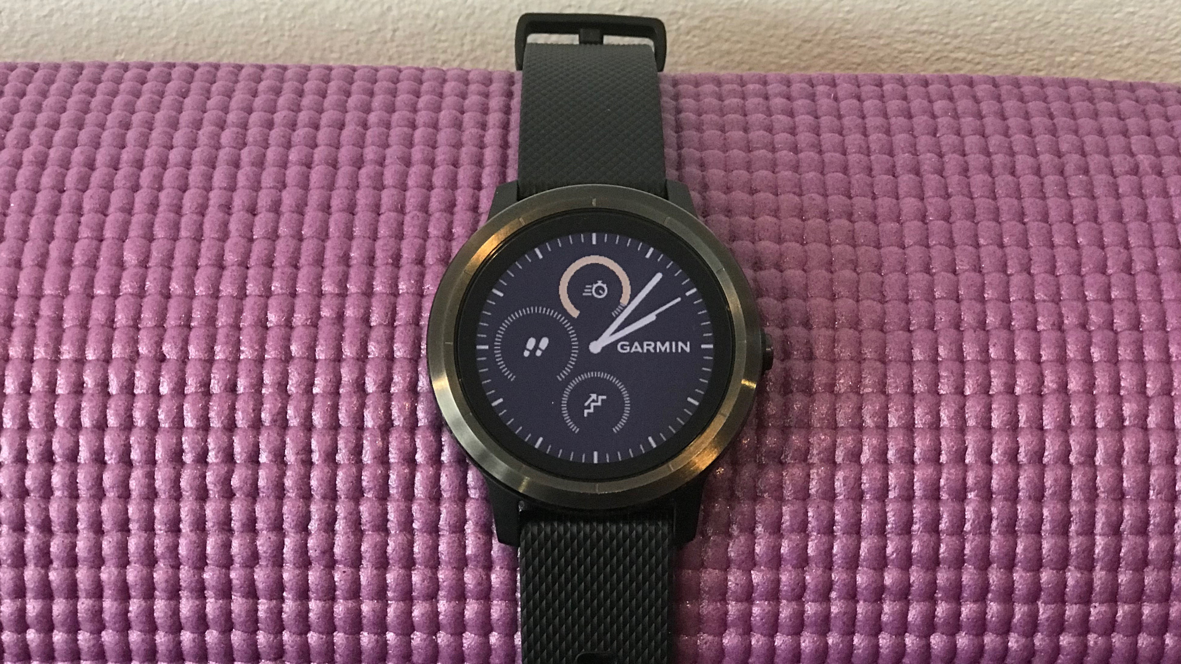
At 43g, and made with a stainless steel casing, the Garmin Vivoactive 3 feels weighty enough to be premium, but like a normal watch once it's strapped on. It's a world away from Garmin's previous Vivoactive HR device, which in many ways felt and looked more like a cheap, blocky sports watch than a quality wearable.
That’s the running theme when it comes to the design of the Vivoactive 3, although packed with smart features and a bevy of sensors, it looks and feels like a 'normal' watch.
This is especially the case in comparison to wearables built solely for tracking, like Garmin's latest Vivosport or Vivosmart devices. It even looks more watch-like than its closest competitors, which is likely to be because both the Fitbit Ionic and Apple Watch 3 have square (or square-er) faces.
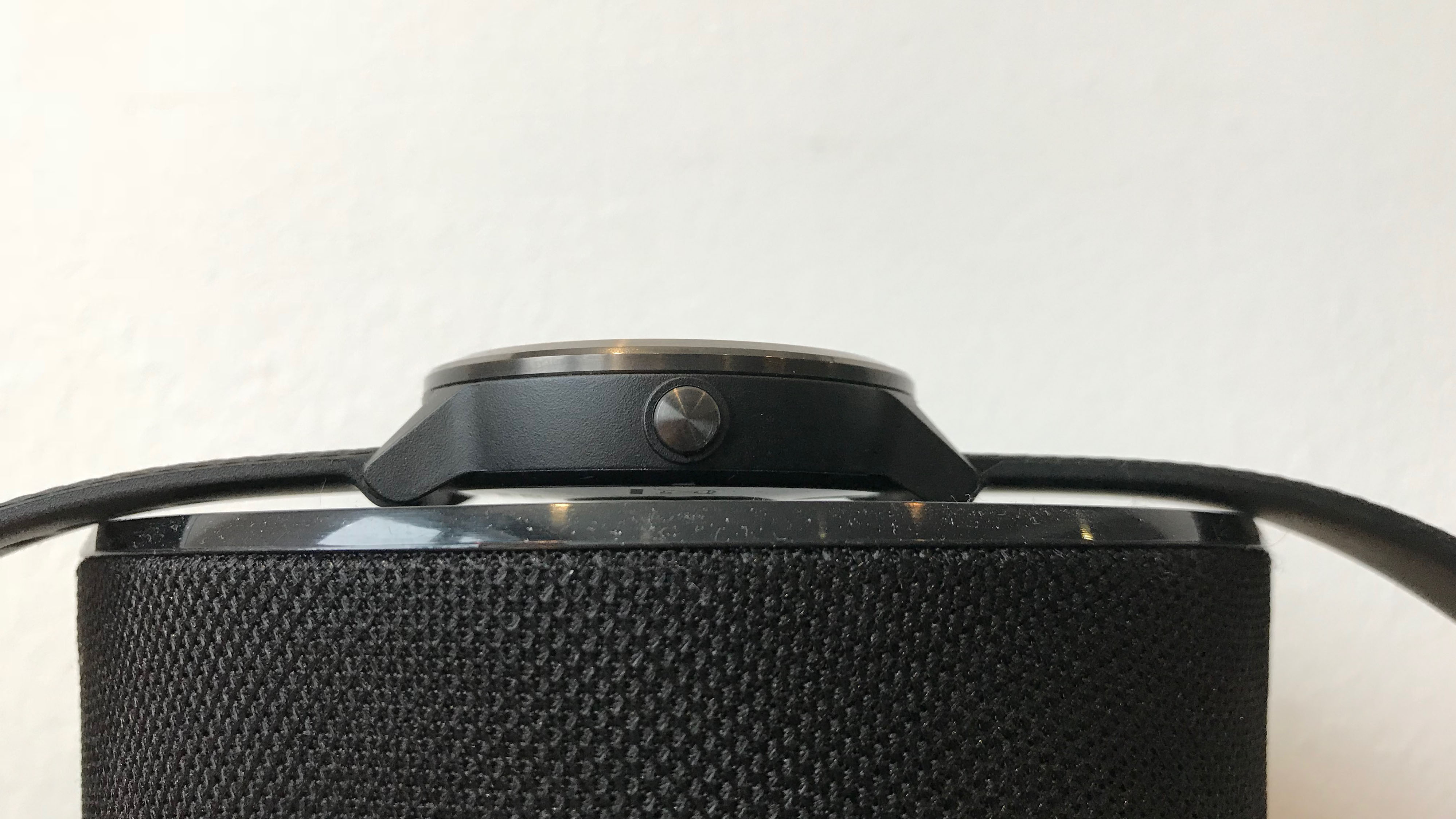
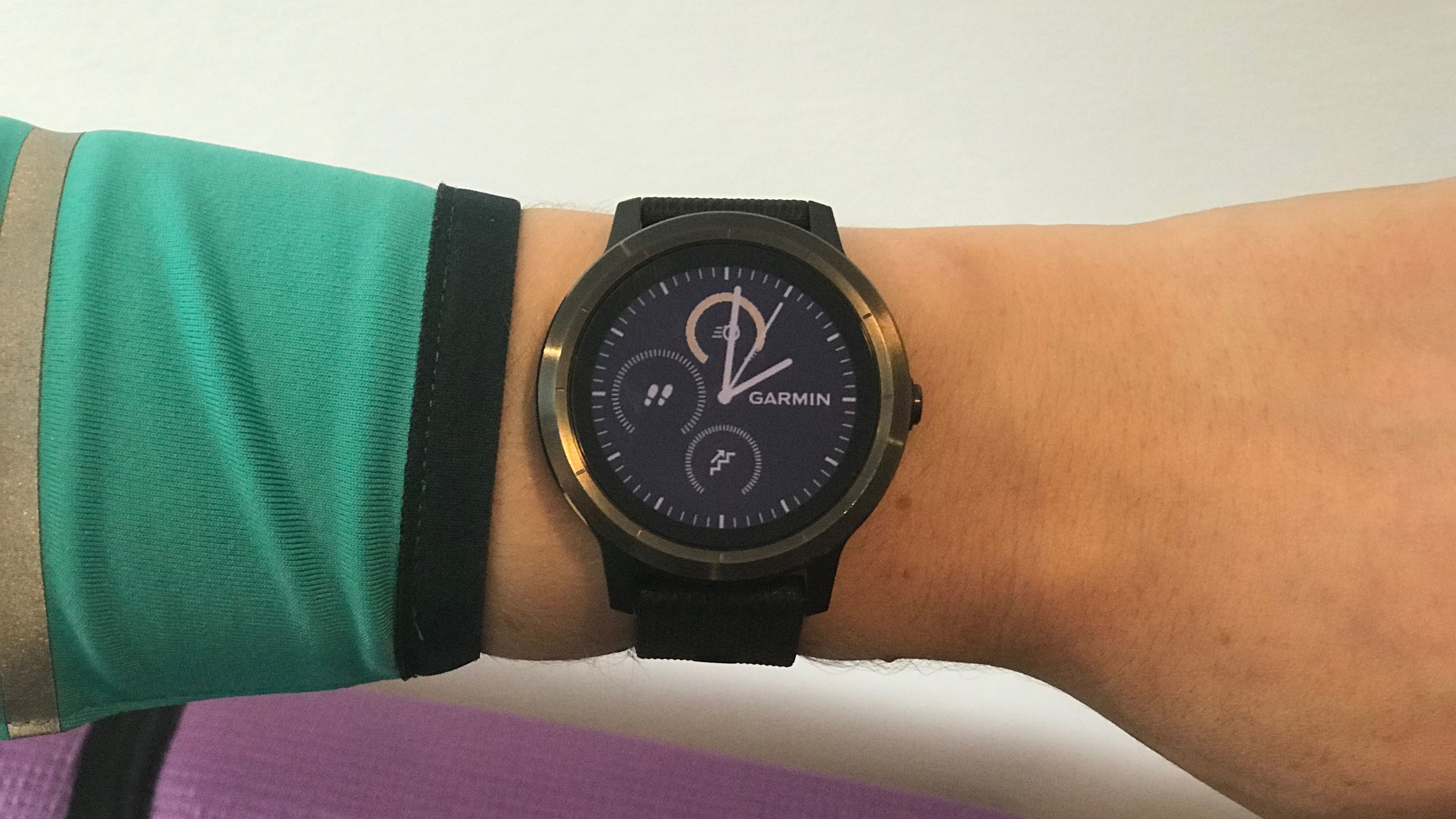
With a depth of 11.7mm the Garmin Vivoactive 3 sits flush against our arms. This combined with a super flexible silicone strap makes for a very comfortable wear. That was the case throughout our whole review period, even at night and at the gym.

The silicone strap is flexible and very easy to get on and off. But once it's on it feels secure, even after a run, swim and a HIIT class. But if you don't like the strap, it's possible to replace it with any other 20mm quick release band.
The Garmin Vivoactive 3's screen measures 1.2 inches and has a 240 x 240 pixel display, which is a size that suits a range of wrists both big and small, and yet still serves up information without you having to squint to see the stats.
Like many other Garmin watches, the Vivoactive 3 has a color transflective screen. At first this looks a bit dark, especially compared to the Fitbit Ionic's OLED display, but it's been created that way in order to make it easier to read, even in direct sunlight, and to make a big saving on battery life too.
The display is always-on, but dimmed. The backlight comes on when you flip your wrist up. This is handy for quickly checking the time, but we found keeping that setting on meant it came on a lot during the night. However, you can customize whether it comes on or not, as well as how long for.
There's a small bezel round the edge of the screen with lines on it to show where the hours are. And unlike a lot of similar devices, there's just the one button on the side of the screen. The great thing about this is you get to decide during setup whether you want it facing toward your body, or facing toward your wrist and hand.

We wore the Vivoactive 3 on our left wrist, so chose the button to be closest to our hand to make it easier to push with our right. This button is pretty important because, among other things, it allows you to access the sports menu and also works as a back button.
Some people are bound to love the minimal effect this provides, others who are used to multi-functional sports watches with lots of buttons and dials may find it lacking.
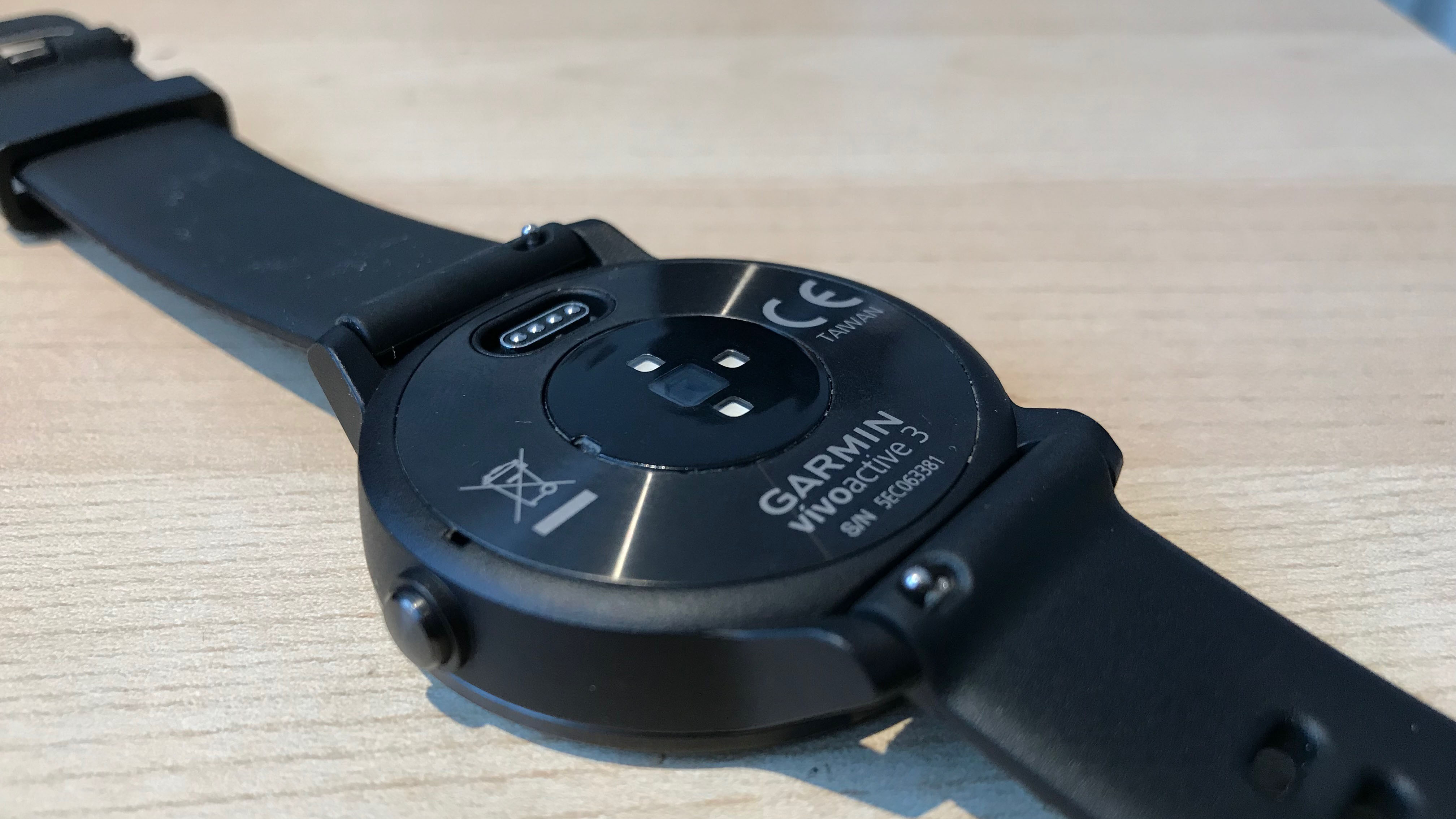
On the underside of the Vivoactive 3 there's a four pin charging port, which is small and can't be felt on your skin, as well as the device's optical heart rate sensor, which again, sits flush against your wrist.

We reviewed the Vivoactive 3 in black silicone and slate, which is a premium-looking dark grey that costs slightly more than black silicone and stainless steel or white silicone and stainless steel.
The Garmin Vivoactive 3 is waterproof up to 50 meters, which is ideal if you're a swimmer and makes it easier to shower and wash-up without worrying about taking it on and off all the time.
Add to that the fact the screen is Corning Gorilla Glass 3 and the case is made from a reinforced polymer and you've got one durable device on your wrist that’ll withstand the most grueling of workout sessions.
When it comes to design, the Garmin Vivoactive 3 certainly ticks all of the right boxes and justifies the price point, providing a watch that looks premium, but most importantly for a 24/7 wearable, feels comfortable.
- Can’t choose between Garmin Vivoactive 3 and Garmin Vivoactive 4? We can help.
You might also want to check out Apple Watch vs Garmin comparison.
- Find the best deals on Garmin products with our Garmin promo codes.
Becca is a contributor to TechRadar, a freelance journalist and author. She’s been writing about consumer tech and popular science for more than ten years, covering all kinds of topics, including why robots have eyes and whether we’ll experience the overview effect one day. She’s particularly interested in VR/AR, wearables, digital health, space tech and chatting to experts and academics about the future. She’s contributed to TechRadar, T3, Wired, New Scientist, The Guardian, Inverse and many more. Her first book, Screen Time, came out in January 2021 with Bonnier Books. She loves science-fiction, brutalist architecture, and spending too much time floating through space in virtual reality.

