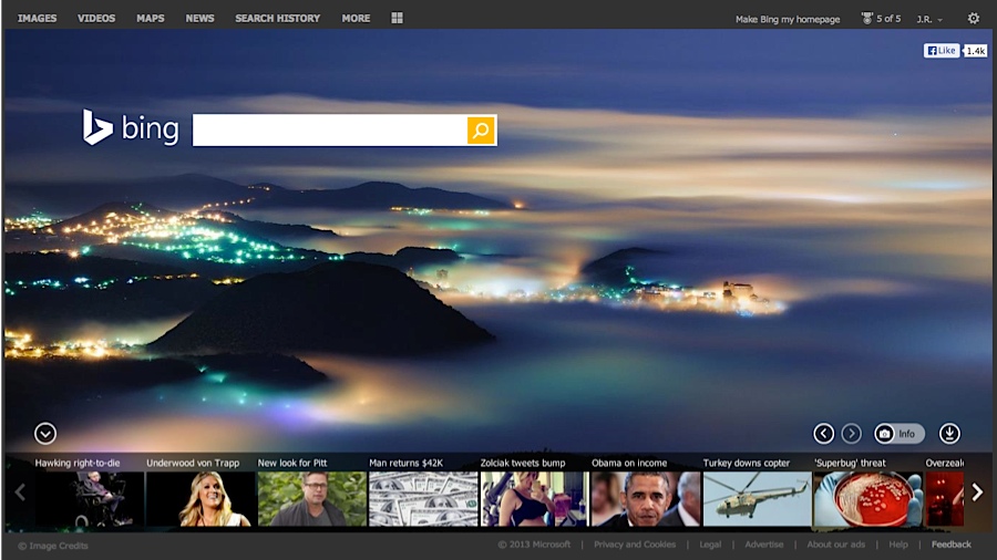
Microsoft puts a fresh coat of paint on Bing, but will users bite?
No longer just search, Bing aims to become whole platform

With Windows 8, Windows Phone 8, Xbox and Office, Microsoft is working hard to unite its products and services under the same shingle, but this week the company offered a peek at how Bing will fit into its new vision of the future.
Microsoft's Bing Blogs announced a rebranding of Bing.com that offers a reinvention of the service's visual identity, starting with a new logo and brand elements intended to stretch across all of the company's products.
Featuring a clean, modern design, Bing's new logo cleverly matches the color palette used in the lower right quadrant of Microsoft's latest corporate branding, but the change is about more than just looks.
"Bing is no longer just a search engine on a web page," explained Bing Senior Director, Brand and Creative Scott Erickson in a blog post. "It's a brand that combines search technology across products you use every day to help empower you with insights."
The right search
In addition to the new look, Microsoft is rolling out a new Bing.com web portal today that's billed as "faster, cleaner and more visually appealing."
New to the service is Page Zero, a feature that attempts to guess what a user is looking for as they type a search query, while intelligently offering multiple choices for queries that have more than one option available.
Other changes include "Pole Position," which displays answers front and center for queries where Bing has a high confidence in the results, as well as combining existing Snapshot and Sidebar features for better integration with social networks like Facebook and Twitter.
Get daily insight, inspiration and deals in your inbox
Sign up for breaking news, reviews, opinion, top tech deals, and more.
The new Bing is available today as a preview, and Microsoft claimed the design was created with every kind of device in mind - from big-screen TVs to future smartwatches and everything in-between, from PCs, smartphones and tablets.
The question remains: Will users flock to the new Bing or stick with the search engine (a.k.a. Google) they're used to? At least the refresh is better than another "Scroogled" ad.
- Get a hands-on look at the new Windows 8-powered Asus Transformer Book T100!