Twitter tests major profile redesign, looks rather similar to Facebook Timeline
Taking all the pages from each other's books

There's been a lot written about how Facebook has continued to adopt Twitter-like features such as hashtags and trending topics, but now it appears the latter is taking a page from the former's design playbook.
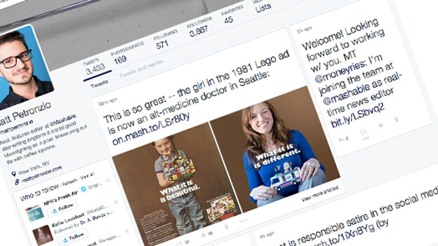
Judging by an experimental version of its profile page, currently being tested on a small sample of users, Twitter seems to have taken a shine to the love-it-or-hate-it Facebook Timeline and wants it for its own.
First noted by a Mashable staffer, the redesigned profile page appears to take on many aspects of Zuckerberg's biggest revamp in recent times.
From its non-linear layout and focus on content cards rather than a list of text-based tweets, to the positioning of the profile photo, background photo and toolbar, the similarities are quite startling.
It's all about 'Me'
While it's not certain whether Twitter ever plans to roll this version of the 'Me' page to all users beyond this experimental stage, its appearance comes shortly after a tweaked page rollout out to all members.
That particular update, which brought a cleaner, clearer and lighter look, was tested for months, so don't expect Twitter to roll-out this Timeline-like update any time soon.
So far the company hasn't responded to requests for comment.
Get daily insight, inspiration and deals in your inbox
Sign up for breaking news, reviews, opinion, top tech deals, and more.
A technology journalist, writer and videographer of many magazines and websites including T3, Gadget Magazine and TechRadar.com. He specializes in applications for smartphones, tablets and handheld devices, with bylines also at The Guardian, WIRED, Trusted Reviews and Wareable. Chris is also the podcast host for The Liverpool Way. As well as tech and football, Chris is a pop-punk fan and enjoys the art of wrasslin'.
