YouTube debuts brand new homepage
Huge social influence and Facebook-like video feed
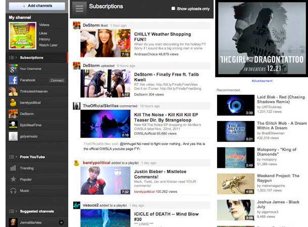
YouTube has unleashed the biggest redesign in its history with a brand new homepage.
The all-new YouTube.com, announced on the official YouTube blog, splits the homepage into three sections which, in many ways, feels familiar and mirrors the way Facebook operates.
The aim of the attractive relaunch is to bring your favourite videos and channels front-and-centre, while bringing greater integration with the main social networks.
On the left, a navigation bar features links to videos shared by your Google+ and Facebook friends, while it also lists each of the channels you subscribe to along with trending and popular uploads.
New video feed
Hitting one of these channels or the social network icons will populate the middle section, which is set up in the same way as Facebook's news feed.
In default mode, the video feed will autopopulate with content from your subscribed channels and social networking friends.
TechCrunch reckons the video feed, which was first introduced earlier this year, now works algorithmically based on your previous acitivity on the site.
Get daily insight, inspiration and deals in your inbox
Sign up for breaking news, reviews, opinion, top tech deals, and more.
The right hand column is made up with recommended content related to your YouTube viewing history.
New paint job
YouTube says it has also added "a coat of paint" to the whole site, along with the ability to easily customise your own channel.
You can see the changes in the video below or head over to the new and improved YouTube.com homepage.
Via: TechCrunch
A technology journalist, writer and videographer of many magazines and websites including T3, Gadget Magazine and TechRadar.com. He specializes in applications for smartphones, tablets and handheld devices, with bylines also at The Guardian, WIRED, Trusted Reviews and Wareable. Chris is also the podcast host for The Liverpool Way. As well as tech and football, Chris is a pop-punk fan and enjoys the art of wrasslin'.

