TechRadar Verdict
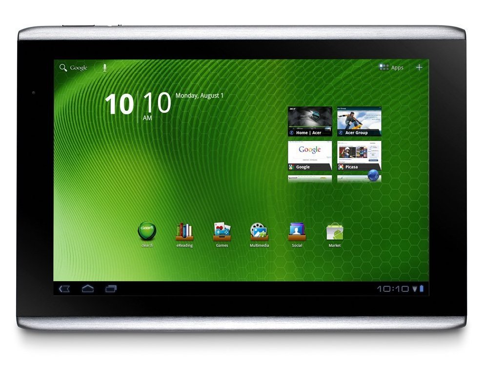
A very good tablet that beats the BlackBerry PlayBook in its performance but sits slightly behind the Motorola Xoom because of its less attractive design
Pros
- +
720p video playback
- +
More rugged than most
- +
Bright screen
- +
Docking station
- +
USB port
Cons
- -
Shorter than average battery life
- -
Short charger cable
- -
Wide bezel
- -
No video rentals
- -
Some minor crashes
Why you can trust TechRadar
In the contest to replace your laptop – and maybe even your TV – Android 3.0 tablets such as the Motorola Xoom are ganging up on the Apple iPad 2 by sheer quantity. We absolutely thrilled over the Asus Eee Pad Transformer, for example. Now it's time for the Acer Iconia Tab A500's day in the sun.
In many ways, this is all about the operating system, so we'll admit that the differences between the three main Android 3.0 tabs are marginal at best. You have to choose your OS poison wisely – the iPad 2 is better for music, movies and games, and it has better quality apps and more of them.
Meanwhile, the BlackBerry PlayBook is more secure than the competition, has real multi-tasking and even a more fluid interface for controlling your apps (er, all four of them).
Android 3.0 Honeycomb tablets are arguably more open than either the iPad 2 or the PlayBook. The app approval process is easier, and coding is less restrictive, using Google SDK.
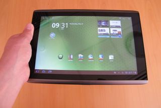
So what does that means for the Acer Iconia Tab A500? Primarily, the decision comes down to the design and handling of the device. The Iconia Tab A500 uses the same Nvidia Tegra 2 1GHz dual-core processor as the Motorola Xoom, they both weigh exactly 730g and both have a 10.1-inch touchscreen. The list goes on: both devices have 32GB of internal memory, 1GB of RAM and support microSD cards up to 64GB.

Yet, the main difference is that the Acer Iconia Tab A500 feels bulkier. That can be a good thing for those who tend to abuse their gadgets mercilessly, since the Iconia Tab A500 has an aluminium back and a sturdier, stockier footprint. In a side-by-side comparison, the Motorola Xoom looks more like an iPad 2 and the Iconia Tab A500 fits in better with a recent crop of Windows 7 tablets, including the rather disappointing Acer Iconia Tab W500.
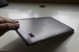
The Iconia Tab A500 not only feels bulkier, it is bulkier. The device measures 260 x 177 x 13.3mm, which is significantly wider than the Motorola Xoom, considering both devices have the same size screen.
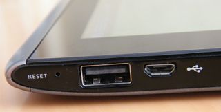
The Acer Iconia Tab A500 also has a dedicated HDMI-out port for playing 1080p video on your HD TV, like the Motorola Xoom. What's really missing is a selection of unusually impressive extra features – the Asus Eee Pad Transformer morphs into a real notebook; the HTC Flyer has a helpful add-on interface component.
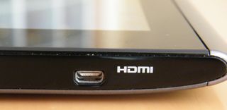
The Acer Iconia Tab A500 also has a front-facing 2MP camera and a rear facing 5MP cam. In the box, Acer includes a charger and USB cable, but no earbuds, case or stand.
The Iconia Tab A500 does provide one UI add-on for categorising apps. For example, games are separated into their own screen. It has a limited appeal, but at least there's something new on offer. One other slight differentiator: the Iconia Tab A500 includes a couple of extra apps and games beyond the norm.
At £450 for Wi-Fi only or £530 for Wi-Fi and 3G, the Acer Iconia is a hair cheaper than the Motorola Xoom but more than the Asus Eee Pad Transformer. There will, however, be a 16GB version emerging in mid-june for £380 which could be a more attractive option.
So does the Acer Iconia Tab A500 really fall in the middle? Does it rank near the top of the tabs or closer to the bottom?
Current page: Acer Iconia Tab A500: Overview
Next Page Acer Iconia Tab A500: FeaturesJohn Brandon has covered gadgets and cars for the past 12 years having published over 12,000 articles and tested nearly 8,000 products. He's nothing if not prolific. Before starting his writing career, he led an Information Design practice at a large consumer electronics retailer in the US. His hobbies include deep sea exploration, complaining about the weather, and engineering a vast multiverse conspiracy.
