Hands on: JooJoo tablet review
Can this web tablet be the iPad alternative to beat?
The iPad has made a splash, but Apple's Flash-free, App-centric platform has certainly left the door open for a web tablet not held back by Apple's shackles.
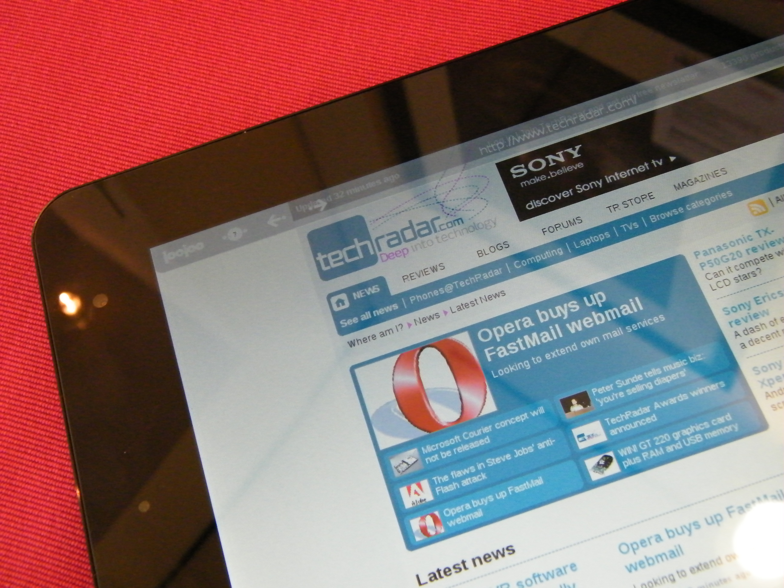
So enter the 12.1-inch JooJoo, which has just gone on sale in the UK. Designed by Fusion Garage, a company that has not been without some controversy, the platform is a gesture-based tablet that is, essentially, one big web browser with a Wi-Fi connection.
The cost, including UK VAT, is £374. We're expecting the entry-level iPad to hit the £399 price point. Is it worth as much as the iPad? Read on for our (varied) thoughts, but first, some basics.
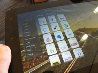
The home screen essentially consists of a variety of web links rather than apps, though these are still downloaded from a 'Store'.
Obviously they don't need to be downloaded from a Store, but JooJoo hopes to ape Apple's success in this way - even if there are no applications to speak of.

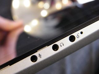
First things first though, the hardware - it's slightly heavier than the iPad although the slick aluminium and dark-edged finish really does look the part - even if it's similar to Apple's device. There's a USB input as well as microphone, power and headphone sockets.
JooJoo has 4GB of built-in solid-state storage in addition to 1GB of memory and Intel's 1.6GHz Atom N270 processor and Nvidia's Ion chip. But, as you'll hear, graphics performance is disappointing.
Get daily insight, inspiration and deals in your inbox
Sign up for breaking news, reviews, opinion, top tech deals, and more.
While the storage is less than the 16GB entry-level iPad, you won't particularly need to store anything on this device as everything is completely web-based.

The bit of hardware that does disappoint is the screen - the 366 x 768 display isn't quite bright enough and certainly isn't good enough for group viewing. The iPad's display is a lot brighter and is far better for viewing alongside others.
So what's it like to use? Unfortunately, the Linux-based interface doesn't quite live up to its slick look. It is sluggish while the menu bar - which needs a one-fingered swipe downwards - appears sporadically.
The unit we have photographed here was also demoed to us previously. During the course of the demo, the device crashed twice and was slow to respond at times.
Apparently these problems (as well as some others we'll detail below) will be fixed by firmware updates in due course, but it begs the question - why is this device on sale now when it's clearly unfinished?
It's a real shame as there is A LOT of potential here. It's just that the JooJoo seems like a beta device - we're not that impressed that it's already on the streets.

One thing we did like was the way the browser enables you to easily swipe between browser screens. Unlike on the iPhone or iPad, this means that any video or music playing in that screen won't stop - it's more like a desktop PC in terms of user experience.
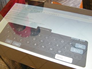
Here's your first glimpse of the keyboard, which works well for searching - there are shortcuts to Google, YouTube and other services.
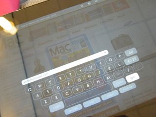
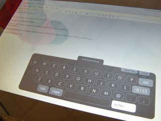
And the main on-screen keyboard has two sizes, which you can see below in action using Google Docs. As the browser works just the same as that of a desktop PC, document editing isn't an issue. We were dismayed that the keyboard doesn't have a Shift key though! Expect this to appear soon.
The YouTube experience is good, but JooJoo hasn't got the blessing of Adobe and is doing things its own way. It has implemented the first beta of Flash 10.1 but doesn't have hardware acceleration and so 720p HD footage (we watched the Iron Man trailer) is poor. For this reason, JooJoo has had to provide us with a non-Flash MPEG playback of YouTube videos - you have to click on the JooJoo logo displayed on Flash videos - in other words, a "JooJoo mode" has had to be developed. Humph.

And for this reason, BBC iPlayer playback is also problematic as there is no "JooJoo mode".


So what do we think? The JooJoo clearly has a lot to offer, but it's marred by buggy software and an uneasy relationship with the very people that should be supporting it - Adobe.
This isn't an iPad killer yet, but it so should be! It's a real disappointment and could be so much better. JooJoo appears to have rushed it out because of the iPad. Instead, it should have waited and got things right first time.
Dan (Twitter, Google+) is TechRadar's Former Deputy Editor and is now in charge at our sister site T3.com. Covering all things computing, internet and mobile he's a seasoned regular at major tech shows such as CES, IFA and Mobile World Congress. Dan has also been a tech expert for many outlets including BBC Radio 4, 5Live and the World Service, The Sun and ITV News.
