Android TV gets a new look with Android O, but it's probably still too confusing
Welcome changes for some users, others... not so much
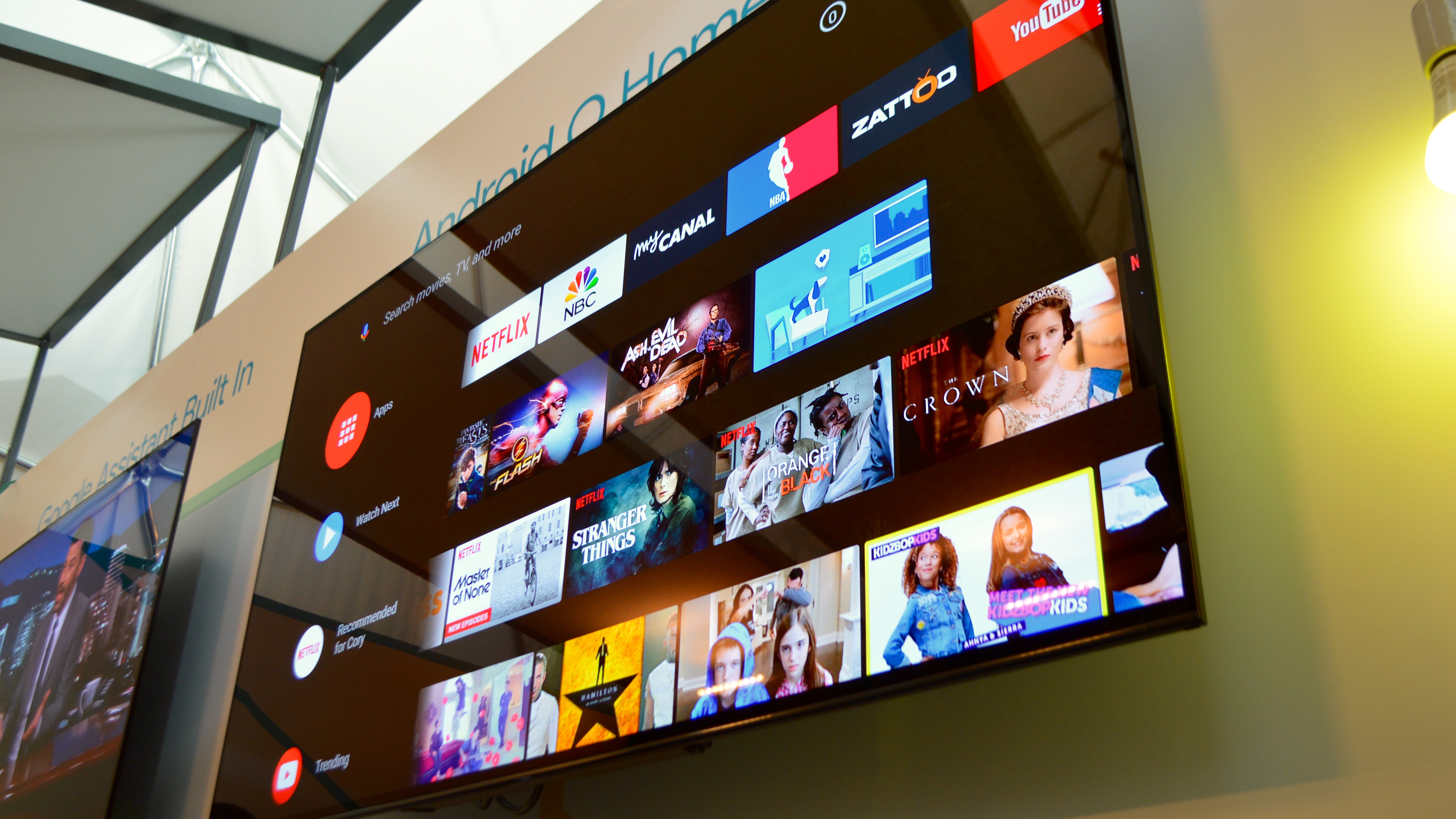
No manufacturer has yet to create the perfect smart TV user interface. That's not stopping everyone from trying, however, and Google is taking another crack with a redesigned Android TV homescreen, courtesy of Android O.
I got a chance to get up close with the new Android TV homescreen at Google IO 2017, taking place in the open air of the Shoreline Amphitheater in Mountain View, California this week.
To see the O-inspired design, I had to go inside, of course, and hole up in a climate-controlled white dome where I went face-to-face with a new homescreen that's said to be designed around how you actually discover and consume content, not how Google or anyone else thinks you'll do those things.
The new homescreen likely won't convince you to run and grab an Android TV set-top box or supported TV, but it is a change over its predecessor. For some, that change will be welcome. For others, the new UI easily straddles the line into information overload, with the potential for confusion high.
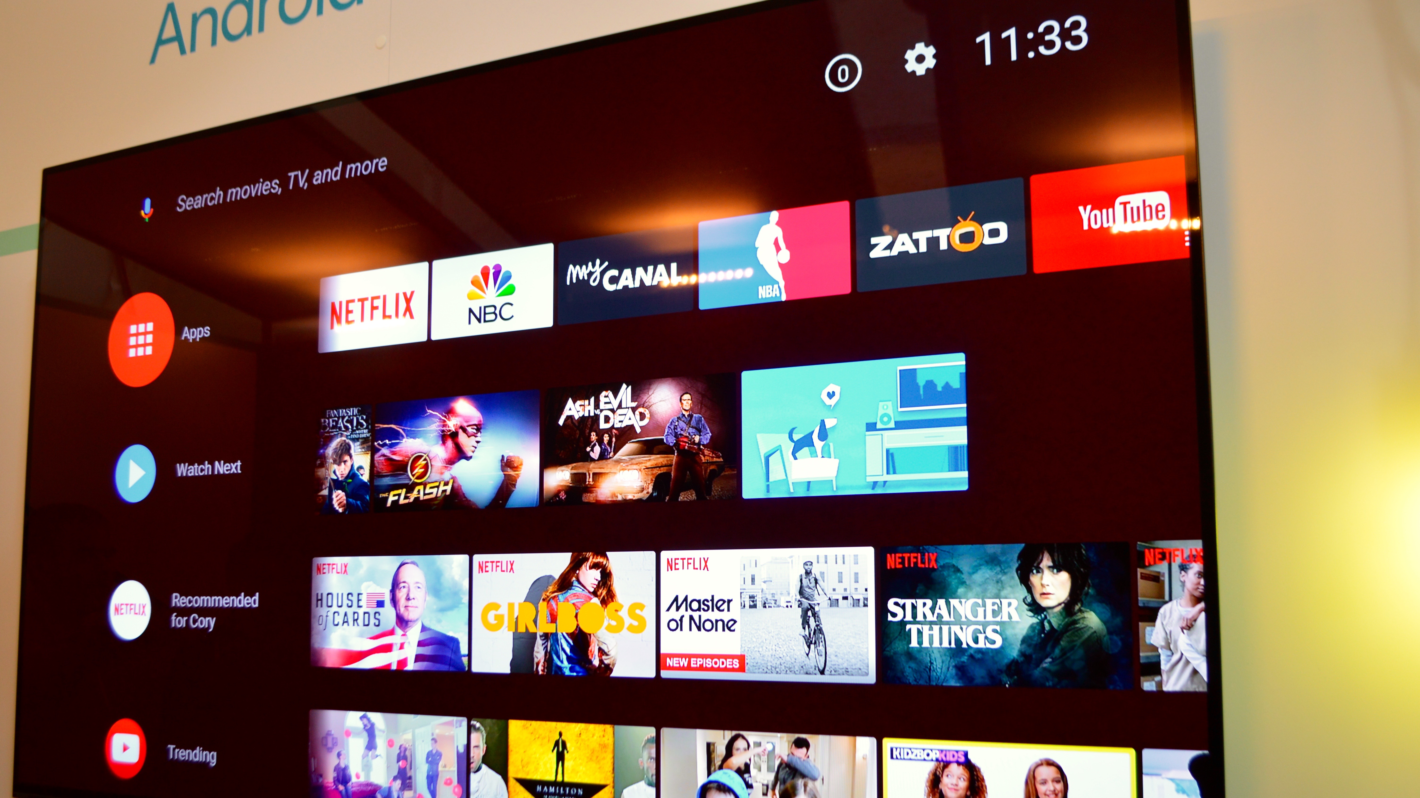
The homescreen's aim is to put content front and center, surfacing TV shows, movies and video clips you're likely to watch from within categories that make sense to house them. It's also designed to reduce the steps it takes to get to that content.
The current Android N homescreen for Android TV is comprised of three rows: search on the top, followed by recommended content from every app on the Android TV, then the apps themselves. Simple enough, right?
Yes and no. With only three rows dealing with the big stuff, you have to scroll through the recommended content to find what you're looking for, or go into an app to access content. The content and apps are mixed together, creating what could be a seem like a jumble that's hard to parse through, and may serve up nothing you're actually in the mood to watch.
Get daily insight, inspiration and deals in your inbox
Sign up for breaking news, reviews, opinion, top tech deals, and more.
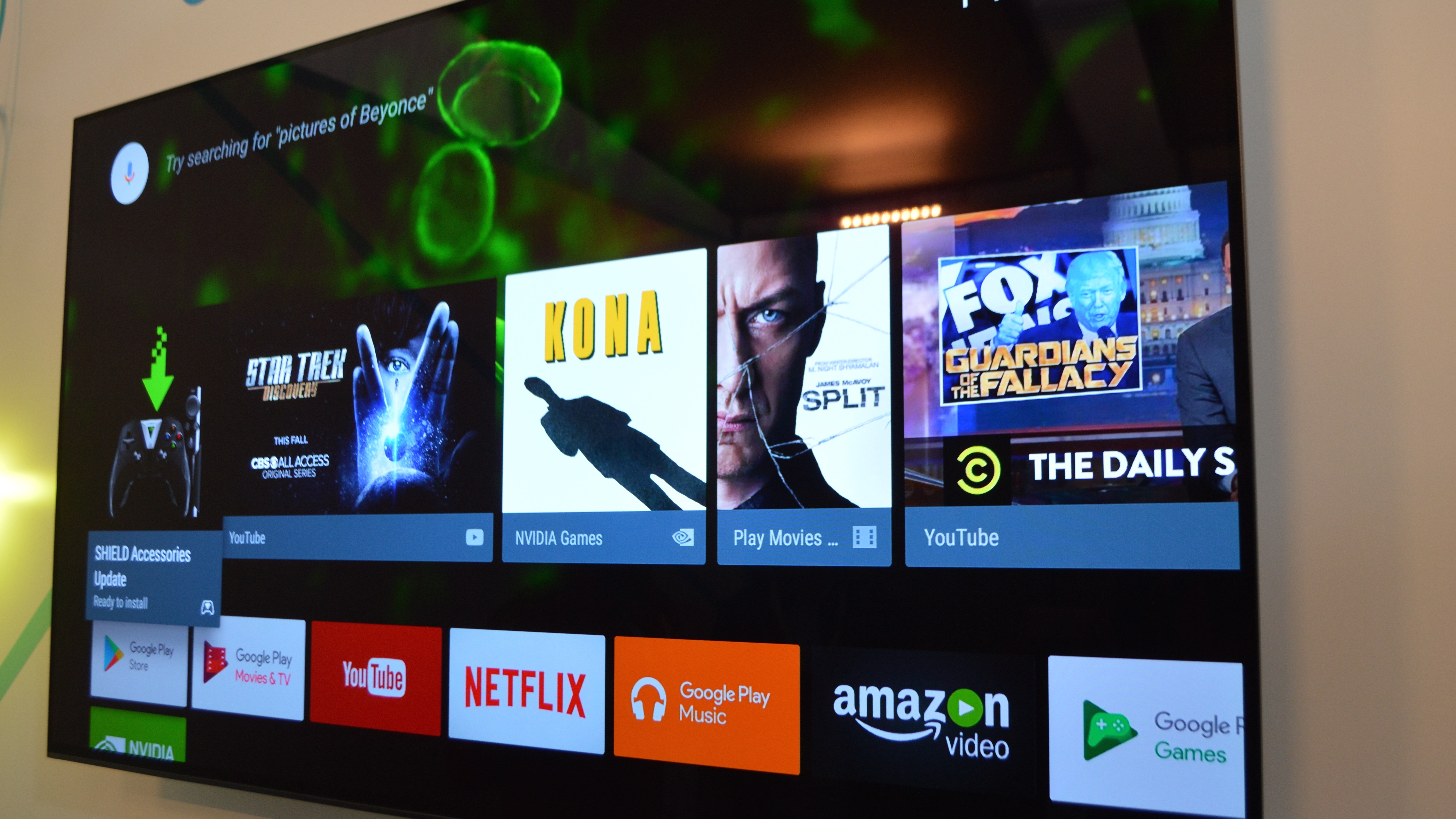
With Android O, Google has introduced a new way to organize content on the Android TV. This is through channels, or dedicated rows for each app or content category. A channel can be something like Netflix, on-demand content, or clips from YouTube.
Organized into rows, the channels let you access shows, movies, and clips from a specific source. This closely resembles a TV guide, which pulls up a list of channels when you press that button on your remote.
This TV guide-look may be a welcome dose of familiarity for some and an organizational framework that makes sense, but for others, particularly those who've grown used to modern smart TV interfaces, you may feel the content you want to watch is buried within a channel, never to be found.
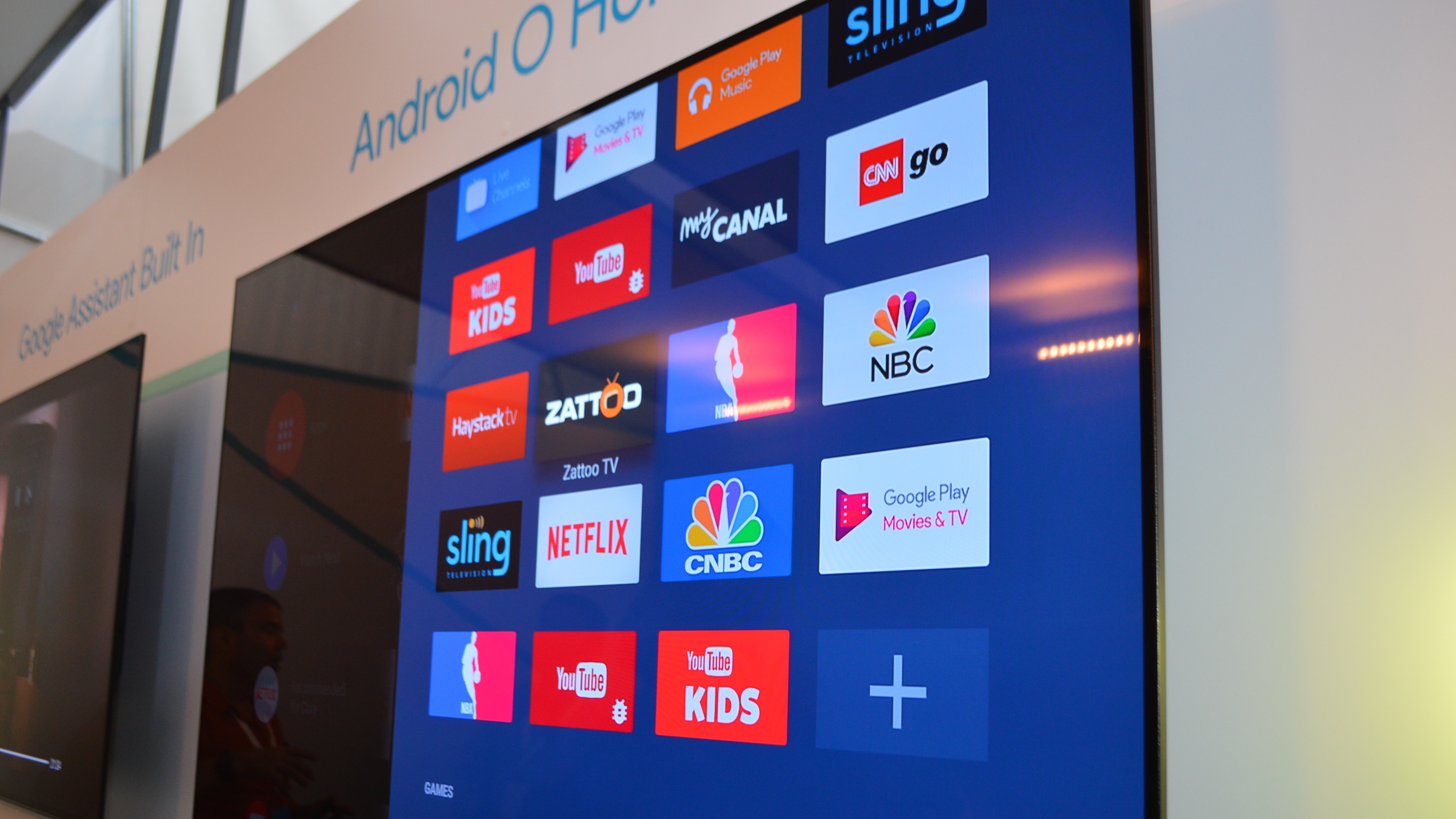
We can only know this for sure with extended use, but the possibility exists for you to be so overwhelmed by apps and content, that you simply stick to the same three or four apps and categories to get your entertainment fix.
This may be what you do anyway, but if Google's aim is to help people watch more content in more apps - which is a story Google wants to sell to developers, too - this new homescreen may be counter to that cause.
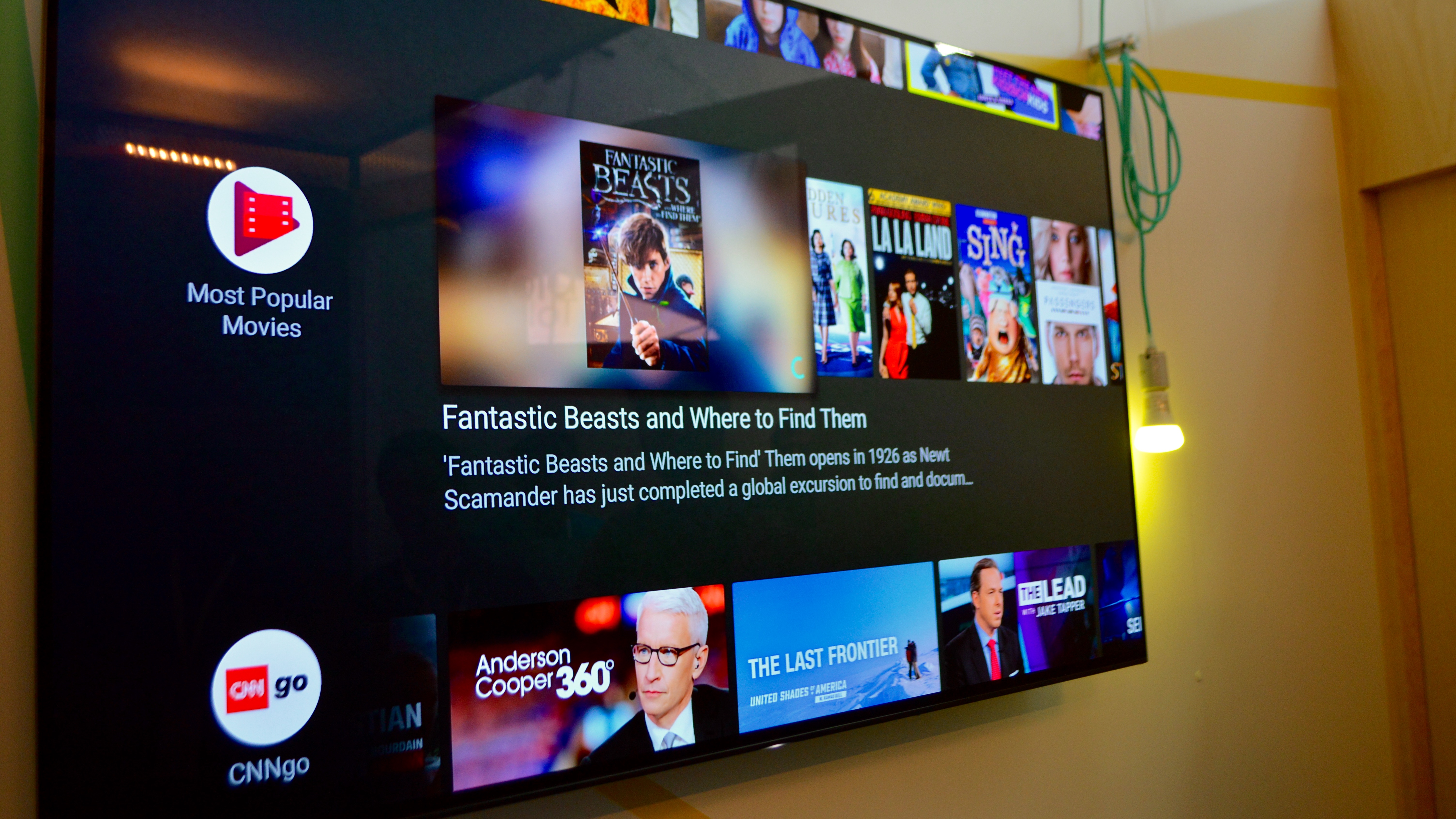
You do have control over how many channels you see and what order they are in. There are no limits to how many channels you can have on your homescreen, though manufacturers will choose which channels to include on your TV when it ships. Once you've got your TV set up, you can take out, put in and shuffle apps and other categories as you like.
On the homescreen, publishers can use a static image (most were in our demo) to show off their content in a channel, or a live trailer. With these, you're basically watching the cinematic teaser for a piece of content, but it adds a little dynamism to the experience.
The new homescreen is attractive, and has an updated look over the old UI. It may not be for everyone, but Google does have one other ace in the hole it hopes convinces you to try Android TV out.
Google Assistant on the TV
This would be Google Assistant. While the digital AI helper wasn't enabled on the Android O television in our demo, another TV running Android Nougat and hooked up to a Nvidia Shield (2017) and a Google Home had Assistant primed for user queries.
With Assistant, you can naturally search for content using prompts such as "Show me Jimmy Kimmel interviewing Winona Ryder". Assistant will pull up every available clip of Jimmy ever interviewing Winona from YouTube, and you can take your pick.
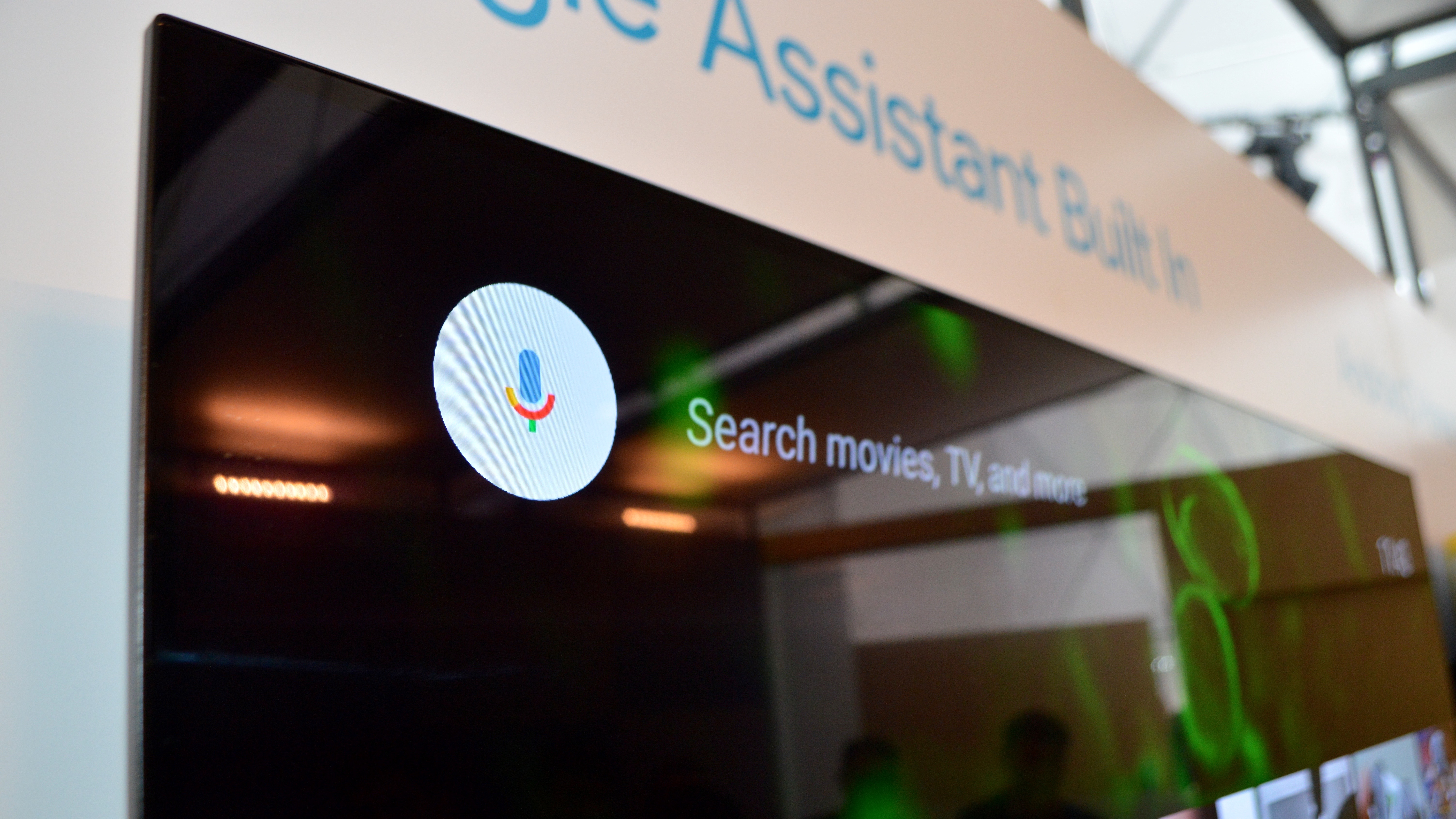
Showing off its smarts, if you say, "Play Stranger Things," Assistant will pull up the wildly popular Netflix show, starting right where you left off the last time you watched it. Assistant will also recognize if you say "that" or "it" instead of a specific TV show or move name, using contextual awareness to figure out what it is you're referring to.
But Assistant's smarts don't stop with content, and this is seemingly what sets it apart from normal voice search.
You can also ask how long it will take you to get to work if you've spent too much of your morning catching up on NCIS, and Assistant will give you an ETA using information from Google Maps.
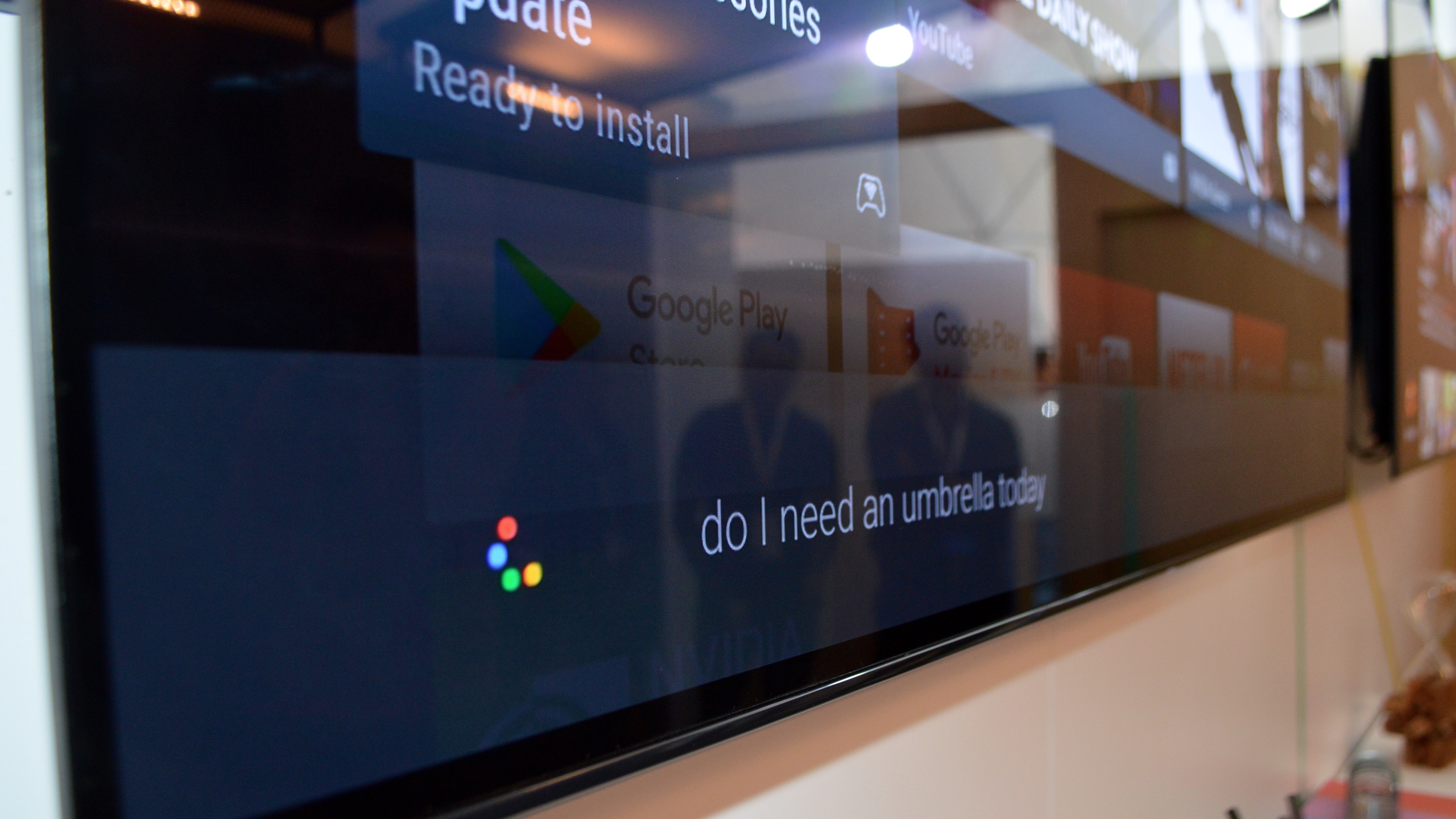
Ask Assistant if you need an umbrella, and you get a readout of the weather. And if connected to your home's Philip Hue light bulbs, Assistant will turn them on and off.
We already know Google Assistant on iPhone is a game changer, but it's less clear if it will be the same for Android TV.
Yes, you get more information that could be useful in your daily life, but taking the leap to asking our television how long it will take to get somewhere or updates on the weather is a further one to make than doing so on our phones.
Or are we that glued to our television screens, it makes sense? Maybe I'm in denial.
That's not to say Google Assistant won't be a well-used feature for Android TV owners, but rather if it will be enough to take the Android TV platform from its middling status to a smart TV platform to beat.
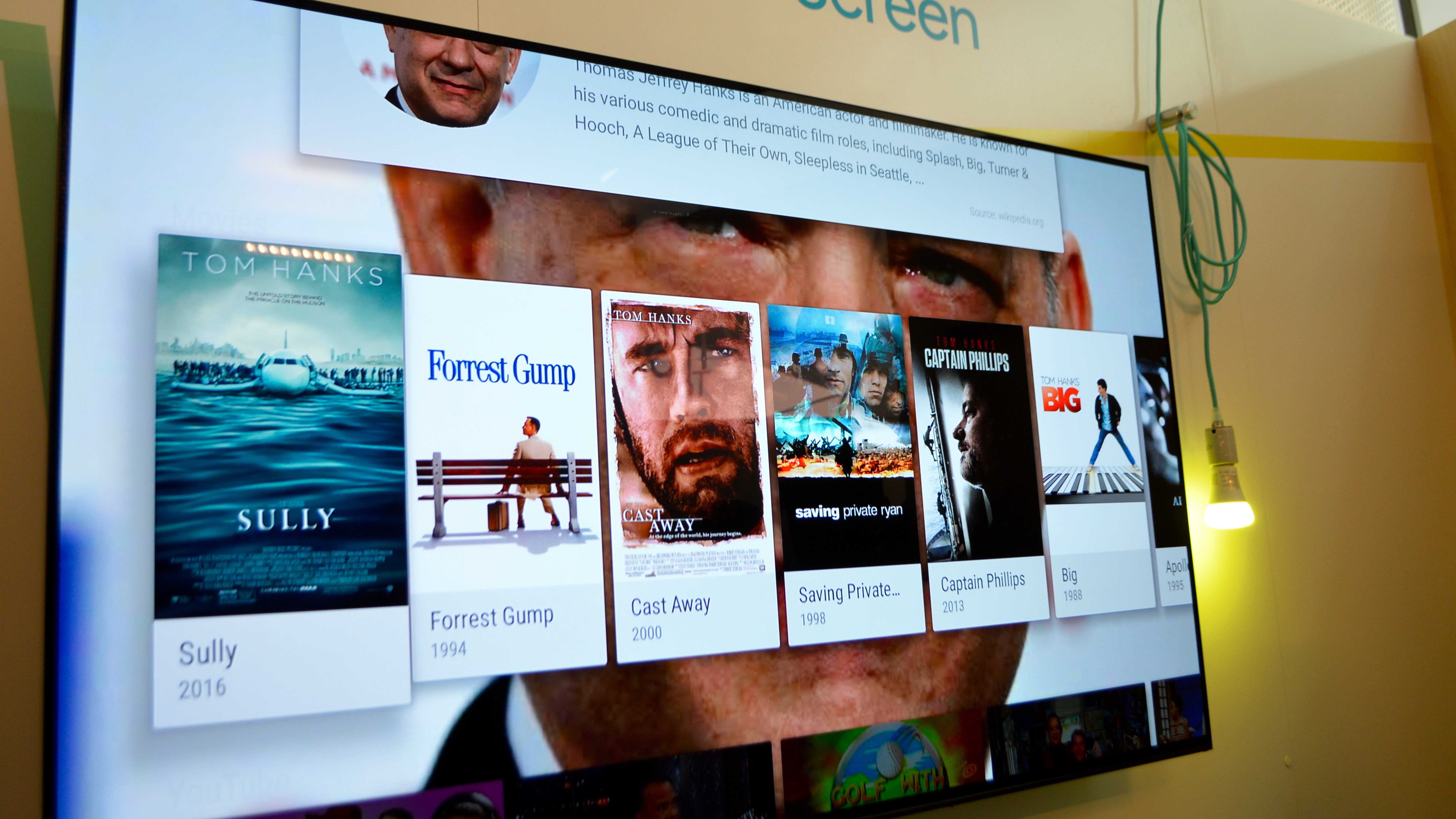
The new homescreen for Android TV is a sizeable change over the current iteration, and if you're curious if and when your screen will get it, here's your answer: any television running Android O and higher will see the new homescreen, but Android O likely won't be available for a few more months.
Google still hasn't decided if televisions running operating systems below Android O will receive the new homescreen, so sit tight if you aren't planning to upgrade.
The changes Google has made to the Android TV homescreen aren't earth-shattering, but they are different. For some Android TV owners, it may be easier to find more shows because you're not scrolling through content recommended from every source.
For others, because you don't have that cream-of-the-crop content right in your view, the task of going through all your channels to find something worth watching could be too tedious. The new homescreen does include recommendations based on recently watched content, but again, you may end up watching movies, shows and clips from the same few sources.
One last note: Android O on the phone brings a number of performance enhancements, and we could see some carry over to the TV in due time. Perhaps, as with Android on mobile, Android TV is turning a new leaf, beginning with the homescreen.
Nick Pino contributed to this report
- Don't miss any of the news from Google IO 2017!
Michelle was previously a news editor at TechRadar, leading consumer tech news and reviews. Michelle is now a Content Strategist at Facebook. A versatile, highly effective content writer and skilled editor with a keen eye for detail, Michelle is a collaborative problem solver and covered everything from smartwatches and microprocessors to VR and self-driving cars.
