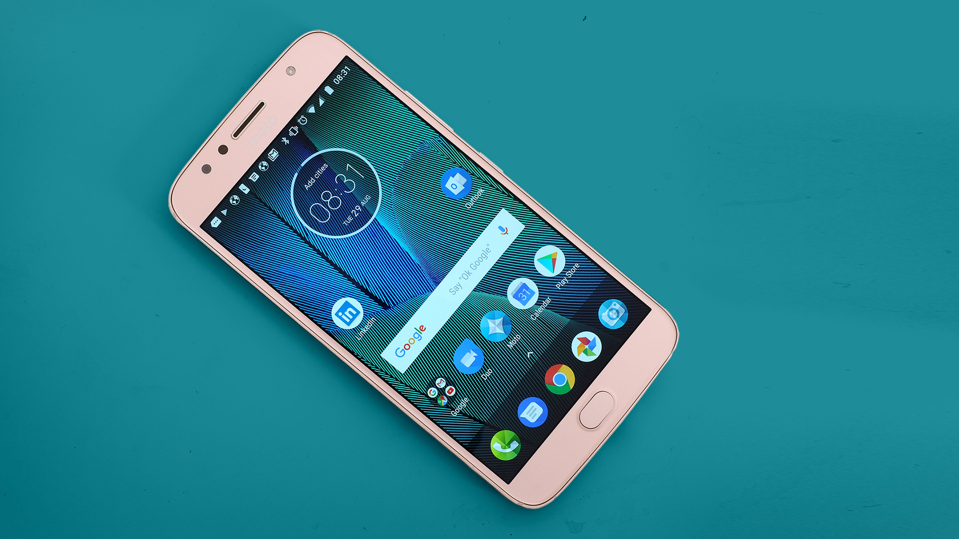
TechRadar Verdict
More metal, more screen, good battery life and a still-great price make the Moto G5S Plus one of the best affordable Androids around.
Pros
- +
Upgraded full metal shell
- +
Very good value
- +
Good battery life
Cons
- -
Significant camera shutter lag
- -
Battery no bigger than G5S
- -
Occasional app crashes
Why you can trust TechRadar
The Moto G5S Plus was the quick-fire successor to the Moto G5 Plus, arriving less than six months after the G5.
It's not overly clear why Lenovo (the firm that now owns the Moto handset business) opted for such a quick replacement, but it's not uncommon in today's mobile market - just look at OnePlus and Sony.
That said, the G5S Plus is no longer the top-dog in Motorola's budget G series line-up, with the recent arrival of the Moto G6 and Moto G6 Plus offering the latest specs for a still-low price.
Update: The arrival of the Moto G6 and 6S Plus has resulted in a price drop for the G5S Plus, making it an even more enticing purchase.
The Moto G5S Plus is still a top buy though, and it's now even cheaper making it an enticing budget buy with a slick design, large screen and rear dual cameras.
It's another solid hit for the series, with potentially-fixable camera lag the only major black mark on what is otherwise a great value, high-quality phone.
Moto G5S Plus price and availability
- Current price: £229.99 ($229.99, around AU$310)
- Launch price: £259 ($279.99, around AU$350)
- Release date: August 2017
The Moto G5S Plus price at launch was £259 ($279.99, around AU$350), but since its arrival in the middle of 2017 the price has dropped to around £230/$230 SIM free.

Mid-range specs at an affordable price
- High-quality metal build
- A 5.5-inch screen
Weight: 168g
Dimensions: 153.5 x 76.2 x 8mm
OS: Android 8
Screen size: 5.5-inch
Resolution: 1080 x 1920
CPU: Snapdragon 625
RAM: 4GB
Storage: 64GB
Battery: 3,000mAh
Rear camera: Dual 13MP
Front camera: 8MP
The Moto G series has become a smartphone institution to rival Samsung's S series. We've been recommending these phones to buyers on a budget since the first Moto G appeared in 2013.
These phones used to be made by Motorola, now Lenovo. And while a few design priorities have changed in the handover, the core philosophy remains: these are handsets made for people who don't want to spend an obscene amount on a phone.
The Plus models, including the Moto G5S Plus, are for people out for a little more; a larger screen, perhaps more memory and a bit more power.
Not much time has passed since its predecessor the G5 Plus arrived, making us wonder, what's different?
At first glance, you'd assume the biggest change is the new dual rear camera setup. But it’s not. Two other elements are more important.
Lenovo has significantly improved the build of the Moto G5S Plus, using a full metal jacket rather than a plastic one with a thin sheet of aluminum on the back. This is a top-grade build, not a penny-saving kludge.
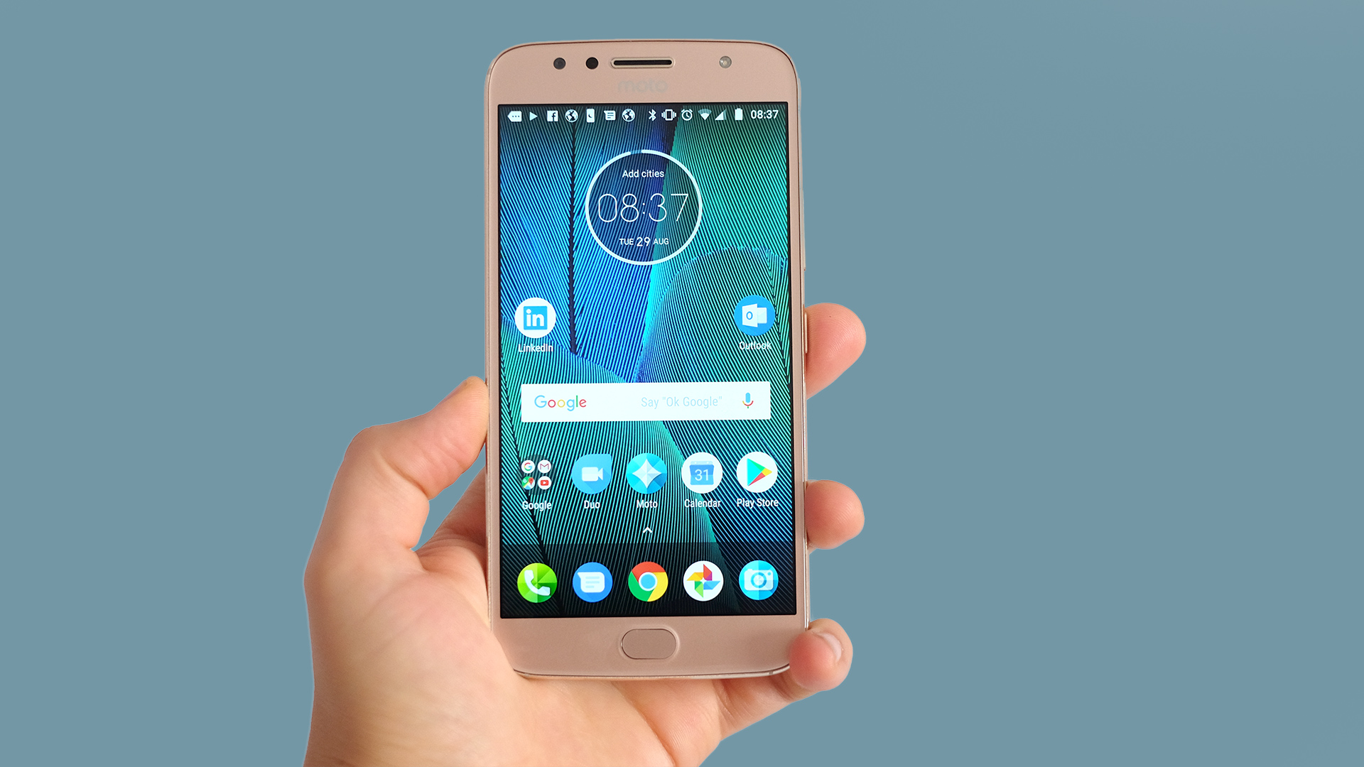
The screen is also larger, a 5.5-inch display rather than the 5.2-incher of the G5 Plus. This is a return to the roots of the Plus line, making it seem a phone geared at enthusiasts.
In some ways, it's a much truer sequel to the Moto G4 Plus than the Moto G5 Plus ever was. It also has NFC, missing from the Moto G5.
This is a very nice phone.
There's not a great deal of progress in terms of camera quality, processor power or display technology.
However, they arguably are not needed, as the Moto G5S Plus already gets close to the experience of using a £500/$600/AU$700-plus phone for half the price.
Design
- Significantly improved all-metal shell
- Front fingerprint scanner
Last time around, Lenovo tried to trick us a bit with the Moto G5 and G5 Plus. They were metal phones, but only just. A significant part of the frame was plastic, particularly on the smaller Moto G5.
Lenovo has fixed this in the Moto G5S Plus. Every part of the shell apart from the antenna lines on the back and the glass covering the display and camera is aluminum. There’s no sneaky plastic anywhere.
The build is a full league above that of the previous phones and this is comfortably the best-looking Moto G phone to date, much as we have a serious soft spot for the original all-black Moto G. It feels great too.
We switched to using the Moto G5S Plus from the HTC U11. That phone is three times the price but the transition didn’t seem a huge drop down in terms of pure feel.
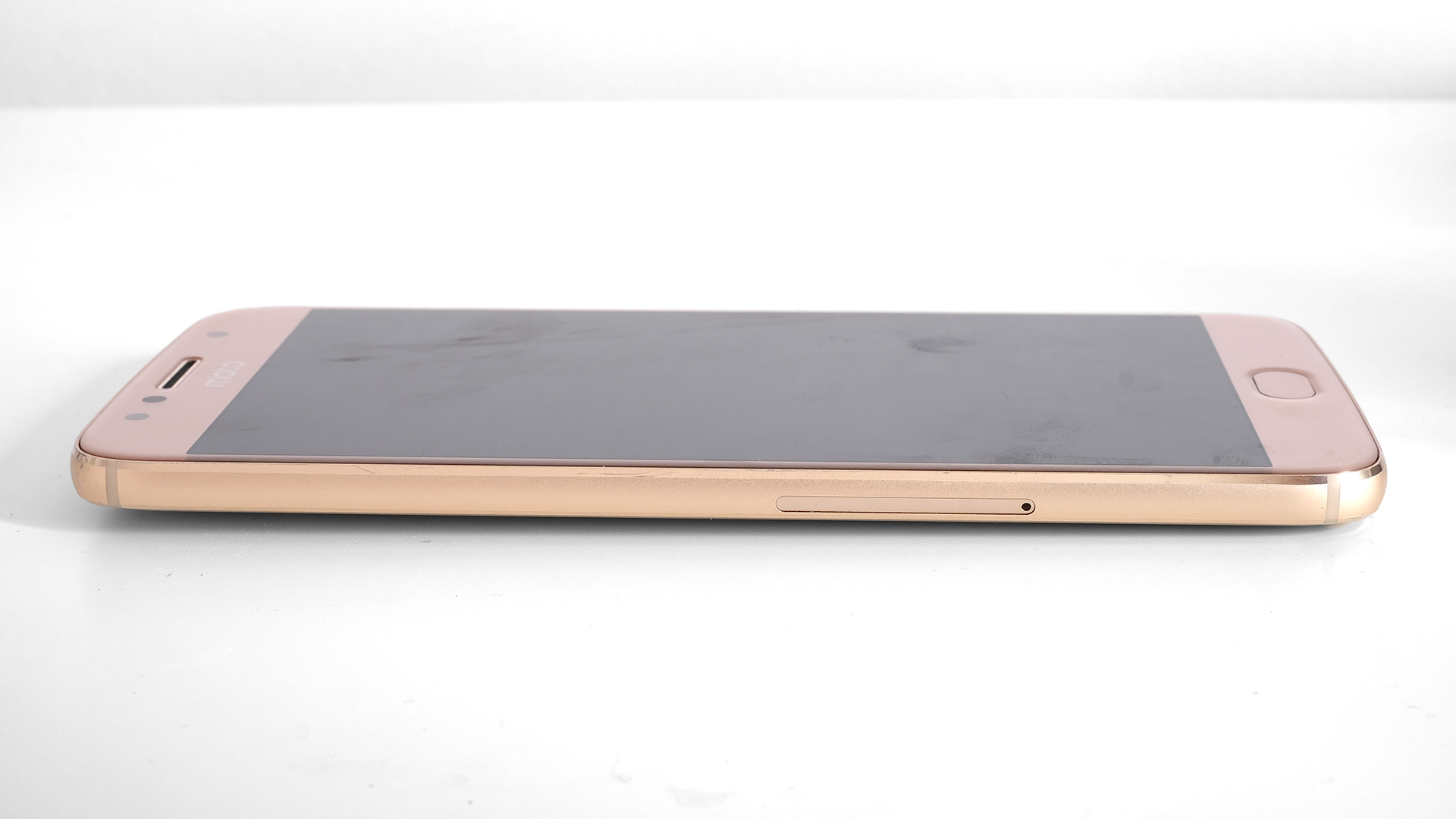
There are some neat extras too. The Moto G5S Plus has a reasonably fast fingerprint scanner in the bezel below the screen, and a microSD slot in the SIM tray to let you add to the 32GB of storage.
Its scanner can also be used to replace the on-screen soft keys. A left swipe is 'back', a right one brings up recent apps. This is just an option, you can turn it off.
Like its predecessors, the Moto G5S Plus has a micro USB socket rather than a USB-C one, a move that seems a little out of date and will be positively archaic by the time the phone slips off shelves.
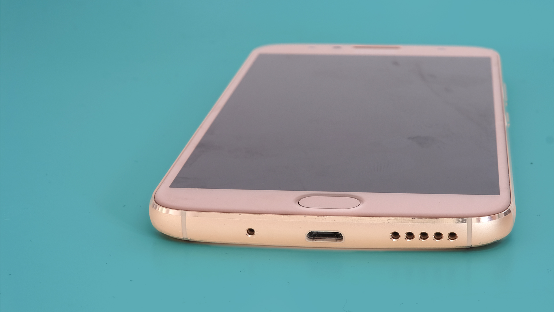
However, USB-C alone doesn’t necessarily provide faster charging or data transfer, only compliance with a higher USB spec does. The two are different.
The Moto G5S Plus has its own fast charging anyway. There's no full IP67/68 waterproofing, which lets a phone withstand being dunked in water, but it does have a water repelling nano coating to stop splashes shorting out the battery or killing the headphone jack.
As with other parts of the phone, you don’t get everything, but you get enough.
Screen
- Large and sharp 5.5-inch 1080p screen
- Customizable color profile
Like the last few generations of Moto G, the Moto G5S Plus has a 1080p screen rather than an ultra-high resolution one. However, in person it’s sharp despite the large 5.5-inch size.
Color is very good too, although the IPS LCD panel isn't able to deliver the sort of super-saturated tones you'll see in an OLED phone. It’s no great loss if you prefer accurate color, and there are two modes to let you tweak the tone.
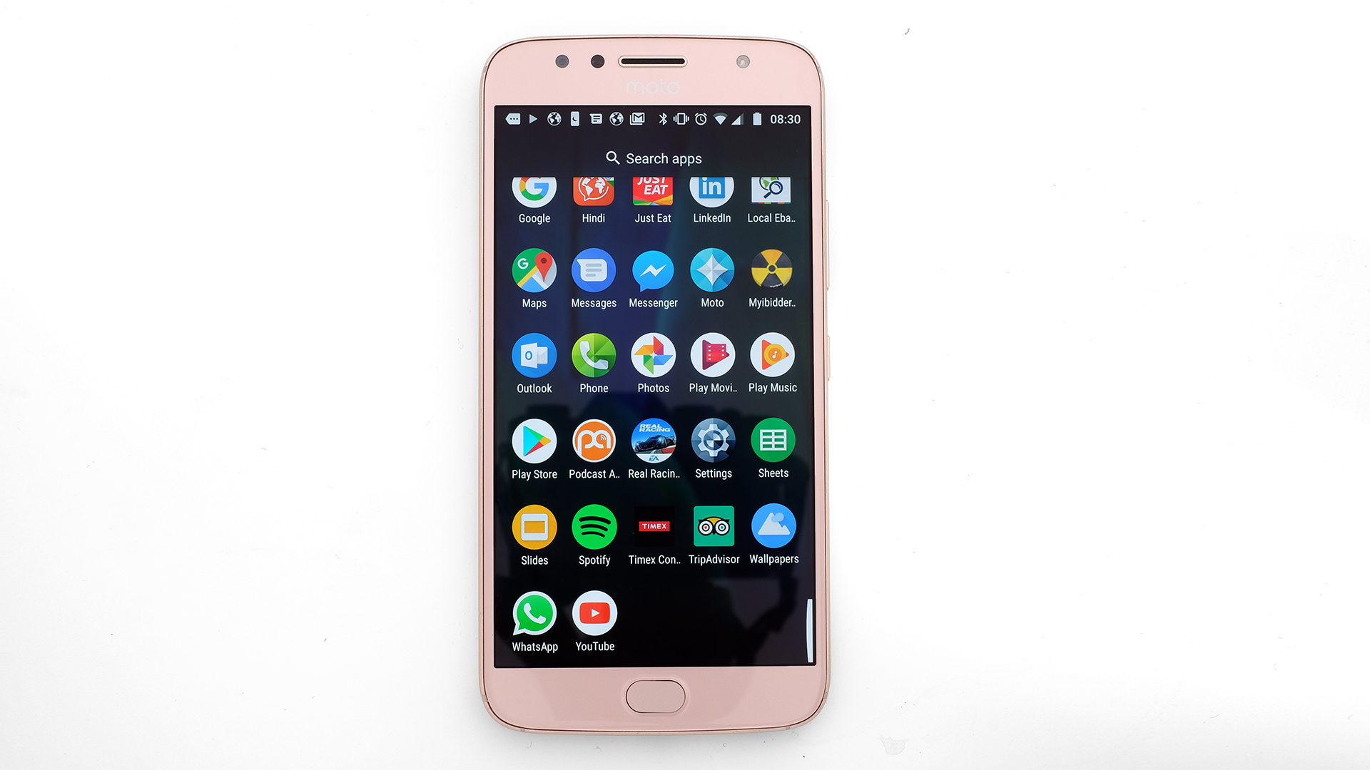
The Moto G5S Plus's default Vibrant mode is the standard poppy look of a higher-quality phone screen, while 'standard' brings the tone closer to sRGB, the traditional palette for monitors. To our eyes it still appears very well-saturated, not the slightly low-energy look you get with a very strict sRGB mode.
Even viewing angles are great, with relatively little loss of brightness at an angle.
Unlike a lot of pricier phones, there's no major curvature to the screen, although the last millimeter or two does have a softened '2.5D' style edge. A fully curved look wouldn't really fit with the design anyway, which leaves the real curves to the aluminum.
Andrew is a freelance journalist and has been writing and editing for some of the UK's top tech and lifestyle publications including TrustedReviews, Stuff, T3, TechRadar, Lifehacker and others.
