TechRadar Verdict
Blackberry's faith has been placed in a device very much suited to a particular type of customer. The specs and features are all there, but the form factor falters against conventional devices.
Pros
- +
Great battery
- +
Excellent build
- +
Loads of RAM
- +
BlackBerry Hub
Cons
- -
Impossible to use one-handed
- -
Lack of apps
- -
Interface unresponsive at times
- -
High price
Why you can trust TechRadar
Update: Interested in getting your hands on the Blackberry Passport? For our US readers, you'll want to check out an AT&T Store near you. For pricing details, have a look here. Also, if you're interested in another perspective on the Blackberry Passport, Jeff Parsons went into detail on his intense love/hate relationship with the smartphone in question.
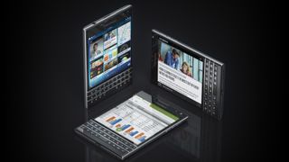
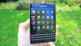
BlackBerry's square-shaped new flagship is here, and it's just as weird in real life as it looks in the promotional pictures. It's a square, boxy little device with a metallic trim and a dumpy physical keyboard attached to the bottom. Ergonomics? Screw 'em.
And yet, dig a little deeper and there might just be something there after all. The 4.5-inch slab boasts a 2.2GHz Qualcomm Snapdragon 801 processor and 3GB of RAM.
There's 32GB of storage, a microSD slot and a rear-facing 13MP camera. In other words, the Canadian company has thrown everything at this device when it comes to specs.
It's not a cheap phone either: it's £529 for a SIM free version ($599, around AU$680) and free on a £30 to £35 a month contract in the UK - meaning it's up there with the iPhones, HTC and Samsung phones of the world.
BlackBerry's also confident the new form factor best suits those business customers that are the unabashed target of this device.
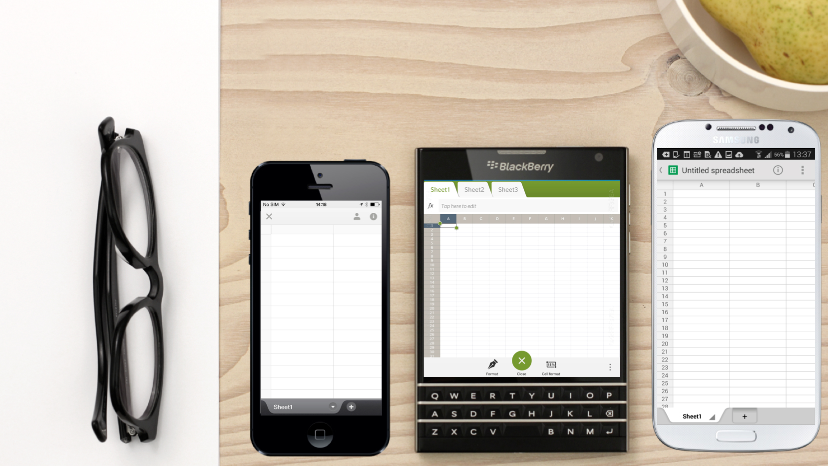
It calls them "power users" and argues that they want a device for working on. Emails, spreadsheets, reports – basically, what BlackBerry has always been known for. The 4.5-inch 1:1 screen incorporates 60 characters in a line, compared to the 40 on a regular smartphone.
Early indicators seem to show that people are responding to it well. BlackBerry says it has already taken 200,000 orders for the Passport and is in the process of developing another "unconventional" device.
The former phone heavyweight has a long way to go to recapture past glories and previous handsets like the BlackBerry Z10 and BlackBerry Q10 failed to impress.
This seems different though, it's not a case of following the likes of the iPhone 6 or Samsung Galaxy Alpha, it's a case of genuinely trying something different. Unfortunately, it also makes some rather basic errors when doing so.
Design
The biggest talking point about the BlackBerry Passport comes from its, ahem, unconventional appearance. People will notice it, and they'll ask about it.
The design is based around the 4.5-inch square screen that, with a 1:1 aspect ratio, is unlike any other smartphone on the market.
There's no portrait or landscape mode to be had here – it's a perfect square. This begets the obvious question of why – why has BlackBerry done this? Well, it ties in to the type of customer the company is focusing its efforts on.
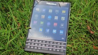
BlackBerry is betting that you'll be using the Passport for checking spreadsheets, office documents, ebooks, presentations and full-scale websites. All of which, it says, are reproduced better on the square, 1440 x 1400 Gorilla Glass 3 screen.
It's an undeniably weird-looking phone, but BlackBerry tried to follow the crowd with the BlackBerry Z10 and it didn't work. So props to the company for attempting something a little bit different.
The second big design point is the return of the keyboard – which was always BlackBerry's calling card. It's attached to the bottom of the screen with a somewhat squat appearance – due to dropping from four rows of keys to three. This means common punctuation marks, as well as numbers, appear as on-screen keys directly above the physical buttons.
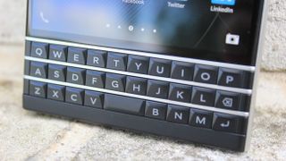
Once you get past the alternative form factor, the Passport is an attractive handset. There's a stainless steel trim that runs along the edges of the phone while the back is a soft rubberised plastic that's comfortable to grip while you fire out emails from the keyboard.
You'll find three physical buttons on the right hand side, used to control volume as well as pause music or video playback. The power switch meanwhile is on top of the handset (as is the 3.5mm headphone jack) and placed slightly right-of-centre.
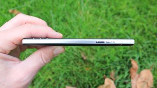
Given the width of the phone, it's extremely difficult to hit this when you're operating it one handed. I always found it easier to slide upwards on the capacitive screen to unlock the phone instead. I'm not quite sure why BlackBerry didn't put the power switch on the side of the device.
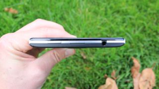
There's a heft to the 194g BlackBerry Passport; but the Canadian company has kept the chassis to a fairly standard 9.3mm thickness. And it looks smart thanks to the black and silver design and the blend of materials BlackBerry's used. It reminded me of a PDA from the mid-90s. Take from that what you will.
It's clear the design of the BlackBerry Passport is more suited to the inside jacket pocket than the one on the sides of your jeans. Also, in real life the size of the device makes it unwieldy. It measures 90.3mm wide and 128mm long and, as I said, is very difficult to use with just one hand.
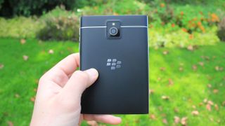
This is a phone meant for prolonged productivity rather than a quick bout of social media browsing. The problem with that is that for most working types, prolonged productivity is handled during the day at a desk on a laptop or desktop. We want to be able to use our phones quickly while out and about and that can often mean one-handed use, which this phone is awful for.
To assume that people will only buy this device for work is plain folly - the modern smartphone can do it all, and for the high end price being charged for this phone, I'd expect it to do so.
