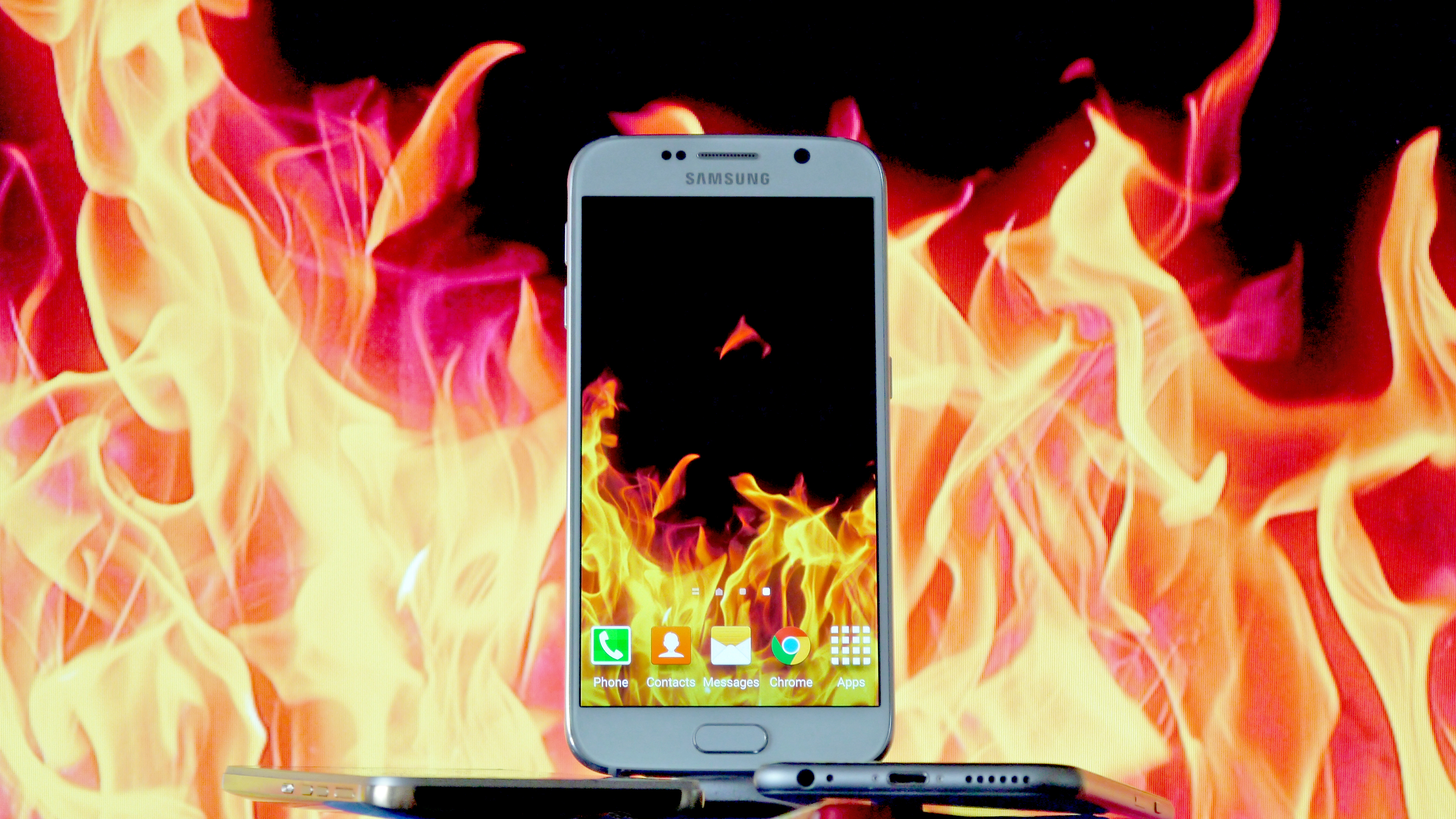
TechRadar Verdict
So close to perfect, but a high price and iffy battery really let it down.
Pros
- +
Great for media
- +
Super sharp screen
- +
Amazing camera
Cons
- -
Battery not good enough
- -
Price too high
Why you can trust TechRadar
Update: The Samsung Galaxy S8 and Samsung Galaxy S8 Plus are here, with bigger screens, better specs and all new features, such as the Bixby AI assistant.
But that doesn't automatically make the Samsung Galaxy S6 a bad choice. If anything, it has gotten better over time thanks to the update to Android Marshmallow. Even Android Nougat is now being rolled out to it and the phone is the cheapest it's ever been, but don't hold your breath for Android Oreo.
Original review follows below.
It's no secret that Samsung needed to do something big with this phone, to unleash something to stop the rot that the Galaxy S4 began two years earlier.
We just didn't expect the Samsung Galaxy S6 to be this good.
Yes, there are still some elements that prevent it from being the perfect phone (this is Samsung after all, a brand that likes to cram as much into the phone as it can get away with) but to leap to this point from the plastic-clad nonsense of the Galaxy S5 is a really, really impressive feat.

Samsung didn't take this task lightly, beginning almost completely from scratch and replacing key members of its design team to make sure it created a standout phone.
Perhaps the S6 is a little too similar to the rest of the competition (it looks stunningly like an iPhone at the bottom) but at least there's the Galaxy S6 Edge for those that want a really unique-looking device.
The big issues, at least when it released, were its price and battery life: the former initially being wincingly high at the time.
Samsung Galaxy S6 price
- Released in April 2015
- Launched at $850 (about £640, AU$1113)
- Currently costs $400, £370, U$525 SIM-free
It's dropped a fair bit now though, what with the introduction of the Galaxy S7 and Galaxy S8, and the 32GB variant can now be had for around £370 ($400, AU$899), the 64GB for £539 ($700, around AU$999) while the huge 128GB variant for £599 ($800, around AU$1,149) - but the latter two are not easy to find.
The iPhone 6S has a different pricing structure, in that the 32GB option is £499 ($549, AU$929) and the 128GB model is £599 ($649, AU$1,079), making it more expensive at the bottom end, but the same or less for a 128GB model.
Why the comparison? The main reason is that Samsung was finally starting to charge a higher premium than the iPhone, where traditionally the undercut has been one of its key selling points in the Apple vs Samsung debate consumers go through.
Thankfully, as you can see above, the price of the S6 has now dropped considerably, especially if you shop around, giving it back that edge.
Though it will still set you back at least as much as the iPhone 6, it's cheaper than the Galaxy S7 and far less than the Samsung Galaxy S8.
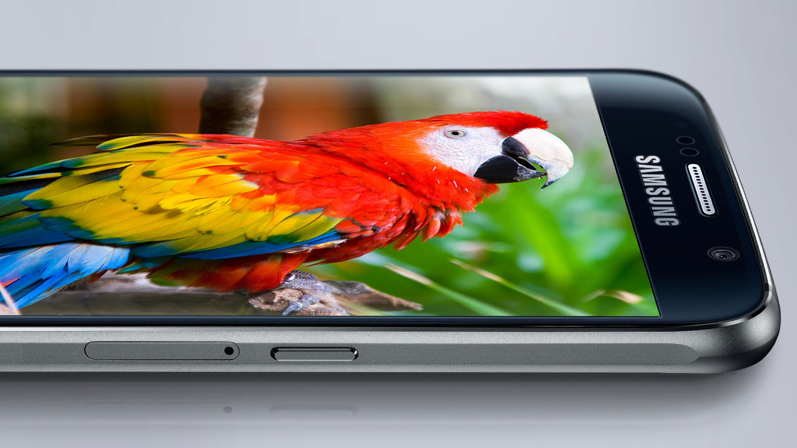
And there's a smaller battery on board than last year, which instantly makes me worry when the screen resolution has been bumped up to give us the sharpest display on the market.
But Samsung's been at this smartphone game for a while now, so can it justify that high price tag by cramming in loads of amazing technology… and make the battery last more than a day?
Samsung Galaxy S6 design
Samsung's gone bold on the design of the Galaxy S6, taking away the usual plastic covering that festooned previous models and finally stepping into the world of metal for its flagships.
It's dallied with a more premium design ever since the Galaxy Alpha was brought out in the middle of last year. But with a higher price and lower spec, that model didn't really catch on, despite feeling really premium in the hand.
So this time Samsung's gone one step further, adding an all-metal band to a strong glass case and, really, making a phone that couldn't be much further from the Galaxy S5.
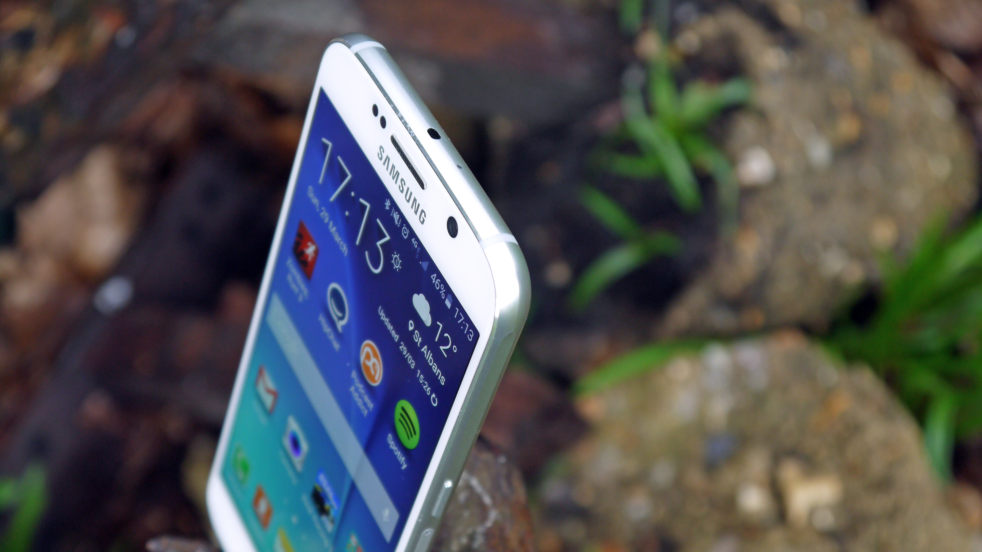
That's not to say the brand hasn't kept some of the design heritage in there - after all, Samsung is a company that's big on tradition. The front of the phone harks back to the Galaxy S4 days, with a rounded and bland fascia combined with the lozenge home button.
The biggest shame is that I didn't get to fully review one of the colored variants rather than 'White Pearl' that you can see above.
The other colors have a jewel-like sheen, reflecting the light in a luxury way. The white is just rather boring, and looks like older devices again.

The reason for sending reviewers the white version first is pretty clear though: this thing is a fingerprint magnet. I know I've said that before about other devices, but it's never been truer than on the Galaxy S6.
The rear of the phone will just become marked and smudged within seconds of handling it, so like a silver car the white chassis on the S6 serves to hide those ugly blemishes.
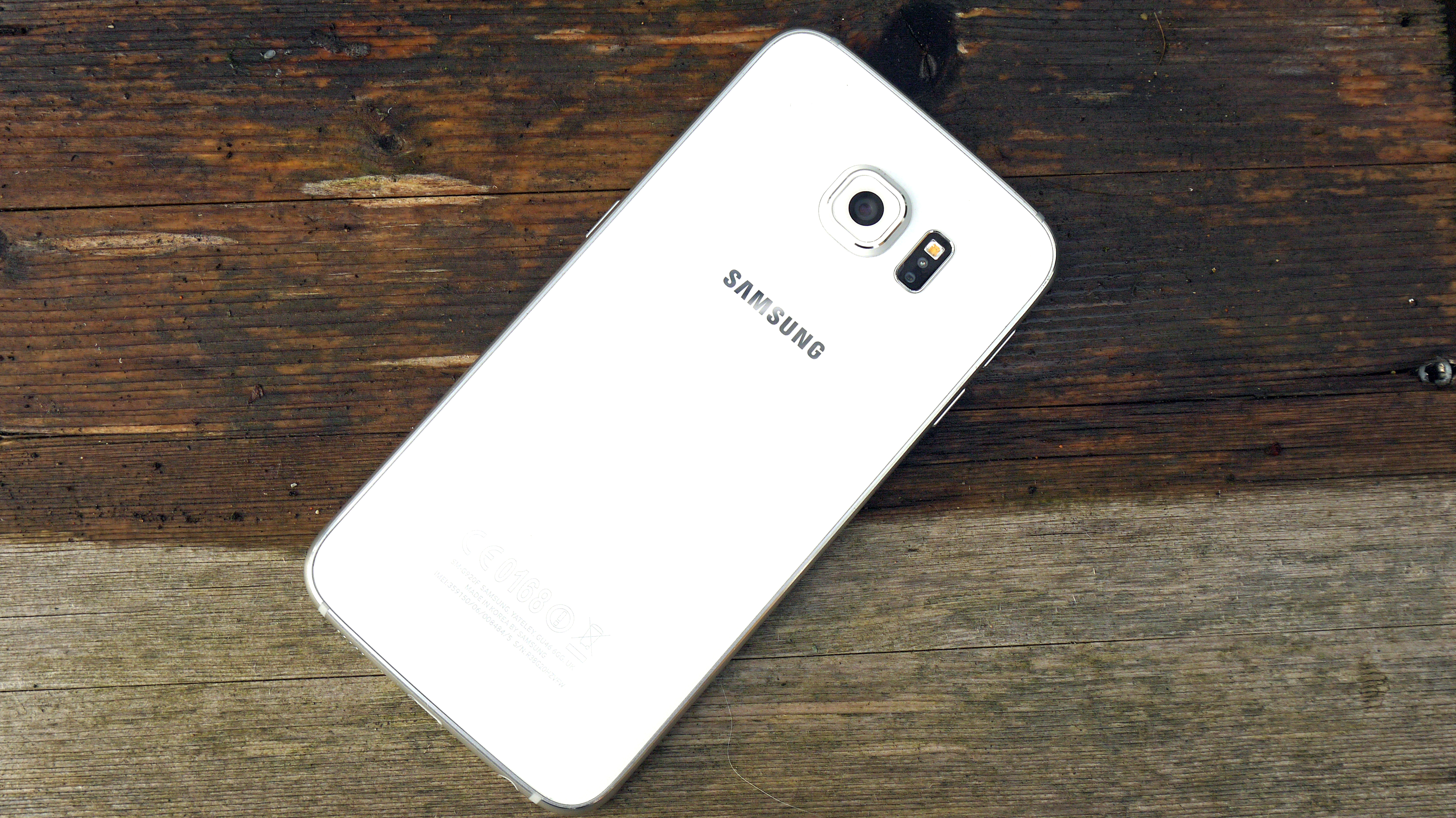
In the hand the Galaxy S6 is a very nice device to hold, with the 5.1-inch screen taking up most of the front. It's compact yet elegant, with a clear feel of premium quality when you're holding it.
That said, it doesn't feel like the most expensive on the market - whatever reason Samsung is giving for charging this high premium, it's not coming through in the design - but it does feel like a device that can be mentioned in the same breath as the HTC One M9 and iPhone 6S in terms of build quality.
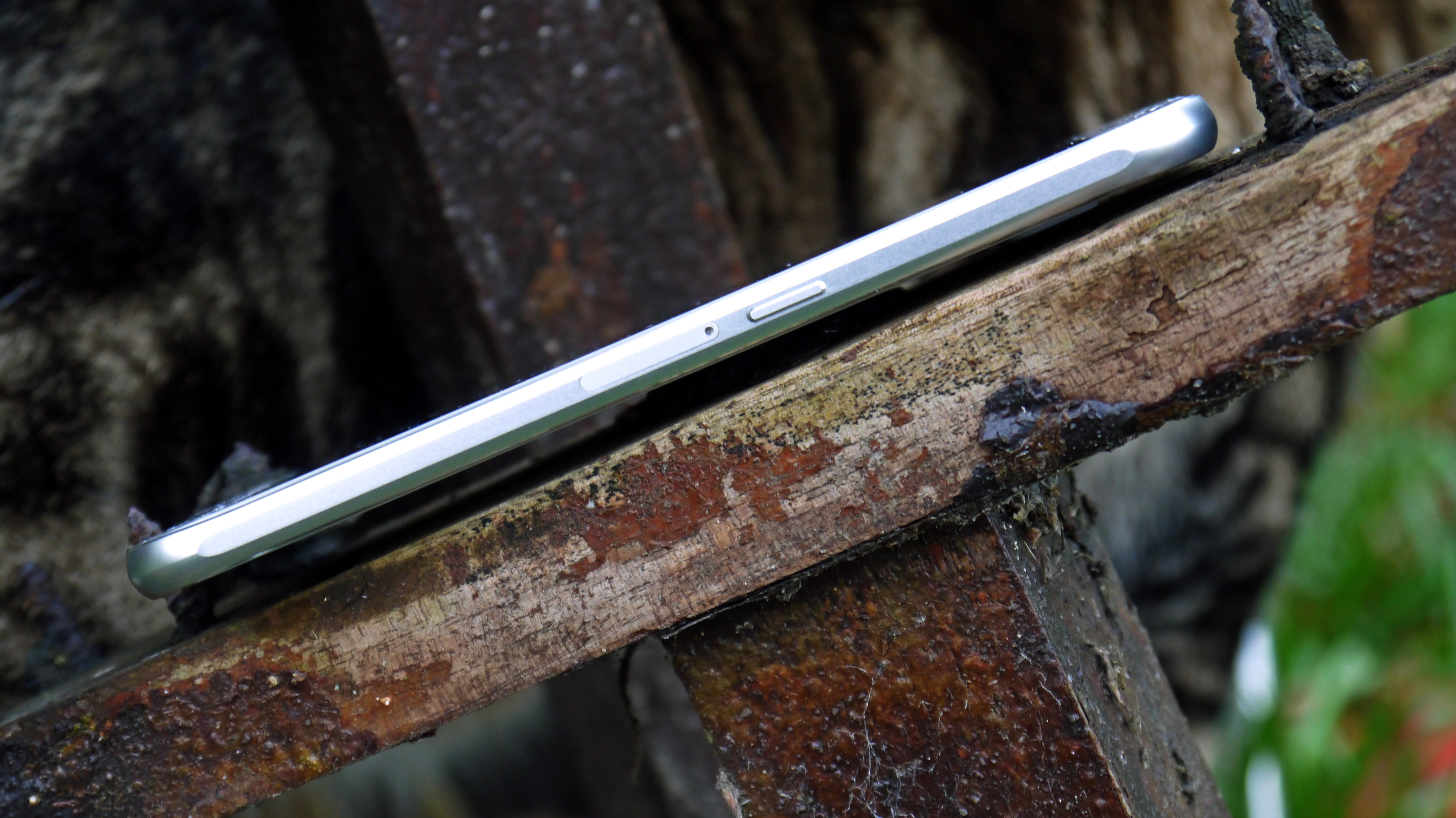
The metal band around the side is split by strips of plastic to allow the antenna and other radios to make their connections - and if it looks familiar, well, it's a very similar design to that used on the iPhone 6S.
These strips are needed as metal is very inefficient at letting phone signal pass through, and Samsung isn't alone in including them. However, with the glass front and rear I was surprised to see them make an appearance.
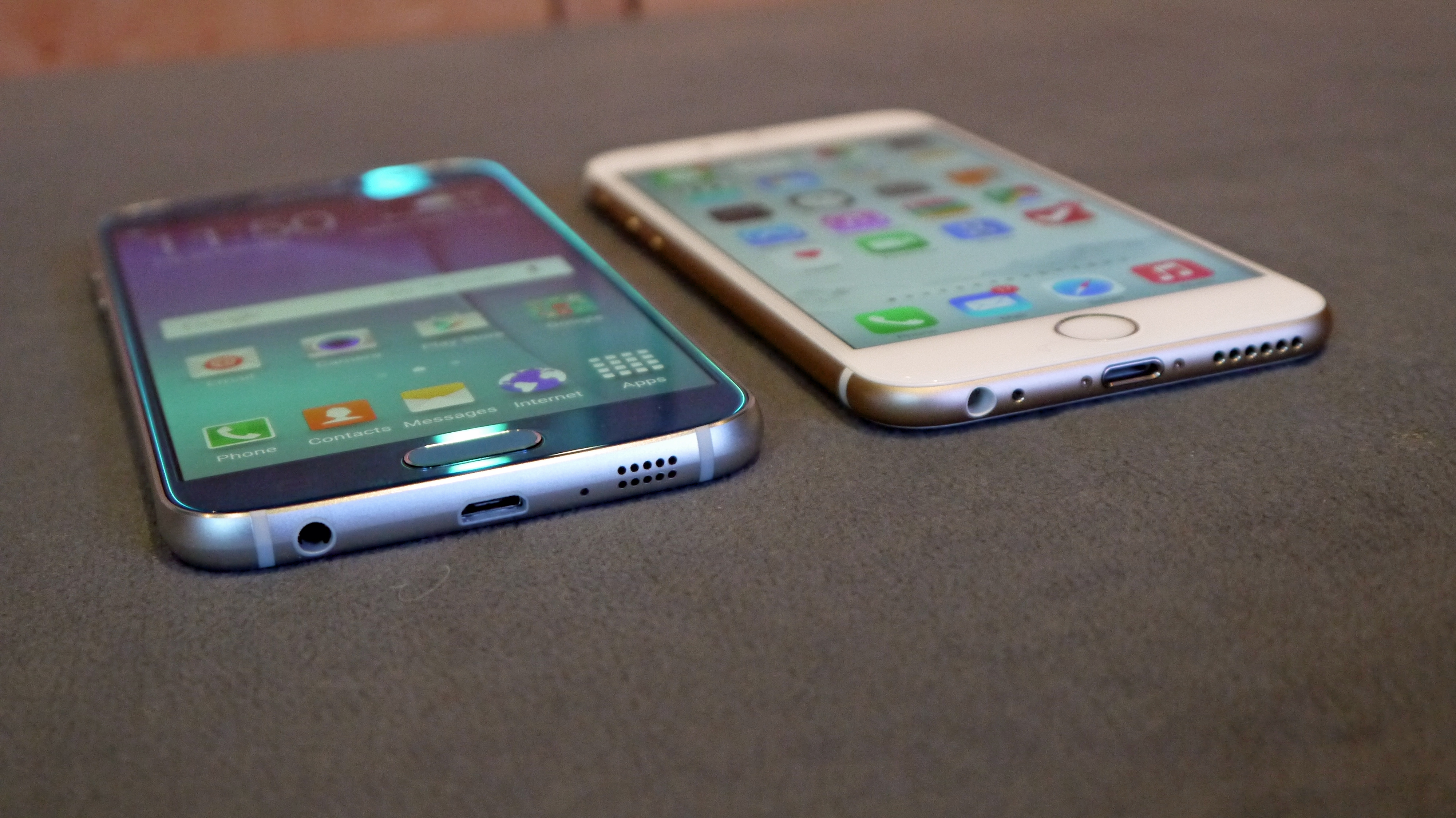
Combined with the fact the bottom of the phone, where the speaker and headphone jack live, looks almost identical to what Apple is doing, this seems to be a risky line Samsung is treading.
The general layout of the phone is well designed though. The volume buttons on the left-hand side and the power button on the right are perfectly positioned, and the home button has been massively upgraded to deliver a very solid click.
That might not sound important, but it's not been the case with previous Galaxy phones so I'm pleased to see Samsung finally step up.
The back of the phone yields one of the less aesthetically pleasing elements though, with the camera protruding quite significantly from the rear of the Galaxy S6.
The reason is obvious: to allow for a higher power optical system and you'll see in the camera section that this was very, very much worth it.
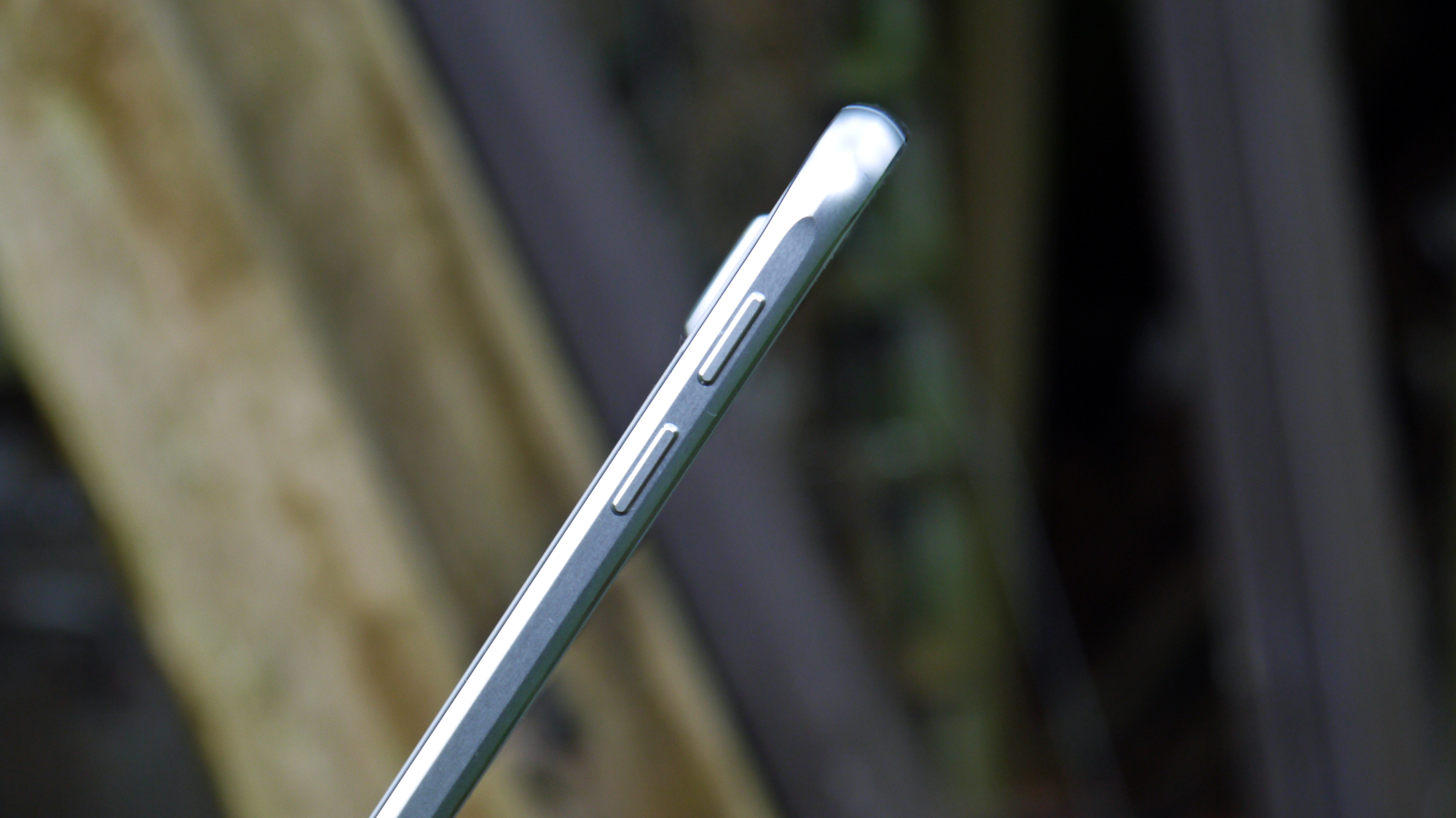
But again, I'm left wondering what Samsung is doing here. In the desperation for a flat phone, the battery capacity is reduced and the camera left sticking out, exposing it to possible scratching.
Why not slightly round the rear, make it sit more nicely in the hand and improve the space for a battery? HTC does it to terrific effect on the One series, but it seems other brands are obsessed with a flat phone. As a result the S6 doesn't even rest comfortably on the desk, with a little wobble when tapping it at work.
But don't let the above make you think this is anything other than a great phone design. It's not up there with the very best - the HTC One M9's craftsmanship puts this head and shoulders ahead of the Galaxy S6 in terms of feel in the hand - but Samsung has finally offered what we've been hankering after for years, and it's done it well.
Samsung Galaxy S6 display
Samsung has always had brilliant screen technology, and once again, that's the case on the Samsung Galaxy S6. The Super AMOLED display offers clear, crisp whites against pure blacks, meaning even dark scenes are shown off perfectly.
The 5.1-inch display now packs more pixels than ever before - 1440 x 2560 in fact, which matches the Galaxy Note 4 but with a higher PPI of 577 - which means you're looking at one of the sharpest displays on the market. Though it's now been beaten by the ludicrous 806ppi Sony Xperia Z5 Premium and more recently the Sony Xperia XZ Premium.
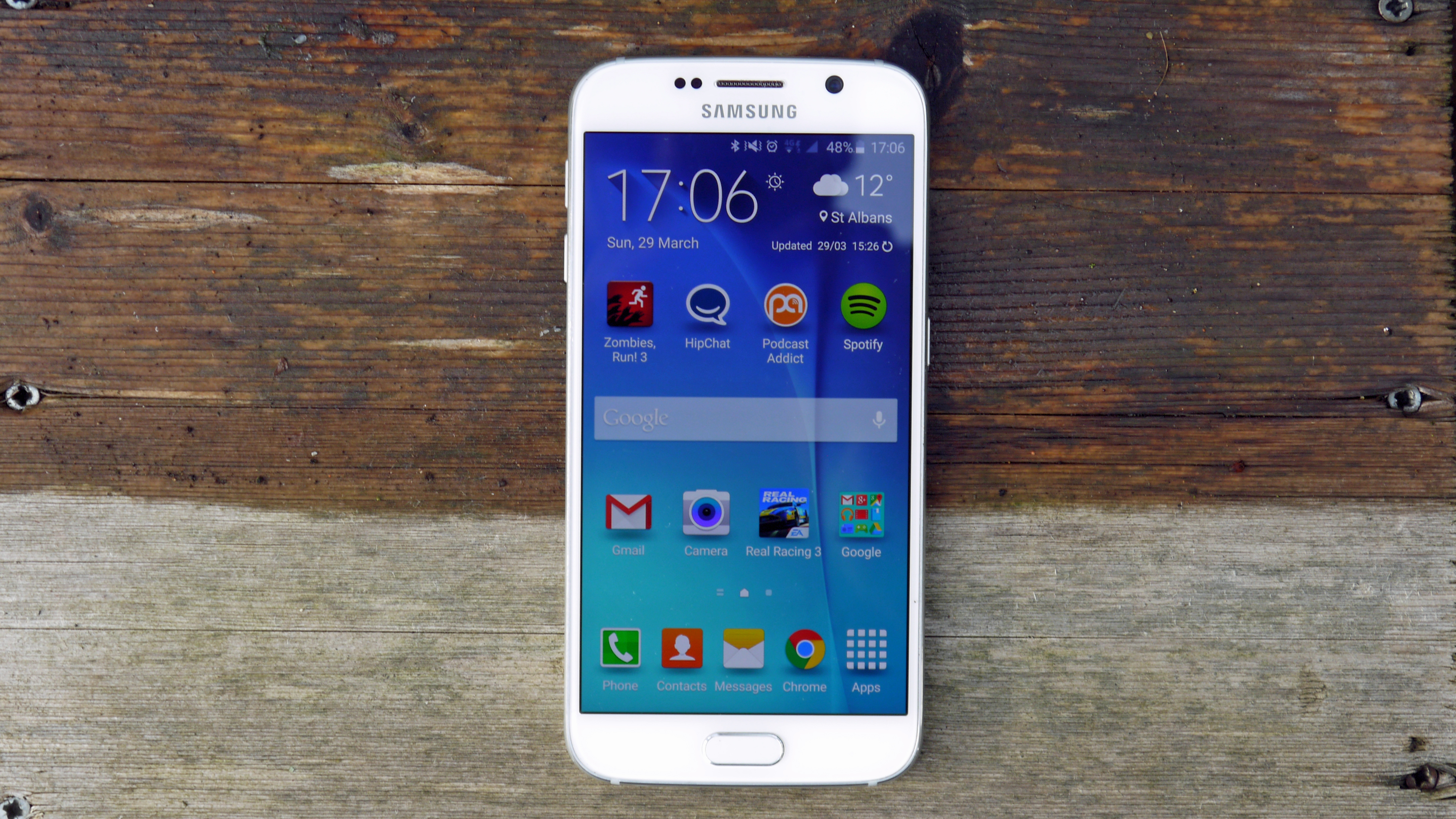
The QHD level of screen was started by LG in 2014 with the G3, but as that was based on LCD technology it left the screen a little dark and power hungry, as each pixel caused a heavier strain on the battery.
Then the Google Nexus 6 came along, and that really impressed with its larger screen. Despite the wider display it still looked great, and when the aforementioned Note 4 came along with the same resolution, the bar was set.
So combining the pixel count of the Note 4 with a smaller display should yield an exquisite display, right? Sadly, no. That's not to say the screen on the Samsung Galaxy S6 doesn't look brilliant - it really, really does - but I'm not sure the QHD resolution really adds that much to the mix, especially given the higher power drain it commands.
Watching some optimized video does look nicer, and held side by side the screen is clearly sharper than a normal Full HD display.
But we've gone way past the point of needing any more sharpness in our phones, and even 720p resolutions don't look terrible (a point well made by Matthew Hanson in his piece on the myths of screen resolution) so I'm wondering why Samsung bothered here.
The Super AMOLED technology can make 1080p screens look phenomenal, and has been for years. And with bigger screens, the improved pixel count helps make them look next generation. But at 5.1-inch, this seems more gimmick than anything else as Samsung looks for anything it can throw into a new flagship to grab headlines.
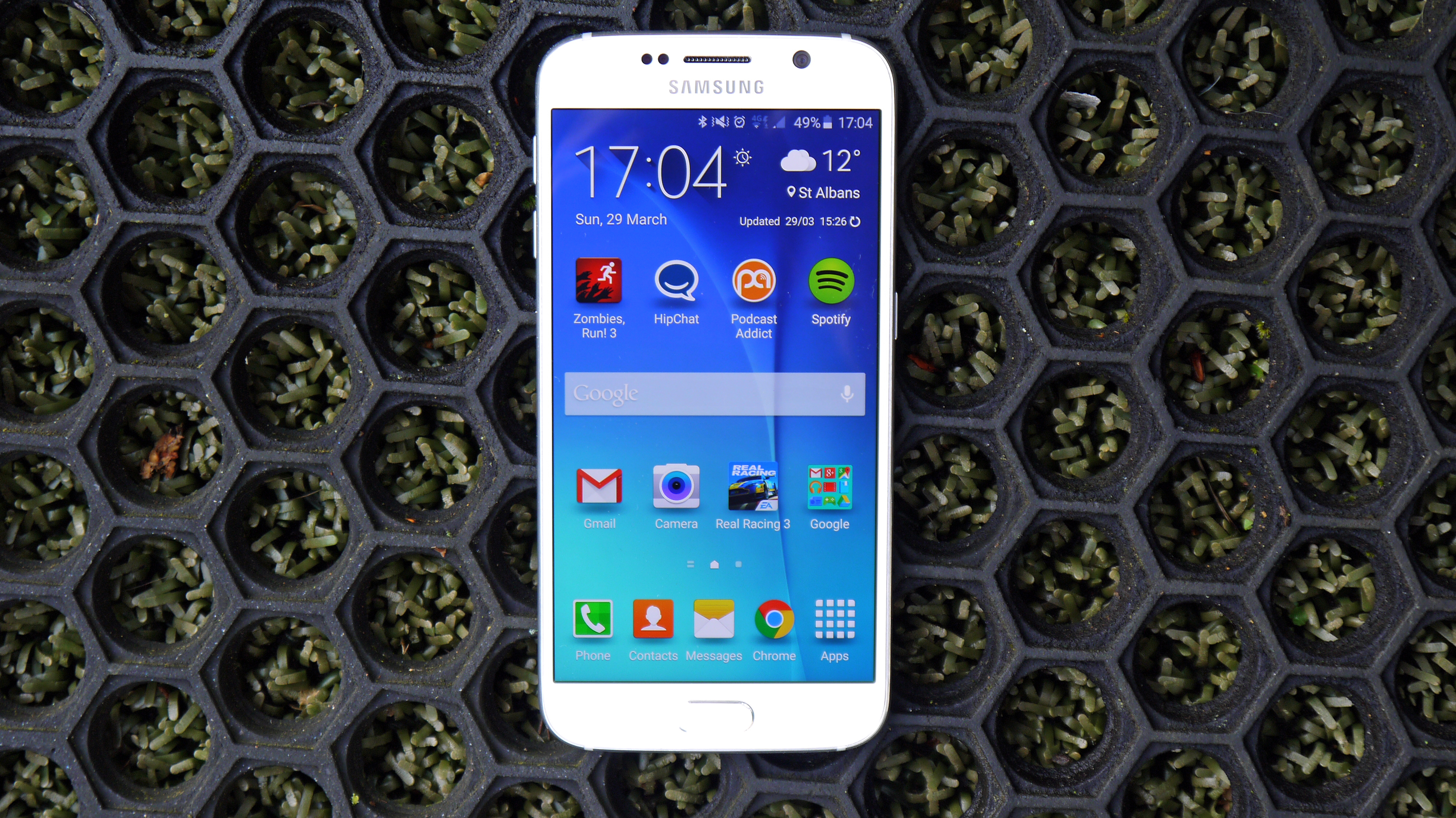
(Admittedly, the improved resolution is needed for the Gear VR headset, where the phone is the screen and so more pixels are better. But that's not going to be a real world use for this phone for many).
The screen on the Galaxy S6 is superb. It does still have all the real benefits of Super AMOLED, as I've mentioned, with outdoor visibility particularly strong.
There's nothing that doesn't look amazing on it - but it does come at the cost of battery life and, well, actual cost, and I'm not sure it adds enough to warrant those sacrifices.
Current page: Introduction, design and display
Next Page Super charging and an amazing fingerprint scanner
Gareth has been part of the consumer technology world in a career spanning three decades. He started life as a staff writer on the fledgling TechRadar, and has grew with the site (primarily as phones, tablets and wearables editor) until becoming Global Editor in Chief in 2018. Gareth has written over 4,000 articles for TechRadar, has contributed expert insight to a number of other publications, chaired panels on zeitgeist technologies, presented at the Gadget Show Live as well as representing the brand on TV and radio for multiple channels including Sky, BBC, ITV and Al-Jazeera. Passionate about fitness, he can bore anyone rigid about stress management, sleep tracking, heart rate variance as well as bemoaning something about the latest iPhone, Galaxy or OLED TV.
