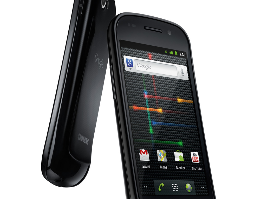
TechRadar Verdict
A solid if unspectacular performance from Google - it's a great phone with a very usable interface, but perhaps lacks the wow factor of some of its contemporaries
Pros
- +
Snappy OS
- +
Android 2.3 with early future updates
- +
Stunning AMOLED screen
- +
Improved battery life
- +
Cool lock screen animation
Cons
- -
Underpowered UI
- -
Not enough Home screen widgets
- -
Slight freezing at times
- -
Light design
- -
Random phone restarting
Why you can trust TechRadar
UPDATE: Now read our Hands on: Samsung Galaxy Nexus review.
Since launching, the Nexus S has undergone a price drop, which we've now reflected in the review. We've also had a few more weeks to play with it, and found a few extra features we thought worth highlighting.
There's also an improved camera section, so check out our detailed look at the snapper-power from Google's latest design.
The Google Nexus S wasn't supposed to happen according to Schmidt. However, the phone that we never expected has now landed in our laps and so we can use it to highlight how the latest tech can and should be used in phones.
You can check out our Google Nexus S video review:
But has Google packed enough tech into this Samsung creation to prompt a resurrection of the Nexus brand, which started with the Google Nexus One, after proclaiming the project was over?
The Nexus S is more than a handset – it's a state of mind (if you believe the way Google is describing it).
Sign up for breaking news, reviews, opinion, top tech deals, and more.
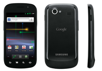
It's being called 'Pure Google', which is a way for the search giant to distance itself from the kerfuffle surrounding the delays encountered by network-issued updates.
But in reality, the second you pick up the phone you realise it's leaning very heavily on the design aesthetic from the Samsung Galaxy S.
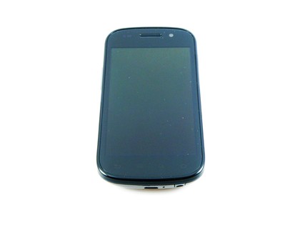
Only a shade heavier at 129g, the Google Nexus S feels light in the hand, and with that lacks the 'premium' feel the iPhone 4 and HTC Desire HD both bring through their metallic chassis.
The curved nature of the frame is nice though – it helps the Nexus S sit well in the palm (with the small lip at the bottom helping it fit correctly, the same as on the Galaxy S) and there's also a curved screen on the front to look at with an interested expression.
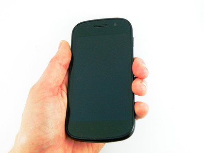
Well, interested or bemused – we're sure this ever-so-slight curve added to the price of the Nexus S, and it's so minimal that we're sure it's nothing more than a gimmick. It doesn't feel any different on the face (it feels nice, just no more than a perfectly flat phone does).
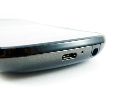
The headphone socket is at the bottom of the phone, rather than the top, next to the micro-USB slot – we're not big fans of that, because it feels weird taking it out of the pocket that way. However, some people love it, and there seems to be a definite trend of phones moving towards that design (the HTC Desire HD for example).
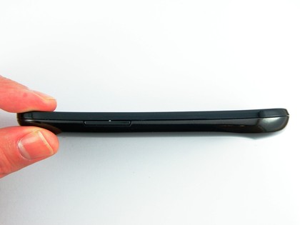
The touch-sensitive keys at the bottom of the four-inch screen have some nicely strong haptics underneath them – a brief touch will be met with a solid confirmation buzz.
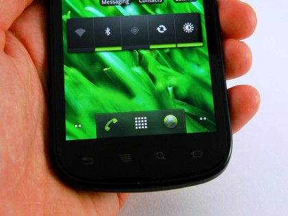
We thought the touch-sensitive buttons (which will light up and down under your caress) were actually scratched when we did our first hands-on with the Nexus S, but as you can see our test model has the same imperfection.

We're not sure why this imperfection happened, but it makes the phone look a little less premium, on top of the already plasticky feel.
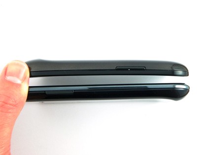
One thing we're very disappointed with Samsung and Google about on the Nexus S is the lack of external microSD expansion. Yes, 16GB of internal storage is good-ish, but we want to be able to transfer stuff across without using a PC connection, or add in extra video storage space as and when we want it.
Overall, we think the design of the Nexus S is fine. It's a shade light and there's no metallic feel to enjoy, but we were fans of the Galaxy S design so we're relatively impressed with this too.
Current page: Google Nexus S review: Overview
Next Page Google Nexus S review: Interface
Gareth has been part of the consumer technology world in a career spanning three decades. He started life as a staff writer on the fledgling TechRadar, and has grew with the site (primarily as phones, tablets and wearables editor) until becoming Global Editor in Chief in 2018. Gareth has written over 4,000 articles for TechRadar, has contributed expert insight to a number of other publications, chaired panels on zeitgeist technologies, presented at the Gadget Show Live as well as representing the brand on TV and radio for multiple channels including Sky, BBC, ITV and Al-Jazeera. Passionate about fitness, he can bore anyone rigid about stress management, sleep tracking, heart rate variance as well as bemoaning something about the latest iPhone, Galaxy or OLED TV.
