TechRadar Verdict
A very good performer from the Android stable that will just keep on pleasing from the box.
Pros
- +
Excellent touchscreen
- +
Android upgrade
- +
Easy messaging
- +
Nice interface
- +
Keyboard is good
- +
Tight Google integration
- +
Slim and lightweight
Cons
- -
Poor camera
- -
No 3.5mm headphone jack
- -
2 year contract
- -
Some touchscreen response issues
- -
Some might find it slightly lightweight
Why you can trust TechRadar
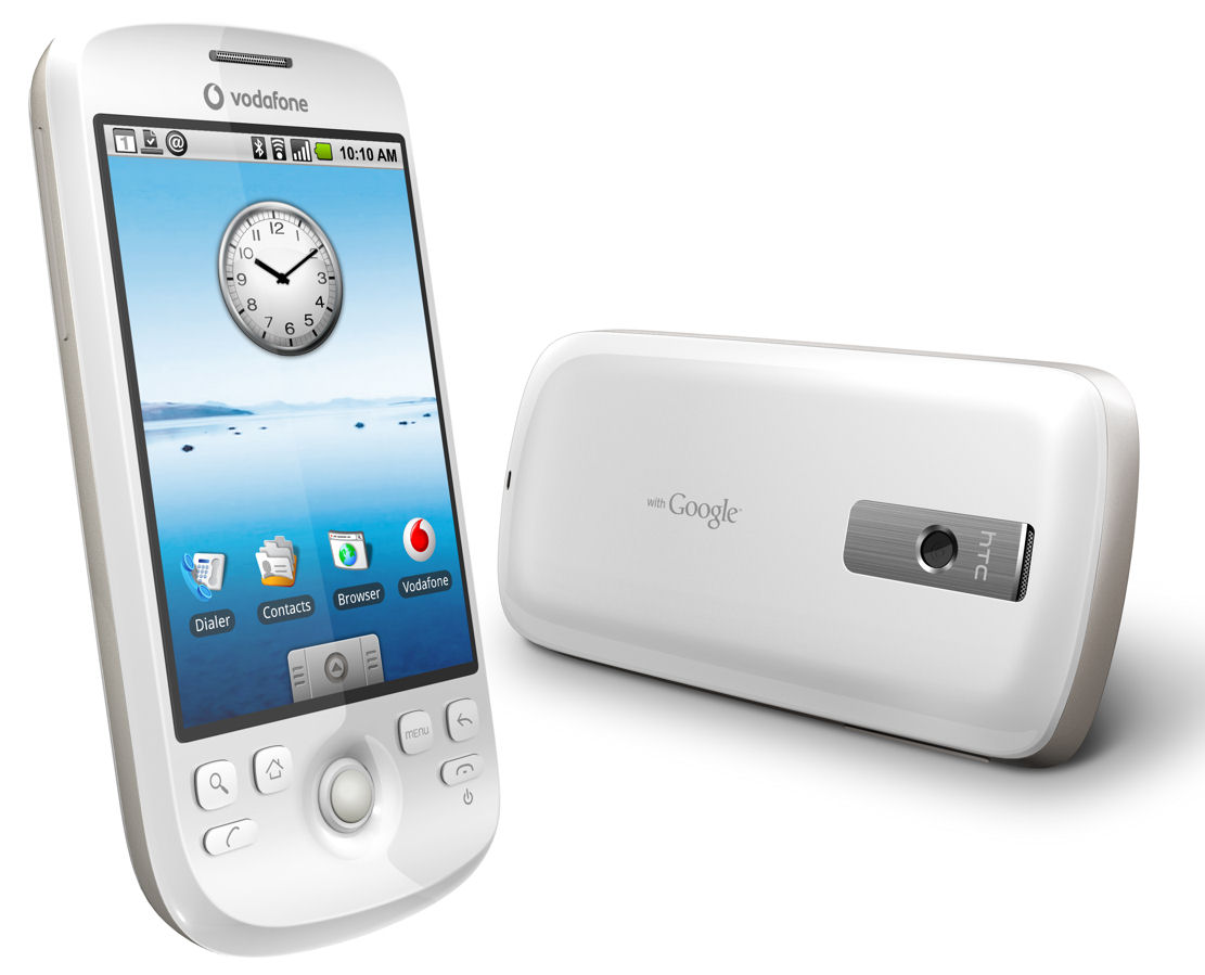
While the world is once again going ga-ga over the latest iteration of the Apple iPhone, some of them have forgotten about the Android movement from Google and others, and the latest from this organisation has landed, the HTC Magic.
Having already brought out the world's first Android-powered phone with the T-Mobile G1, the Taiwanese company got its act together faster than the likes of Samsung, Motorola and LG to bring out another 3.2-inch touchscreen handset.
Significant upgrade
And this one manages to fix a huge amount of flaws found in the first iteration, and even sheds the physical keyboard in favour of an on-screen effort, thanks to the latest Cupcake 1.5 update of Android.
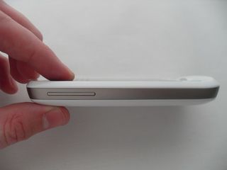
It once again seamlessly integrates Android Market to take on the App Store with a whole host of bolt-on programs, and even pings in with pocket-friendly dimensions of 113 x 55 x 14mm, and as lighter than a 120g feather (as it only weighs 119g).
But it's all very well to say that you're going to get the best phone just because it's fixed a few bugs and shed a few pounds... what we want to know is whether the HTC Magic is the phone that's going to thrust Android into the psyche of the phone buying public as successfully as Apple has with its iPhone.
The main talking point about the HTC Magic is clearly the fact that it's the next in the Android lineage, and to that end, you can hardly say it's spectacular as it's sporting the same interface we've seen before on the G1, more or less.
In the box
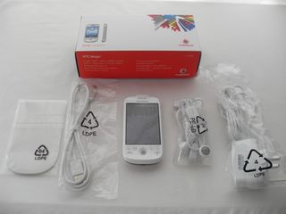
First of all, let's have a look at what we get in the box. There's the phone itself, and it's accompanied by a Mini USB 2.0 charger, a similarly ported headset, a cover for the phone and USB lead as well, all in the same white, making them easier to spot on a cluttered desk.
But what's both different and interesting is the move to team up with Vodafone, resulting in a whole new chassis while retaining the same 3.2-inch screen.
Keyboard
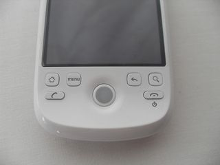
The layout of the buttons is slightly different, with two key changes: the menu button, previously positioned at the base of the screen on the T-Mobile G1, has shifted to just above and to the left of the trackball, and there's now a new search button on the far right, which interacts with nearly every application on the phone to let you search for whatever your heart desires.
The lip that repulsed a few users on the G1 has been retained, but has shrunk in size somewhat and been moulded much more discreetly into the shell of the phone, while still being nice to hold in portrait mode.
But the startlingly different change between the HTC Magic and the G1 is the loss of the keyboard. In an interview with T-Mobile previously we were told that the keyboard was one of the real selling points of the G1, something the customers really looked for when picking up the device for easier messaging.

Well, either Vodafone thinks the pink network is lying or just wants to differentiate itself somehow, but its shed the QWERTY and now sits at a size zero-esque 14mm thickness, which means it's much more lightweight (and attractive) than its G1 sibling.
Hand feel
One interesting by-product of the weight loss is the way it feels in the hand. The plastic exterior doesn't quite stray into the realms of feeling cheap, but the overall feel is something you'll have to get used to, as the light feel of the phone feels odd initially.
However, it's just about the right size for one-handed operation in most cases, although you'll probably find yourself 'doing an iPhone', ie placing it in one palm and poking with the other hand on more than one occasion as you interact with the plethora of different screens on offer.
What's more, you have to remember from the off that this phone may be free, but will cost you £35 a month (albeit only £30 if you do it online) for the next two years. That's a very long time for the gadget-lover, especially when the next 12-18 months are likely to herald the arrival of a great many new Android phones for you to salivate over, so a nice deal could soon turn into a prison sentence if you're not sure this is the phone for you.
Current page: HTC Magic: Overview; look and feel
Next Page HTC Magic: Interface
Gareth has been part of the consumer technology world in a career spanning three decades. He started life as a staff writer on the fledgling TechRadar, and has grew with the site (primarily as phones, tablets and wearables editor) until becoming Global Editor in Chief in 2018. Gareth has written over 4,000 articles for TechRadar, has contributed expert insight to a number of other publications, chaired panels on zeitgeist technologies, presented at the Gadget Show Live as well as representing the brand on TV and radio for multiple channels including Sky, BBC, ITV and Al-Jazeera. Passionate about fitness, he can bore anyone rigid about stress management, sleep tracking, heart rate variance as well as bemoaning something about the latest iPhone, Galaxy or OLED TV.

After semiconductors, semimetals might be the next big thing as the tech industry looks for a replacement for ubiquitous copper
The new Nintendo Switch 2 Camera proves I was right to hope for a new age of Nintendo peripherals – but what comes next?
The Nintendo Switch 2’s interactive-manual bloatware is a paid app, and it’s the last straw following a disappointing launch
