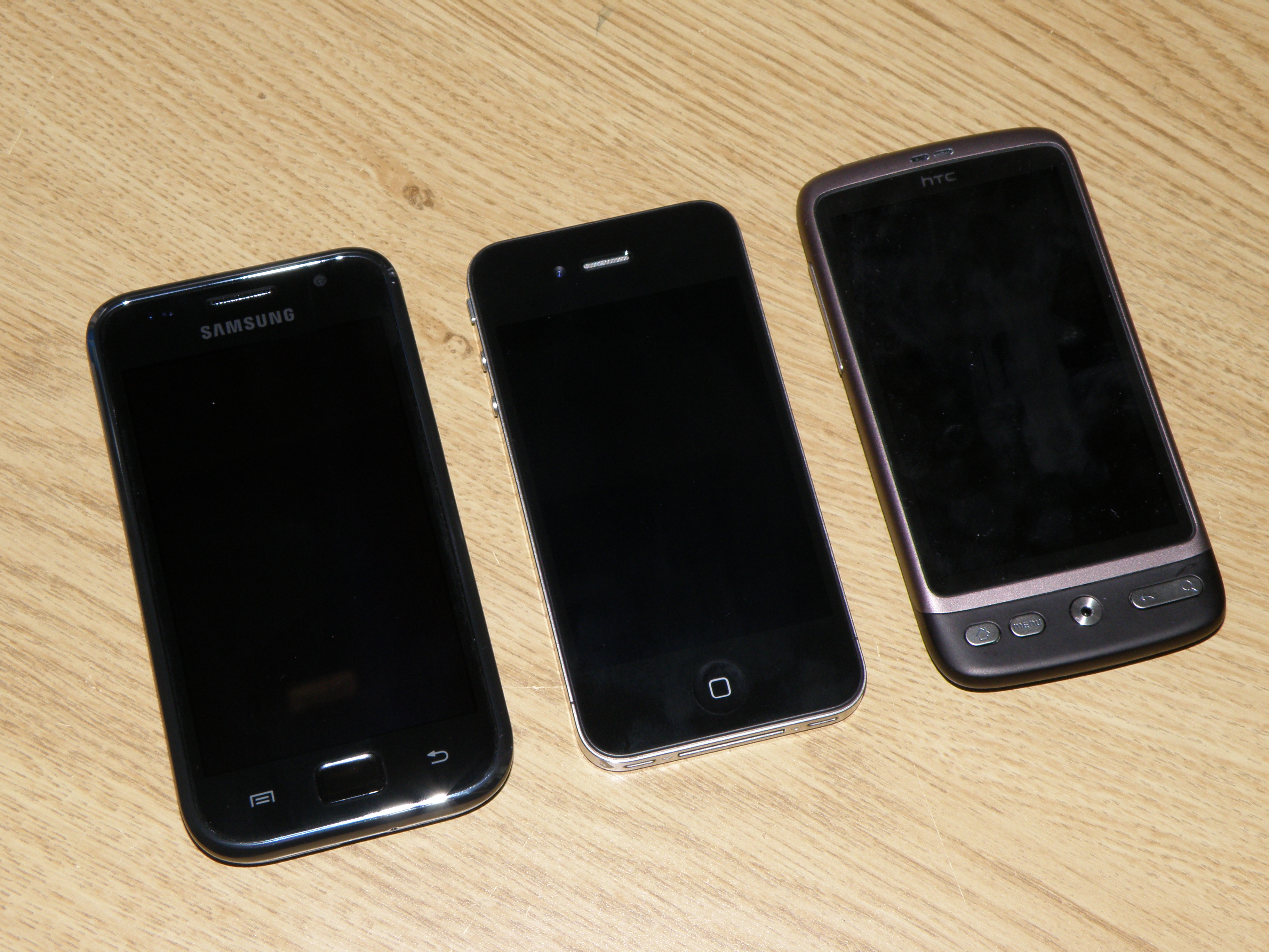
HTC Desire vs iPhone 4 vs Samsung Galaxy S
Our top three smartphones face off
If you're looking for our HTC Desire HD coverage, then check out HTC Desire HD vs iPhone 4 vs Samsung Galaxy S instead.
The world has been forced to live with sub-standard smartphone experiences for years; putting up with a huge number of foibles in order to access the latest tech.
Want GPS on your Nokia N95? Get used to low battery and a slow UI. Want to record video? You'd be better off sketching what you see rather than try and decipher the blocky mess you're left with.
But now most smartphones are getting to the stage where there's very little wrong at all – no longer is there a compromise to be made.
So let's take a look at the top three in the world at the moment and see which phone gives you the most for your cash:
Interface
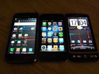
iPhone 4
Get daily insight, inspiration and deals in your inbox
Sign up for breaking news, reviews, opinion, top tech deals, and more.
The iOS4 interface is more evolution than revolution, but that doesn't mean it's not a lot better than before. Things like double tapping the home button to call up multitasking and iPod controls work well, and the menu system is as familiar as ever.
However, the time is right for Apple to start thinking about widgets – people might have been scared before, but now iPhone users are starting to 'get' what smartphones are about, and a few things like weather widgets wouldn't go amiss – it's not always 23 degrees and sunny.
HTC Desire
The HTC Sense UI is one of the best overlays we've seen on a mobile – it's the perfect blend of style and functionality.
From being able to pinch the screen to see all Home screens at once to the integrated social networking in the contacts menu, the overall feeling is one of intuition.
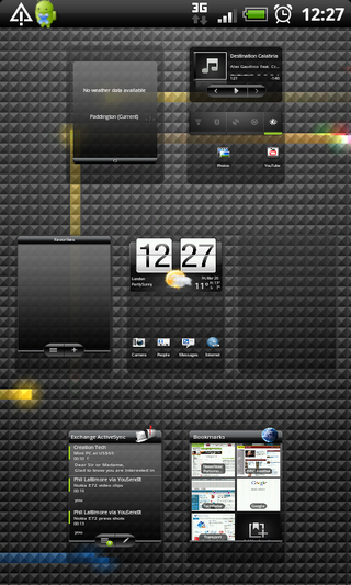
Granted, it takes a while to set up, but once done you're sorted for the entire journey with your new phone.
Samsung Galaxy S
Adding the TouchWiz 3.0 interface was a good move for Samsung, as it offers more than the basic Android overlay we've seen on its other Android phones.
Seven Home screens are accessible for widget and icon dropping, and the menu system is simple to use.
However, the widgets on offer are woeful – why are there so few available, Samsung?
The contacts menu is better, but a little convoluted compared to the intuitive Sense UI.
Winner: HTC Desire
Current page: Desire vs iPhone 4 vs Galaxy S: Interface
Next Page Desire vs iPhone 4 vs Galaxy S: Screen
Gareth has been part of the consumer technology world in a career spanning three decades. He started life as a staff writer on the fledgling TechRadar, and has grew with the site (primarily as phones, tablets and wearables editor) until becoming Global Editor in Chief in 2018. Gareth has written over 4,000 articles for TechRadar, has contributed expert insight to a number of other publications, chaired panels on zeitgeist technologies, presented at the Gadget Show Live as well as representing the brand on TV and radio for multiple channels including Sky, BBC, ITV and Al-Jazeera. Passionate about fitness, he can bore anyone rigid about stress management, sleep tracking, heart rate variance as well as bemoaning something about the latest iPhone, Galaxy or OLED TV.
