TechRadar Verdict
HTC has done it again: created a stunning phone with very few flaws.
Pros
- +
Beautiful design
- +
Expandable memory
- +
Effective Duo Camera
Cons
- -
Camera poor in bright light
Why you can trust TechRadar
Update: The HTC One M8 is no longer easy to buy in shops, so you'll need to get it through other online portals. The HTC U11 is the newest phone from the brand, and is a much better buy for many, many reasons... although it costs a lot more as a result.
I'd hate to be a phone designer, trying to achieve unique and exciting features in a jaw dropping package for what is essentially a screen with some extra bits and pieces surrounding it.
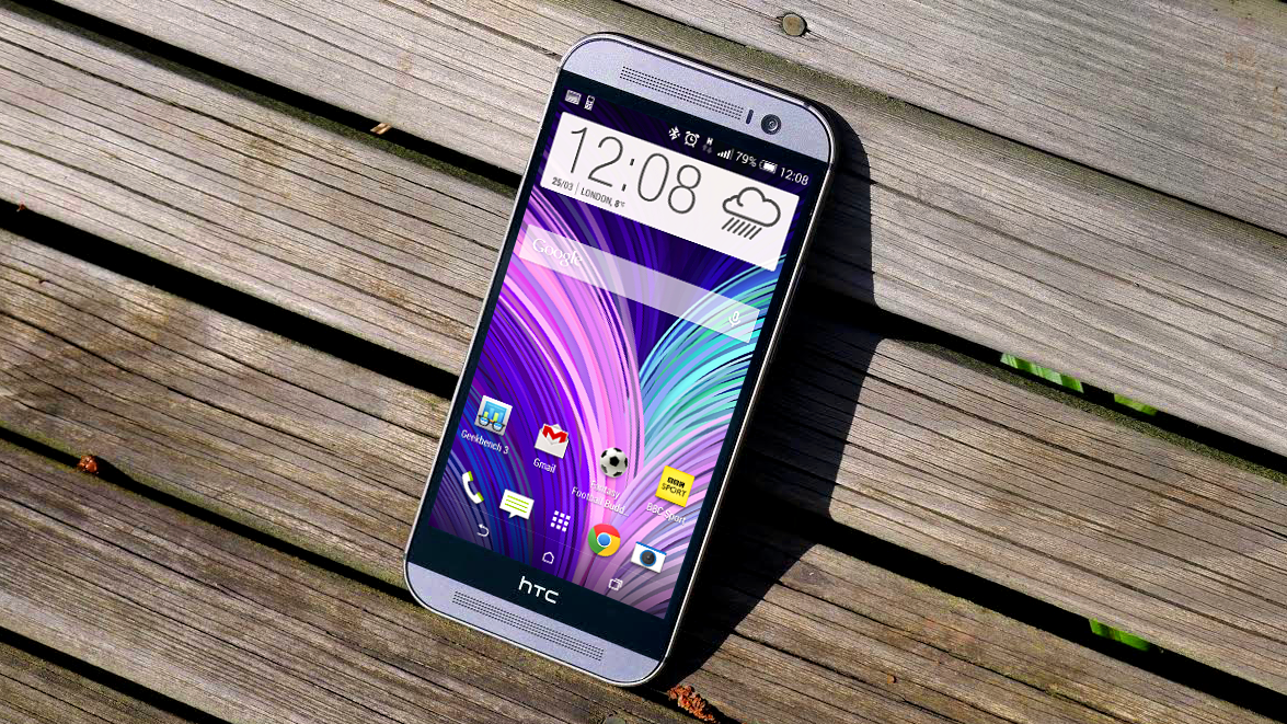
So it's all the more impressive that HTC, after making the best-looking phone of 2013 (the HTC One), managed to make the HTC One M8, a phone crammed full of power and great features while improving the design that won it so many accolades.
The poor naming aside, the One M8 is a phone that takes the superb DNA of the HTC One, improves it in nearly every area and then packs it full of still impressive technology...and also finds space to pack in a microSD card slot.
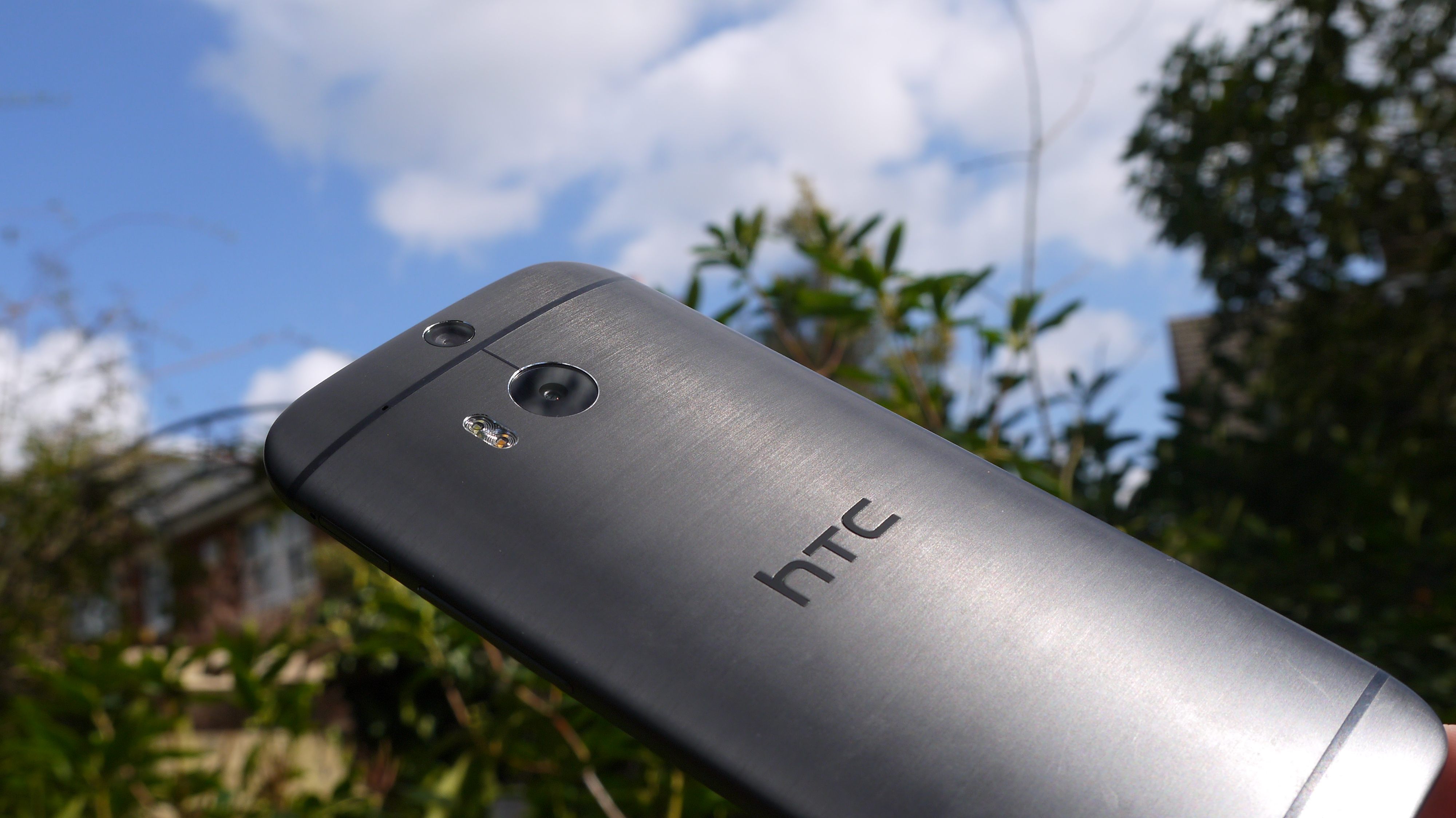
On top of that the chassis has been retooled to now be made of 90% metal, up from around 70% of the previous model, and the result is a brushed aluminium design that seems compelling the second you lay eyes on it.
Nowadays we're well past this phone - the HTC U11 is the latest handset from the Taiwanese brand, and is miles better (with the price to boot). It's got the latest Snapdragon 835 CPU, a QHD screen, squeezable sides and a two-tone chassis.
Which makes it all the more confusing when you consider HTC has brought out the One E8; same size and internals, but with a plastic chassis that's still available for a lower price. See the differences here:
Sign up for breaking news, reviews, opinion, top tech deals, and more.
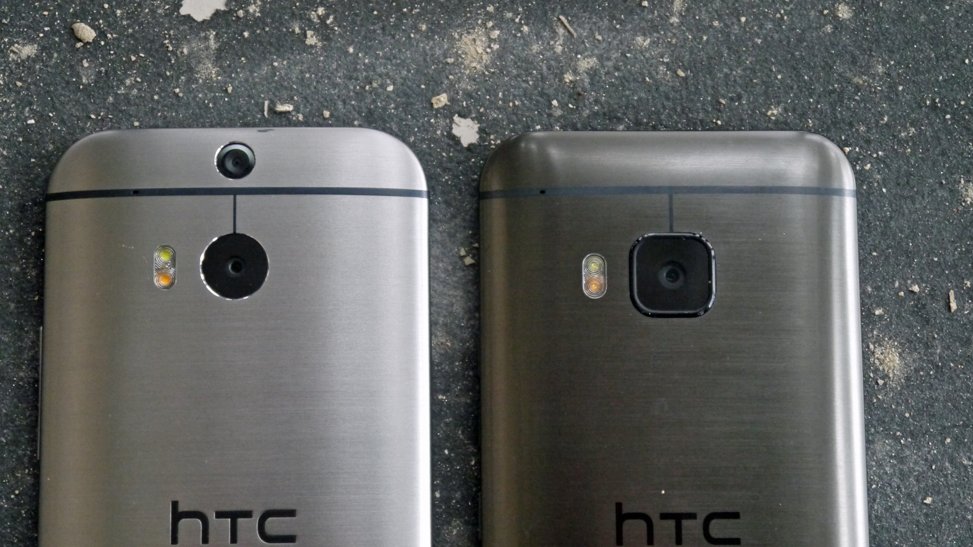
And now - here's the bigger treat. The HTC One M9 is on the scene, and as such the One M8 seems like a little older hat than before.
That might not quite be the case though, as the new phone doesn't show an appreciable improvement in what it can do beyond a fancier chassis and higher price tag.
There are some extras: a 20MP camera will entice spec fans, if not those that value an immaculate mobile photography experience, it can shoot in 4K and has Dolby baked into the BoomSound speakers.
But is it the perfect evolution to the One M8? It doesn't seem so.
In lieu of the HTC One M9 Mini, the HTC One M8s has also rocked up, a cheap alternative with the same metal body as the HTC One M8 (though slightly thicker by 0,2mm), however it doesn't offer much of an upgrade over the ageing HTC One M8.
Or for yet another option there's the HTC One A9. This has a metal shell too and is lower end than the HTC One M9, its specs aren't much of an improvement on the HTC One M8, but its design is more iPhone-inspired.
Let's go back in time a little bit here: when it launched the HTC One X - let's not get into the fact that this company needs to employ a whole new team dedicated to naming products - HTC was in a nosedive.
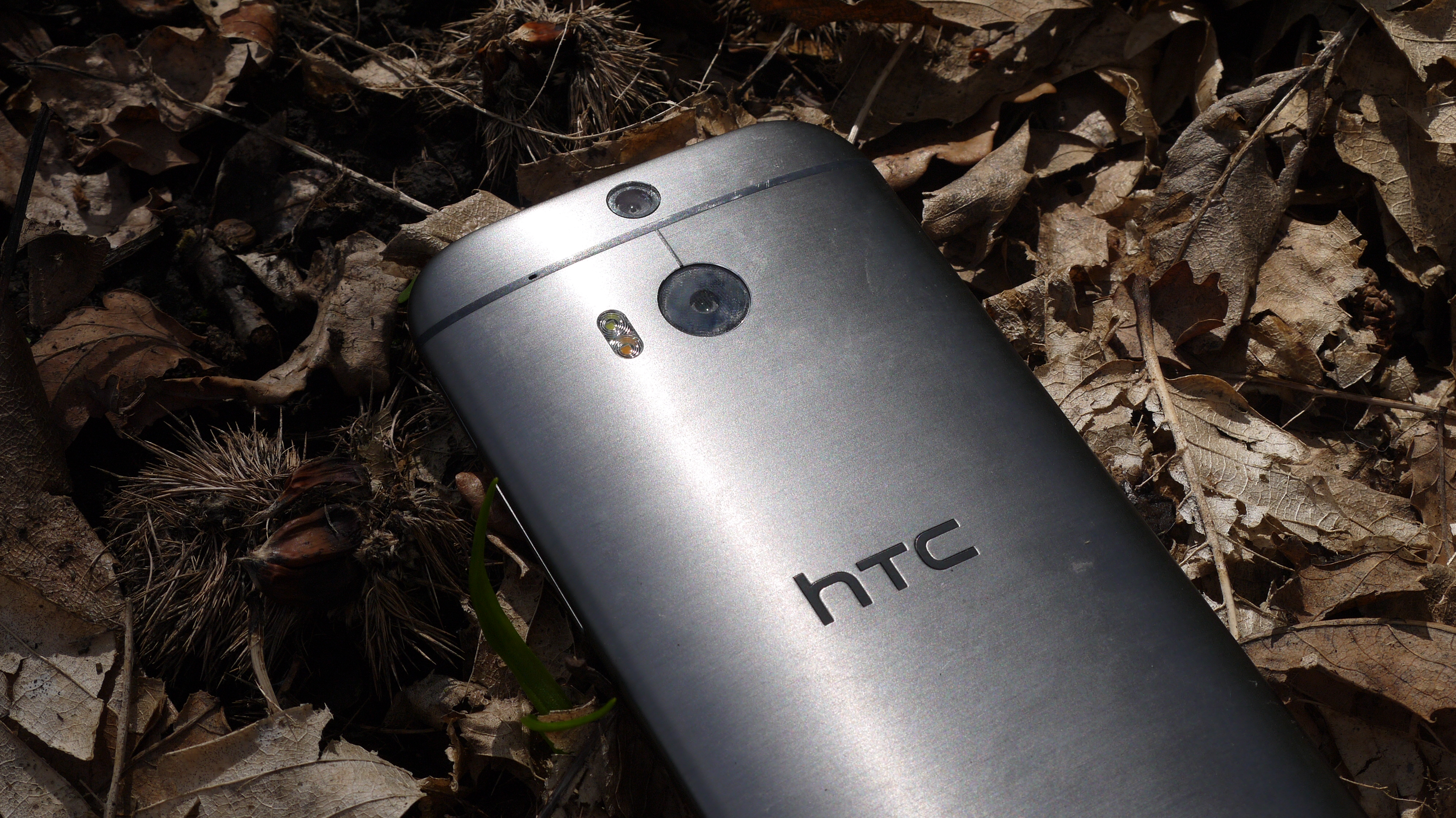
From the heights of the HTC Desire, the world's first true iPhone competitor, it had fallen dramatically, and sales were in the toilet.
The brand needed a reboot, and the HTC One was just that. It wasn't a commercial success in the same vein as the iPhone 5S or the Samsung Galaxy S4, but it was critically superior.
So HTC had a tough choice: make a sequel that was mere evolution, an HTC One S (wait... that's been done) if you will, which would make the world realise it truly believed in its design trajectory, or reinvent the wheel again, try a different kind of impressive phone and run the risk of offering up a flop?
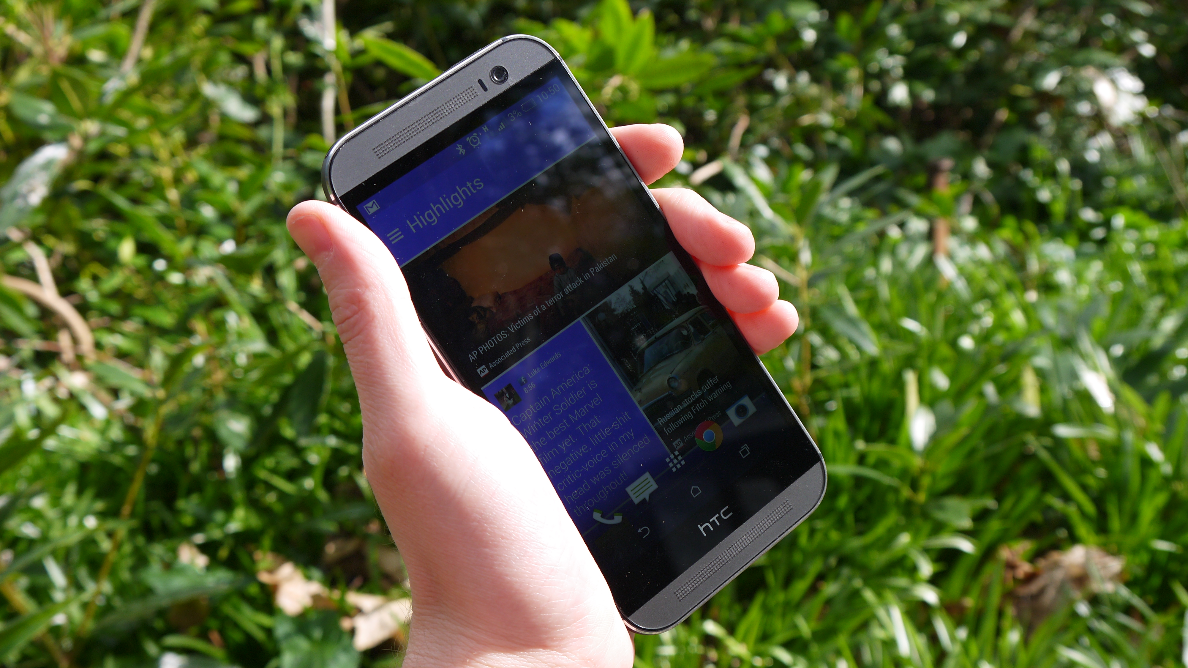
Somehow the company has managed to create something that stands astride both categories.
The HTC One M8 is an even better-designed device that takes the principles of the original One, expands them in the right places and adds in some more HTC sauce here and there.
The result offers up something that can compete with Samsung on the technological front yet still stand toe-to-toe with Apple, arguably the producer of some of the best-looking devices of all time.
Of course, the One M8 isn't a phone that's going to be to everyone's tastes. It started out expensive, coming in at upwards of £450 SIM free (AU$899, around US$820), but that's to be expected from a flagship phone like this.
Since its launch there have been a number of price cuts which means you can get a HTC One M8 for as little as £250/$270/AU$420 if you shop around, but that's still a sizeable chunk of change for an ageing phone.
The metallic chassis is really the primary reason, but it will be interesting to see if buyers are still as wedded to it when the One E8 offers such similar specs with a much lower price.
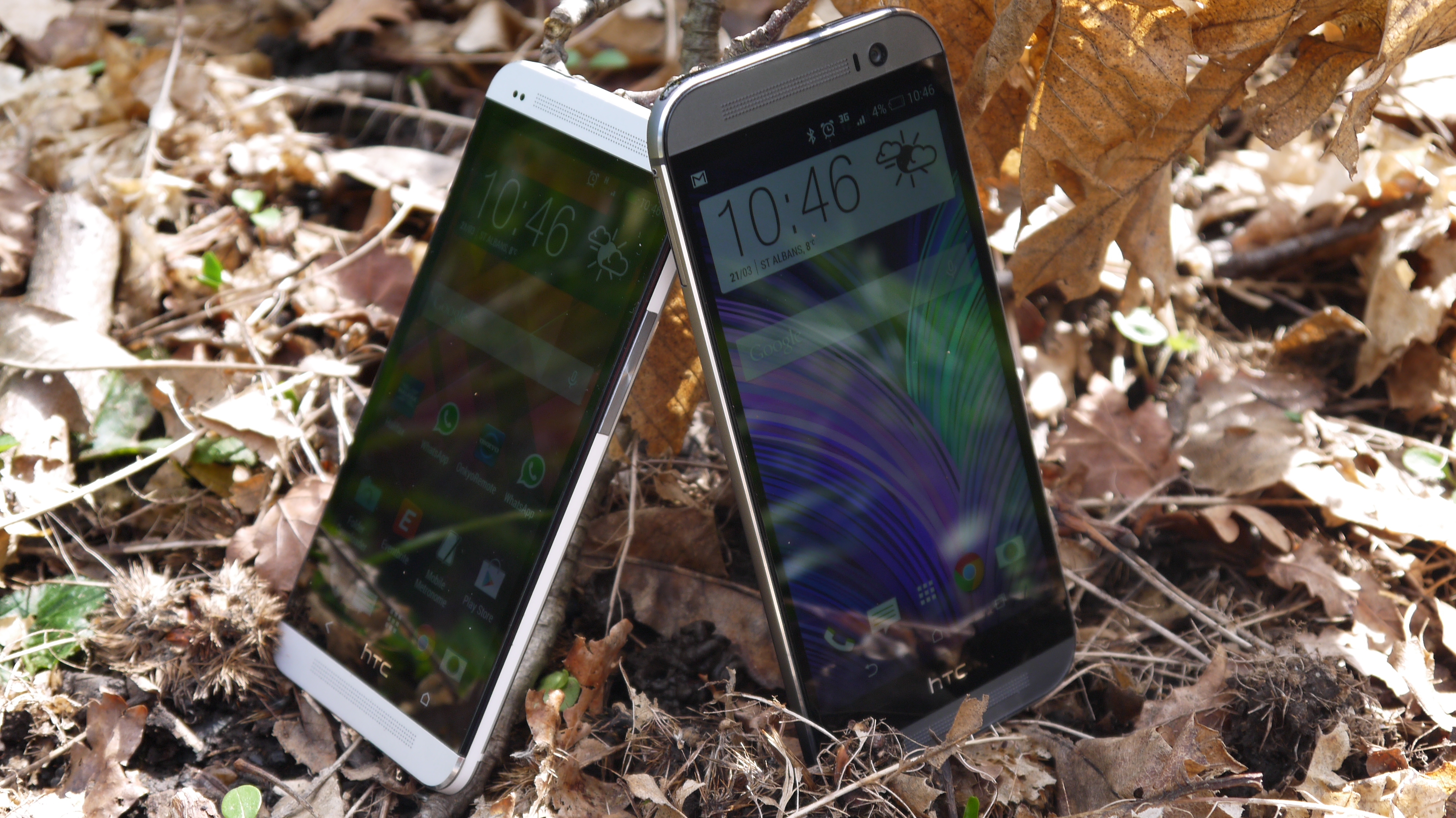
You'll need to be ready to pay a significant amount for the HTC One M8, but once you hold it you'll accept that it deserves to command such a premium.
There are other things that will put off some too: the fact that the screen is now 5 inches mean this is a larger device, one that can take two hands to operate at times, and it's even bigger than the 2013 version as a result.
HTC needs to sort out its efforts in the mid-to-low smartphone arena, but that's a topic for a different day. The HTC One M8 is a phone that's supposed to offer the best of the smartphone market, one that can survive the onslaught of the iPhone 6 and the Galaxy S6, while preserving HTC's heritage and bringing the bottom line closer to something more healthy.
Through a clever combination of technology and design, it appears the company has managed to do just that - and in today's impossibly congested smartphone market (especially at the high end) that's something to be applauded.
Design
As you can guess from the introduction, the HTC One M8 is a phone that is as much about premium design as it is about packing in the latest version of Android and a decent processor.
The brand took great pains to point out that the One M8 is a phone that builds on the heritage of 2013's One, but improves in just about every arena. The metal chassis is still there, and the aluminium casing now makes up 90% of the frame, up from about 70% previously.
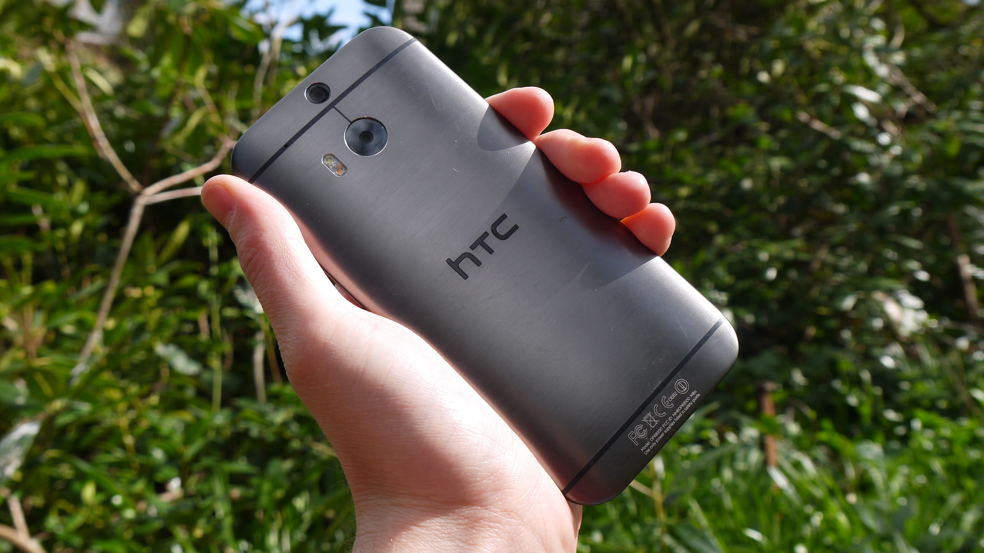
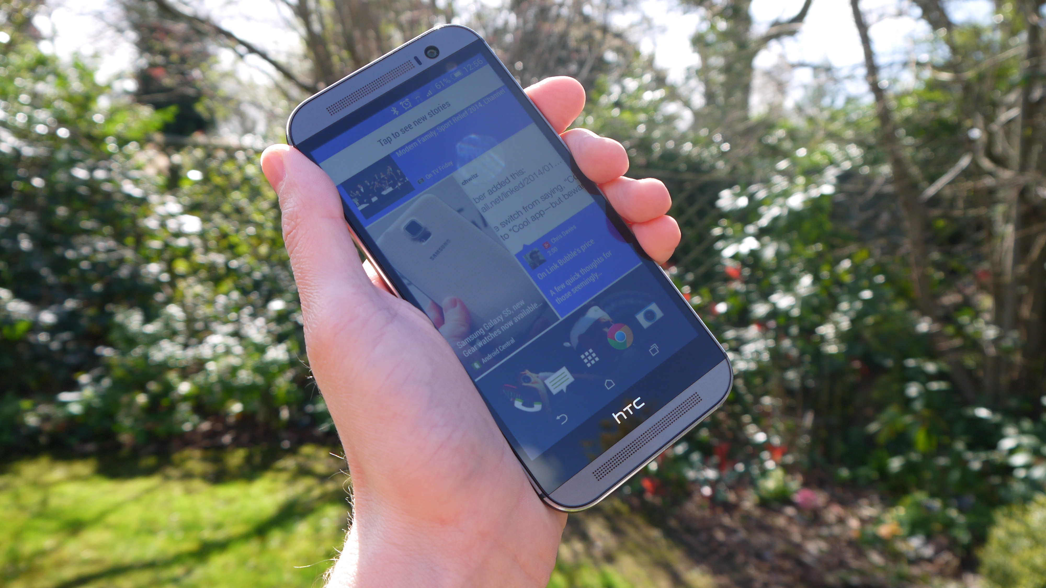
This is probably the most significant change, along with the fact the back and sides are now more curved, as it brings a really impressive feel in the hand. If the original One was characterised by first-time users saying 'Wow, that feels lovely' the next iteration takes that message further.
HTC is obviously proud of the HTC One M8's design, as it retained it for the HTC One M8s, while sticking closely to the look for the HTC One M9 as well.
There will be very few brand-agnostic people that wander into their local phone emporium, pick up the HTC One M8 and a couple of competitors, and don't find that the Taiwanese brand's device is streets ahead in the design stakes - and I'd bet that most would be unable to resist a purchase after that.
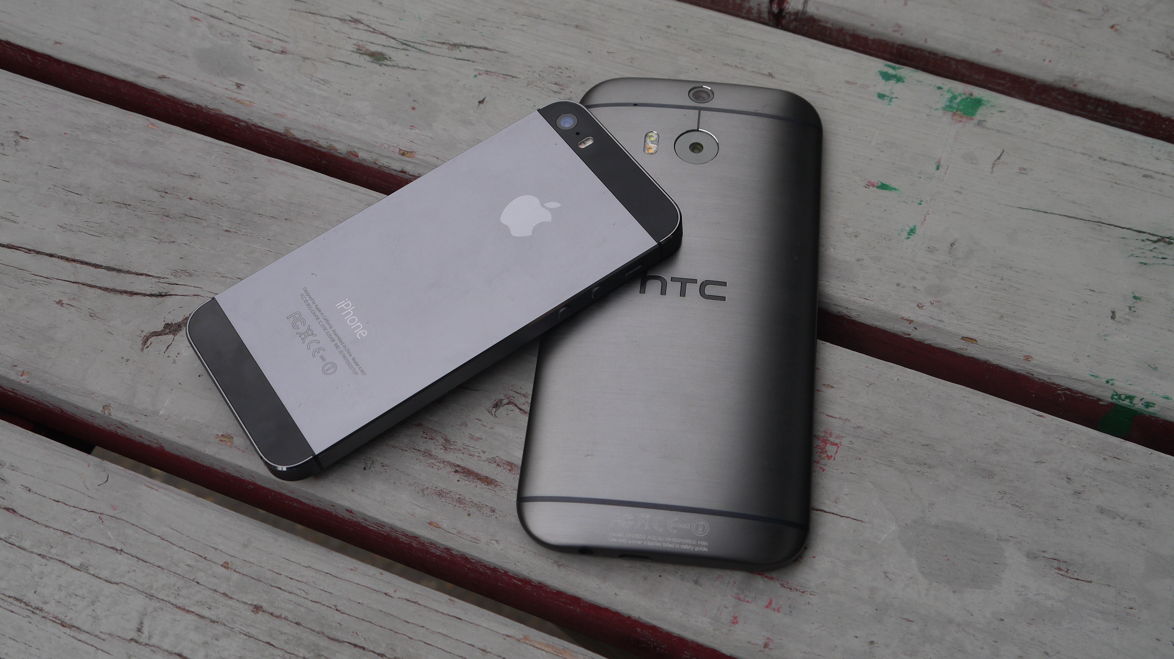
The difference here between the One M8 and the iPhone 5S - two of the phones that lead the way in the design stakes - is weight and screen size. Having something that feels premium is incredibly important when you're spending so much on a phone per month, and while the iPhone is beautiful in its metal casing, it's too light to feel like you're getting something really premium.
There's a subconscious reaction when you pick up something for the first time, a natural expectation of how it might feel in the hand, and the HTC One M8, with its 9.35mm thickness and 160g weight, marries those two very well. Though the iPhone 6 and iPhone 6S pull off a similar trick, combining size and weight to great effect.
It's no coincidence that smartphones are packing on the grams a little bit these days. Where around 120g was the fashion a couple of years ago, now we're seeing heavier phones as designers try to meet a new paradigm (plus all that new technology needs to go somewhere, after all).
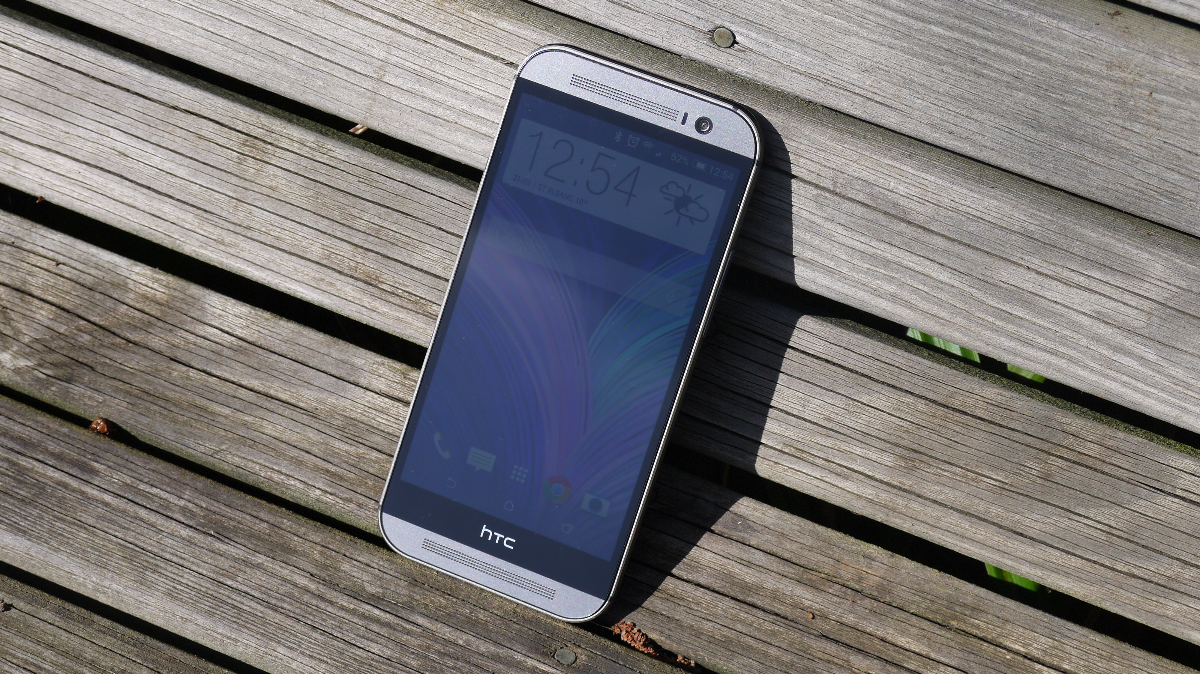
Let's look at the actual design of the HTC One M8 - and it's definitely equal parts evolution and revolution.
The flagship version will be this metallic grey, although a silver version that evokes the previous model and a champagne / rose gold option are both available too. However, this brushed metal effect is stunning, and helps distance the One M8 from its predecessor.
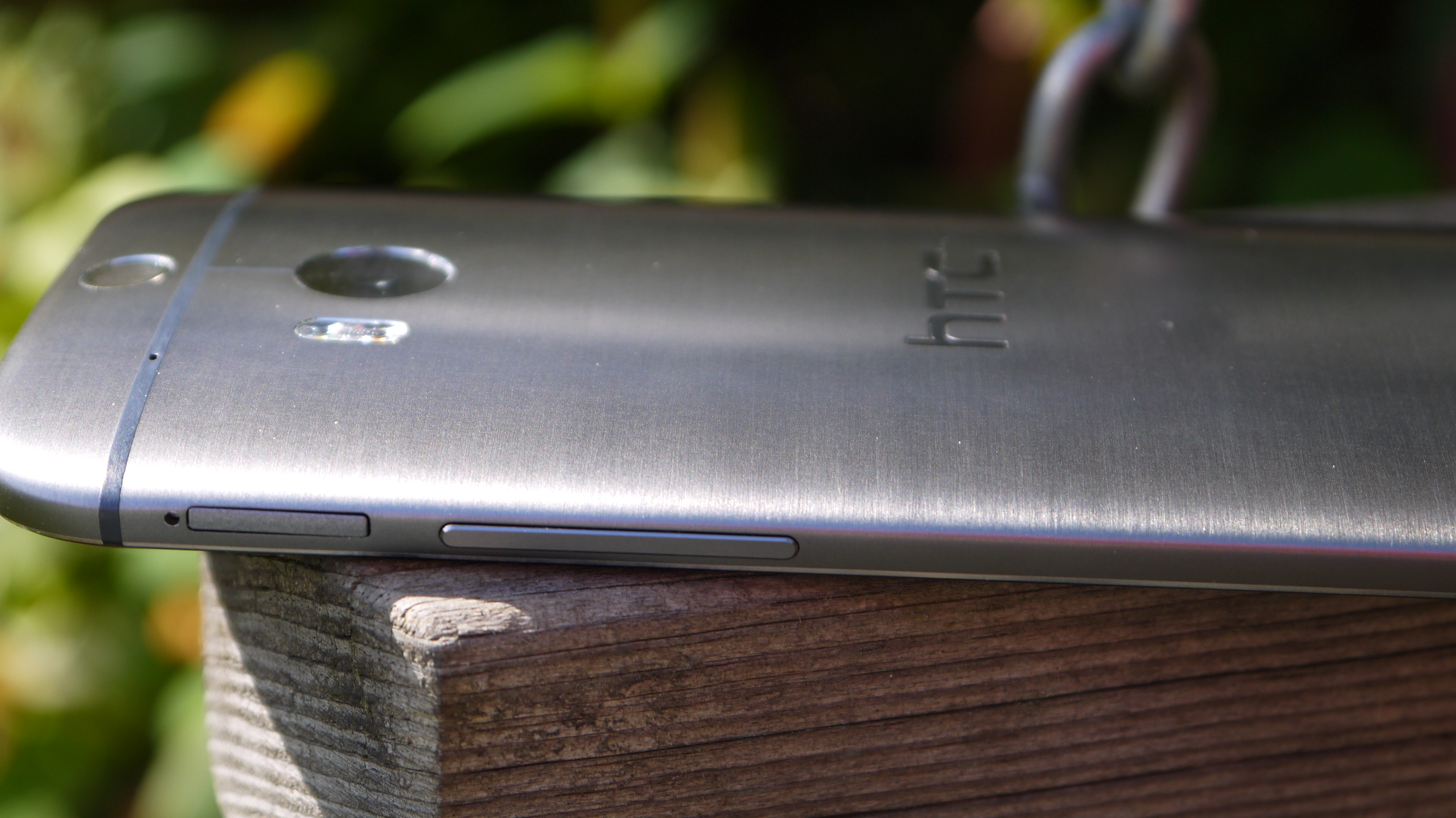
Holding it in the hand is a really pleasant experience, one that makes you feel like you're holding something you should spend a lot of money on.
Quite rightly some will baulk at the larger chassis, mostly down to the decision to include the Boomsound speakers above and below the screen, but once you've heard them in action you'll struggle not to agree that they're a worthy trade-off.

The iPhone 6 and even the Galaxy S5 have a more compact design language than the One M8, which is larger thanks to the speaker addition, but overall I don't think this detracts from the overall effect.
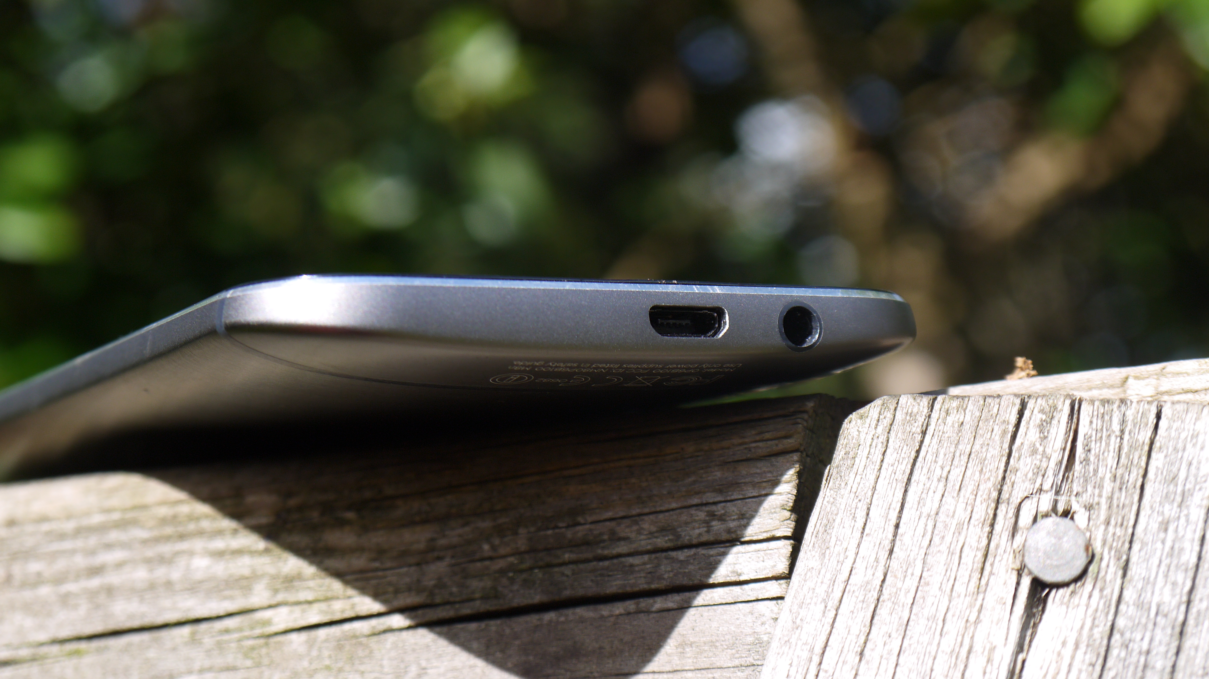
The headphone jack has been moved to the bottom of the phone, which will anger some users. I still think this is an unintuitive place to add the port, as I've become used to having it at the top. Arguments that it makes it easier to slip in and out of the pocket don't hold water, and it makes the phone hard to hold in portrait when listening to music.
But I've got some really good news for you phone-lovers out there: the HTC One M8 comes with a microSD slot! I thought this would never happen after the brand did away with the expansion for the original HTC One, citing design reasons and a general lack of need thanks to the ubiquity of cloud storage (which is clearly still not true).
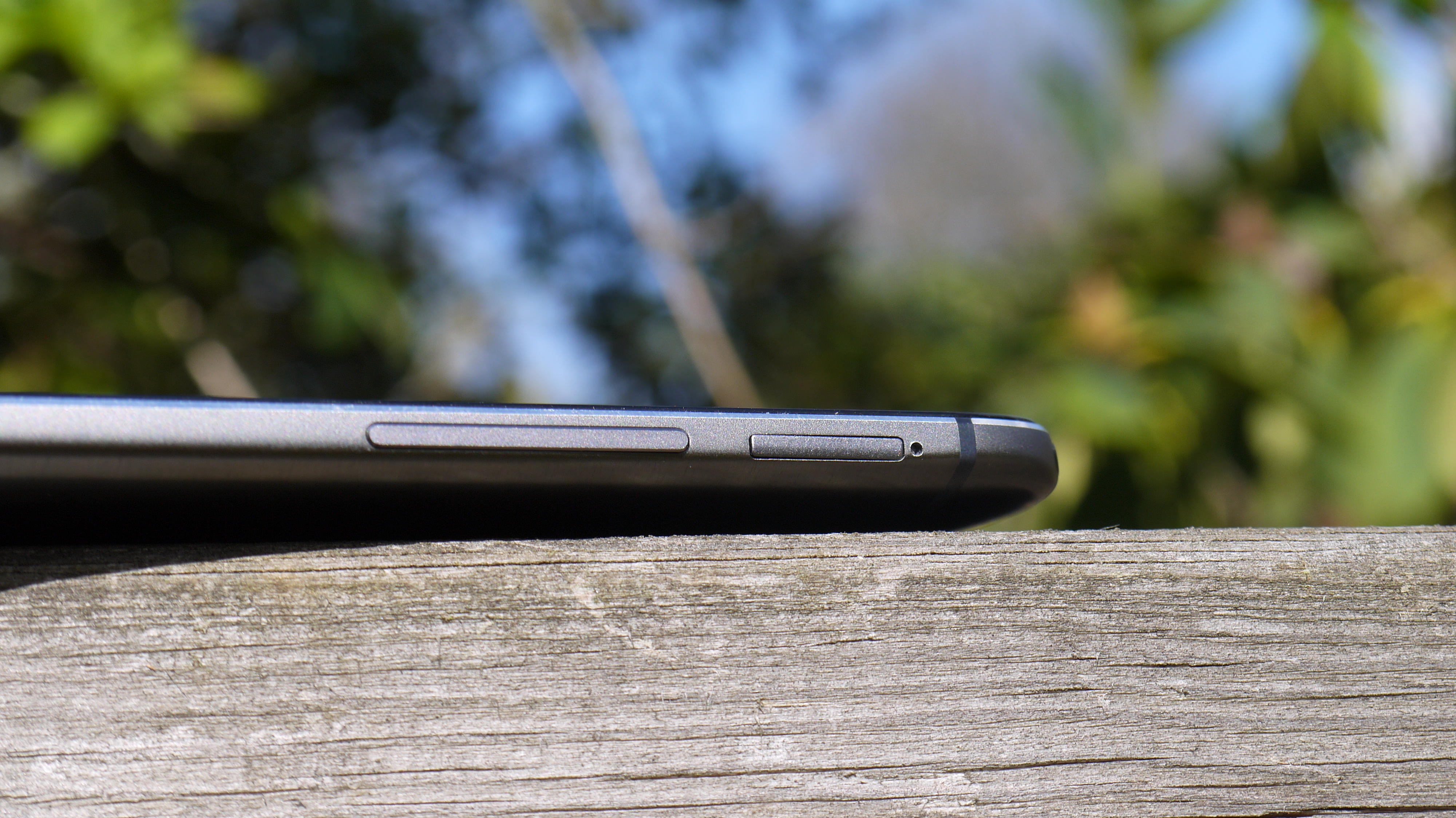
To hammer home that last point, HTC told me that it re-introduced the expandable memory as it was a) able to do so without compromising the design and b) it had heard from so many consumers that this was a real sticking point for not buying the original One.
It's always good to see a brand climb down when consumers ask for something, and now this means that there are no issues about filling your phone up with photos and home videos as well as music and movies.
It also means it can look Sony's flagship from the same period, the Sony Xperia Z3, in the eye as that handset also comes with expandable storage.
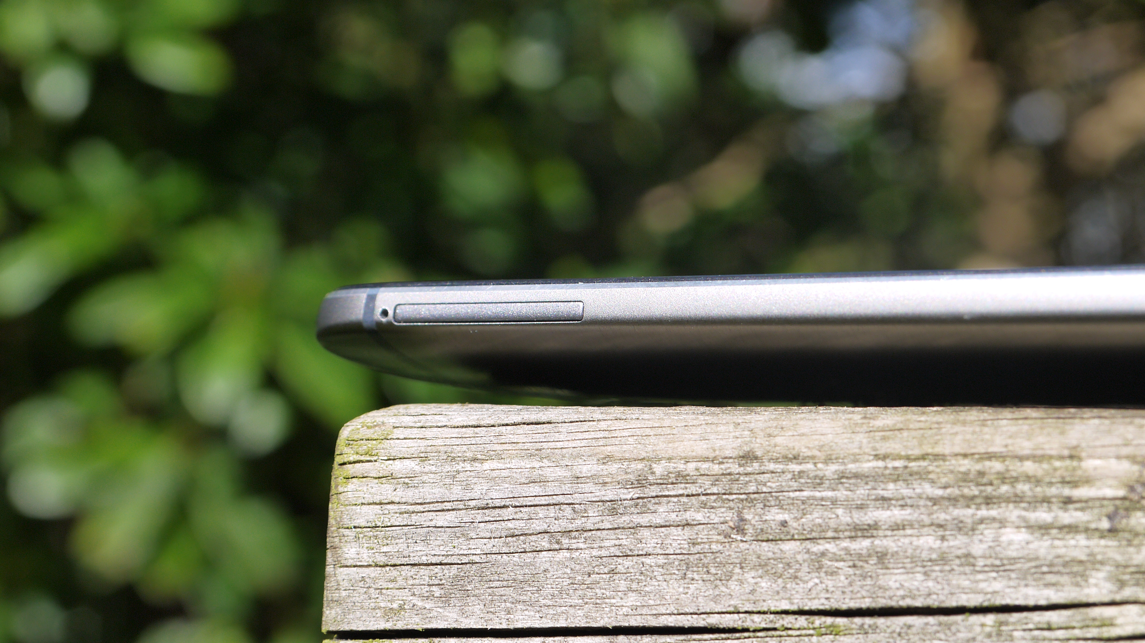
The slot isn't that easy to access on the fly, as like the nanoSIM port it needs a small tool to pop open the drawer. That might be annoying for the more hardcore photographer, but most people will rarely, if ever, hot swap cards, so it just offers a cheap and easy way to increase the 16GB / 32GB onboard storage by up to 128GB.
The top of the phone is all plastic still, and this is to do with antenna technology as well as allowing the infrared signal to control home theatre devices.
This, combined with the thin plastic strips on the rear of the phone, allow for phone and Wi-Fi signal to permeate through the chassis... when you hear engineers talk about how hard it is to make a metal phone that can still connect to other devices, the design language of the One M8 is even more impressive.
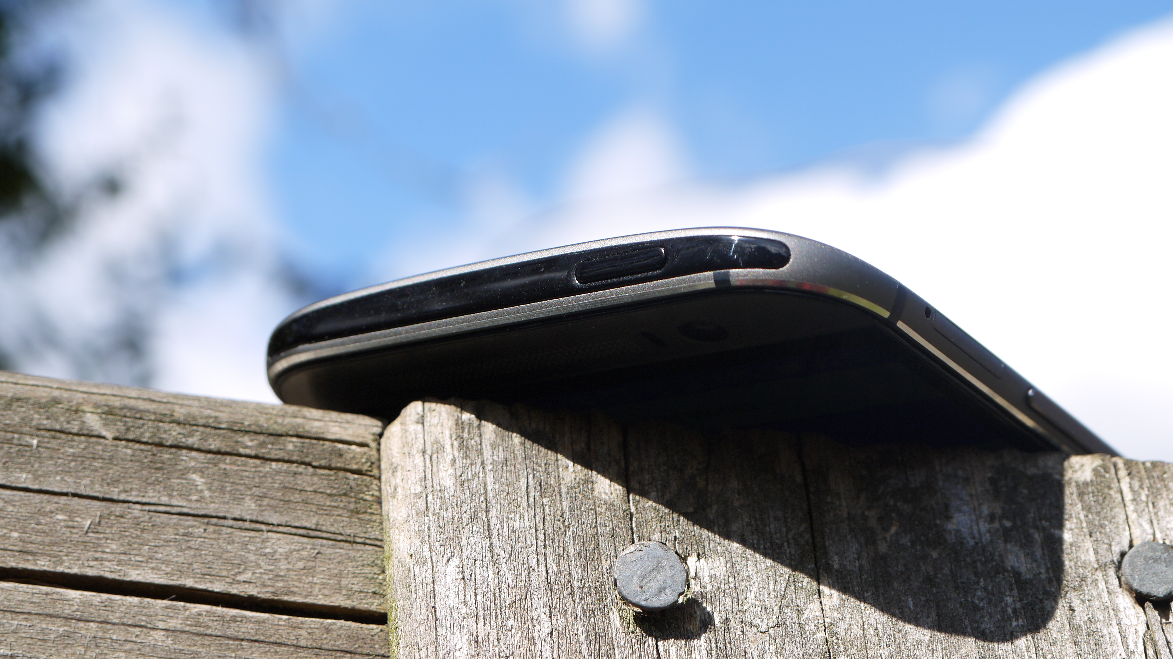
The design isn't perfect on the One M8 though - although the following points are more little irritations than anything that undoes the work of the overall design ethos.
One area I'm really happy about is the button travel, as the original One has very flat keys that were hard to find and press. The One M8 improves on that massively, making everything easier to find in the pocket or bag and tap.
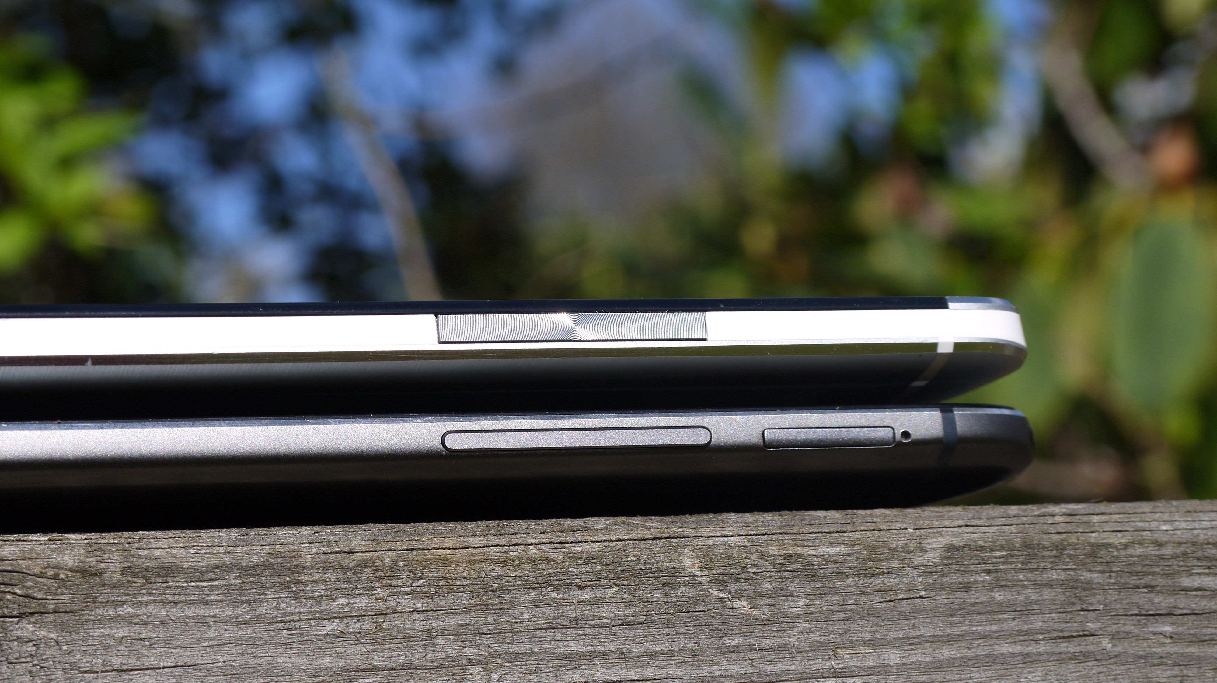
However, the keys still feel a little plastic and have a little bit of wiggle when rocked back and forth. This is the same criticism I had with the first One, and it got sorted after a couple of months, but I'd expect a phone of this calibre to have every part of the device locked into place - a rattle ruins things a little bit.
The power button is still on the top of the phone, which I can live with, but it's been moved from the left to the right side. I've argued with a few people about this, as it seems that some people prefer this orientation where others find it incredibly hard to hit.
I'm in the latter camp, as my finger naturally sits on the left of the phone and I found it very easy to unlock the first One. Now not only do I have to shuffle along to find the power button, but whenever I do so I accidentally engage the volume key, meaning I always keep turning the ringtone up and down.
This was probably the most infuriating part of the HTC One M8 - which isn't a bad thing to have at all, but is a poor thing to happen over and over again.
I'm also a bit perplexed about the fast HTC decided to drop the capacitive buttons (understandable given Android 4.4 KitKat's love of on-screen keys) yet keep the same big black bar that contains the HTC logo. This feels like a lot of wasted real estate on the front of the phone, and could have allowed the brand to keep the same footprint as the previous model if it had found another place to chuck its name.
The reason for this is probably due to the need to pack in the necessary internal components while maintaining the BoomSound speakers, but given the level of intelligence on show here when it comes to packaging the device, it seems like a missed trick.
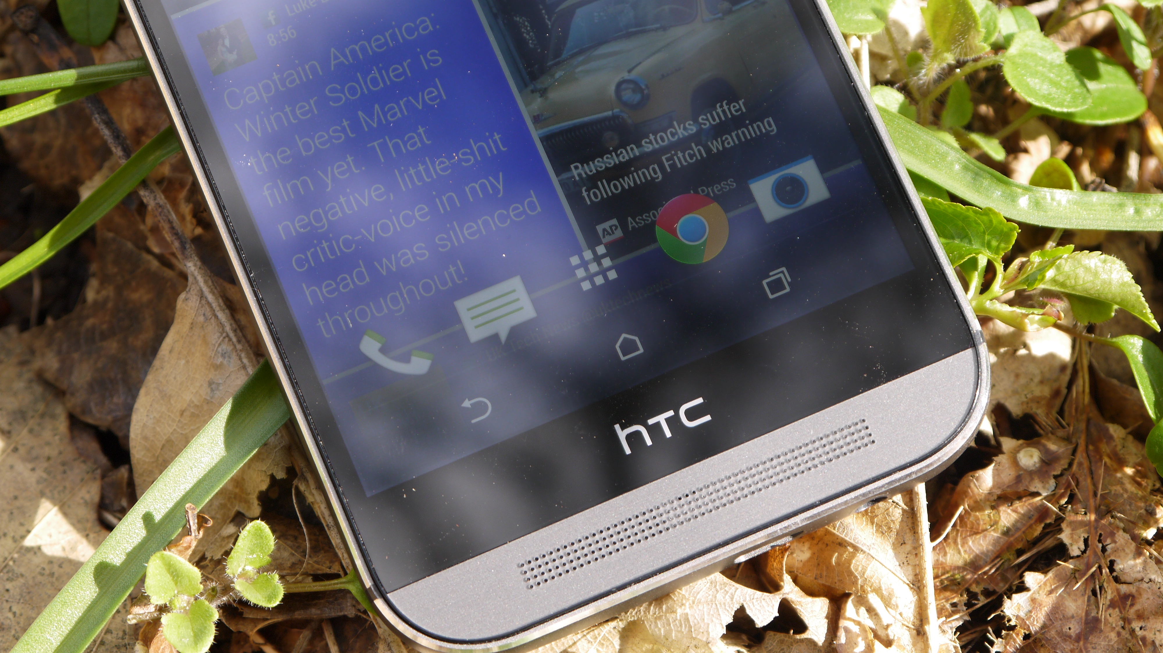
But before you get too downhearted, here's the upshot: the HTC One M8 is one of the most beautiful phones ever made, and that's a statement that's even more impressive given we were saying the same thing about the device this time last year.
The improved use of metal in the chassis really works, and the shape is updated without losing any of the heritage of last year's popular model. The addition of a microSD slot is inspired, and while I can't say I'll ever get on board with the headphone jack being on the bottom, it's something that you can live with.
In short, if you want a phone that looks the absolute business in the smartphone world, AND builds in some top-end components, you couldn't do much better at the time and even now the M8 is one of the best looking phones around.

Gareth has been part of the consumer technology world in a career spanning three decades. He started life as a staff writer on the fledgling TechRadar, and has grew with the site (primarily as phones, tablets and wearables editor) until becoming Global Editor in Chief in 2018. Gareth has written over 4,000 articles for TechRadar, has contributed expert insight to a number of other publications, chaired panels on zeitgeist technologies, presented at the Gadget Show Live as well as representing the brand on TV and radio for multiple channels including Sky, BBC, ITV and Al-Jazeera. Passionate about fitness, he can bore anyone rigid about stress management, sleep tracking, heart rate variance as well as bemoaning something about the latest iPhone, Galaxy or OLED TV.
