TechRadar Verdict
A very nice piece of hardware that performs well, but we shouldn't be running out of app storage space on day one
Pros
- +
Well designed body
- +
Interactive lock screen
- +
Responsive screen and buttons
- +
Glitch-free home screens
- +
Clever Facebook integration
Cons
- -
Laggy camera
- -
Ugly HTC Facebook pages
- -
Woeful onboard app memory
- -
Earpiece volume too quiet
Why you can trust TechRadar
There's a slight lack of high-quality action in the mid-sized Android phone section. The big manufacturers are focusing their attentions on creating monstrous, high-end "super-phones" with entire LCD monitors stuffed in their cases, while the smaller phone makers concentrate on offering budget handsets with smaller screens and lower specs.
Thankfully the HTC Salsa has appeared to fill that touchscreen gap, and comes as a throwback to 2010's lovely little 3.2-inch HTC Legend, trying to be the perfect compromise between performance, price and screen size – with added Facebook integration and a larger 3,4-inch HVGA screen.
With pricing expected to be around £20-£25 per month on contracts, could this be an affordable mass-market winner for HTC?
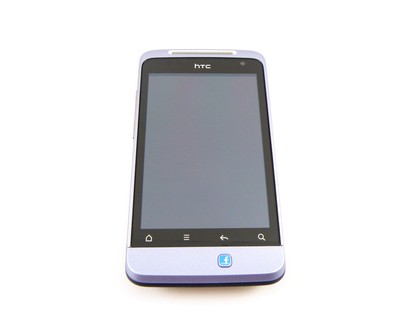
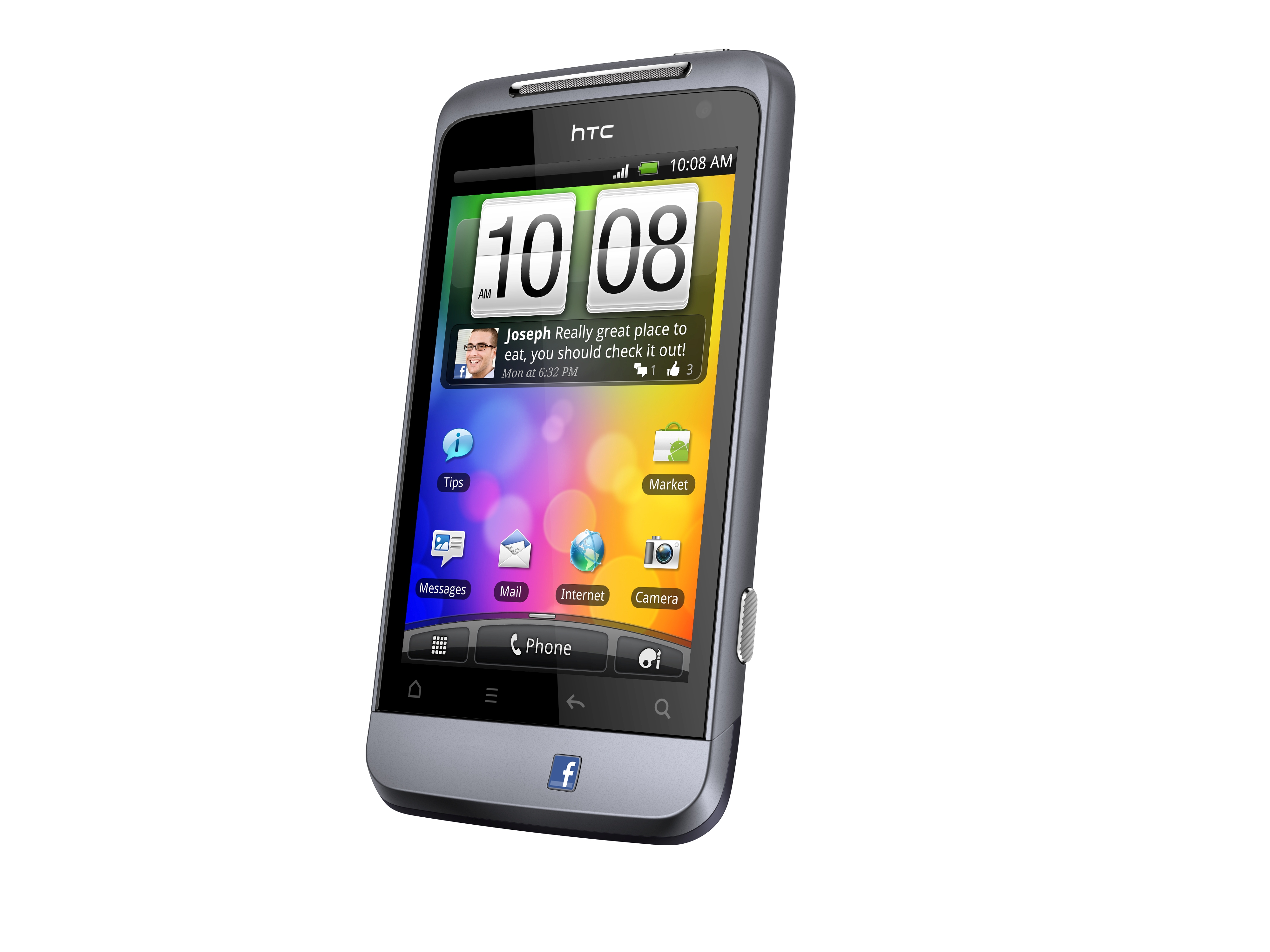
Physically, you get a tough, matte, metallic body, with HTC for once opting to use a colour other than black – the Salsa comes in a shimmering lilac. However, if you're a male user, you could get away with calling it a more macho "bluey-grey". It's certainly a relief to have something from HTC that isn't a dull, black, plastic rectangle.
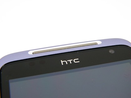
The form factor is similar to that of the HTC Legend, with a similar flared "chin" that used to be HTC's hallmark design feature plus the same four capacitive touch buttons.
The optical trackpad has, once again, been binned, as with HTC's Desire S and Wildfire S 2011 updates, making the Salsa a few millimetres shorter than the Legend despite the screen size boost.
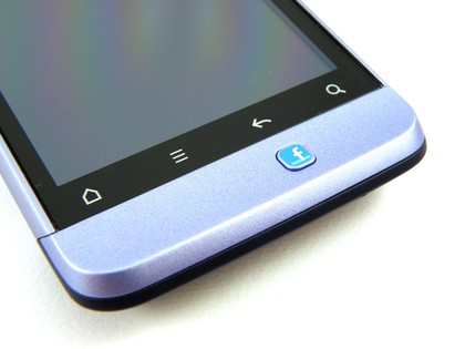
One of the finest physical touches is the Salsa's camera button. It's a proper, soft-touch button of the sort you'd find on a standalone digital camera, with a distinct two-stage press that makes focusing and shooting much, much easier than usual on cheap phone buttons, helping keep shots free of motion blur.
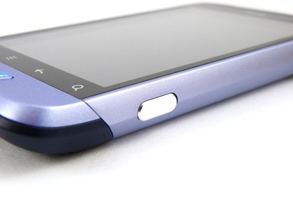
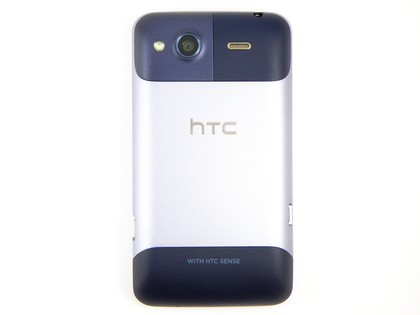
The Salsa is just as sweet looking around the back, with the bluey-grey metal nicely topped and tailed by grippy rubberised chunks.
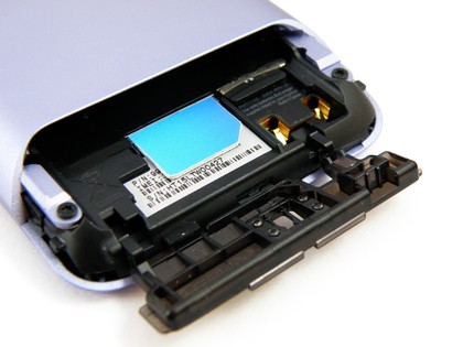
The bottom rubber section is removable, after a bit of a struggle and worry, to reveal the phone's insides, with the battery, SIM and SD card held in place by a locking plastic bar.
The HTC Salsa feels very nice in the hand, well-balanced and pleasingly heavy, with metallic side buttons and logos giving it a touch of class. The capacitive buttons and the physical Facebook one are all backlit, so there's no struggle when using it in the dark. Plus they make it look nice.
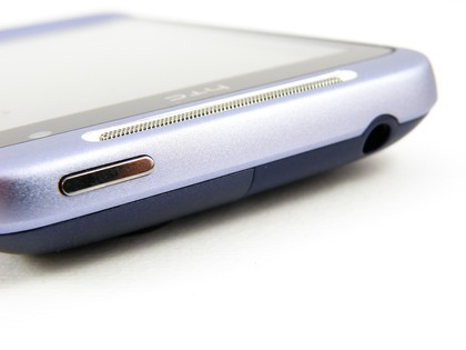
Everything else is as we've come to expect from one of HTC's 2011 Android range – a 3.5mm headphone jack and the power button along the top, silvery volume rocker and USB connector to the left. And it's every bit as robust as most HTC phones these days.
Current page: HTC Salsa: Overview, design and feel
Next Page HTC Salsa: Interface