TechRadar Verdict
Pros
- +
Slick interface
- +
Huge amount of feature support
- +
Skype integration
Cons
- -
Won't run on older phones
- -
App store is smaller
- -
Not as immersive as other platforms
Why you can trust TechRadar
Windows Phone has always been deliberately different; in earlier versions that sometimes meant missing options, no SD card support and tight control of what apps could do to protect battery life, as well as the live tiles of the Start screen putting your friends at your fingertips or the quirky charm of your Xbox avatar waving at you.
In Windows Phone 8, Microsoft sets out to fill in those gaps by improving on Windows Phone 7 without losing the positive aspects of what sets it apart from iOS and Android.

The new look for the Start screen is a great example of this.
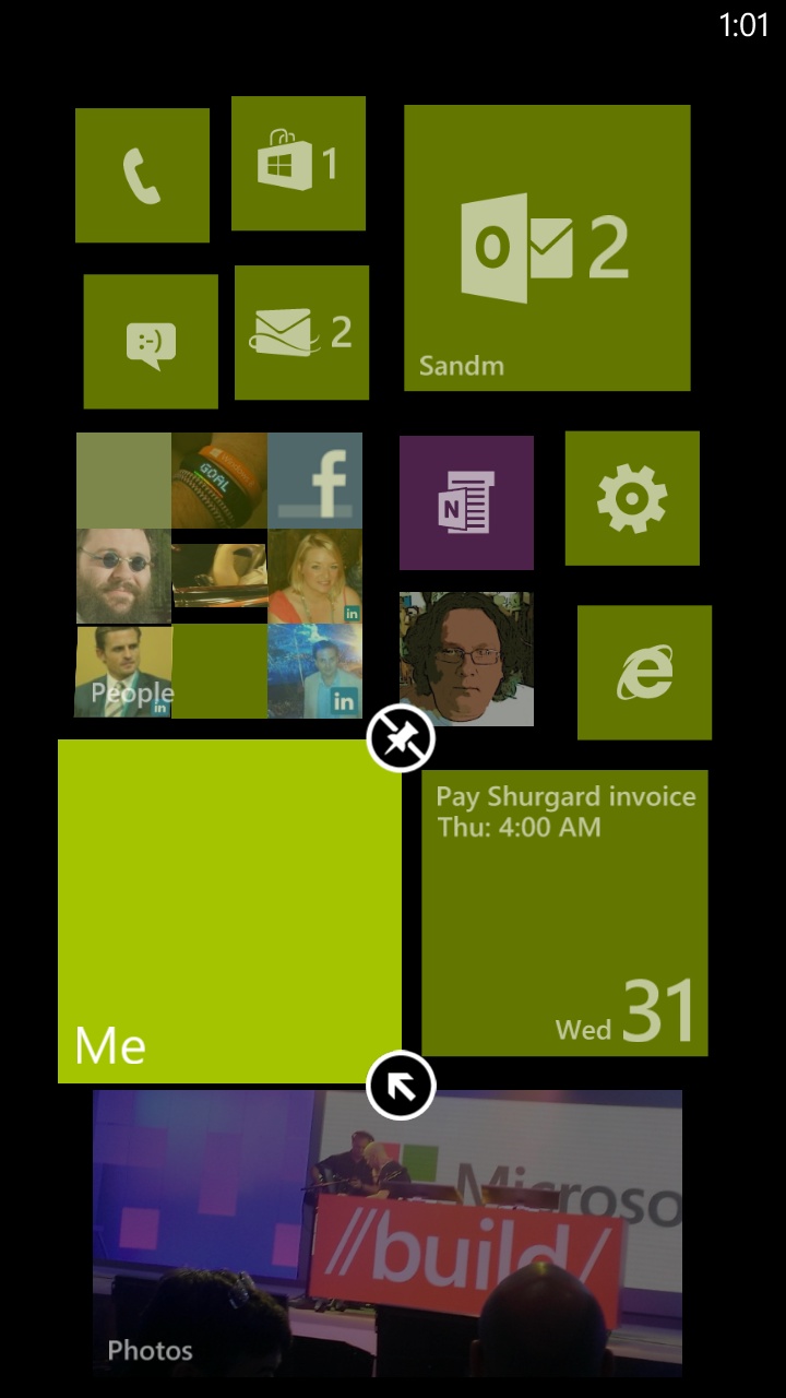
You still get live tiles for the apps that you choose to pin to Start but now you can set the size for every app, making it twice the width of a standard tile, or a tiny quarter-size tile.
If you want to see more information, like full details of your next appointment, you can make the tile for any app larger; that's no longer restricted to built in apps from Microsoft and phone makers.
Tiles like the dialler, maps, settings and Internet Explorer that don't show any live information don't have to take up a full slot on screen.
A nice side effect is that you can create a much more interesting layout with offset tiles, instead of just a two-by-four grid of tiles.
Sign up for breaking news, reviews, opinion, top tech deals, and more.
Microsoft has also done away with the gulley down the right side of the homescreen which encouraged you to slide across to the app list but seriously ate into the screen real estate, with the Live Tiles on Windows Phone 8 enjoying the full width of the display.

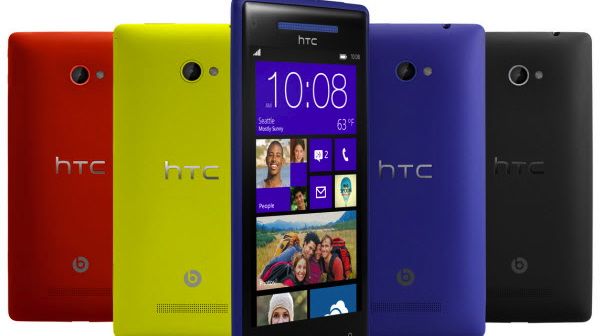
There are now twenty different accent colours to choose from as well; three greens, two pinks - even steel and taupe - so you can get a much more stylish and personal look.
The lock screen is more personal and more useful too.
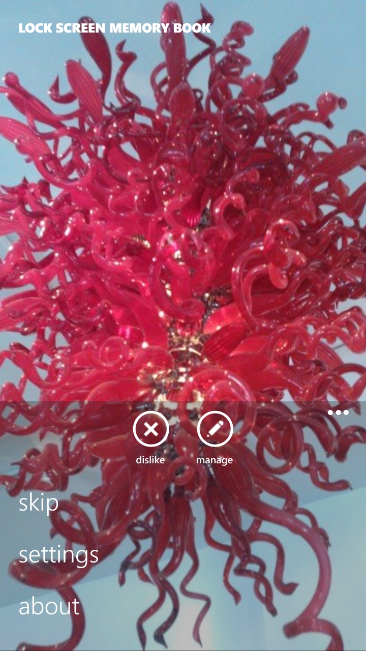
Instead of picking one photo you get bored with, you can get the image of the day from Bing or a selection from your Facebook photos, or you can choose your favourite photos on the device, so there's something new every time you look at your phone.
Any app can offer dynamic lock pictures, and the five notification slots are no longer limited to the built-in apps; if you're running WhatsApp or you care more about Facebook messages, you can get those notifications on the lock screen instead.
The other new feature is the ability to see lock screen widgets too, be it sports scores or up coming calendar entries, making one of the most oft-used displays more useful than before.
Since the release of Windows Phone 8 Microsoft has released Windows Phone 8.1. This new update is available to almost all Windows Phone 8 devices and brings further improvements and new features to Microsoft's mobile operating system.
Mary (Twitter, Google+, website) started her career at Future Publishing, saw the AOL meltdown first hand the first time around when she ran the AOL UK computing channel, and she's been a freelance tech writer for over a decade. She's used every version of Windows and Office released, and every smartphone too, but she's still looking for the perfect tablet. Yes, she really does have USB earrings.


