TechRadar Verdict
The Xperia Z2 is an excellent smartphone with all the components you'd expect from a flagship device, providing a pleasing user experience. The trouble is, it doesn't excite me.
Pros
- +
Feature packed camera
- +
Great screen
- +
Decent battery life
Cons
- -
Sluggish at times
- -
Bezel heavy design
- -
4K recording issues
Why you can trust TechRadar
The Sony Xperia Z3 may be Sony's current flagship handset, but that doesn't mean the dust has settled on the Sony Xperia Z2.
Released over a year ago and a little over 12 months since the Xperia Z hit the shelves, the Xperia Z2 still has a lot to offer. It builds on its predecessor, the Sony Xperia Z1 with an improved screen, increased power under the hood and a slightly more compact chassis.
There's no question that the Xperia Z2 went head to head with the Samsung Galaxy S5, HTC One M8, LG G3 and Nokia Lumia 930 last year - and with that in mind it' has its work cut out.
The introduction of the Xperia Z3 meant a price reduction for the Z2 making it even more appealing for some. Sony also added to the older phone by packing it with an update that included Hi-Res audio, a new battery saving mode and even the ability to play your PS4 remotely (cunningly called Remote Play).
Now that Android 5.0 Lollipop has landed, this phone is a real win for the lower cash.
It carried a lofty price tag of around £545 at launch, as you'd expect from a flagship handset but then the SIM-free Xperia Z2 dropped down to a more reasonable £300, $400 (around AU$580) SIM-free. In the UK you can grab the Z2 for free on two-year contracts starting at £17 per month.
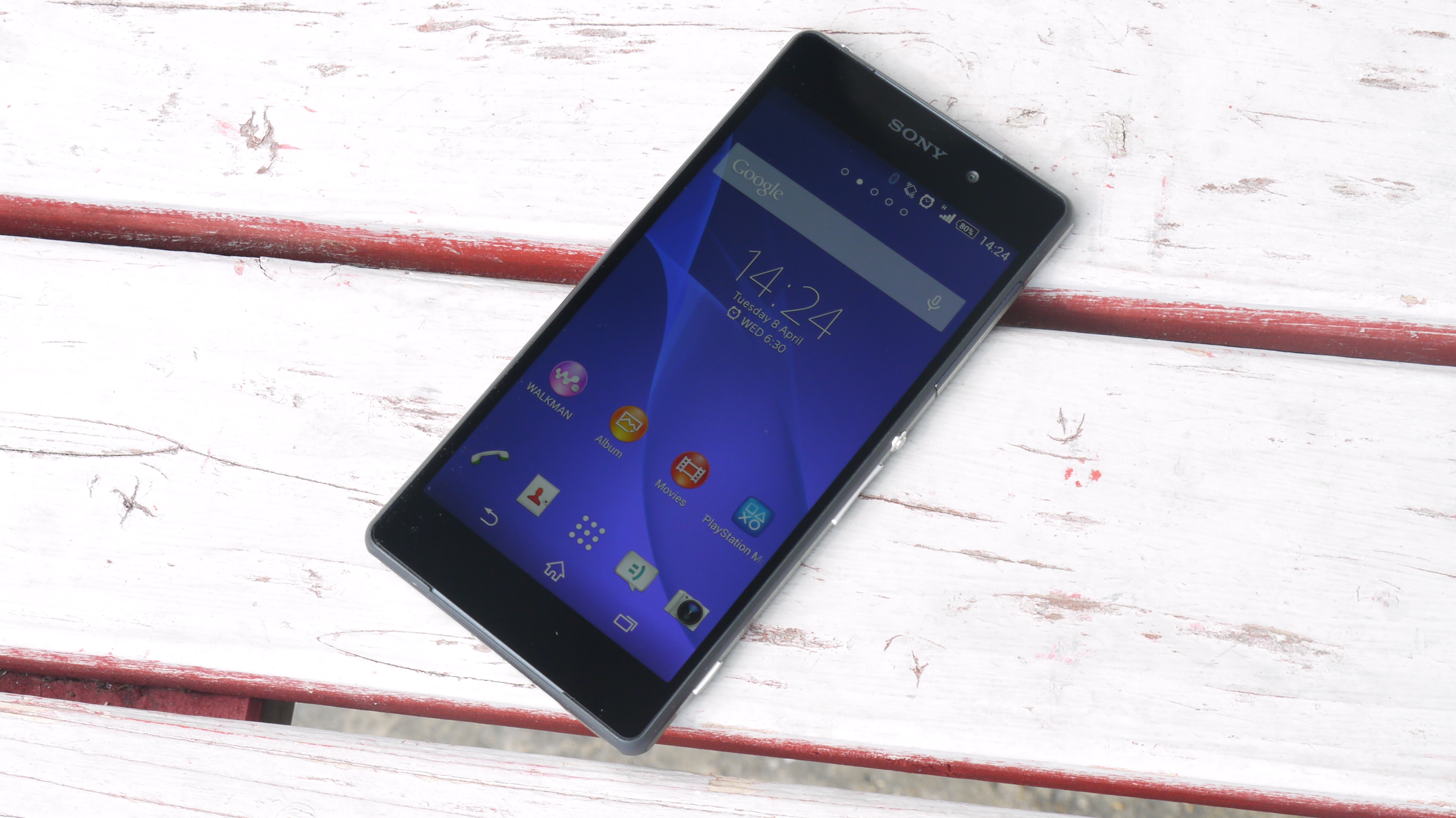
The Sony Xperia Z2 is pretty much on par with its direct rivals despite the arrival of the Xperia Z3. Although it's slightly cheaper than some now, so if you're looking for a way to choose between them pricing could be a factor that'll help you make up your mind.
Sign up for breaking news, reviews, opinion, top tech deals, and more.
You'd be hard pushed to tell the Z1 and the Z2 apart, as they look almost identical with the same metal and glass design providing a sturdy and premium, if not a little industrial, finish.
Sony has carried the same design principles through to the Z3 so the two handsets look very similar, although there are slight differences in the dimensions. The Z3 has been on a diet and thus, is 0.7mm thinner and 9g lighter than the Xperia Z2.
The slabs of glass on the front and rear of the Xperia Z2 may add a level of class to the handset, but they're also a magnet for fingerprints and dust.
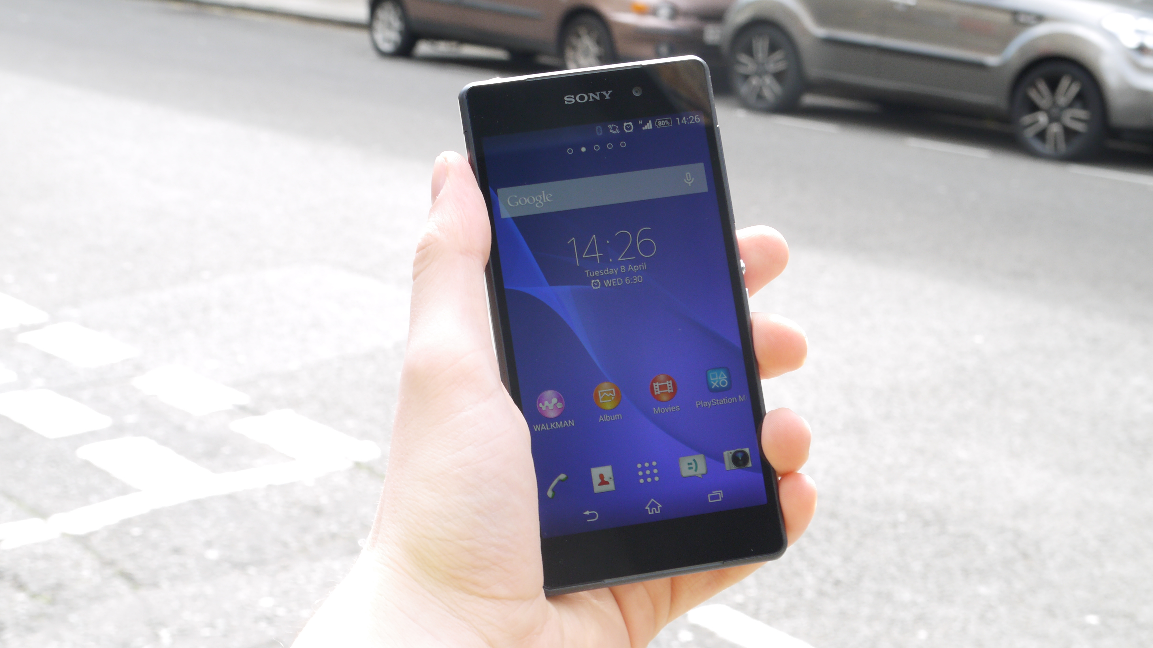
I was constantly wiping the Sony Xperia Z2 to clear the smudges off the screen, but within minutes they built up again. This got rather frustrating after a while, and with exactly the same thing happening round the back I felt like I was fighting a losing battle.
On a positive note the Xperia Z2's body appears to be far more robust than that of the Z1 and Z1 Compact, which were found to scratch and scuff remarkably easily making the handsets look bruised and battered.
Round the front Sony continues its trend of sizable bezels above and below the display, extending the length of the Xperia Z2 making it taller than its predecessor as well as the One M8 and Galaxy S5.
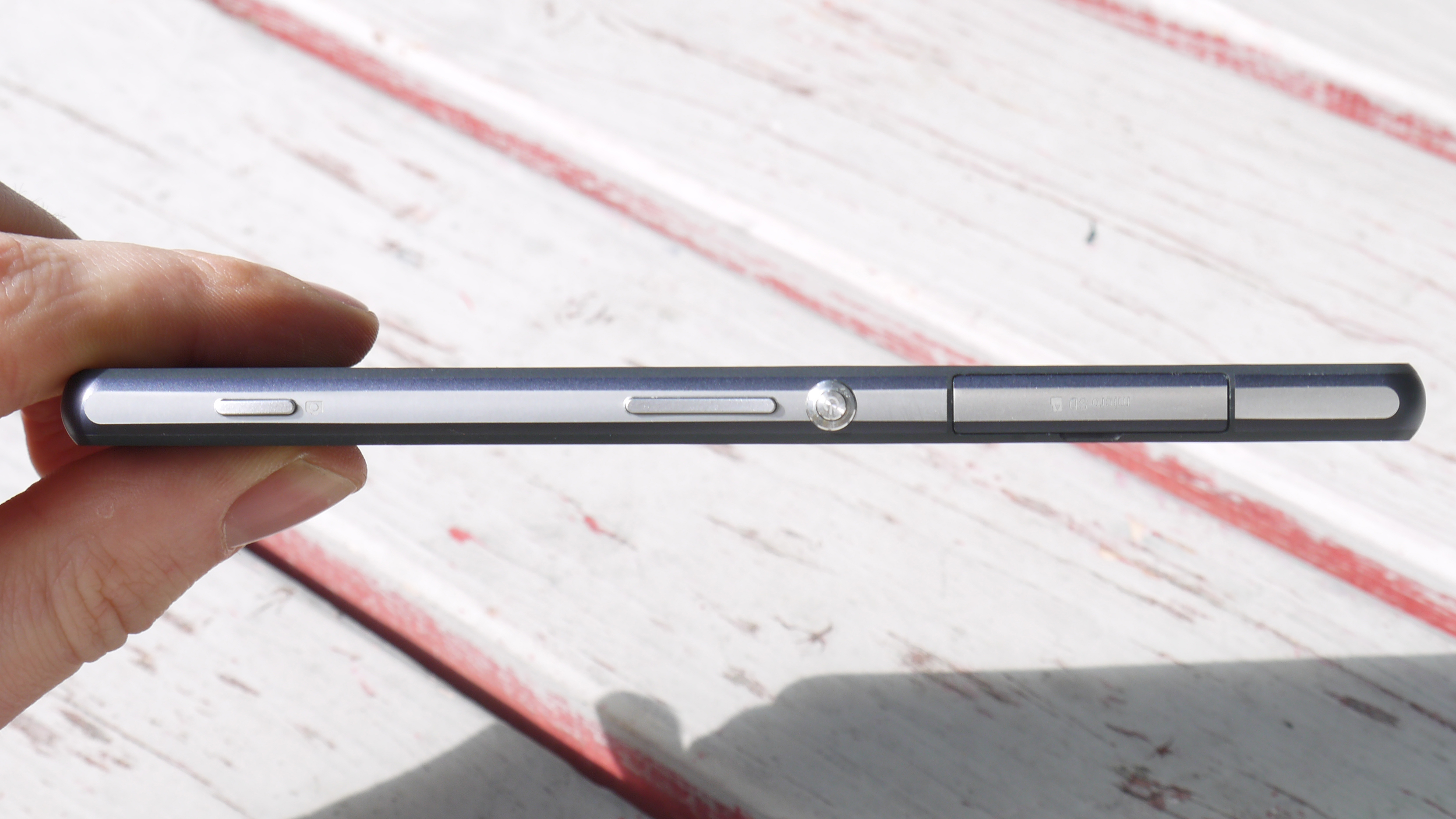
These extra large bezels do detract slightly from the overall finish of the handset, but I suspect in a similar fashion to the black bar below the screen on the One M8, they're all about squeezing in the latest tech under the hood.
Sony has narrowed the width and shaved off some of the depth in an attempt to make the Xperia Z2 usable in one hand, and for the most part it is.
It's by no way a small device, but I was able to hold the Xperia Z2 in my hand and access pretty much the whole expanse for the 5.2-inch display without calling in my second paw.
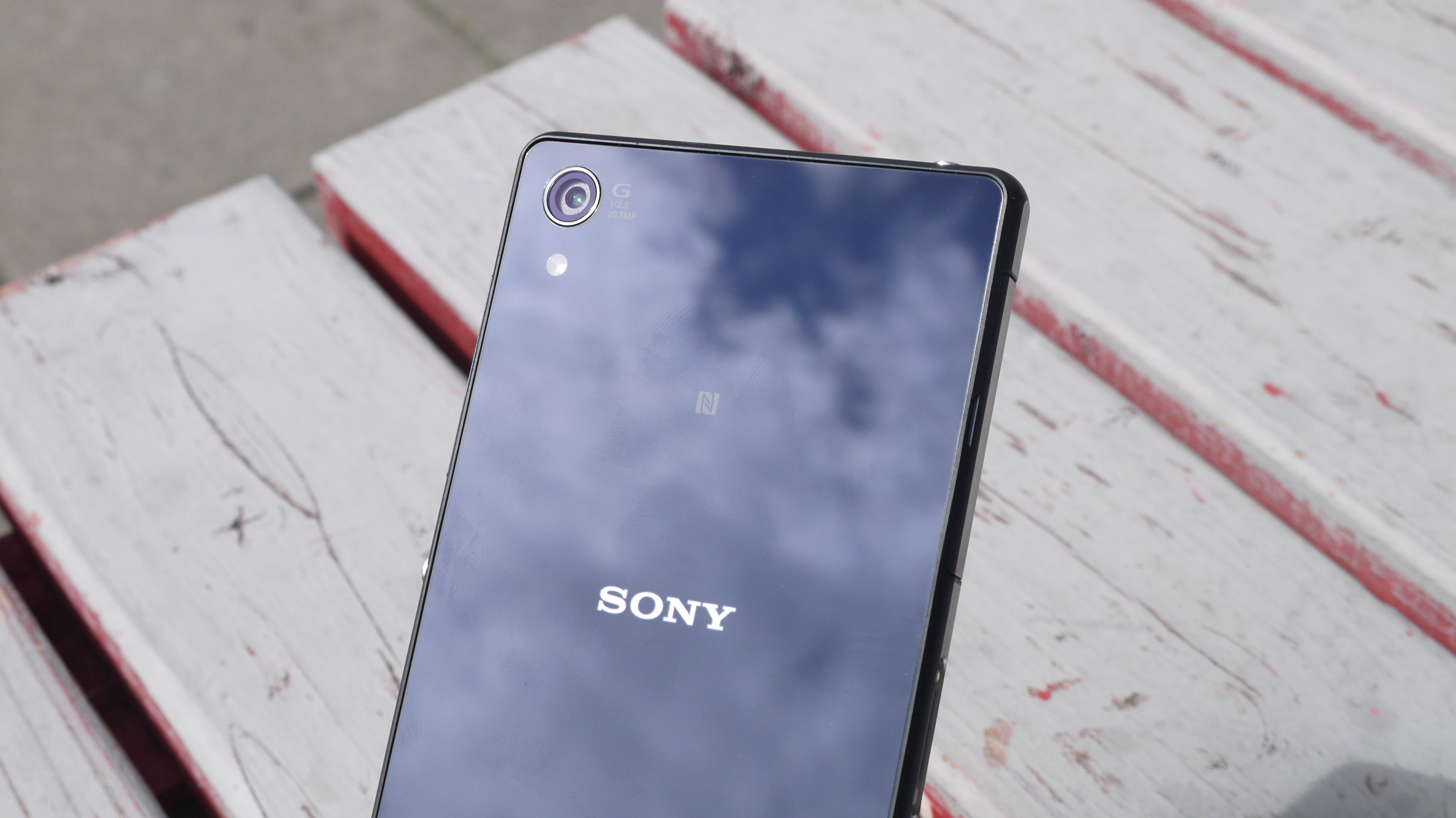
The metal and glass body doesn't give a huge amount of grip, and the flat angular design means it's not the comfiest handset to hold for extended period of times.
I came straight from the HTC One M8 to the Xperia Z2 and the curved rear on the HTC made it far more palm-friendly than Sony's offering.
Perhaps a nod towards HTC is the arrival of dual front facing speakers on the Xperia Z2, although at first glance you may not notice they're there.
Sony has been far more subtle with its placement compared to HTC, with small deviations in design at the top and bottom of the Xperia Z2's frame revealing slender speaker grills.
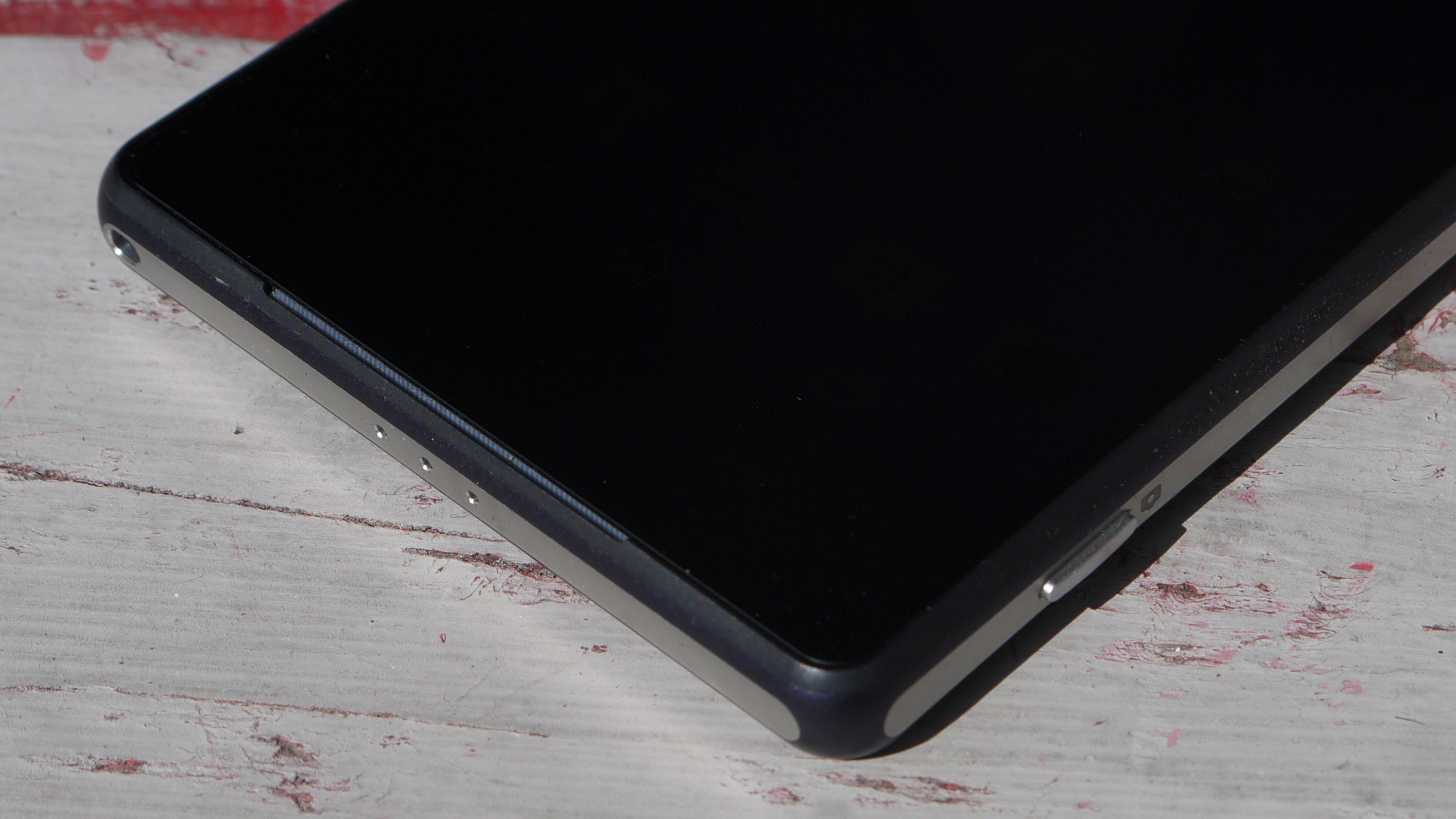
That subtle integration does mean that the bezels above and below the display are more pronounced, where as at least on the M8 the additional height appears more justified thanks to the big grills.
Hidden behind the upper speaker is a RGB notification LED, allowing the Xperia Z2 to alert you to a new message, Facebook post or email without you having to wake the screen. Different colours denote notifications from different services, making it easier for you to decide whether or not to check it out.
Flip the Xperia Z2 to landscape for a movie marathon or gaming session and you'll immediately benefit from the new speaker location. The Xperia Z1 had its speaker location on its base which was easily covered when held in landscape.
Back to portrait and the centralised power/lock key down the right side of the Xperia Z2 nestles under your thumb or finger, making it extremely easy to access.
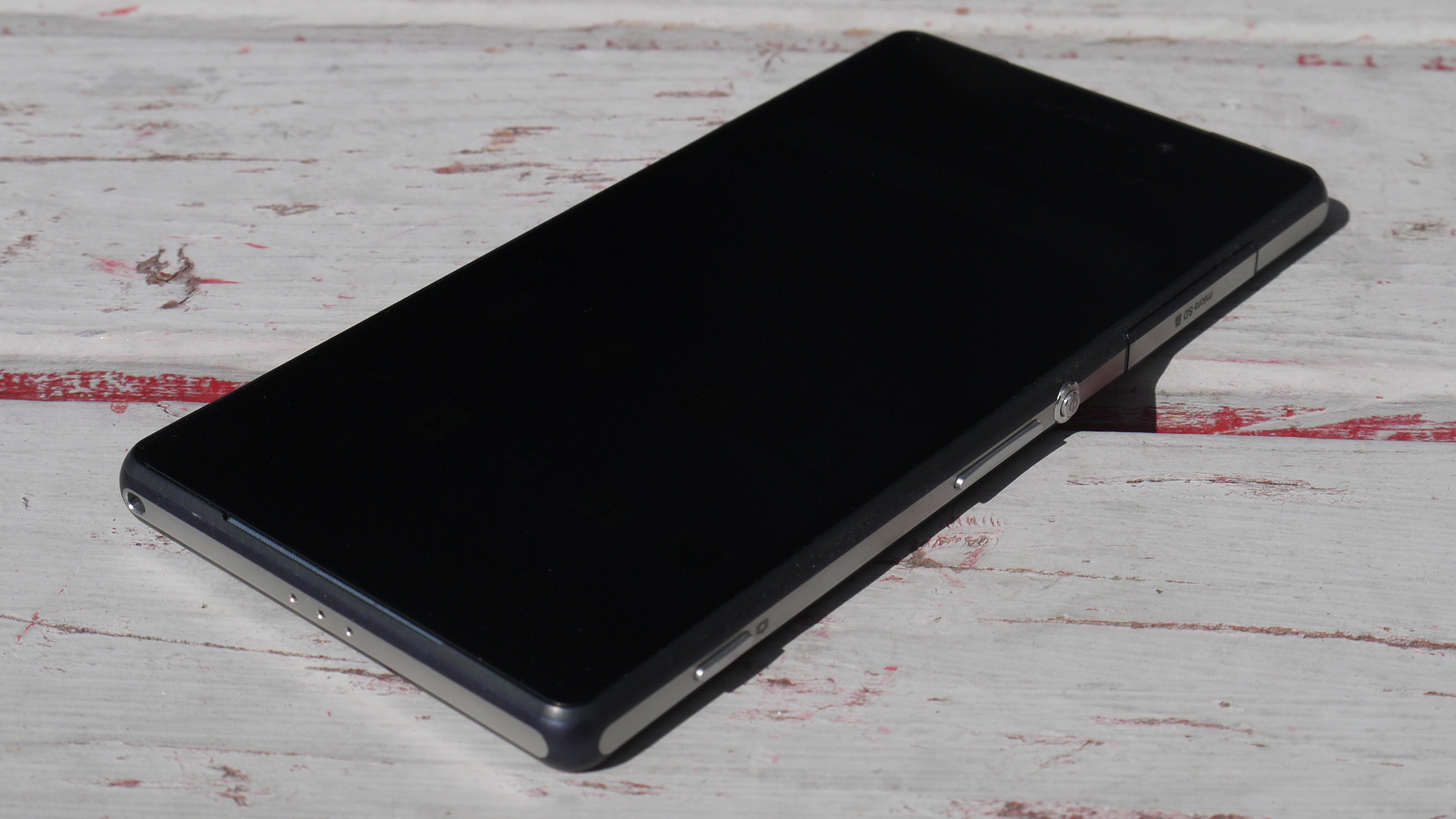
The volume rocker sits just below, again in an easy to reach position, while towards the base of the handset you'll find the dedicated shutter key which provides a shortcut to the camera app as well as a way to snap pictures underwater.
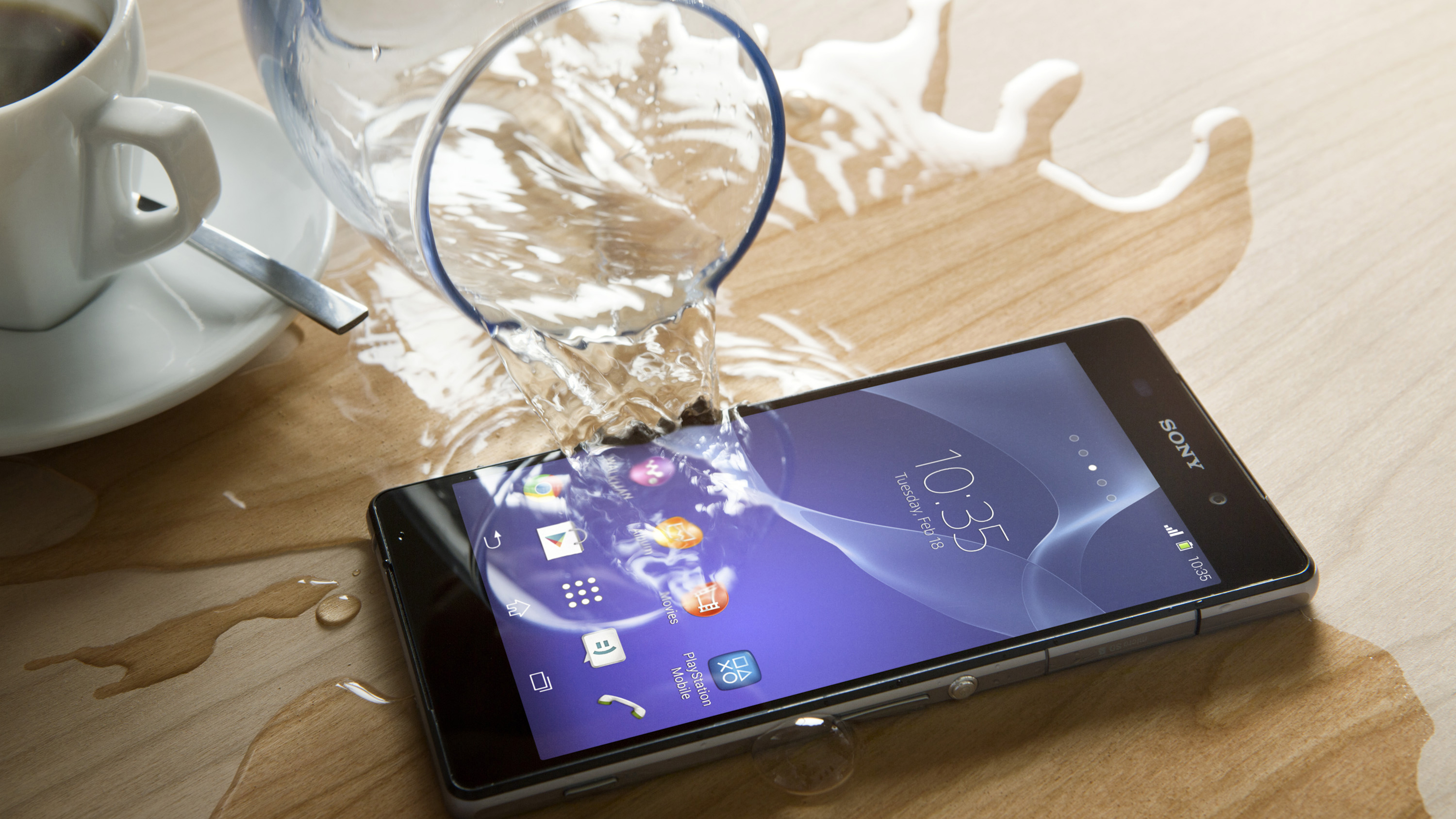
Sony has kept up its dust- and waterproofing tradition with the Xperia Z2 and thus you find the first of two flappy bits on the right of the handset.
It's tasked with covering the microSD slot, allowing you to build on the mediocre 16GB of internal storage with support of cards up to 128GB in size.
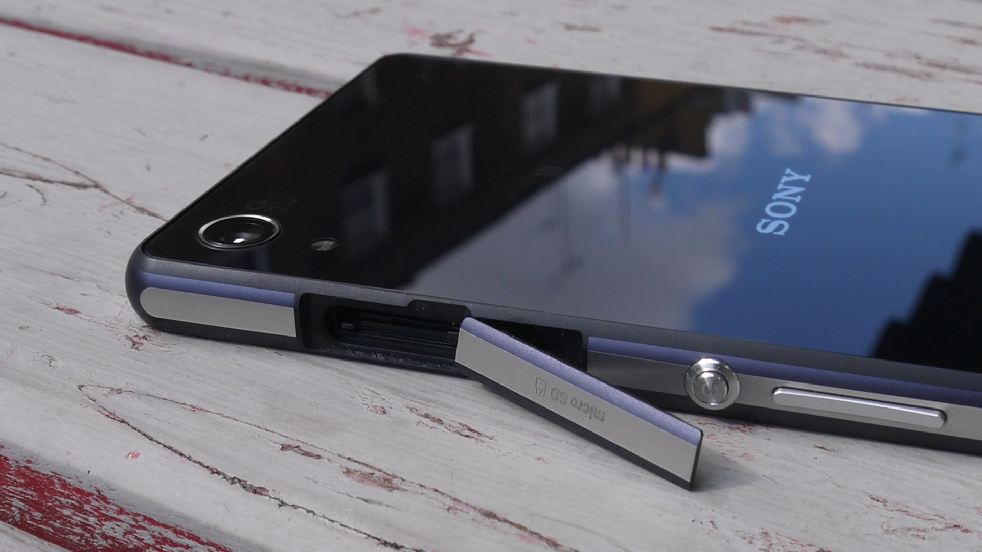
I found this flap, and the one of the left side covered the microSIM and microUSB ports, easy to remove and replace - although I fear for their durability. All it takes is for one of those flaps to fail and next time you take your Xperia Z2 into the bath it's game over.
There have already been reports of the Xperia Z2 failing to keep the water out, but during my dunking time with the handset I didn't experience any leakage. Just remember to close those flaps firmly!
It is frustrating to have to open a flap to access the charging port, and with it being located on the side of the device rather than the base like the Galaxy S5, it makes the Z2 harder to handle when plugged in.
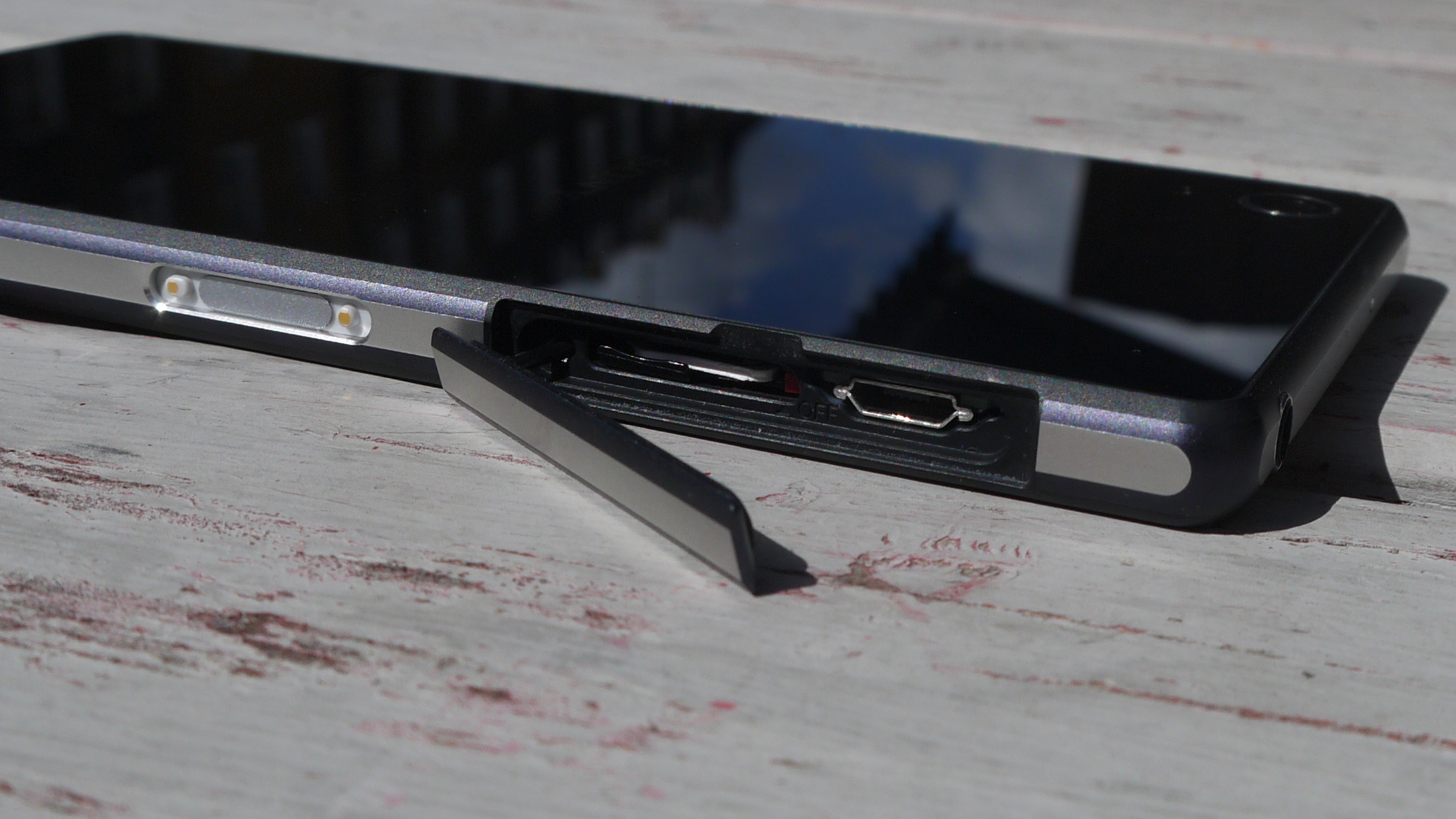
Anyone looking to upgrade from the original Xperia Z though will be pleased to see an uncovered headphone jack up top, continuing the tradition from the Z1.
Round the back the Xperia Z2 doesn't look that much different than the front, with the understated 20.7MP camera lens and single LED flash the only blemishes on the glass covered surface.
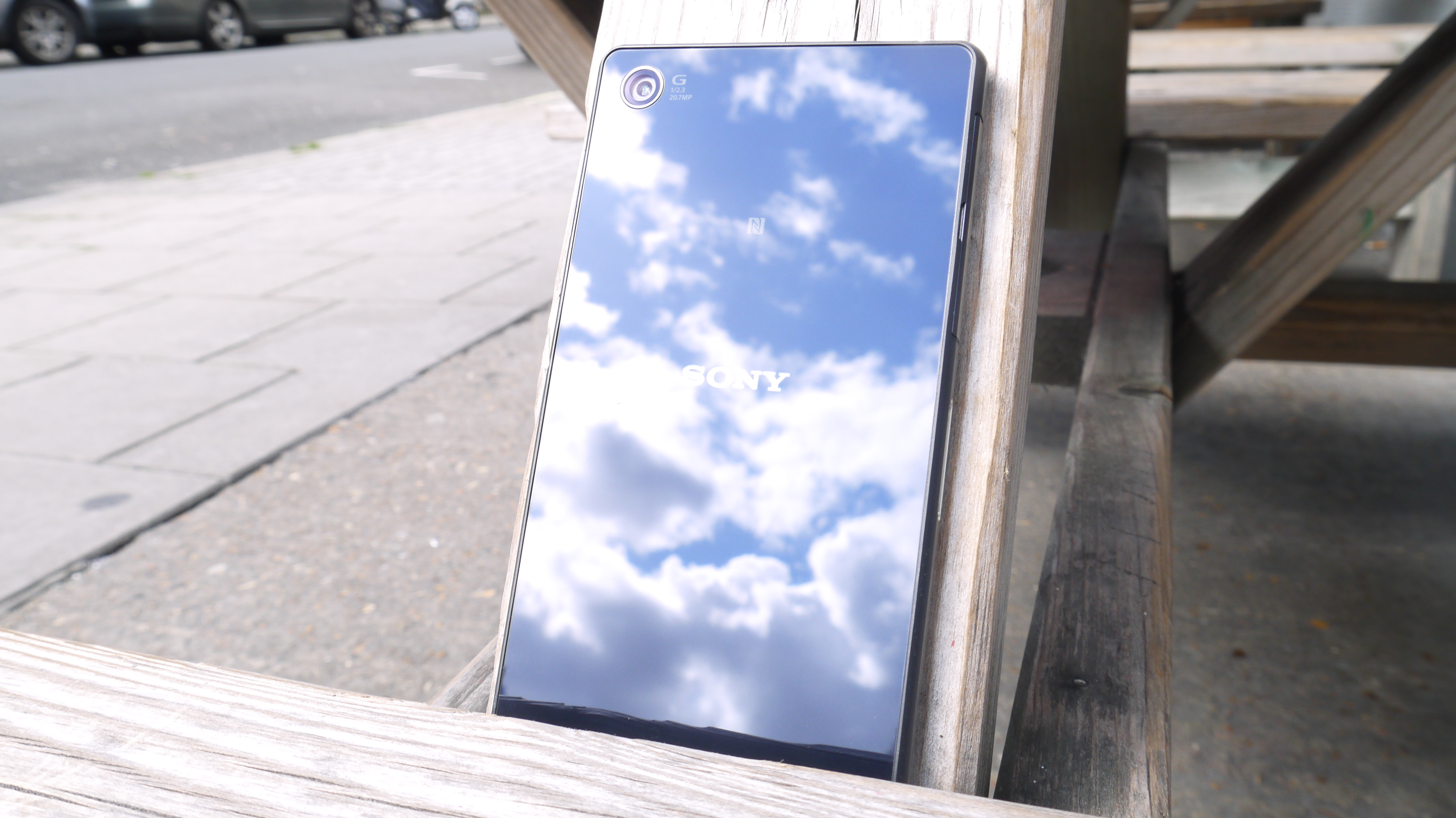
The Sony Xperia Z2 doesn't do anything outlandish in terms of style, and it's yet another black slab of glass - but it is a well built, premium, functional and waterproof device which certainly trumps the design of the Galaxy S5.
There's an argument to be made that it's been overshadowed by the arrival of the Sony Xperia Z3. And while that's true to some extent, it's only the case if you absolutely have to have the latest and greatest device.
Otherwise there's still plenty you can get from the Xperia Z2, as I shall demonstrate over the next few pages.

John has been a technology journalist for more than a decade, and over the years has built up a vast knowledge of the tech industry. He’s interviewed CEOs from some of the world’s biggest tech firms, visited their HQs, and appeared on live TV and radio, including Sky News, BBC News, BBC World News, Al Jazeera, LBC, and BBC Radio 4.
