TechRadar Verdict
A great handset that's more phablet than phone - and it's only slightly let down by lackluster design.
Pros
- +
Great screen
- +
Good camera in bright light
- +
Improved interface
- +
Can now be picked up cheap
- +
Android 5.0 feels smoother
Cons
- -
Lightweight chassis disappoints
- -
QHD doesn't wow
- -
Screen isn't particularly bright
- -
Android 5.0 has slowed app boot-up times
- -
Not enough of Lollipop's visual sheen in update
Why you can trust TechRadar
The LG G2 was one of the most critically acclaimed phones of 2013, exceeding all expectations. Strange then that one year after this triumph, LG seemed to have lost its confidence, rushing the release of the LG G3 as the market threatened to slip away.
With Samsung, Sony and HTC all bringing out superior models, LG couldn't afford to wait. Instead, it tried to race to the front of the pack with a dramatic step forward in screen technology.
Apart from that stunning screen, all the LG G3's enhancements were direct responses to criticism of the previous model: removable battery, microSD slot, metallic frame and a new, mature interface.
On top of all that, the company has finally rolled out Android 5.0 Lollipop to G3 handsets on certain networks in the UK, with the final set of users due to receive it in the very near future.
One major point in the G3's favour is the price. Where other handsets cost a huge chunk of cash, the G3 can be picked up for a little over half of the cost of a new iPhone 6, and has better specs in some regards. That's not bad at all.
So with that in mind, and with the LG G4 set to hit shops shortly, is the LG G3 the perfect smartphone?
Design
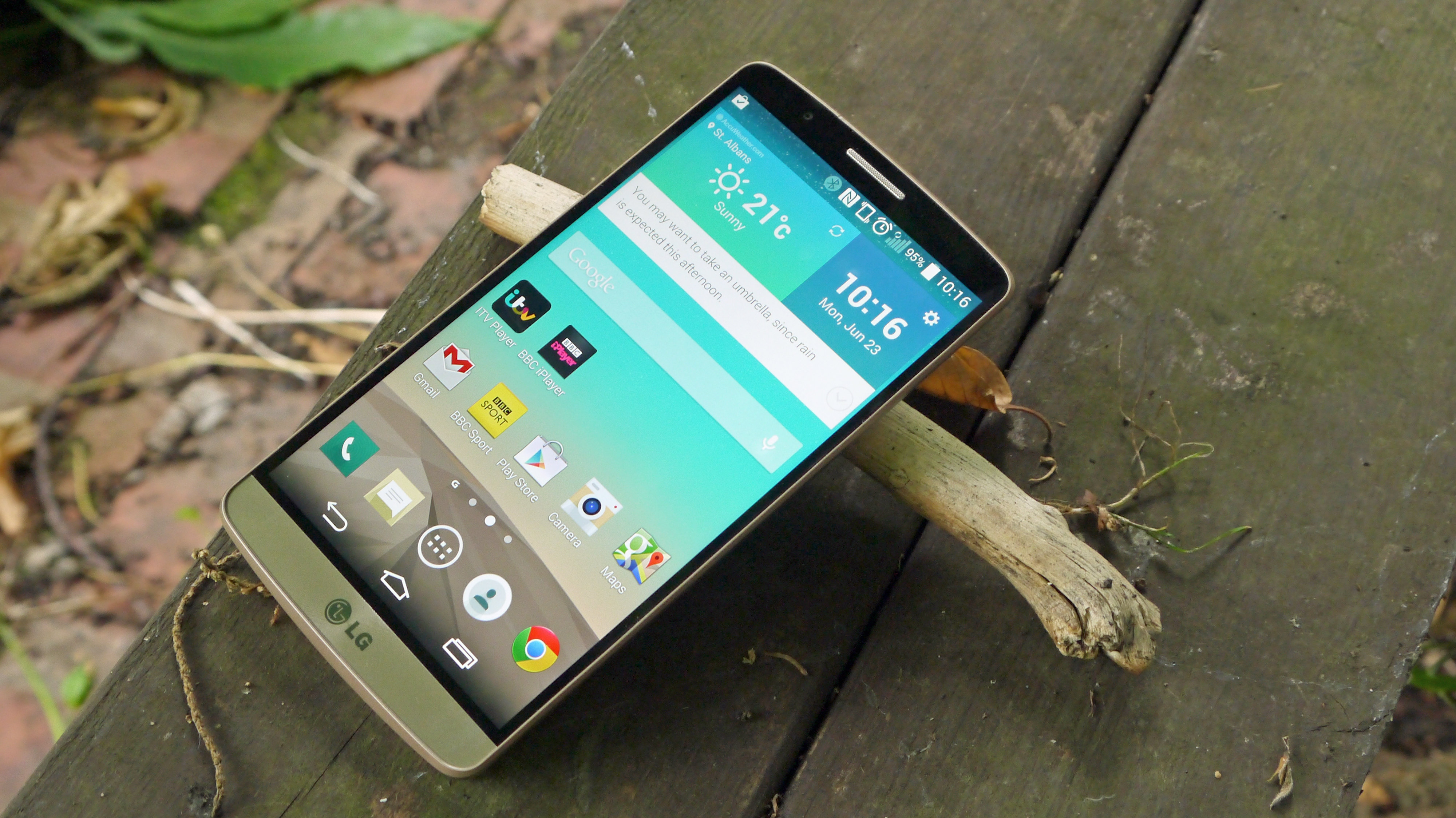
One of the features most heavily touted in the pre-launch leaks was the LG G3's new metallic skin. The all-plastic unibody of the G2 was one of the main reasons it didn't achieve five-star status, so the prospect of a metal body on the G3 caused much excitement.
Sign up for breaking news, reviews, opinion, top tech deals, and more.
But then when the phone was displayed for the first time, this turned out to be a plastic shell painted to look like a brushed metal case. LG was almost apologetic about this, saying it wanted to deliver a metal phone that felt as premium as possible, but the mechanics simply didn't allow for it.
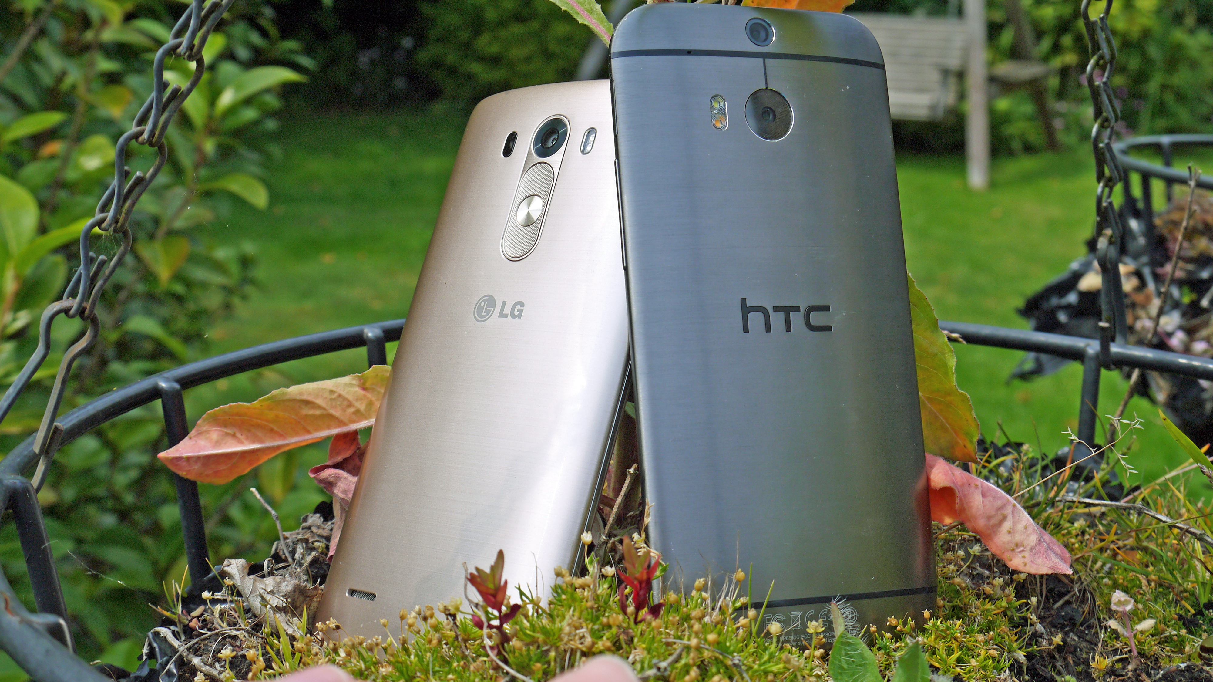
The result is a compromise. LG has created a special film that takes away the plastic feel somewhat, while still looking the part in a world where consumers are crying out for high-end design. And on a table or on the shop shelf, it's a great looking phone.
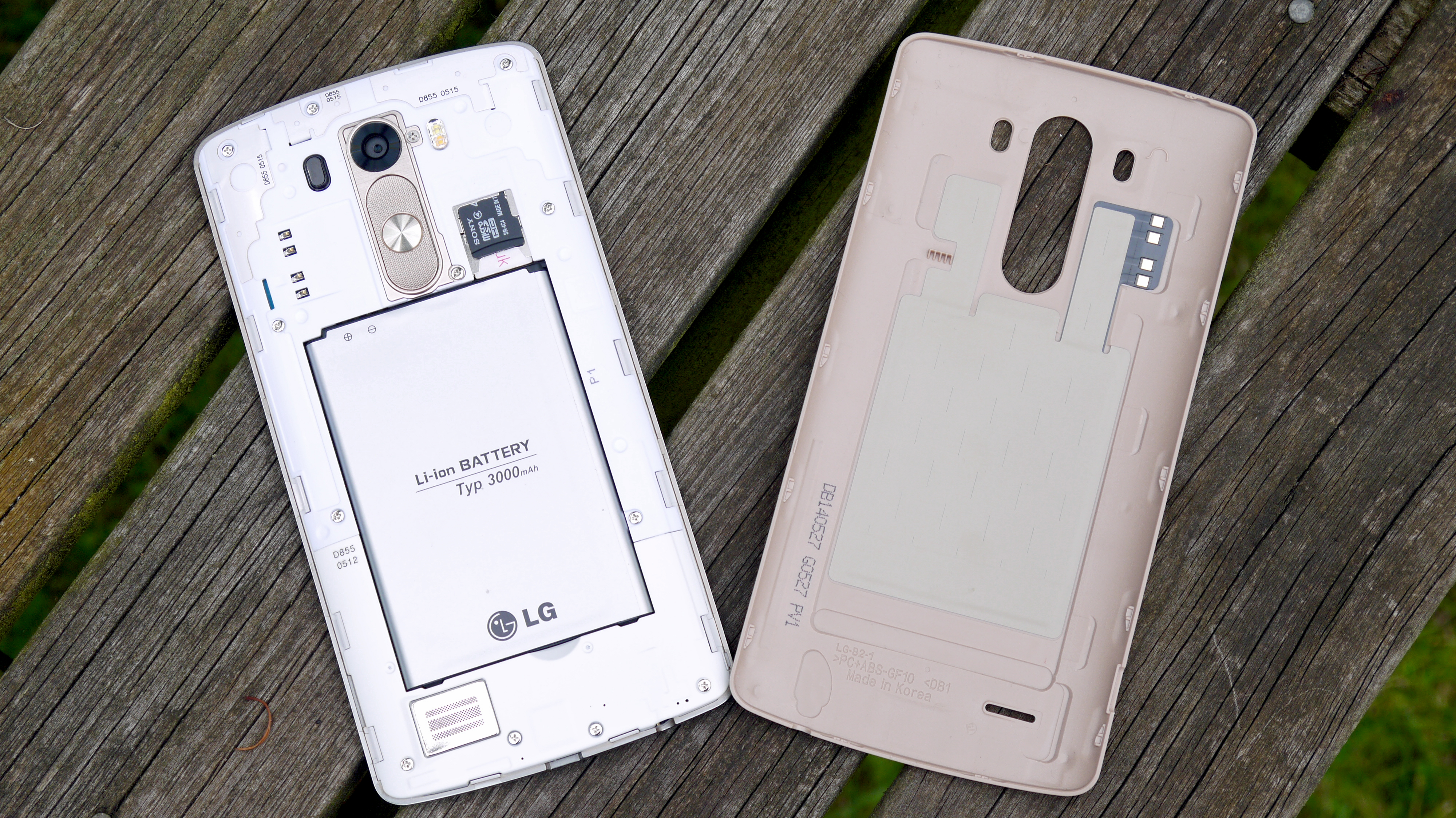
LG has done something else that I was keen to see: made the backplate removable, allowing you to swap the battery and add in a microSD card. I'm not convinced that a removable battery is strictly necessary in a phone, but I always think a microSD card is a good option to have.
That's especially true because the LG G3 only comes in 16GB and 32GB options and most will buy the former, which doesn't give a huge amount of room for all the larger apps on offer these days.
Unfortunately, the removable battery demands a backplate, which means that despite being made of a more refined material, the LG G3 actually feels cheaper in the hand than the G2. Not by much, but enough for me to long for this metallic plastic to be used on the older version.
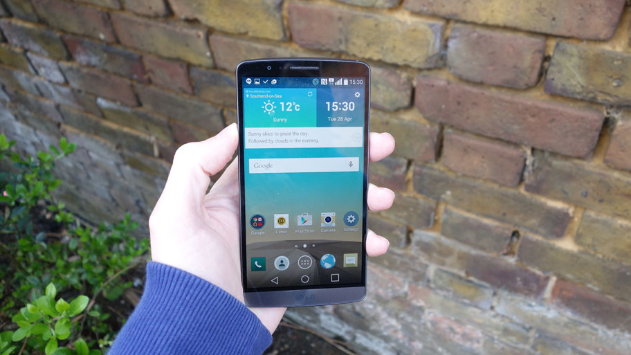
And then there's the issue of the screen. Not the actual display itself, which is excellent, but the size of it.
The smartphone category is constantly evolving. Where once we thought any display over 4 inches as enormous, it's now tiny. Phones with a 5-inch screen have become a normal option at the high end, although I get the feeling that this is the limit of what's acceptable.
The G3's 5.5-inch screen is just too large to be considered a smartphone – we're definitely at the bottom end of phablet territory here. This means it's not as fluid to navigate the screen with one hand. Combined with the more angular corners, using the G3 is not a great experience, despite its impressively thin bezels.
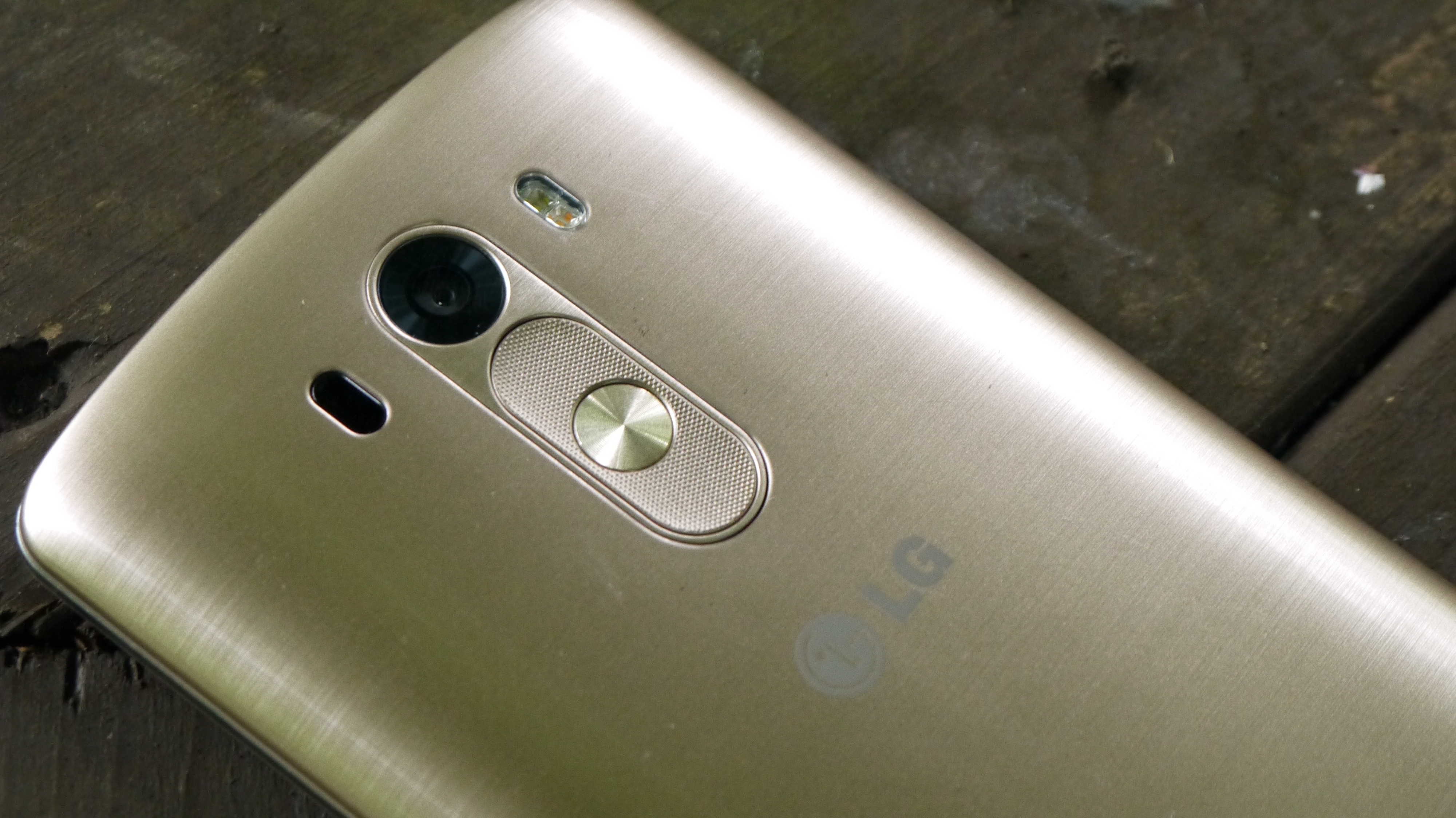
I do like the rear buttons though. The principle gets burned into your muscle memory much faster than you'd expect, to the point where I keep tapping the camera on other handsets in a futile attempt to turn off the screen.
And LG's upgrades here (including making the power button more rounded and the volume keys ridged) mean it's even easier to operate without looking. If you're thinking this is a reason not to buy the phone, then disregard it – it's actually a really neat feature and one that I'm surprised hasn't been copied yet.
In summary, LG has both improved the design of its flagship phone and taken a couple of steps backwards. The G3 certainly looks more premium, and offers the removable battery and microSD slot some people believe they simply cannot live without.
But the separate backplate means the whole thing is less tightly packaged, and I found holding it less pleasant than I did the G2.
If you're going to make a phone look metallic, then it ought to have the same satisfying weight as the HTC One M9 or iPhone 6 Plus, whereas this is more like the Samsung Galaxy S5 in feel, albeit with a coat of paint and no weirdly dimpled back.
True, the new design is much less prone to fingerprints than the predecessor, but that doesn't change the fact that those who don't want a phablet will see the G3 as a touch too large.

Jon is a freelance journalist who has been covering tech since the dawn of the smartphone era. Besides TechRadar, his words and pictures have appeared in The Telegraph, ShortList, Tech Advisor, Trusted Reviews, Expert Reviews, and more. He largely covers consumer technology, with a particular focus on smartphones and tablets. However, he's also been known to dabble in the worlds of entertainment and video games.
