TechRadar Verdict
The Lumia 950 proves that there's a lot going for Windows 10 Mobile, though also a lot of work to be done. Its best trick is that it blows up to desktop-like proportions with Continuum, but it sorely needs apps. Dedicated Microsoft fans and willing beta testers need apply.
Pros
- +
Windows 10 Mobile is slick
- +
Iris-scanning lockscreen
- +
Continuum is its best trick
Cons
- -
App situation is dire
- -
Microsoft Maps is 'Apple Maps bad'
- -
Call quality is subpar
Why you can trust TechRadar
Update: The big Windows 10 Anniversary Update has arrived on the Microsoft Lumia 950. But unlike desktops and laptops, the new software doesn't bring a whole lot of new goodies to Windows 10 Mobile.
In fact, if you go in cold and look for noticeable changes, you probably won't find any. However, there are some useful additions that will make using the Lumia 950 a little better.
Microsoft has added panorama mode to its stock Camera app – a fairly self-explanatory feature. It has also made the lock screen more informative by allowing for more at-a-glance notifications.
Lastly, Action Center has been updated to allow users to set the priority level of specific notifications so that you'll never miss what matters to you.
Original review follows below.
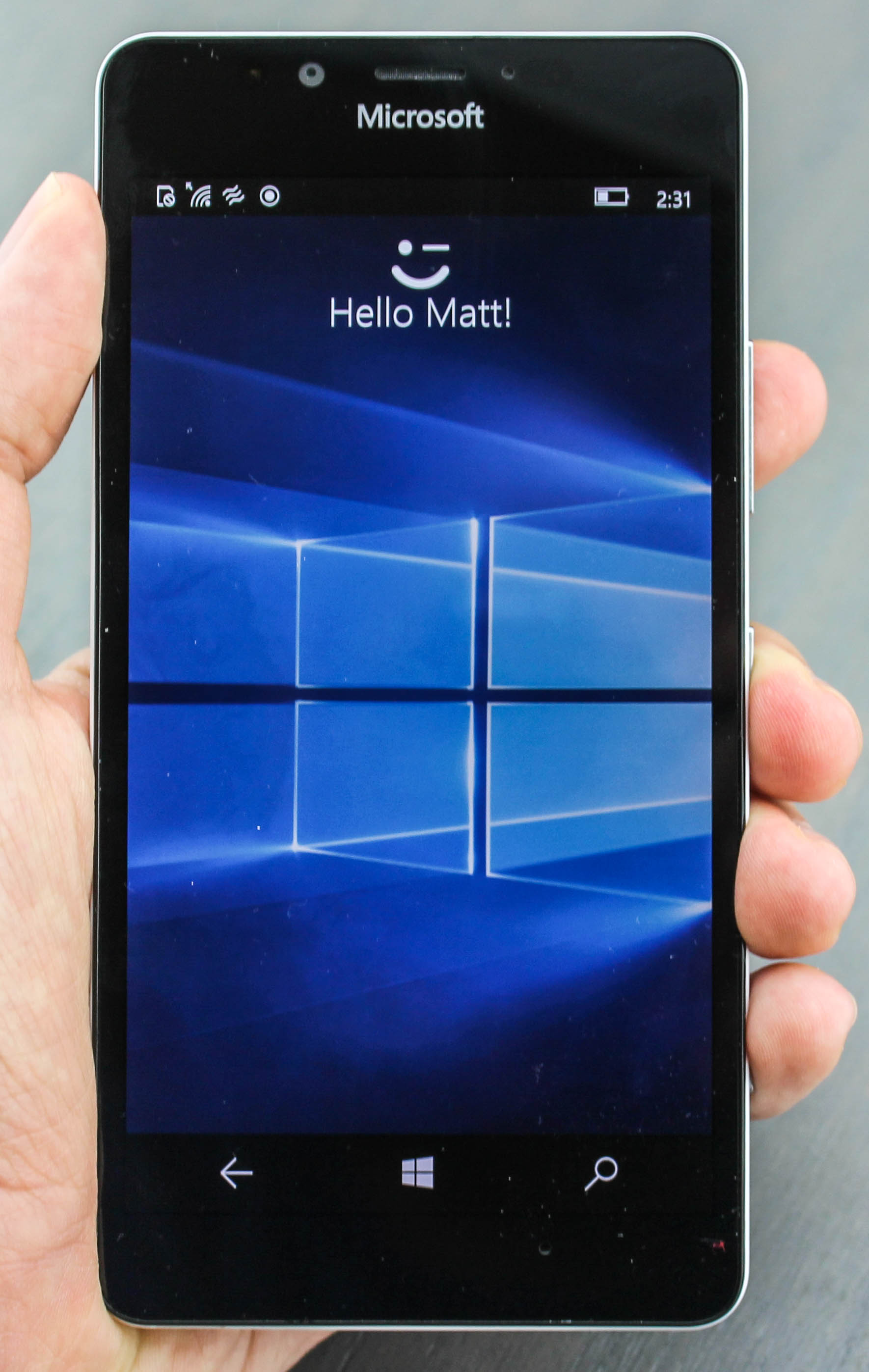
Whenever I look at the Microsoft Lumia 950, it scans my eyes, winks at me and unlocks with the words "Hello, Matt" – as if it knows me and wants to flirt. In a way, I feel like I recognize it, too. And, I won't lie, I kind of like it back … just not that much.
It reminds me of my first true smartphone, the Audiovox SMT 5600, a rebranded HTC Typhoon, before HTC even sold phones. It was small, so it looked like an everyday phone and, importantly for me at the time, it ran Windows Mobile 2003 SE.
More than a decade later, that's once again the appeal of the Lumia 950. It looks, feels and runs like your average-sized Android phone. Only the phone's operating system is Windows 10 Mobile, much to the benefit of Microsoft's diehard fans and PC holdouts.
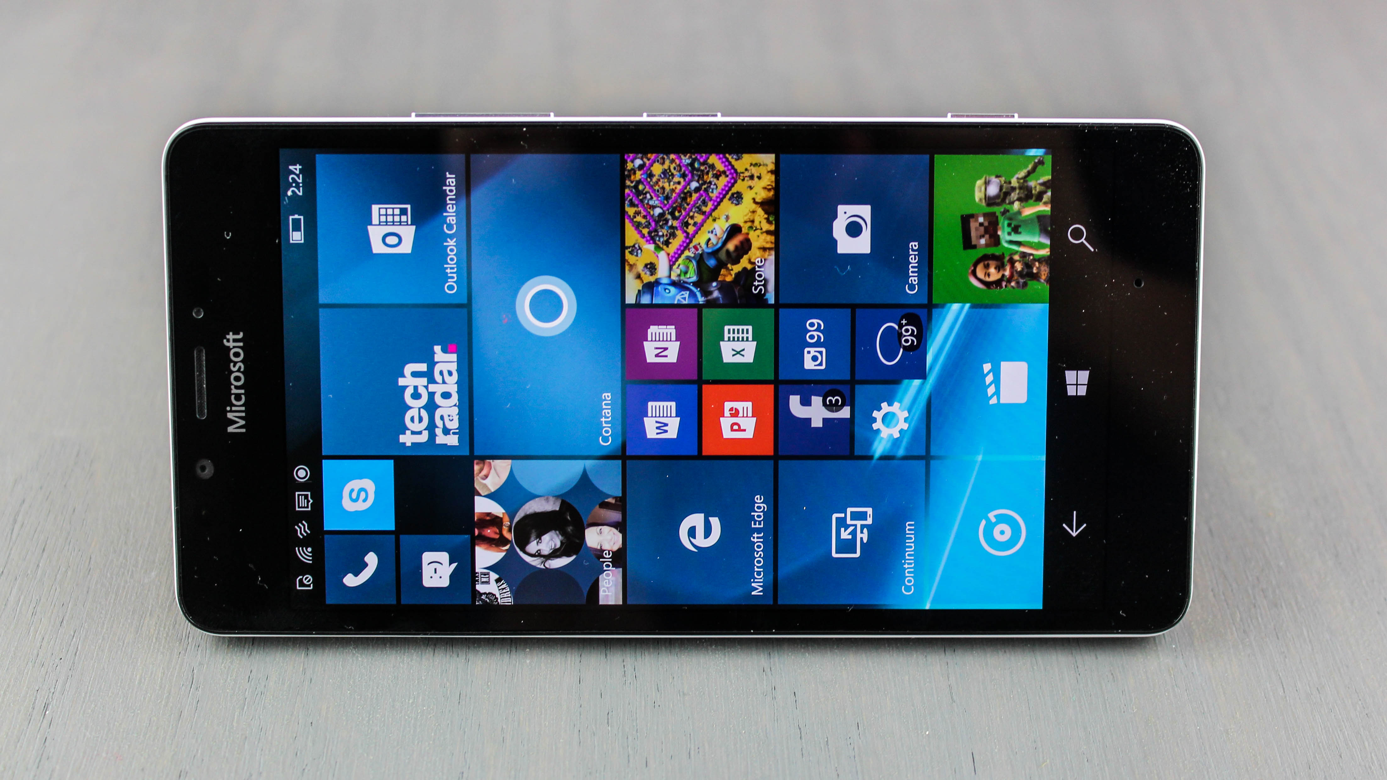
This 5.2-inch phone does try a few interesting tricks so that it's not too basic. Its iris-scanning technology makes for a nifty unlock method and Continuum lets me scale the software to TV proportions for a useful desktop-like mode.
Lumia 950 lays the foundation for Windows 10 Mobile, and it's off to a better start, even if Lumia sales are dismal. I felt like that about the Audiovox SMT 5600, too, before the Redmond company blew it in mobile.
But now it's up against the best phones ever made, like the similarly-sized Samsung Galaxy S6, iPhone 6S, LG G4 and Nexus 5X. Does it really have what it takes to win converts from iOS and Android, or keep Windows Phone 8.1 users from defecting? Clearly, it's not that simple.
Design
The Microsoft Lumia 950 does its best impression of an average Android phone, almost as if it's trying to get you to buy it, take it home and say, "Too late! You're running Windows now." It reminds me a lot of my Nexus 5X in size, color and styling.
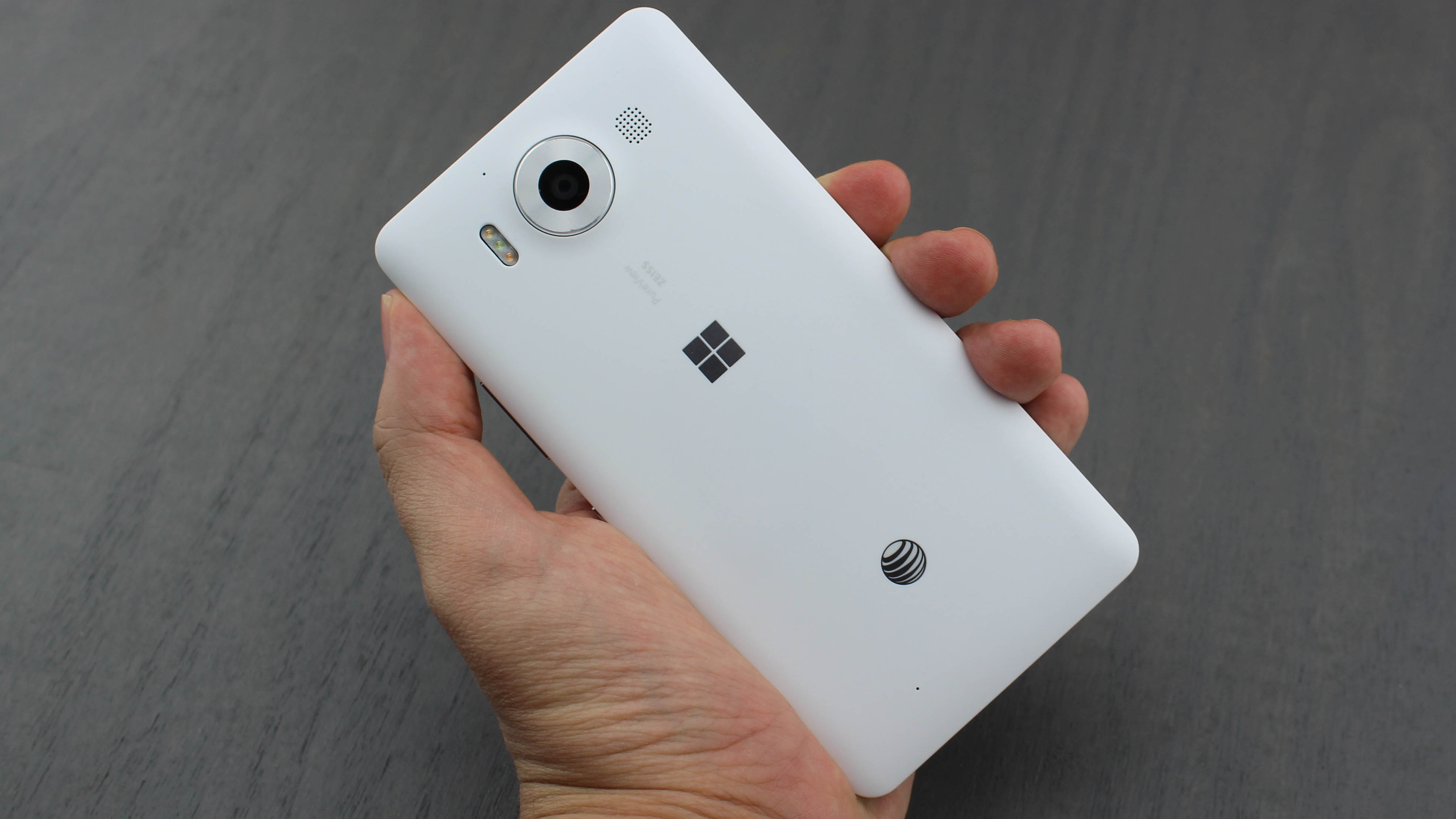
It doesn't measure out to be the thinnest or lightest phone of its size, with dimensions of 145 x 73.2 x 8.25mm and a weight of 150g. But it's still a nice fit for one-handed use with a little extra stretch. The boxy design is palm-friendly, and the thicker-than-normal bezel means you'll never accidentally touch the display.
You'll also never mistake this for a "premium" handset, either. The Lumia 950 is enveloped with a one-piece plastic shell that overlaps its Gorilla Glass 3-protected screen.
While the front is in a glossy black, the rear cover comes in matte white or matte black. Gone are the fun, vibrant colors of orange or lime green, as seen from last-generation Windows phones.
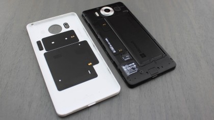
Microsoft played it safe with colors, and it did the same with the microSD card slot and removable battery. It has both, while other phone manufacturers (namely Samsung) have axed these key features, much to the chagrin of vocal critics.
The microSD card and battery are easily accessible behind the removable plastic cover, a boon for professional users. Even the expandable storage slot can be accessed without removing the battery (but the same doesn't apply to the the stacked nano SIM card underneath of it).
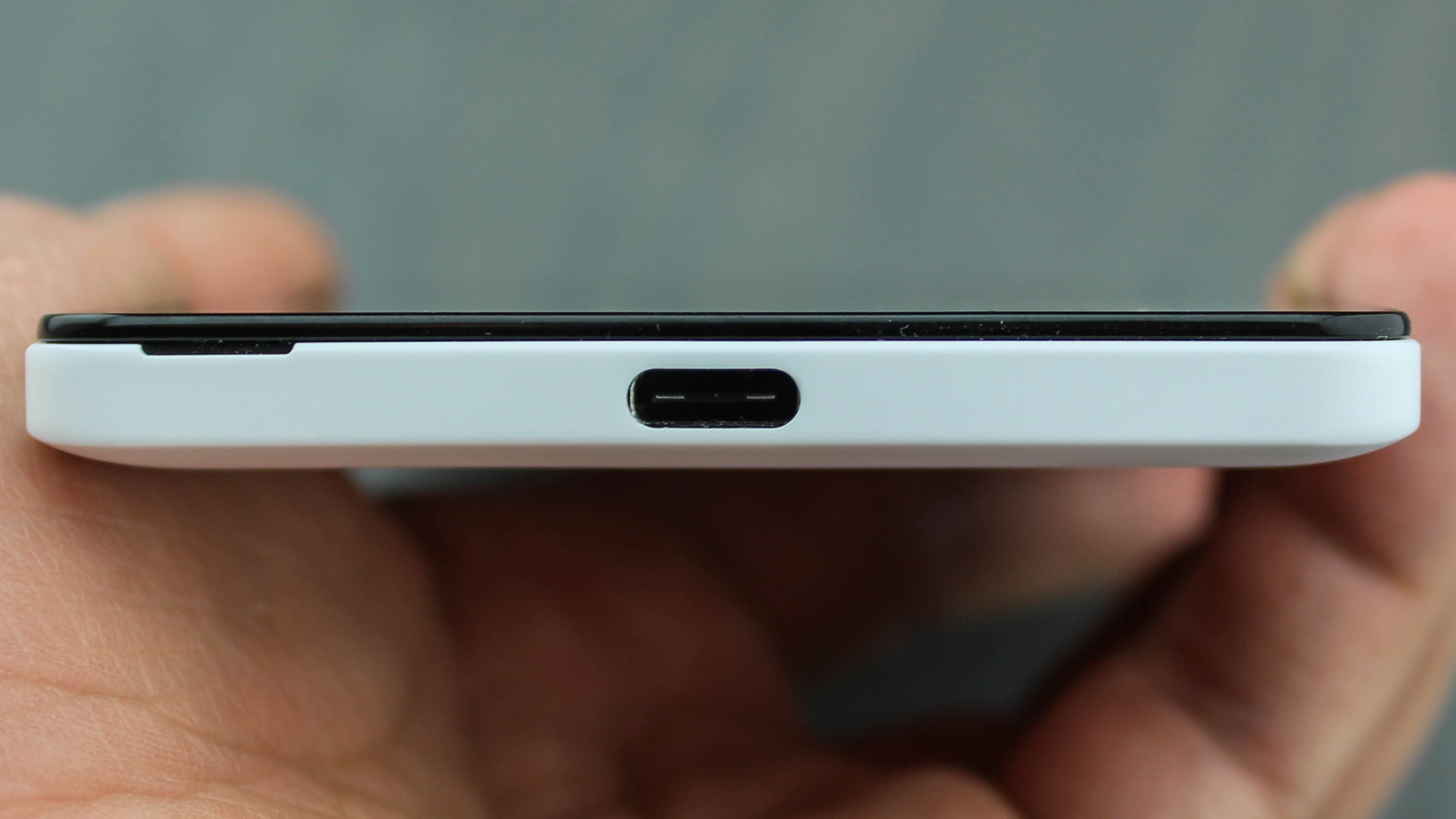
Powering that 3,000mAh removable battery is a USB-C port on the bottom frame with fast charging capabilities. I still hate carrying around an extra cable, as much as I appreciate the reversible connection. It'll be easier once microUSB is further phased out of devices at the end of 2016.
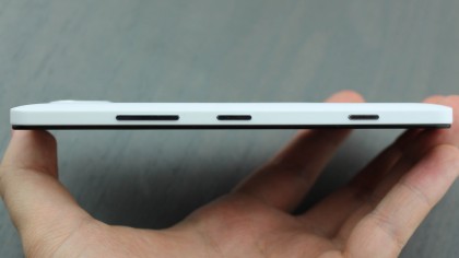
The top of the Lumia 950 frame has a normal headphone jack, while the right side houses a power button and volume rocker, or more accurately the volume rocker and power button. They're in reverse order from many of today's phones, and that's how Nokia had them.
Sadly, there's no double-tap-to-wake function. In fact, the only way to turn on this phone is to press that tiny power button on the right side.
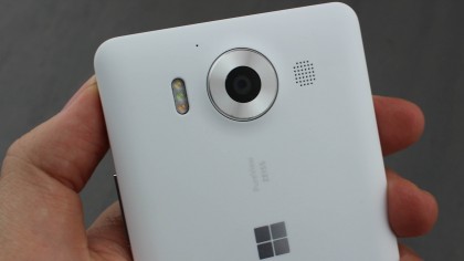
I was hoping to see a pair of front-facing speakers, but there's one in the back of this phone, right next to the camera. At least the 20-megapixel (MP) camera is flanked by a fancy triple LED flash on its left side, and there's no significant camera bulge, like on the Nexus 5X.
Instead of the speakers I was asking for, I got something else that's long been on my wish list: a dedicated camera button. Truthfully, I've been asking for this for a while, to the point where I have gotten used to – and like – the Samsung Galaxy Note 5 double tap mechanic for launching the camera app, but I'll certainly take this, too.
The words "Microsoft" are above the screen, and there's an on-screen Windows logo acting as the home button on the front. Around back, just off-center is another Windows logo. You'd never know it was a Microsoft phone without these, meaning Microsoft's fitting in just fine with cheap phones made of plastic these days.
Display
Windows 10 Mobile has a dark theme turned on by default, and it really lets the deep blacks and Microsoft's familiar blues shine on this 5.2-inch AMOLED display.
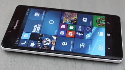
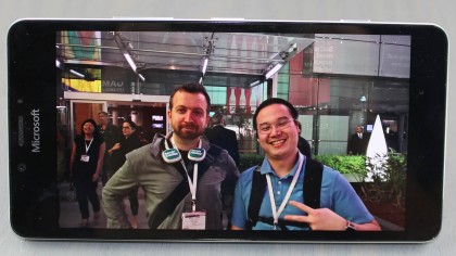
The quad HD resolution at 2,560 x 1,440 doesn't hurt either, packing 564 pixels per inch (ppi) into this 16:9 display. That's sharper than the iPhone 6S and iPhone 6S Plus and ties the Galaxy S7, but it doesn't come close to matching Apple and Samsung's brightness levels.
Brightness has become more important for me than resolution ever since we hit 1080p. I'm now more interested in seeing my smartphone in bright sunlight at the beach, not being able to appreciate extra pixels too small to detect with the naked eye. The Lumia 950 does well enough outdoors and has wide enough viewing angles, but it could be brighter at its max.
Whatever the brightness setting, I noticed this phone runs hot when in use for longer than a half hour. It's most evident when scrolling with my fingers using the touchscreen. The slower (and less problematic) Snapdragon 808 chip shouldn't run this hot, like a problematic Snapdragon 810, but maybe this is why the new Microsoft Lumia 950XL uses "liquid cooling."
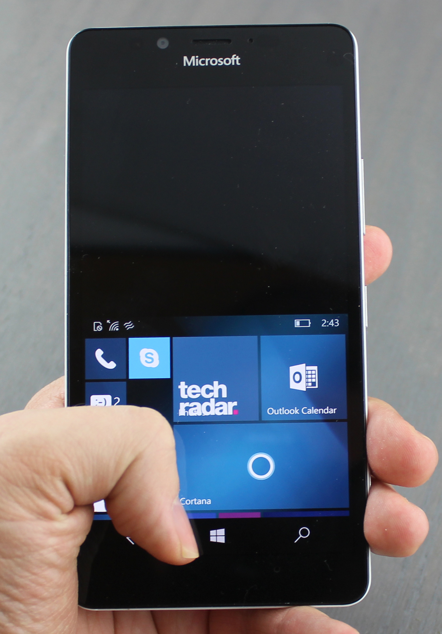
The Lumia 950 doesn't have liquid cooling, but it does offer a handy glance screen. This shows limited information, like the time, date and simple notification icons, when the phone is asleep.
Like Motorola's slightly more advanced Moto Display, the static text here is in white against the otherwise turned off AMOLED display in black. It's not a battery hog, but this feature can be turned off in settings.
Windows 10 includes a one-handed-use mode, sort of like Apple's Reachability mode. It drops the entire screen down and stays there even when you tap into other menus. You have to tap the Windows home button to revert it or let the screen sit idle for a while.
This helps that 5.2-inch display feel a smidge smaller for critical, one-handed touchscreen tapping on the subway or tube.
