TechRadar Verdict
While the Motoblur widgets mask a strong performer, a little tweaking and you'll find a QWERTY-touch combo to love.
Pros
- +
Rock solid metallic body and keyboard
- +
Great, responsive screen
- +
Good camera, fantastic 720p video quality
- +
Fast, glitch free operation
- +
Some great media and connectivity features via Motoblur
Cons
- -
Tatty-looking, bloated Motoblur widgets
- -
Below average battery life
- -
Poor video file support
- -
Keyboard is a little too small for easy use
- -
Terribly clunky Motoblur Facebook and Twitter integration
Why you can trust TechRadar
This time last year the Motorola Milestone won itself a fair few fans thanks to being one of the few high-spec Android phones to come with a QWERTY keyboard attached to it.
The original Milestone certainly wasn't one of the prettiest or most elegant Android phones, but for those unable or unwilling to adapt to the touchscreen way of life, it provided a rare and welcome QWERTY option.
Things have changed over the last 12 months, with the arrival of Android powerhouse HTC on the QWERTY scene with its excellent HTC Desire Z. Has Motorola's design team got what it takes to compete?
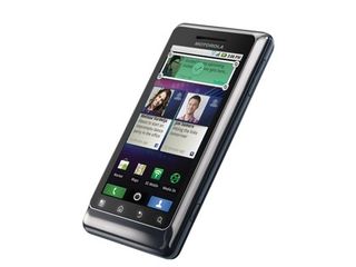
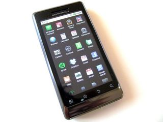
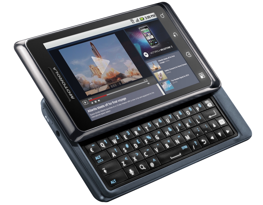
First impressions of the Milestone 2 are very positive. The phone's slightly slimmer than the original Milestone, with a nice, weighty, solid feel to it. The 3.7-inch screen takes up most of the front of the device, with only a small bezel and the standard collection of four touch-sensitive Android buttons beneath it.
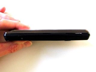
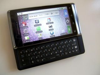
Motorola's crafted most of it from metal, so it feels extra tough and solid. There's a thin rubber coating applied to the back of the Milestone 2, so it's nice and grippy, plus the keyboard sliding mechanism is also rock solid with none of the worrying wobble suffered by the HTC Desire Z's bespoke hinge. The Milestone 2 feels heavy and tough in comparison.
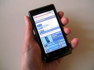
The four capacitive buttons give you a weak haptic response when pressed, and Motorola has also changed the order they appear compared to the original Milestone. It seems to make more sense having the Menu button on the far left, with the Home button next, then Back and the largely pointless Search.
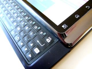
The QWERTY keyboard's keys are backlit, with Motorola removing the original Milestone's directional controller to free up more room for extra keys – replacing it with the standard four-way cursor key array and an OK button to confirm menu options.
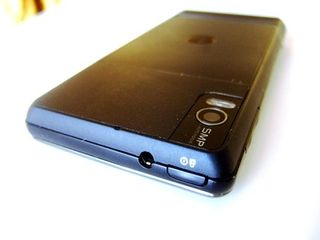
Around the edges you get the combined power and screen-lock button on the top – which we found a bit too small and well hidden to find without looking for it – next to the 3.5mm headphone jack. The volume up/down toggle switch is to the right and the micro-USB socket (and nice white charging notification light) on the left.
Inside the box is a 1400mAh battery, an 8GB microSD card, micro-USB cable and plug-in power charger, with some old fashioned foam-covered Motorola-branded headphones. And the box is nice, too.
Current page: Motorola Milestone 2 review: Overview and design
Next Page Motorola Milestone 2 review: Interface