TechRadar Verdict
Pros
- +
Good messaging hub
- +
Excellent web browser
- +
Fluid interface
Cons
- -
Can seem confusing
- -
Lack of killer apps
- -
No stand out features
Why you can trust TechRadar
After a number of delays and setbacks BlackBerry 10 finally arrived in January and BlackBerry's new mobile platform has already witnessed its major first update in its life cycle with BlackBerry 10.1 now available on all three BB10 devices.
We've explored the new version of the operating system and have updated our BlackBerry 10 review accordingly - you lucky, lucky people.
The BlackBerry Z10 kicked off the Canadian firm's renewed onslaught on the mobile market, but it has since been joined by the QWERTY keyboard toting BlackBerry Q10 and more recently the budget focused BlackBerry Q5.
While in the short term focus will be put on the devices it's the software the handsets are running that is really the key to BlackBerry's long term success, or ultimate demise.
The BlackBerry smartphone range has been in desperate need of a reboot for a while as the likes of iOS 6, Android Jelly Bean and Windows Phone 8 have outstripped the extremely outdated BB OS7 platform.
Whereas the other systems have witnessed incremental upgrades, BB 10 is a totally new offering – the BB OS7 base has been completely scrapped and the new platform rebuilt from the ground up.
BB10 sees the implementation of a whole new user interface, doing away with the familiar BlackBerry system we're all used to in favour of something that resembles the likes of Android and iOS, although with its own unique features thrown in for good measure.
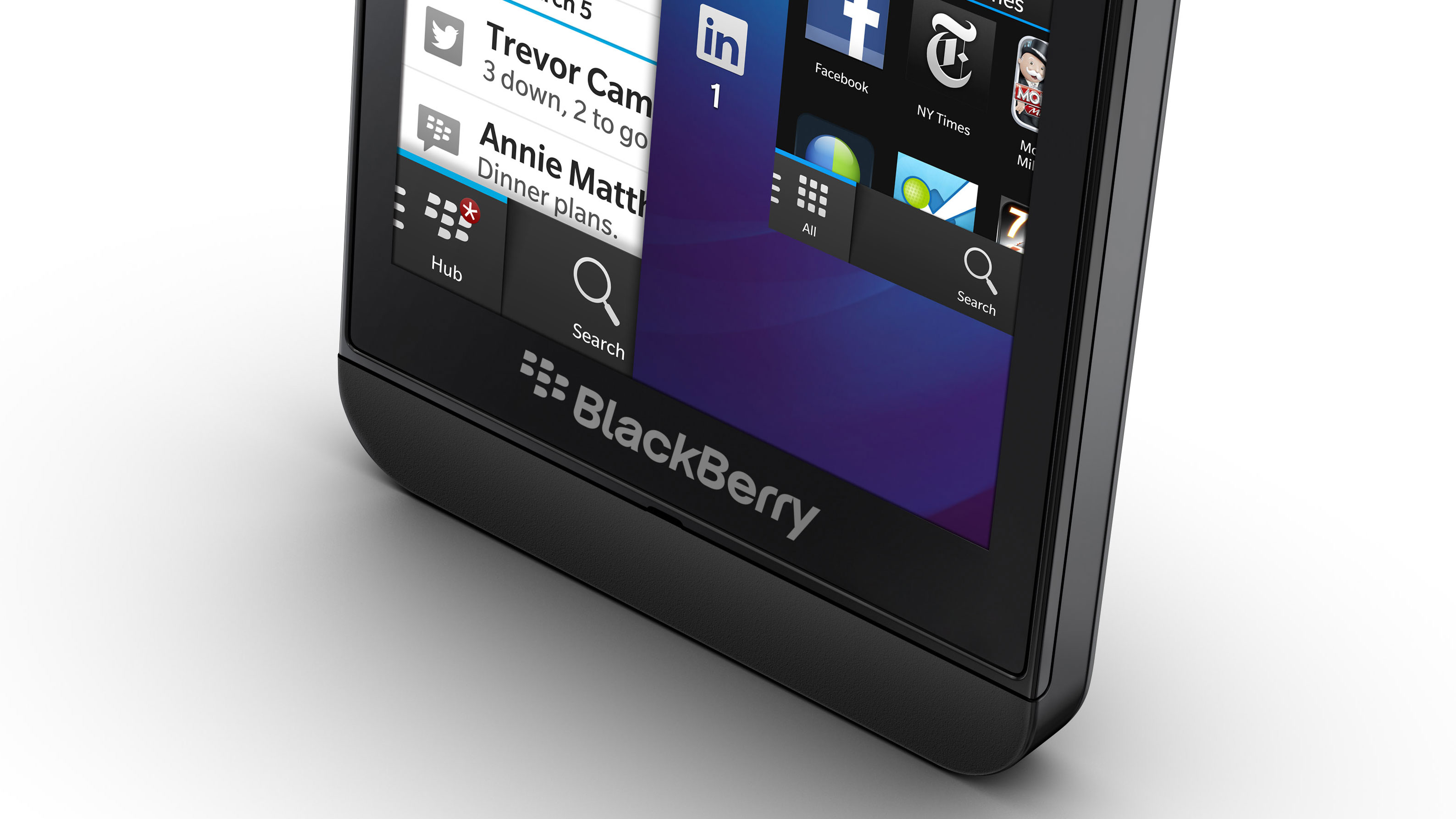
BlackBerry 10 has merged homescreens, widgets, app lists and a unified inbox into one slick interface, offering up an easy-to-navigate user experience.
Lock screen

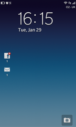
The first thing you're greeted with on BlackBerry 10 is the lock screen, which not only shows the time and date, but also notifications, unread messages and upcoming calendar events.
There's a button to launch the camera straight from the lock screen to grab a quick snap, just hold down on the icon for three of seconds.
It's slightly longer than we'd like and the simple slide action on some Android handsets is quicker.
To unlock a touchscreen BB 10 handset you need to slide your finger up the screen. As you do, the homescreen below will begin to appear, giving you a sneak peek of what's underneath.
What you can't do from the lockscreen is jump straight into a new message, email or other notification. Instead you' have to unlock the handset in the normal way and then slide into the BlackBerry Hub.
It's not a huge issue but it's something we'd like to see crop up in a future update as it will further enhance the fluidity of BB 10.
When viewing the lock screen you can drag down from the top of the display to show the night time clock mode - which has a lovely analogue clock face and a toggle for your alarm.
The black background and red highlights mean when you check the time in the middle of the night you won't be blinded by a bright display, which is always a bonus.
Homescreen
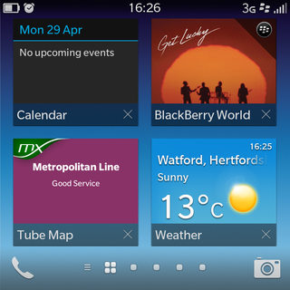
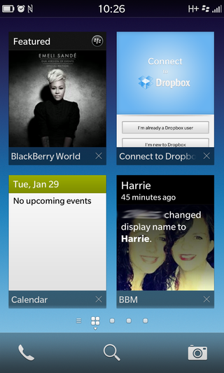
The main BlackBerry 10 homescreen is comprised of 'Active Frames', technically mini-applications, which give you an overview of information from a particular app and launch the full version when tapped.

BB10 will display up to eight of these active frames, showing your most recently used apps with the latest app appearing in the top-left position.
Only four of these panes can fit on the screen at one time, so you'll need to scroll down to see the rest – which all seems a little pointless, since you can just as quickly swipe sideways to access the app list and launch the app you want from there.
For those of you who may be concerned that these 'Active Frames' could be both data and battery-intensive, BlackBerry assures us that this is not the case, with the QNX core of BlackBerry 10 providing efficient power management, and the frames only downloading the minimum amount of data required for them to update.
To be fair we've seen pretty good battery life from both the BlackBerry Z10 and Q10 during our in-depth review process, so we're inclined to believe BlackBerry's claims.

If you get fed up of seeing a particular frame then you can easily close it by hitting the small cross in the bottom right corner and if you close all the panes you'll be taken by default to the first page in the app list until you open another.
When you're in an app there's no back button on screen to help you exit. This brings us to another key feature of BB10, as it encourages you to use a gesture to quit applications by running your finger up from the bottom of the screen, returning you to the active frame view.
While this is easy to do on the Z10 and Q5 it's a little trickier with the Q10 which doesn't provide any additional space between the bottom of the display and its QWERTY keyboard.
Those who are already familiar with other smartphones will find the action pretty unnatural and it takes a while to get used to the new way of doing things on BlackBerry 10.

John joined TechRadar over a decade ago as Staff Writer for Phones, and over the years has built up a vast knowledge of the tech industry. He's interviewed CEOs from some of the world's biggest tech firms, visited their HQs and has appeared on live TV and radio, including Sky News, BBC News, BBC World News, Al Jazeera, LBC and BBC Radio 4. Originally specializing in phones, tablets and wearables, John is now TechRadar's resident automotive expert, reviewing the latest and greatest EVs and PHEVs on the market. John also looks after the day-to-day running of the site.
