TechRadar Verdict
A much lower price tag has helped the Galaxy S3 remain an attractive proposition, but with an older OS and slightly aging features there's now better budget options out there.
Pros
- +
Decent battery life
- +
Superb screen
- +
New, lower price
Cons
- -
Subjective design
- -
Older Android OS
- -
Aging features
Why you can trust TechRadar
The Samsung Galaxy S3 has been available in the market for over two years now, but with the recent update to Android 4.3 Jelly Bean and further price reductions thanks to the recent introduction of the Galaxy S5 there's still a lot going for the ageing handset.
It may have been two years ago but Samsung made a big deal about this phone at launch and it is easy to see why. Sales topped 30 million in November 2012, and given the amount of people seen rocking the handset, those number seem to bear a hallmark of truth.
The question now is can the might of the Samsung Galaxy S3 still carry it through or will this smartphone veteran finally have to step aside to let the younger, fresher guns through?
One of the biggest draws to older flagships is the lower price, and with contracts now starting as low as £14.50 per month and at £169 on pay as you go there is little that the Korean device can do wrong.
This low price means that it will find itself fighting out against the so called "mini" generation, handsets that all match up with the 4.8-inch 720p screen. The powerful Sony Xperia Z1 Compact is on the scene and is unquestionably the most powerful of the smaller screened handsets, but is a fair bit more expensive, and Samsung has its the new Galaxy S5 Mini too.
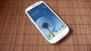
That super low price tag also means that even the likes of the Moto G are providing some really powerful competition.
But let's get down to the main question – is this the phone you should be spending your hard-earned cash on?
The Samsung Galaxy S3 started the design nature that has flowed through nigh on every Galaxy handset since. As Samsung put it, the S3 was 'inspired by nature – it sees, listens, responds, and enables you to share the greatest moments'.
While this is all a little hyperbolic, the nature theme is certainly present when you handle the phone for the first time.
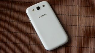
Brushed polycarbonate adorns the large device, which runs in with dimensions of 136.6 x 70.6 x 8.6mm (5.38 x 2.78 x 0.34 inches), despite still having to pack in a 4.8-inch Super AMOLED HD screen.
You've got a choice of annoyingly named colours such as "marble white", "pebble blue", "amber brown", "garnet red", "sapphire black" or "titanium grey".
I say "large device", but given the current range of massive flagships with the 5.5-inch LG G3, the 5.2-inch Sony Xperia Z2 and the 5.1-inch Galaxy S5 (dare I mention the 6.4-inch Xperia Z Ultra) the Galaxy S3 is by no means huge. During day-to-day use I found that the Galaxy S3 is just about the perfect size for me, and my hands are by no means small.
I'll lay it out right now: the plastic feeling of the Galaxy S3 won't appeal to all, especially against the likes of the all metal HTC One and One M8. It feels very lightweight (despite tipping the scales at 133g/4.7oz) in the hand, and some people will read this as feeling a little cheap.
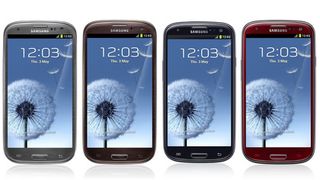
Let me be clear though, the Galaxy S3 is not a cheap-feeling phone. It's got a really solid Gorilla Glass 2 front, a well-packaged interior and a more robust battery cover. It's polycarbonate rather than bog-standard plastic, although I'm not sure some people will like the more rounded nature of the design.
When it comes to colour options, there's no doubt in my mind that the pebble blue offering is more attractive than the white (the marble white looks similar to a low-end Galaxy Mini or similar), but the host of extra colours I mentioned earlier really do mean that you're not tied down.
As the Galaxy S3 was the launch pad for the design of almost every Galaxy handset to date, the rounded nature does feel very familiar, even if it was a little controversial on the day of its announcement.
Even by today's standards the bezel feels minimal and helps to accentuate the screen and give a more premium feel.

The button design is the same as on every Galaxy handset and has been well thought out. Although it is by no means the biggest handset, it is difficult to make all the keys accessible on a handset of this size. The lock button on the right-hand side (rather than the top) makes a large degree of sense and feels very natural.
Other traditional Samsung buttons are around, with the home button, and its soft key 'back' and 'menu' buttons being great additions; it means contextual menus can be found easily without needing to mess around looking for the on-screen icon.
Google has certainly pushed the on-screen navigation buttons recently, but I'm still convinced that adding real buttons is the way to go.
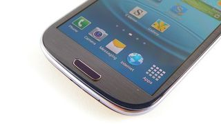
The volume up and down button is parallel to the lock key on the left-hand side of the phone, and also within easy reach when holding the Galaxy S3 in the hand.
The microUSB slot is placed at the bottom of the phone - easy to find with a charger - while the battery cover is also made of the same polycarbonate material as the rest of the body. Oh, and the battery cover is removable.
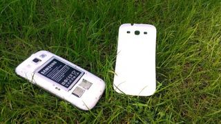
This means that not only can you switch the battery in and out - a key consideration for many people - there's also a cheeky surprise in the shape of a microSD slot next to the microSIM port.
Sure, there are stats that say only 10% of users regularly go over 16GB of storage, but there's always the lower end version of the Galaxy S3 for that. With HD movie downloads becoming far more prevalent, plus the influx of HD apps, I think more space is an excellent idea.
Overall the Samsung Galaxy S3 feels superb in the hand. The design contours well against the palm, and while the screen size may be a little big for some (you'll need a bit of shuffling to reach the upper section of the screen) it's definitely more than useable day to day.
In short, the Galaxy S3 still manages to retain its premium feel and is shaping up to be a bit of a bargain with its lower price tag.

Gareth has been part of the consumer technology world in a career spanning three decades. He started life as a staff writer on the fledgling TechRadar, and has grew with the site (primarily as phones, tablets and wearables editor) until becoming Global Editor in Chief in 2018. Gareth has written over 4,000 articles for TechRadar, has contributed expert insight to a number of other publications, chaired panels on zeitgeist technologies, presented at the Gadget Show Live as well as representing the brand on TV and radio for multiple channels including Sky, BBC, ITV and Al-Jazeera. Passionate about fitness, he can bore anyone rigid about stress management, sleep tracking, heart rate variance as well as bemoaning something about the latest iPhone, Galaxy or OLED TV.
The new Nintendo Switch 2 Camera proves I was right to hope for a new age of Nintendo peripherals – but what comes next?
The Nintendo Switch 2’s interactive-manual bloatware is a paid app, and it’s the last straw following a disappointing launch
After Nvidia, Mediatek may have convinced another huge tech company to use its expertise to develop AI chips


