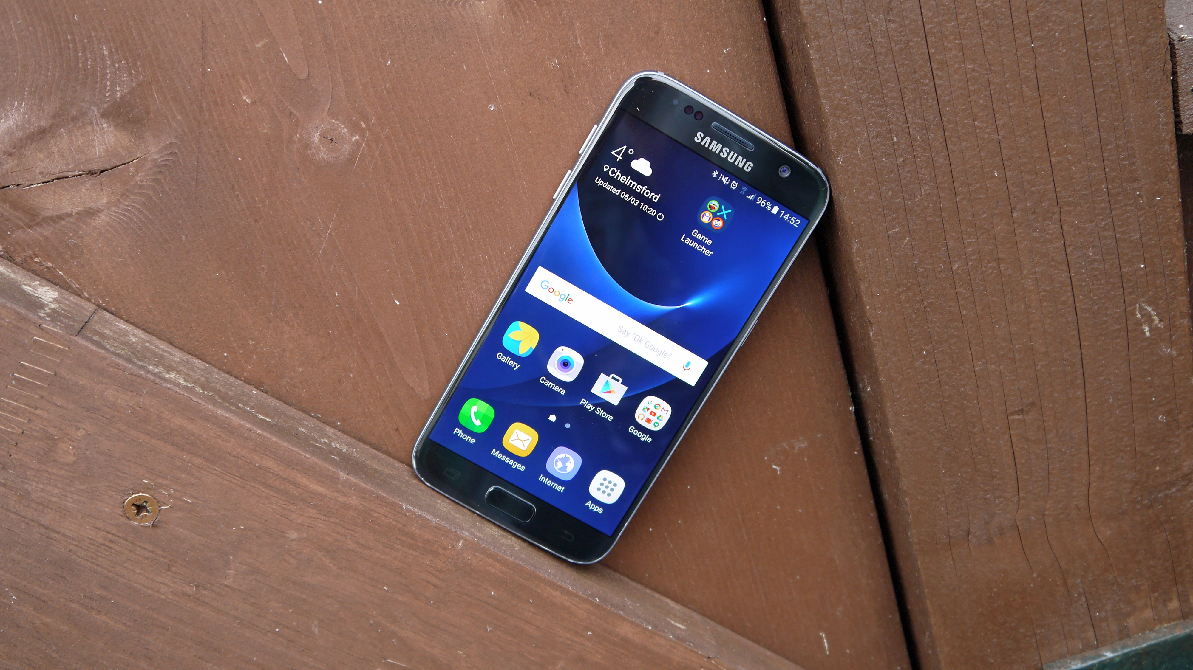
TechRadar Verdict
Samsung has tweaked the winning design from the S6, righted the wrongs of its previous flagships, and made a phone you don't want to put down. The Samsung Galaxy S7 is iterative perfection.
Pros
- +
Improved, waterproof design
- +
Fantastic screen and power
- +
Superb camera
Cons
- -
High price at launch
- -
Only 32GB internal space
- -
Fingerprint magnet
Why you can trust TechRadar
The Samsung Galaxy S7 was a stellar phone at launch. It's a handset that packs great battery smarts, strong camera abilities and loads of raw power into an increasingly affordable package, and thanks to this we awarded it 5 stars back when we first reviewed it in 2016.
Of course, it's 2019 now, and the Galaxy S7 has been superseded by the Galaxy S8, Galaxy S9 and Samsung Galaxy S10, but given this phone's ever lower price it's still worth taking a look at the Samsung Galaxy S7 for your next smartphone purchase.
The design is similar to 2015's Galaxy S6 - meaning some have said the Galaxy S7 should be called the Galaxy S6S - but this in-depth review shows there's a lot more going on under the hood to supplement the improved design.
If you're looking for the curved phone variant of this design, the Galaxy S7 isn't competing as closely with the Galaxy S7 Edge as the S6 did with the S6 Edge, with the curved display variant getting a bump in screen size this time round, taking it more into phablet territory.
Samsung Galaxy S7 price and release date
- Released in March 2016
- Launch price £569 (around $750 / AU$900)
- Now down to around $280/£250/AU$550
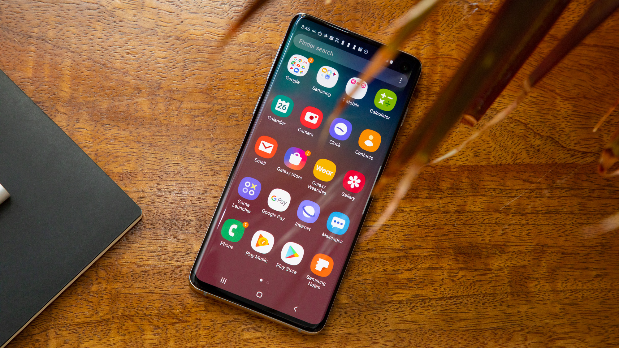
Samsung's latest main flagship phone is the Galaxy S10 and you may want to buy it instead of the Galaxy S7.
The Galaxy S10 features a stunning all-screen design, an in-screen fingerprint scanner, far more power and an improved camera.
If you want the best phone in the world right now, check out the Samsung Galaxy S10 review. If you want a great phone for a lot less money, keep reading our Galaxy S7 review.
While the Samsung Galaxy S7 once had a high-end price it's now quite affordable, as you can find it for around $280/£250/AU$550. It is also getting harder to find the phone new, but if you're happy with a refurbished or pre-owned handset then you can knock even more off the price.
That significant drop is thanks to the launch of newer phones like the Samsung Galaxy S10 and Samsung Galaxy S10 Plus - see how much you'll need to spend on your contract at our best Galaxy S7 deals page, and expect the price to fall even lower as time goes on.
In fact, you might only have to wait until Black Friday (November 29) or Cyber Monday (December 2) for the prices to drop lower.
Even though there's the newer Samsung Galaxy S10, Galaxy S9, and Galaxy S8, it's hard not to like the Galaxy S7. It takes the much-improved, premium design from the Galaxy S6 and reinstates a few features from the Galaxy S5 that were shockingly missing from its successor.
The package is an enticing one, but 2016 was a tough year for flagship phones, so Samsung needed something big to stay ahead. The LG G5 launched with a unique modular pull but failed, the HTC 10 looked to rekindle some of the Taiwanese firm's former glories (with mixed success) and, of course, the iPhone 7 landed with no headphone jack and waterproofing to match the Galaxy S7's similar ability.
Samsung may have been first out of the flagship blocks, but it needed to make the most of its strong start to stay ahead of the pack.
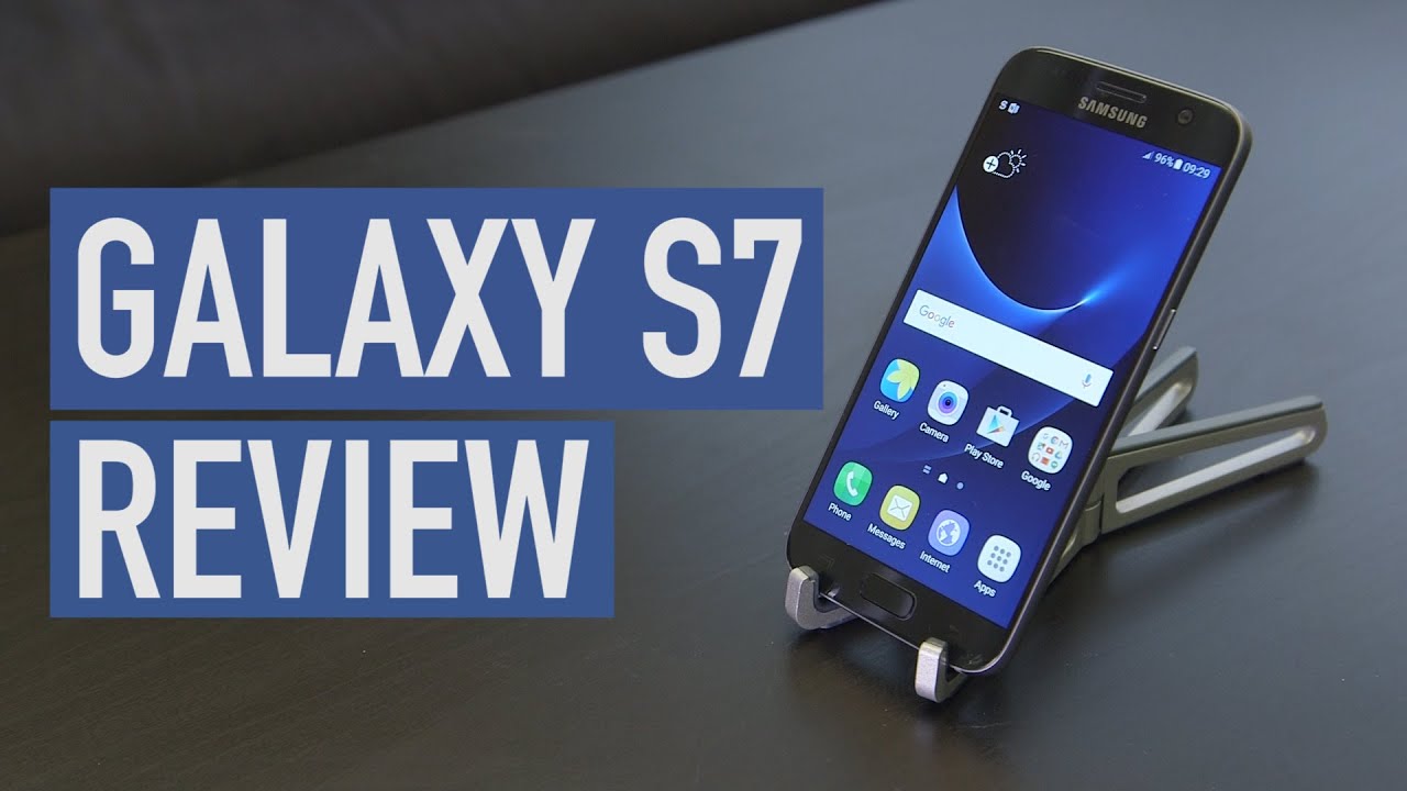
Be sure to watch our video review of the Samsung Galaxy S7
- Read our in-depth Samsung Galaxy S7 Edge review
Design
- Design is similar to previous iteration, but still strong
- Rear curving makes it much nicer to hold in the hand
- Now waterproof, which adds a level of security to use
- Can be gripped securely thanks to smaller bezels
- Muffled single speaker
Weight: 152g
Dimensions: 142.4 x 69.6 x 7.9 mm
OS: Launched with Android 6, upgradeable Android 8
Screen size: 5.1-inch
Resolution: 1440x2560
CPU: Snapdragon 820/Exynos 8890
RAM: 4GB
Storage: 32GB (with microSD)
Battery: 3000mAh
Rear camera: 12MP
Front camera: 5MP
At first glance you'd be forgiven for thinking the Samsung Galaxy S7 looks almost identical to the Galaxy S6. And that's because it is.
Samsung has reused the premium glass and metal finished it employed on the S6, which finally saw the manufacturer move away from its reliance on plastic to materials which better reflected the flagship price tag it was slapping on its top phones.
On closer inspection though, you'll begin to notice the subtle differences that make the Samsung Galaxy S7 the best looking, and feeling, Galaxy ever.
Samsung has dropped the metallic rim around its iconic physical home key, enabling it to blend a little more seamlessly into the overall aesthetic of the S7, almost masking its existence.
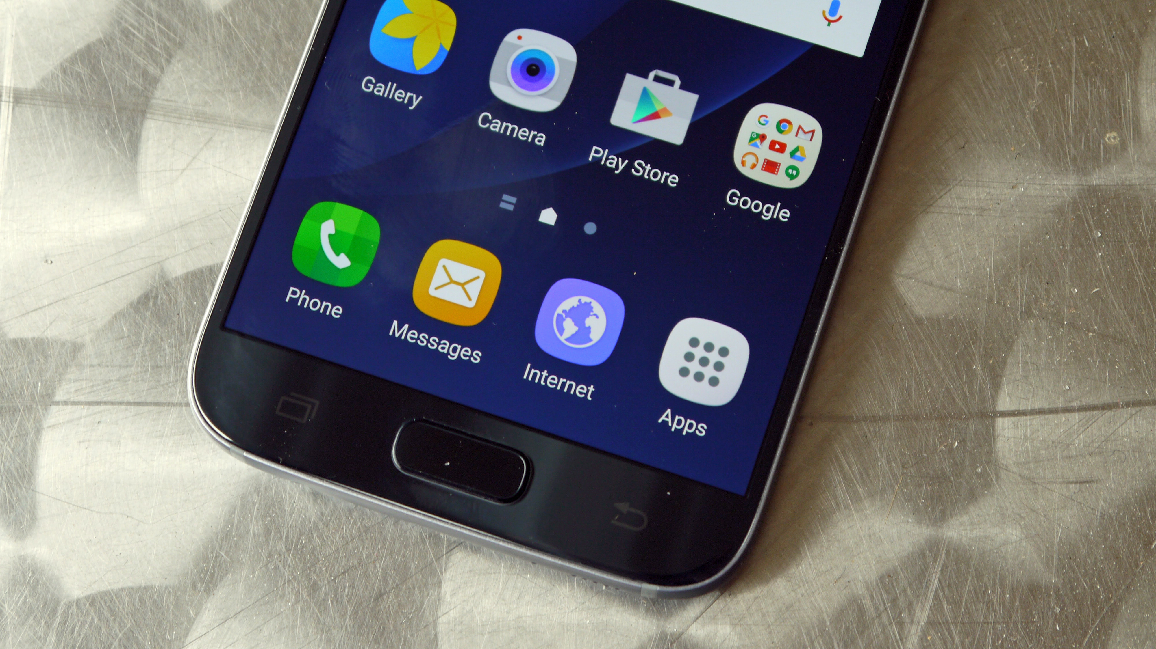
I'm a fan. It makes for a cleaner look, and that look is further improved with the color-coded earpiece grille, which was also metallic on the S6.
The corners are more rounded, and the aluminum frame that's sandwiched between the front and rear glass is less obtrusive, with less of an overhang than its predecessor. That means there is less metal against your skin, which initially makes the S7 feel a little less premium than the S6, but once you've got used to it you'll find it's still a stylish presence in the hand.
While the Galaxy S7 sports the same size 5.1-inch display as the S6, Samsung has managed to shave off a fraction of the bezel around the screen, reducing the handset's height and width slightly.

That gives you dimensions of 142.4 x 69.6 x 7.9mm – and it's that last number which is the most interesting. At 7.9mm thick the Galaxy S7 is fatter than the S6 by 1.1mm, but holding it in your hand you won't know.
That's because of the gently sloping edges on the rear of the handset. The finish, which is mirrored on the rear of the Galaxy S7 Edge, is borrowed from the Galaxy Note 5, and enables the phones to sit more snugly in the palm for a firmer, more comfortable hold.
The Galaxy S7 is a phone you can grip confidently – unlike the iPhone 6S and LG G5, with their flat backs resulting in a slightly awkward position in the hand. The metal and glass doesn't offer much in the way of grip, but because the phone is better positioned in the hand I felt like I was less likely to let it slip compared with the iPhone or S6.
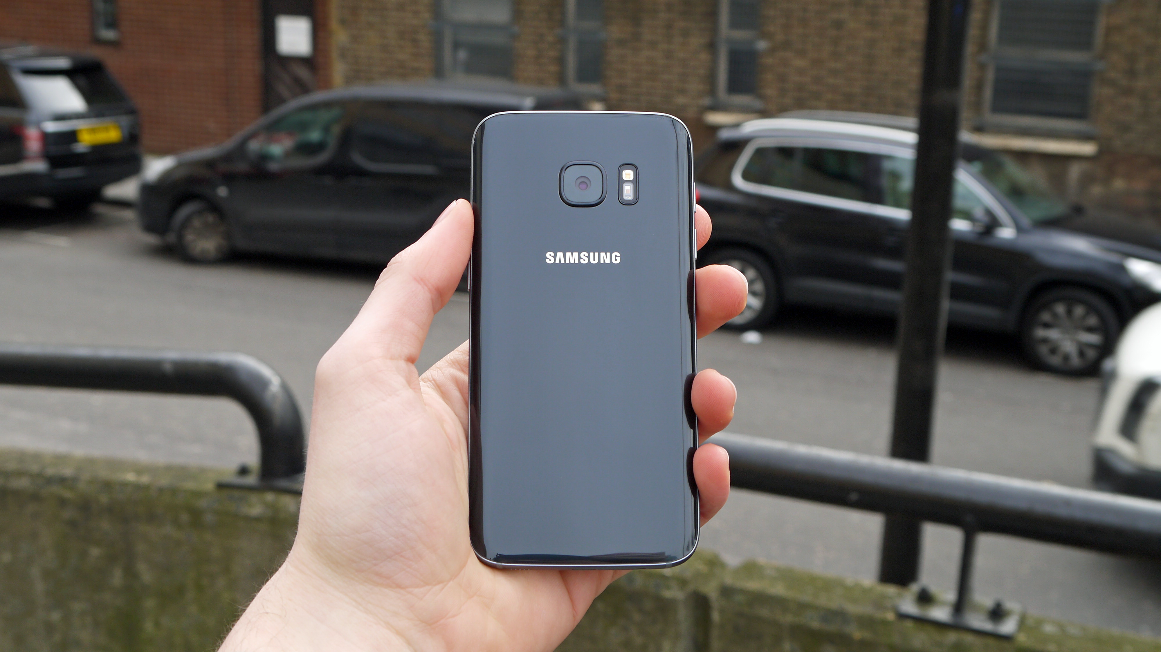
The size, shape and general design of the Galaxy S7 means it's easier to hold and operate one-handed too. I could reach the other side of the screen with my thumb with far less strain, and it required little to no shuffling in the hand to move around the whole display.
The power/lock key on the right and volume keys on the left also fall nicely under thumb and finger, although you'll still have to juggle the S7 a bit to reach the fingerprint scanner, which is embedded under the physical home key.
Returning to the rear of the Galaxy S7, the square camera bulge is still there, but this time around it's less protruding. Samsung has managed to flatten its snapper considerably since the Galaxy S6 – it's now down to just 0.46mm, and while it's still not flush with the body of the S7, it's far less volcanic.
It's not totally flat, which is something Huawei CEO Richard Yu was more than happy to tell us about at the launch of the P9 - a phone which has, as Yu put it, "no bump, no bump!"
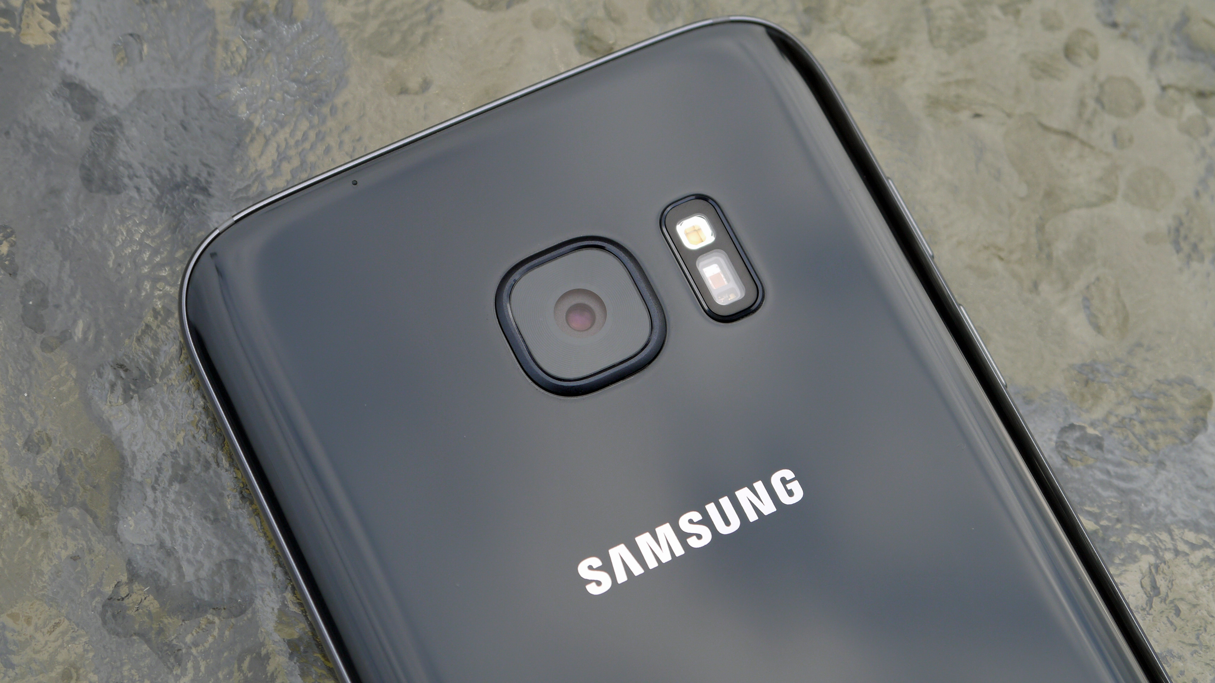
Alongside it you'll find the LED flash and heart rate monitor – a feature Samsung insists on putting on its top-tier handsets, even though a smartwatch or fitness tracker is much better placed for this tech. It also measures stress and O2 saturation levels, although it's unclear just how accurate these sensors are.
It's there if you want it – just head to the S Health app – but I can't see it getting much use.
What I noticed almost immediately, however, was just how much of a fingerprint magnet the Galaxy S7 is. The glass looks great, but I found myself frequently reaching for my microfiber cloth to smarten up the appearance of the S7.
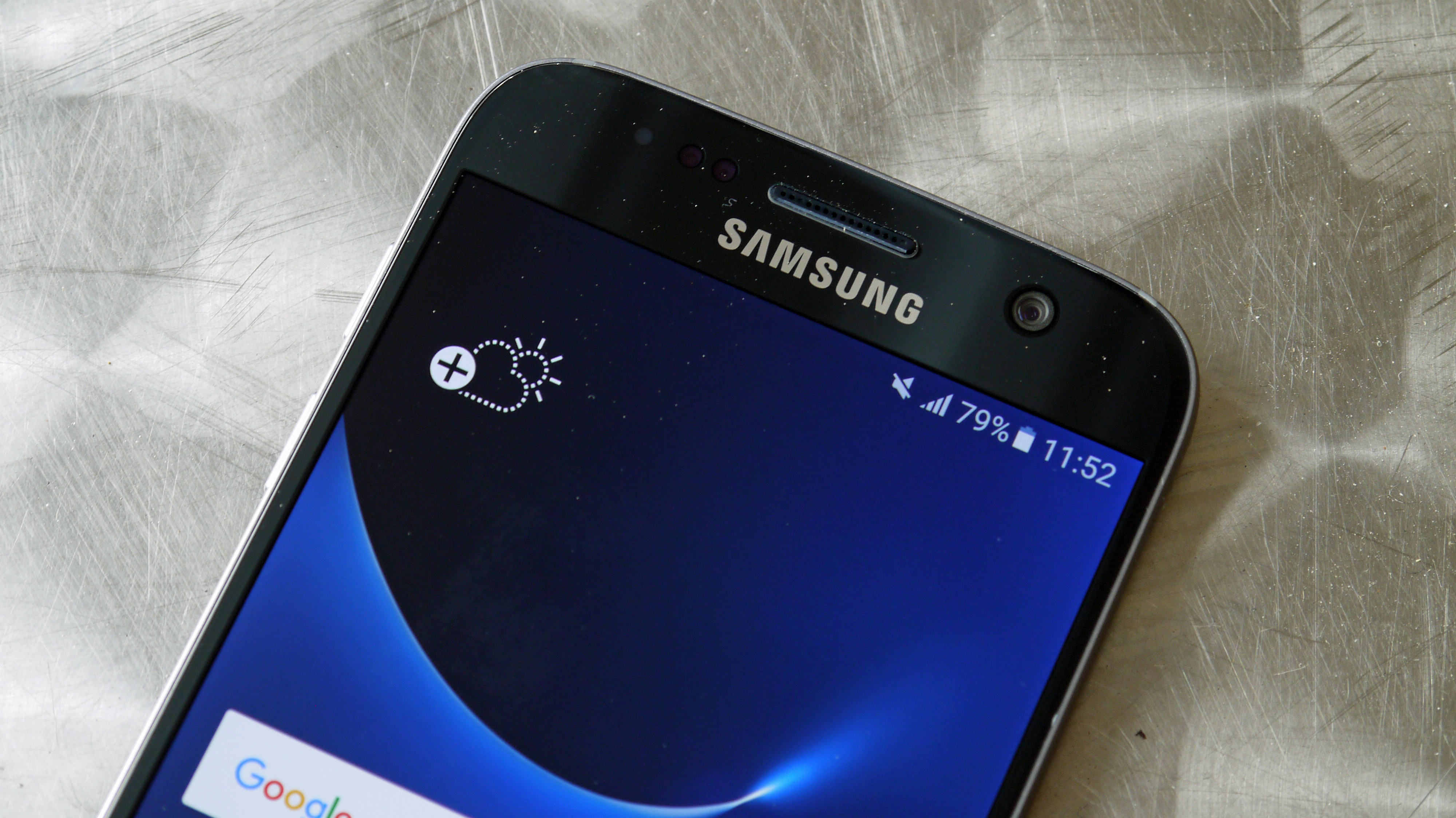
It's exactly the same issue the Galaxy S6 had, and it's surprising that Samsung hasn't tried to address this with the S7.
There was hope Samsung would address the single speaker setup it placed on the Galaxy S6, but alas it hasn't. It's kept the single speaker on the base of the Galaxy S7, rather than opting for dual front-facing offerings like HTC, Sony and newer Samsung phones.
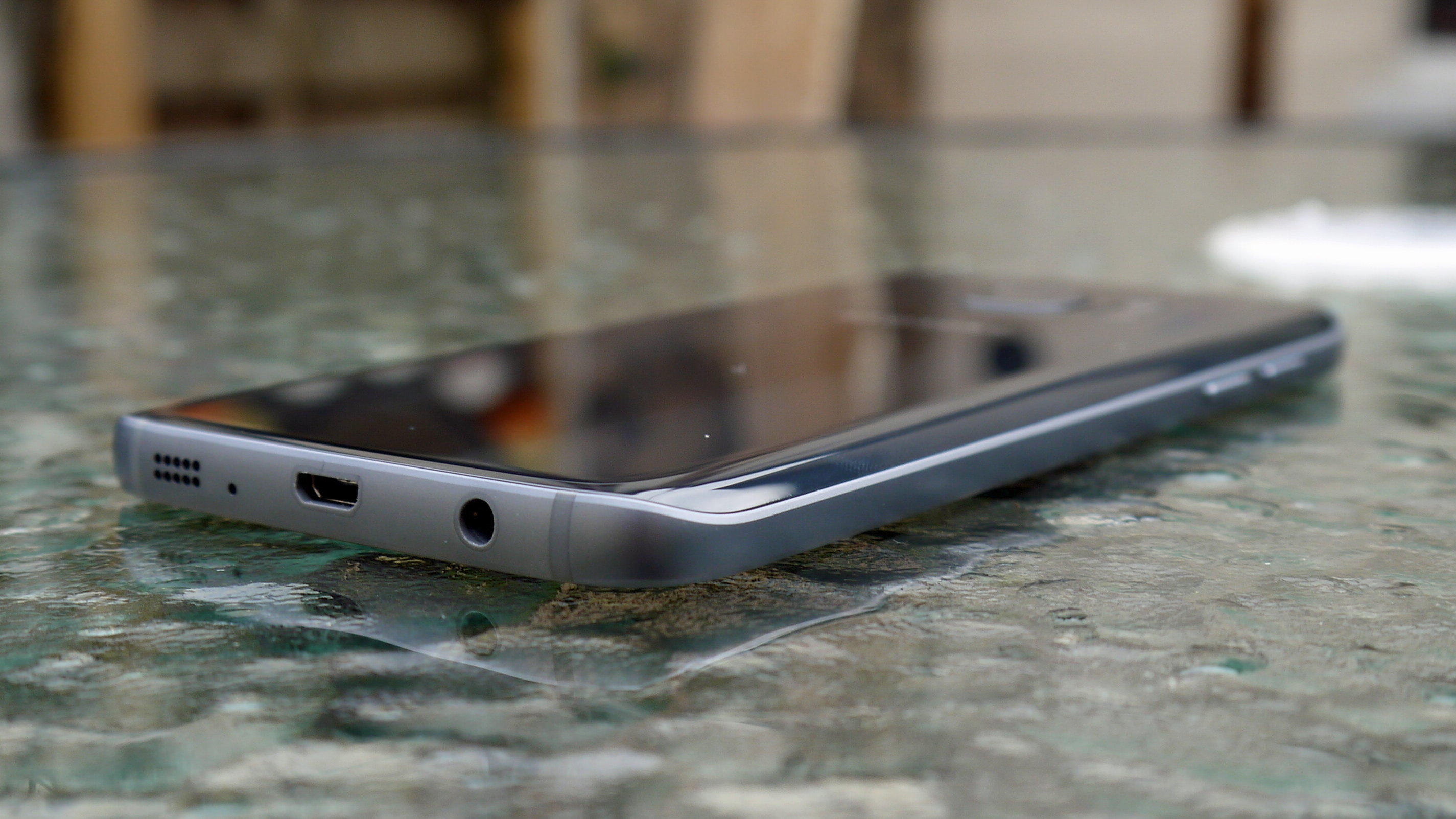
It's not a huge issue, but the result is sound from your movies, games and music can end up being muffled by your hand.
Samsung has resurrected two features from the Galaxy S5 though, with a microSD slot and dust and water resistance both appearing on the Galaxy S7. The microSD port shares a tray with your nanoSIM, which can be slid out of the top of the handset.
This lets you build on the 32GB of internal storage by up to a further 200GB, giving you plenty of space.

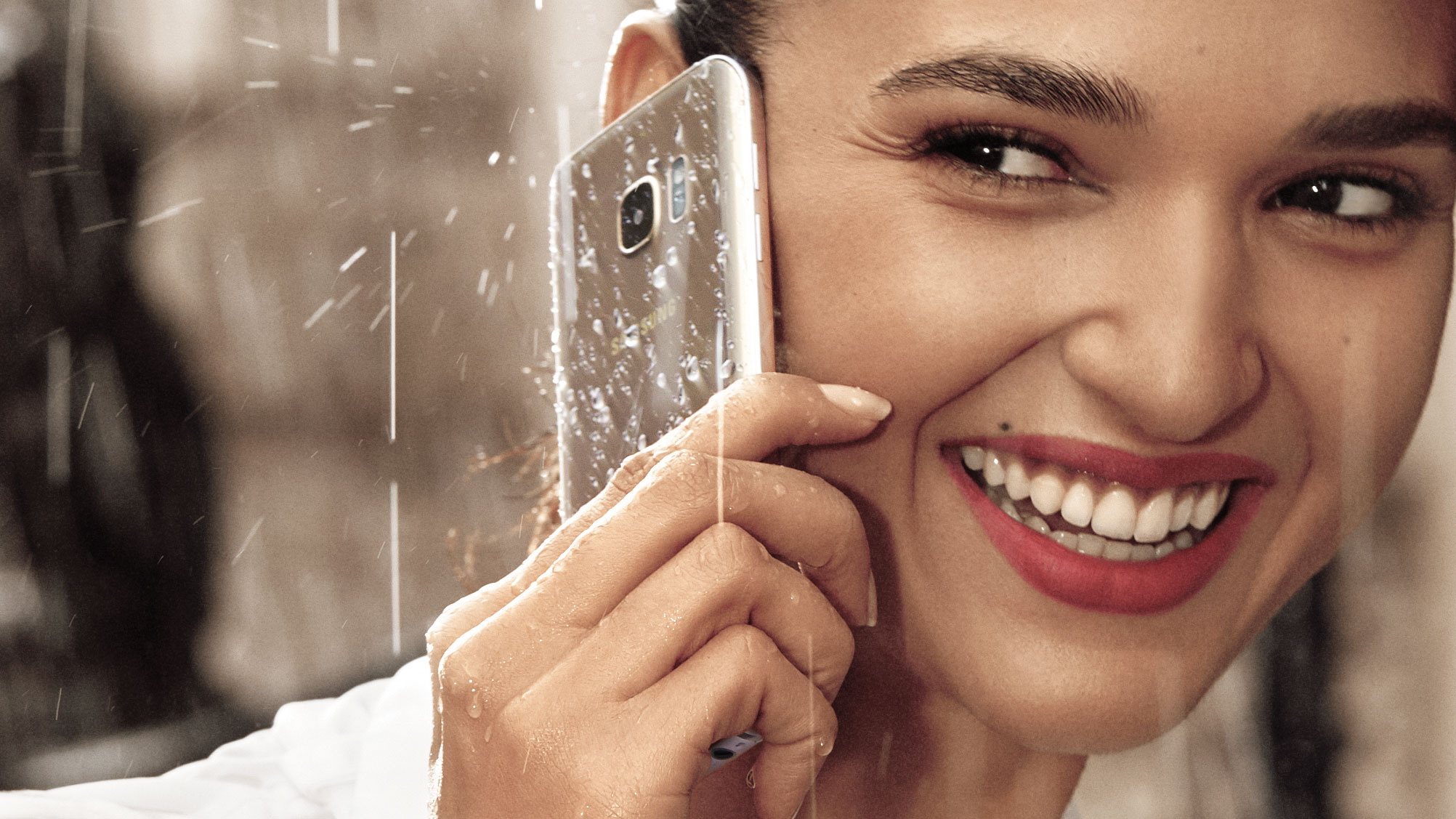
Meanwhile, the IP68 water resistance has improved from the S5, allowing submersion of up to five feet for 30 minutes, plus there's no annoying flap covering the charging port.
The micro USB port has been waterproofed, but the S7 won't charge if it detects water in its hole. If you've taken the phone for a plunge in the bath, you'll need to dry the charging port before plugging in.
Samsung hasn't reinvented the wheel with the design of the Galaxy S7, but it didn't need to. The Galaxy S6 was an excellently styled device, and the S7 has managed to improve on that.
Display
- One of the best displays on any smartphone
- Colors are clear and crisp, contrast ratios excellent
- Good auto brightness and easy outdoor visibility
- Always on display is excellent addition
At first glance, the S7's screen appears to be the same as the 5.1-inch, QHD Super AMOLED offering on the Galaxy S6. The resolution is still 2,560 x 1,440, giving you a pin-sharp 577ppi pixel density.
That's no bad thing, as the screen on the S6 was excellent – but Samsung's made things even better on the Galaxy S7.
The folks over at DisplayMate have run independent, objective scientific analysis on the Galaxy S7 and S7 Edge displays, and the results show performance improvements across all tests versus their S6 predecessors.
What does this all mean? The main point is the screen on the Galaxy S7 is 24% brighter than its predecessor, with improved contrast ratios to boot.

Held side by side with the Galaxy S6 I could see the Galaxy S7 screen had whiter whites, and colors appeared to be a little more natural compared to the slight over-saturation on the S6.
In short, the Samsung Galaxy S7 has a fantastic display. You're unlikely to notice much of a difference coming from a Galaxy S6, but for those looking to upgrade from a handset that's older your eyes are in for a treat.
Of course newer phones like the Galaxy S10 and iPhone 11 Pro have this screen beat, but they're also far more expensive.
Never off
That's not all the screen on the S7 has to offer – it also boasts always-on functionality, a feature that both Samsung and LG (on the G5) have employed on their flagship handsets in 2016.
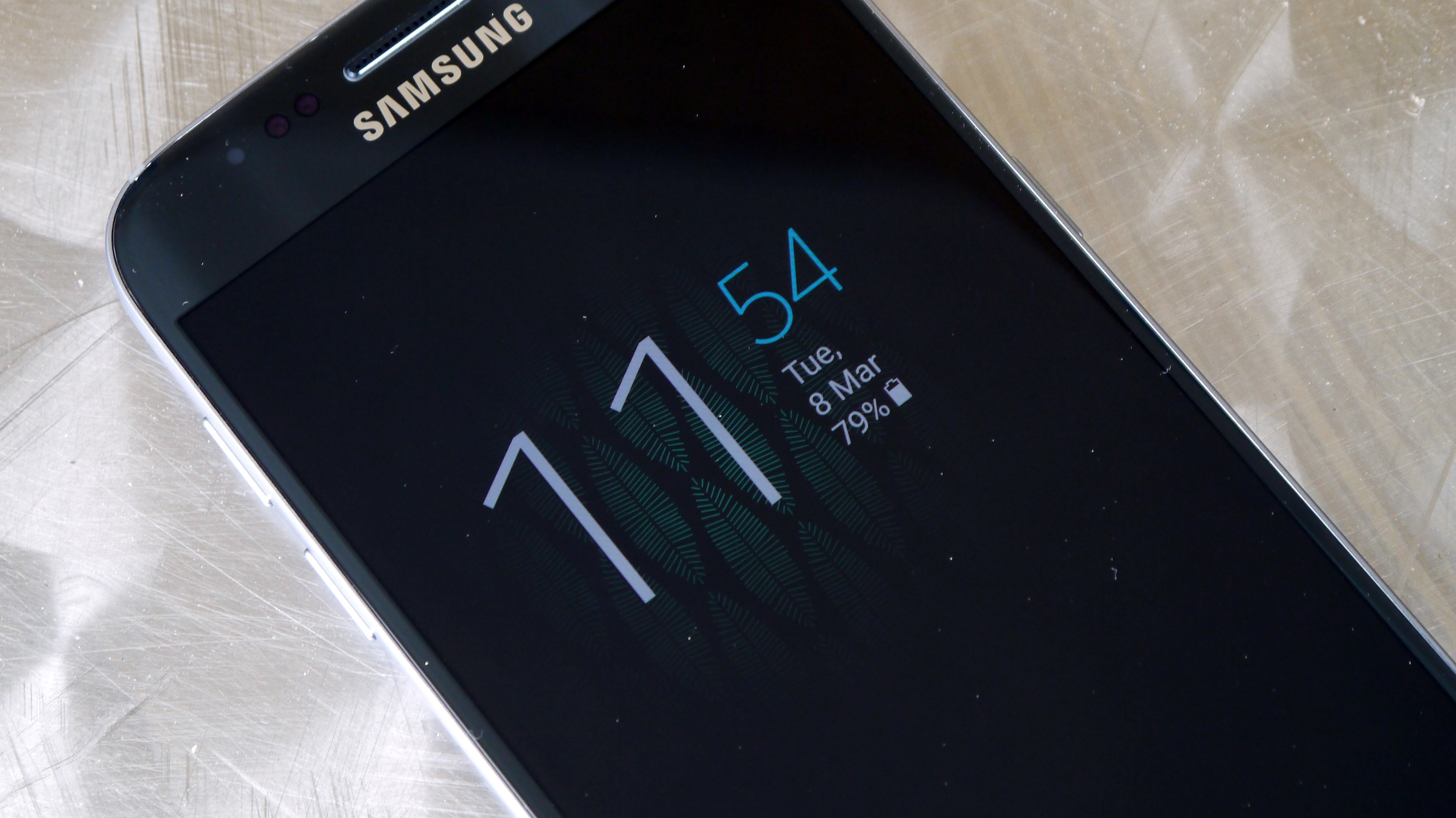
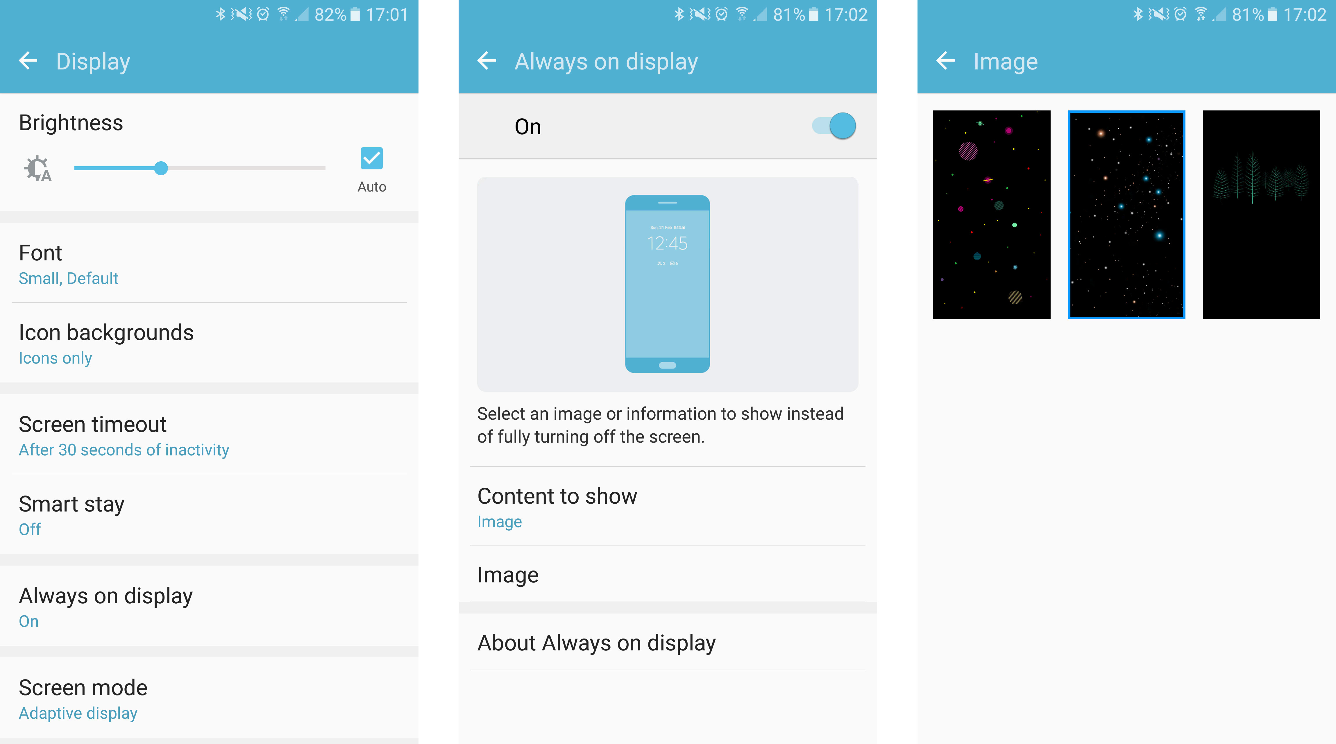
Samsung's implementation sees the screen on the Galaxy S7 show a few different things when the handset is lying idle. The default option shows the clock, date and battery level, plus counters for new text messages and missed calls will also display (if you have any).
That's useful, but I was disappointed that the notifications icons were limited to just these two things. I do most of my messaging via WhatsApp and Facebook Messenger, and not having notifications for those on the display was a little frustrating.
However, in the Samsung Galaxy Note 7 these have been overhauled, with WhatsApp (and other) notifications added below the clock. Now that this handset has been discontinued (owing to all the catching fire it did) it's good to see that the features live on - users are starting to get the new software which brings more options to the always-on display.
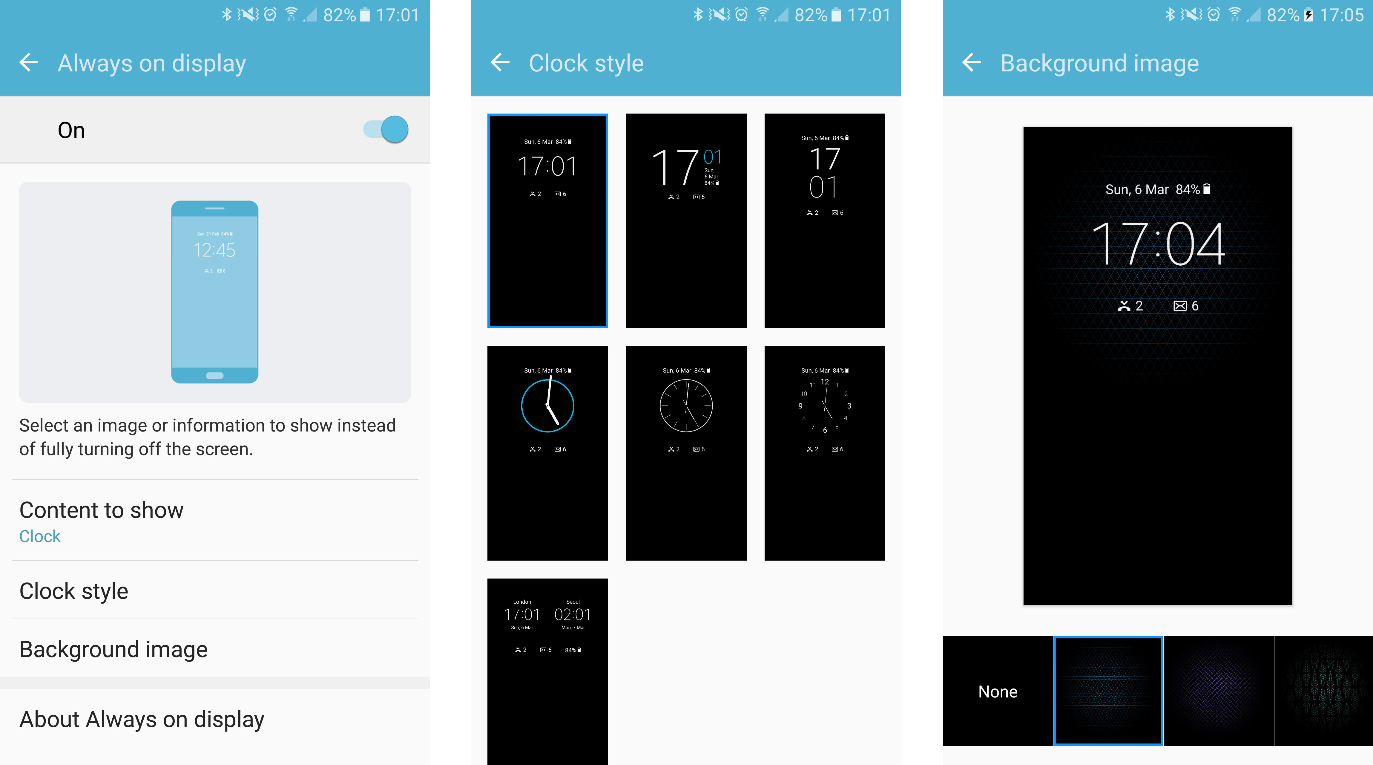
Samsung has opened up the API to app developers, so in the future we should see more notifications come to the always-on display, but it's something Samsung could have done itself, and it's annoying that it hasn't.
Aside from the default display, the other two options you can have are a calendar view or a full-screen pattern, neither of which are particularly useful. I expected at least calendar entries to be shown in some basic form with the former, but alas you just get a view of the days in the month, and that's it.
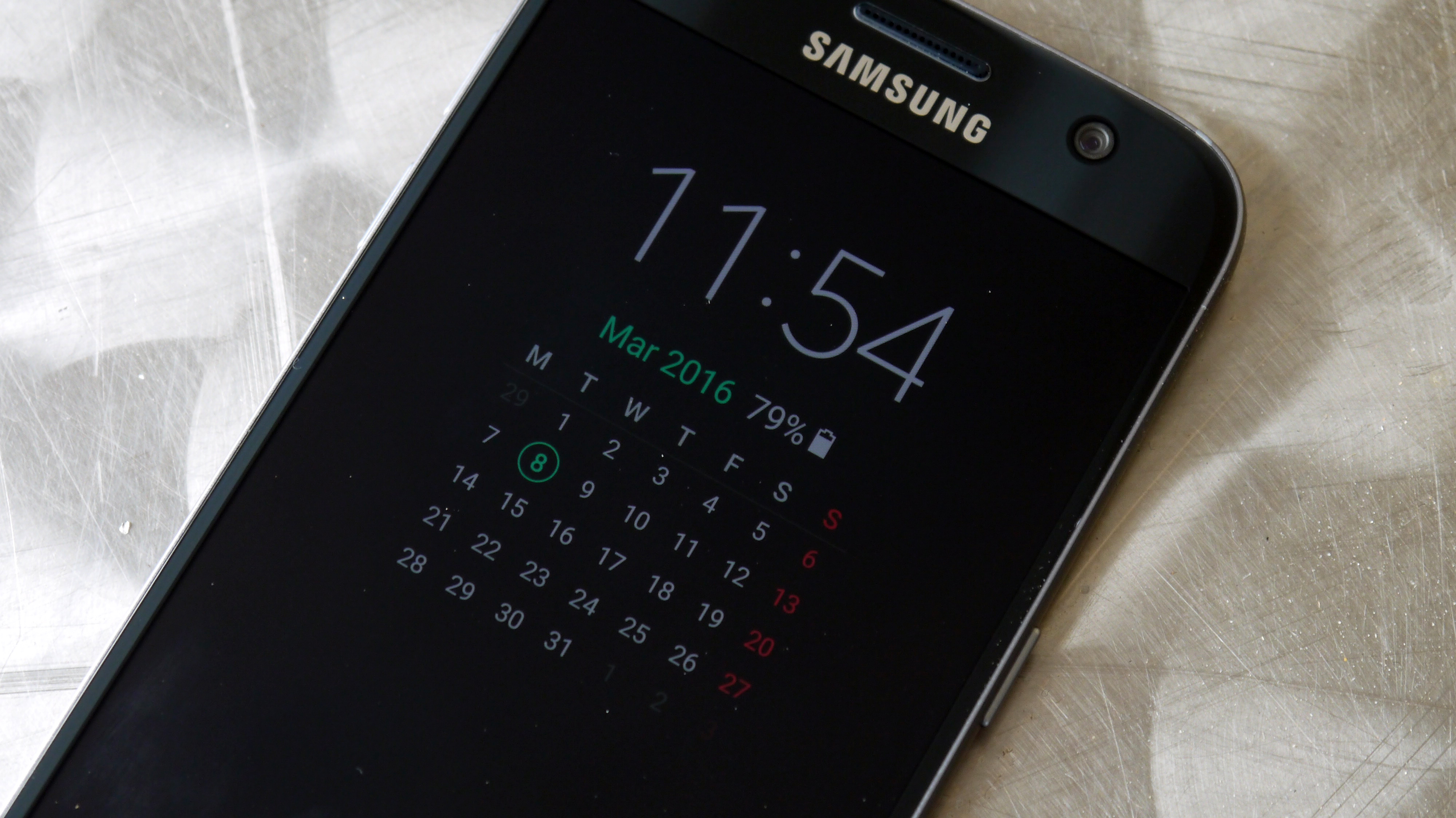
Meanwhile the pattern, instead of using a portion of the screen, takes up the whole screen. Furthermore, there are only three patterns to choose from (although more are now incoming), and you can't customize them in any way. The hope is more will appear in time, but for now it's useless.
With the screen never turning off (although you can disable the always-on feature in the settings), there is an additional drain on the battery. Samsung claims it consumes less than 1% every hour, though, and during my time with the Galaxy S7 I didn't find it was killing the power.
It may seem like a relatively tame addition, and at first I dismissed the always-on functionality as nothing more than a gimmick.
However, as I spent more time with the S7 I became accustomed to glancing at my phone for the time and date, as well as to see if I needed to stick in the charger. Simple, yet affective.
- Get the best deal on your next Samsung purchase with our Samsung coupon codes.

TechRadar's former Global Managing Editor, John has been a technology journalist for more than a decade, and over the years has built up a vast knowledge of the tech industry. He’s interviewed CEOs from some of the world’s biggest tech firms, visited their HQs, and appeared on live TV and radio, including Sky News, BBC News, BBC World News, Al Jazeera, LBC, and BBC Radio 4.
