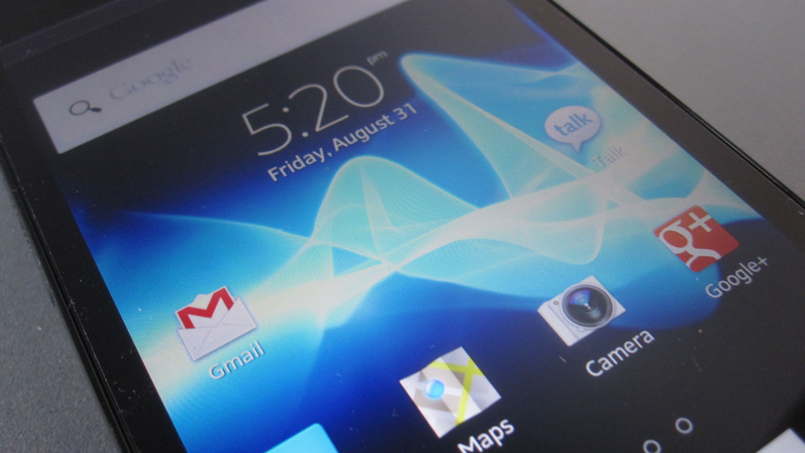
TechRadar Verdict
Pros
- +
Fantastic design
- +
A re-skinned version of Google that is, in some ways, superior to the stock Google
- +
Solid battery life
Cons
- -
A few blemishes prevent it from taking the top prize of a beauty contest
- -
Behavior of certain apps will confuse novice smart phone users
- -
Disappointing camera performance
Why you can trust TechRadar
The look and feel of Android devices has been a hot topic for some time now, and which has recently come to a boil, in the form of litigation. Many diehard Apple fans contest that Android smartphones and tablets, or at least certain models, shamelessly rip off Cupertino. And believe it or not, the other side sometimes shares that sentiment.
Many choose Android because they want a break from Apple and are never thrilled whenever a new handset arrives looking a lot like an iPhone 4S.
These people crave something distinct, something different, both inside and out.
Thankfully, a few parties are attempting to do just that. And, those who truly want "think different" might want to look towards Sony. Specifically the Xperia Ion. It represents the very best that Android can possible be.
But at the same time, it still represents some of the most inherent frustrations that plague the platform and that users must still continually cope with.
Hardware and Design
There are many ways to describe to the Xperia Ion. Its distinct design might not beautiful to all, but it's most certainly and undeniably bold. The thing simply has presence and oozes confidence. Its sharp angles offer a break from the super safe curves you normally see, and is a breath of fresh air.
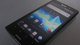
At 5.2 x 2.7 x 0.4 inches, the phone is fairly large. Its considerable profile is the primary reason for its imposing presence. Yet, the Ion fits comfortably in one's hand without becoming too much to handle.
And given how much space it takes, its 5.1 ounce weight is surprisingly light.
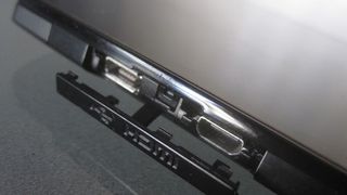
At the very top is the 3.5mm headphone jack. On the right is the power button, the volume rocker, and a camera button. On the left, where one would normally find the volume keys, is the micro USB port, to connection the Ion to a PC or the AC adapter, and HDMI port, to connect the device to a HD television. Both obscured by a small door. The bottom, aside from the microphone, is totally bare.
The back of the Ion is simply gorgeous. Its mostly brushed aluminum back is curved and very eye-catching, and more importantly, a joy to touch. It unfortunately dirties quite easily, but thankfully, it's ultimately quite durable.
A sleek backside
The back is also where one will find the 12 megapixel camera lens, and a flash. Again, Sony's industrial designers did a great job spicing up what is often a very (needlessly) boring part of a phone.
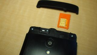
Initially it appears that the back does not open up, like Apple's iPhone 4s, but of the two plastic strips at the top and bottom, the one up north is actually removable. Inside you'll find the micro-SIM tray and micro SD slots (which is empty) in case the 16GB of internal storage is not enough.
The highlight of the front is the large 4.6-inch 1280-by-720-resolution display, capable of 720p. Apple has the Retina Display, and Sony has the HD Reality Display.
Performance wise, it's extremely impressive, with bright and bold colors, provided if the conditions are right. Being indoors, outside, or under the sun makes the screen exceptionally hard read.
At the top is a status light, front facing camera that is also 720p, and the AT&T logo is impossible to ignore. Android handset almost always displays the carrier's logo, this is hardly new, but given how much attention to detail was given to the phone, it sticks out quite awkwardly.

At the bottom are the usual row of home Android icons, in the form of captive buttons. Under each is an illuminating light, which activates accessed. One has to wonder why the icons themselves are not-backlight. Seems like such a unnecessary quibble, but again, when style is clearly the name of the game, it needs to be mentioned.
Otherwise, the overall look of the phone strikes an intriguing mix of mid 80's, boxy aesthetics and modern day flair (which somewhat channels the heyday of portable Sony electronics, specifically the era of the Walkman. But one that, once more, becomes stained quite easily. The front is a finger print magnet like no other phone before it, or so it feels.
