How to enhance any photo in 6 simple steps
It's not just about doing the right things, it's about doing them in the right order
Introduction
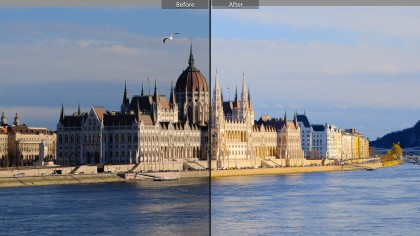
Photos don't often come out of the camera perfect. Sometimes they're skewed, sometimes they're too dark or too light and sometimes the colors are flat. You often capture stuff you didn't mean to and find foreign objects have strayed into the frame and spoiled your picture.
So these six steps work both as a photo fixing guide and a checklist to make sure your picture is as good as it can be. You might not need them all, but there aren't many pictures that don't need any of them.
The screenshots are from Adobe Lightroom and Photoshop because they show all the basic generic photo editing tools in a simple way, but you'll find all of these tools in just about any other image editing program.
There's one more thing. Always work on a copy of your photo rather than the original, just in case you change your mind one day and want to go back. You can do this by duplicating the photo first or by using the Save As command to save a new version as soon as you open it.
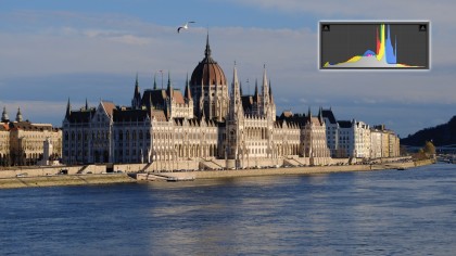
So let's try out these steps on this so-so travel shot...
Step 1: Check the basics
First, you need to make sure that your photo is worth the effort of saving, and this depends on two things – does it have a full range of tones and is it sharp enough?
The image histogram will tell you how much leeway you have for adjusting the brightness and contrast in the picture. Some programs will display a histogram panel, others will show the histogram if you use the Levels command.
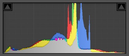
You need to make sure the histogram isn't cut off abruptly at the right hand side. This is where the image highlights are, and if this is 'clipped' it shows that areas of the picture are completely blown out and unrecoverable, and it often means your picture can't really be saved however much work you put in. Highlight clipping happens a lot with skies – happily, our image is fine because the histogram tails off long before that.

Now zoom in to 100% magnification on-screen. You can use sharpening tools to correct a small amount of softness or image blur, but only up to a point. The Internet used to be awash with snake-oil sharpening plug-ins that promised to correct any blur, however bad, but publishers (and photographers) are much more realistic these days.
Our picture's fine detail is a little soft, but it's all there and should respond well to sharpening.
Step 2: Crop and rotate
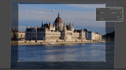
It's rare to take a picture that's perfectly straight and is composed so perfectly that cropping wouldn't improve it. But any image editor will let you straighten and crop your pictures, and some will do both at once.
Our shot of the Hungarian Parliament Building isn't quite straight, and there's probably more space around the building than we need, but the combined straighten/crop tool in Lightroom can fix both at once.
When you're straightening images, you can use the horizon as a guide or, if it's not visible, the walls of buildings – try to use walls near the centre of the frame for alignment since it's normal (and natural) for those near the edges to be slightly off-vertical if you had to shoot with the camera tilted up or down.
There's one more detail – note the 'Aspect' option in the panel. Most programs will let you preserve the aspect ratio of the original photo so that its proportions don't change when you crop it. Alternatively, you can choose a different aspect ratio such as 16:9, for example, for images designed for inserting in HD movies or full-screen display on a widescreen monitor.
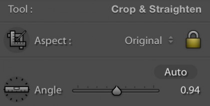
So why do this first? Because cropping out unwanted parts of the picture means you're not adjusting parts of the image you're not going to keep.

Step 3: Fix the exposure
High-end image-editors will let you adjust Levels, Curves or both, but these are a pretty technical approach and you can save them for more advanced work.
The simplest solution for routine enhancements is brightness and contrast adjustments, just like you get on a TV. The panel you see here is from Adobe Lightroom, which refers to 'Exposure' rather than 'Brightness', but the principle is the same.
Essentially, you use the exposure/brightness slider to make the image brighter or darker as necessary, then the contrast slider to make the contrast stronger or weaker. Usually, images benefit from more contrast, but this time a slight brightness increase and contrast reduction make for a lighter, airier result.

You need to watch the histogram when making brightness and contrast adjustments. The better programs squash the tones in the picture without actually clipping them, but older software is often cruder, and may simply shift the histogram along and clip the highlights or shadows.
Always fix the exposure before you start on the colors, because you often find that fixing the exposure and contrast also goes a long way towards fixing flat colors.

Step 4: Improve the colors
Digital photos sometimes look a little undersaturated. Digital cameras are very good at recording scenes exactly as they are in real life, but sometimes that can be a bit of a disappointment compared to the colors we think we remember.
The traditional tool for enhancing color is the Saturation control, but this is a bit of a blunt instrument which increases the strength of all colors by the same amount – weak colors become only slightly less weak, while strong colors can quickly go off the scale and lose details and textures.
That's why most image-editors now have a Vibrance control too. This is selective, boosting weak colors much more than strong colors.

In practice, you need to experiment a little to find the best balance. In Photoshop and Lightroom, the Vibrance slider seems to boost blues more strongly than reds, so to get the rich warm colors in this picture we had to push the Saturation up to near maximum and then wind back the Vibrance. In effect, we boosted all the colors, then pulled back the strongest.
It's a good idea to fix the exposure and the contrast before the final two steps because doing it at the end can exaggerate any bad effects or artefacts that they produce.

Step 5: Sharpen the details
Everyone likes their pictures to look as sharp as possible, but sharpening tools need to be used with care. Strictly speaking, the type of sharpening you apply should be tailored to how the image will be used, whether it's on-screen, in a print or in a magazine, for example.
The sharpening most people have in mind, though, is 'capture' sharpening – sharpening that overcomes any slight softness in the camera's sensor or lens – and while there are lots of different sharpening tools and filters out there, the go-to gold standard is the Unsharp Mask filter.
It looks complicated and you can quickly tie yourself in a knot trying to juggle one slider against another, so it's important to do things in the right order.
Don't start with the Amount value, start with Radius. This is the width of the sharpening effect, and 1 pixel is a good balance between edge halos around objects (these get bigger with a bigger radius) and effectiveness.
Now increase the Amount value until you get a good balance between increased sharpness and unwanted edge effects.
This will also bring out the noise, so use the Threshold slider to reduce the noise effect. Keep the setting low, e.g. 3 values in Photoshop, or you'll start to undo the sharpening effect.
The Unsharp Mask filter can be found in most image-editors and it works in much the same way in all of them.

Step 6: Clone out the mistakes
Finally, there's usually stuff in a picture you wish wasn't there, and while the tiny parked cars at the base of the building across the river are too small and fiddly to bother with, that dratted gull isn't. They don't just steal your fries, they get in your pictures too.
Fortunately this is an easy fix. Almost all image editing programs have a clone tool, and even though the spot removal tool in Lightroom is a simpler and more basic alternative, the principles are the same.
Essentially, you mark out the object you want to remove and the software picks a nearby area to copy over it automatically (Lightroom), or you choose the clone 'source' area and then paint over the object you want to remove manually (Photoshop's Clone Stamp tool).
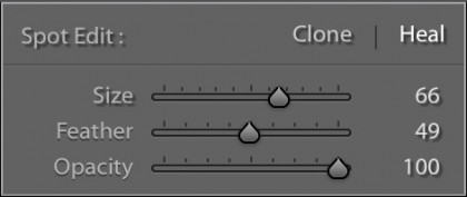
The trick is knowing which area to use as your source, and how subtly you can use the cloning tools – this is how professional image retouchers make their money.
Actually, there's another trick – knowing when you're wasting your time. Cloning out a gull against a sky is easy, and your repair will be invisible. Cloning out the tiny cars against a complicated background would take hours and is likely to look a lot less convincing.
So that's it – six simple steps to try out on any picture. You may not need them all, but using them as a checklist will make sure that you're not sharing a sub-standard picture that a couple of minutes' work could fix.

Rod is an independent photographer and photography journalist with more than 30 years' experience. He's previously worked as Head of Testing for Future’s photography magazines, including Digital Camera, N-Photo, PhotoPlus, Professional Photography, Photography Week and Practical Photoshop, and as Reviews Editor on Digital Camera World.