Best lightweight window managers for Linux
Lightweight alternatives to the command line
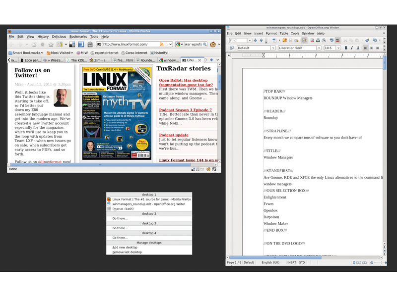
If you do a lot of work on a Linux computer, continuously switching between many windows, the right window manager can make you much faster and more productive than an extra 2GB of RAM.
In this context, 'right' means any combination of two different qualities: raw speed and correspondence with your actual needs, habits and personality. If you need to make the most of an obsolete PC, you'll probably want something slimmer and nimbler than either Gnome or KDE.
In other cases, what saves you more time is whatever does by default, with one click or keystroke, what you want to do most often. Be it vertical maximization, iconization or jumping around virtual desktops. The possibility to use the mouse as little as possible is another big productivity boost.
Whatever your needs, Linux has more than Gnome or KDE. This month we present five alternative window managers that were chosen with these criteria: first, they had to be lightweight, in order to be usable on low-end computers. Next, they had to be installable with normal package managers, so that you can try them quickly if you run the most common distros.
Finally, we gave precedence to lesser known window managers, rather than those normally pre-installed by those same distributions. That's the only reason why excellent products like Xfce aren't present: you've probably already got it in your login menu.
How we tested...
The programs have all been tested on a dual core AMD 64 3800+ system with 8GB of RAM, running Fedora 14 with all the updates available as of April 2011. We've looked at how easy it is to install and configure each window manager, how many options it has and how much its look and feel can be modified by the user. We've also looked at how well they work with the most essential applications you're likely to use.
Enlightenment DR 16 (E16)
The Enlightenment DR16 Window Manager, or E16 for short, was born in 1997, when most inhabitants of Linux-land were fiercely debating the One True Desktop Way, Gnome or KDE.
In the middle of all that, Enlightenment arrived and showed a different and, for many, much more visually pleasing way to handle a desktop. Today, the E16 version of Enlightenment is still, as its home page says, "graphically stimulating".
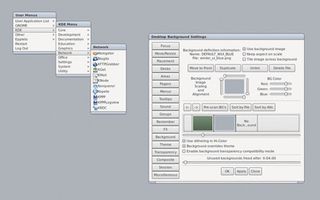
E16 is the only window manager in this roundup that is able to maximize windows vertically or horizontally, when you click with your left or middle mouse buttons on the middle icon in the window's title bar. The first feature (present in many other window managers) lets you read as many lines of text as possible without scrolling. The second is great for typing very long lines in terminals or editors without wrapping them around or losing sight of other windows.
You can customise every single detail of how E16 looks, feels and behaves. Doing so is what makes it so fun and quick to use, so be prepared to spend some time on it. The configuration panels have so many options, it takes half a day to look at them all. E16 also has shelves, or boxes that work more or less like Gnome panels.
The main, if not only, problem we've found in E16 is that its default application menu is a mess. Instead of first level sub-menus such as Games, Internet, Office and so on, you get KDE, Gnome, and Others, each with its own Games, Office, etc... sections. So a novice should first know if he or she wants to go Gnome or KDE and only then tell the computer if it's time to work, surf the internet or play.
On top of that, probably due at least in part to packaging bugs in Fedora 14, a lot of entries are repeated with the same or different names. Firefox, for example, is present both as Firefox and Firefox Web Browser.
Finally, as weird as it may seem, you cannot change E16 menus without editing the text files in $HOME/.e16/menus/. Luckily, they have a very simple syntax. If you do that or install epplets (more on them later), remember to select Maintenance > Regenerate Menus from the System menu.
In the same place you can also clear the many caches that E16 uses to work faster.
Looks matter
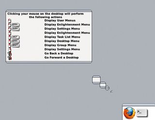
E16's default theme has very tiny window borders but you can change its look in lots of ways. By default, you have two virtual desktops. Each is twice as wide as your monitor, but it could be as much as 64 times bigger. Pushing the mouse cursor on the edge of your screen moves you to the other half of the current virtual desktop. This takes a while to get used to, but many users like it (eventually).
The top bar of each workspace has two tiny triangles at its edges that open the system menu and windows lists. In the right bottom corner of the screen lives an iconbox, a sort of panel with a slider that holds all your icons without cluttering the screen. You can even use more iconboxes simultaneously.
Each window is configurable individually and you can tell it to remember its settings. Different move and resize effects exist and visual tooltips pop up so learning E16 by doing is easy. Nearly everything can be done with the keyboard.
E16 can be launched alone or inside KDE or Gnome, replacing their default window manager. We strongly suggest you do the former. At least in Fedora, E16 alone starts, and runs single programs, faster.
Above all, E16 + KDE looks like two screenshots pasted over each other, fighting over who should be on top. Gnome + E16 isn't much better.
It is possible to write small, graphical add-ons for E16, such as clocks or mailbox and system monitors, called epplets. Those installable as binary packages in Fedora frankly failed to impress: a system monitor such as Gkrellm does the same things better and looks much cooler too.
Verdict
Enlightenment
Version: DR16 1.0.7
Web: www.enlightenment.org
Price: Free under GPL
E16 is wildly configurable, fast and fun but maybe a little erratic.
Rating: 8/10
Openbox
Back in the 90s, if you wanted a lean and mean but flexible window manager, that was able to do what you wanted with minimal eye candy and few distractions, but that didn't look like some GUI experiment from a decade earlier, sooner or later you'd try Blackbox.
Over time, that application has spawned several variants, recognisable by the 'box' suffix. Today, Openbox is the window manager of that family that you are most likely to find pre-packaged for your distribution. That's why it's here. Keep in mind, however, that most of what you read in this page also applies to Openbox's relatives.
If you aren't prepared, the first time you start Openbox you'll find yourself nervously wondering whether your graphics card passed out. A basic design idea of the *box window managers is that it's not just panels that are unnecessary; you don't really need icons either. By default it's a dull, dark grey background and nothing else.
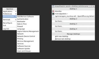
Don't despair, though, everything is here and the wiki on the Openbox website lists plenty of options to add panels. System menus are accessible with the right mouse button. Menus are almost the same as Gnome's, with one notable addition: Openbox knows its users aren't afraid of the command line, so it has a whole Terminals sub menu. This will give you immediate access to Konsole, Gnome Terminal, Emacs terminal or the old, but immortal Xterm.
Speaking of sub-menus, one little but really neat feature of Openbox is that it makes it really easy to create dynamic ones. Quoting from the Openbox wiki: "Pipe menus are dynamic menus, built on-the-fly from scripts. The output is piped back to Openbox and used for the menu".
For example, let's say that you already have a shell script that downloads RSS feeds, stock tickers or whatever you want from the internet. If you tell that shell script to save titles and URLs of all those feeds in one plain text file with a simple markup, you'll have created a 'News' Openbox sub-menu that lists the most recent news every time you select it, and opens in your favourite browser the ones you click on.
Virtual desktops
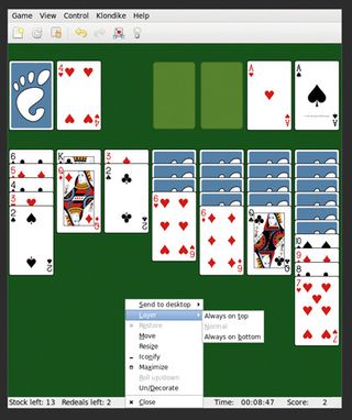
The not-so-complicated instructions to create your own pipe menu scripts, including links to existing ones, can be found at http://openbox.org/wiki/Openbox:Pipemenus.
Openbox also supports virtual desktops. To move from one to another without using the mouse, press Window Key+D.
As we said, Openbox doesn't use icons. When you minimise a window, it just disappears from the screen. You can reopen it in the same root menu used to switch between virtual desktops, that is also accessible by pressing the middle mouse button.
If you aren't comfortable with this system, but want the minimised windows to remain visible on the screen anyway, Openbox (E16 and Window Maker can do it too) offers an alternative to icons. You can 'roll up' windows, as if they were drapes, inside their top/title bar and only leave that visible on the desktop.
In order to save space, Openbox doesn't draw side or bottom borders. For the same reason, even the title bar is optional. If you right click on it and select Un/Decorate, it will become one pixel wide just like the other sides of that window. To get it back, go to the very border of the window itself until you see a small segment close to the pointer, then click with the right button.
All in all, even if it does look really bare, Openbox has almost everything you'd expect from a modern window manager. What isn't there can be added, with minimum effort, by following the good documentation on the website.
Probably the only major function that you'll have to add manually is session management (if you use Openbox without Gnome or KDE, otherwise it will integrate with their session managers) and there are step-by-step instructions on the Autostart and Getting Started pages of the Openbox wiki.
Verdict
Openbox
Version: 3.4.11.2
Web: http://openbox.org
Price: Free under GPL Fast, essential without being ugly, and easily extensible.
Rating: 9/10
Window Maker
Another veteran window manager that has been around since the 90s, Window Maker has a very characteristic look and personality. After you've used it for a few minutes, you'll probably recognise any screenshot of it immediately, no matter how heavily it has been customised, due to the two pillars of its interface: the Dock and the Clip.
The Dock is a sort of panel from which you can launch your favourite applications by double-clicking on their icons. You can add more applications simply by dragging their icons over it. And dragging icons out to the root window is all you need to do to remove stuff.
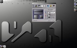
Drag and drop
A lot of configuration in Window Maker is done by dragging and dropping. The main limit of the Dock, at least for some users, is that its layout is fixed: you can put it on the upper or lower left of the screen, but it will always be a vertical single column.
The top left corner of your monitor is the default location for Window Maker's second distinctive feature: the Clip. This widget, unlike its Microsoft equivalent, does have a reason to exist.
The Clip can be placed wherever you want and besides switching from one virtual desktop to another, it also works as a temporary container for the icons of all the applications running in the current workspace - which is why some Window Maker users call the Clip a Dock enhancer. You can also drag an application icon away from the Clip and drop it on to the Dock if you decide you'll need it in all of your future Window Maker sessions.
You start applications in Window Maker by clicking on the corresponding entry in the root system menu. Unlike Openbox, Window Maker only offers Xterm as a default terminal but the root menu includes a Run widget in which you can type whatever command you need.
To declutter the screen, you can configure the Clip to AutoAttract the icons of all active programs that aren't in the Dock. Otherwise icons of open applications will be placed in the lower left of the screen and you can choose to make them appear on all workspaces. Wherever the icon is, clicking on it with the right mouse button lets you change settings, configure startup options and choose if you want it to start automatically every time you log into Window Maker.
The screwdriver icon in the Dock launches the Window Maker graphical configuration editor, a program called Wprefs. You can also start it from the root menu, where it is listed, oddly, as Preferences Utility at the bottom of the Appearance section.
You can do all sort of things in Wprefs, including changing the default icons. Remember, however, that if you do that, you must first tell Wprefs to change the Icon Search Path.
If you're unhappy with how you have configured the desktop, you can reset it to Window Maker's default values; but if you like it, you can save it for future logins.
One thing that causes confusion among first time users is how to launch the same program more than once from the same icon. The solution is simple but long-winded, so look for it before you start experimenting in the official FAQ, which can be found with the user guide and some useful tutorials on the website.
Graphical widgets
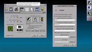
What's left to say? Oh yes, of course: dockapps, are little graphical widgets designed for Window Maker (but also usable in other window managers) that do the most diverse things. You can find lots of them at www.dockapps.org, from temperature indicator Dwgo (Don't Want to Go Outside) to Wmtext, which displays the output of a shell command with the font and background of your choice.
Summing up, Window Maker starts up fast, stays fast, is easy to use and has a nice retro look. On the down side, it didn't read the Gnome and KDE menus and windows are hard to resize.
Verdict
Window Maker
Version: 0.92.0
Web: http://windowmaker.org
Price: Free under GPL
Fast, full-featured and good looking, but less integrated with modern apps.
Rating: 7/10
Get the best Black Friday deals direct to your inbox, plus news, reviews, and more.
Sign up to be the first to know about unmissable Black Friday deals on top tech, plus get all your favorite TechRadar content.
