6 iTunes alternatives reviewed and rated
Fancy ditching iTunes in favour of something simpler? We check out six alternative apps for your music

Ever since iTunes was introduced in 2001, Apple has continued to tinker with it, updating how it works and how you access and play music.
iTunes 11 has introduced some interesting new interface components, the best of which is the new album view. This presents a grid of albums, and clicking one expands a track listing.
However, although this feels simple and elegant, simplicity and elegance within iTunes are only skin-deep. The app remains a complex, frequently unwieldy beast, primarily because it now has to deal with managing all kinds of media on your Mac, including books, TV shows, movies and apps.
At best, you can sometimes hide the clutter, but iTunes is no longer an app with a razor-sharp focus, and even accessing music can be done in several different ways, which can cause confusion.
This group test, then, is all about finding out whether you can replace the iTunes application with something better for the single act of playing music. Ideally, we wanted to find apps that would enable you to work with your existing music, but that would have more straightforward interfaces and fast search functions.
We also wanted any potential replacement to have multiple ways of viewing the app (rather like the iTunes mini player) and be stable and reliable.
Of the six apps we selected, there's a surprising amount of variation in terms of design. Although some tend to resemble earlier versions of iTunes, others are more akin to iOS apps, and one oddly has the visual appearance of a real-life piece of hi-fi kit, complete with a massive volume knob.
Get daily insight, inspiration and deals in your inbox
Sign up for breaking news, reviews, opinion, top tech deals, and more.
It's testament to the dedication of developers that any such apps even exist - it can't be easy convincing people to try a competitor to one of the best known and commonly used pieces of software on the Mac.
Still, that doesn't mean they get off lightly in our testing – we're looking for the best, and if nothing's good enough, we'll have to stick with iTunes…
Apps on test
Album Flow 1.0
Ecoute 3.0.8
Enqueue 1.0.1
Fidelia 1.2.1
Sonora 2.0 (beta)
Swinsian 1.7.1
Test one: iTunes integration
How does it handle your existing music?

All apps on test except Album Flow and Ecoute can manage their own libraries of music, with Enqueue also providing the means to monitor specific folders. However, there was variation in the way each app dealt with existing iTunes content.
Ecoute and Fidelia get it right, directly accessing iTunes library files, the former also optionally enabling you to write metadata back to the library on quit. Album Flow ostensibly also has the right idea, in working directly with iTunes, but, bizarrely, it requires iTunes to be launched in order to access its music.
The remaining three all rely on an import function, and all had problems. Swinsian fared best, pulling in playlists and albums, but it missed a lot of cover artwork. Meanwhile, Enqueue and Sonora failed multiple times to import everything, often crashing while attempting to do so. Enqueue at least managed to import the majority of our test iTunes libraries, but even missing 10% of your music is 10% too much.
Verdict
Album Flow 1.0: 2/5
Ecoute 3.0.8: 5/5
Enqueue 1.0.1: 2/5
Fidelia 1.2.1: 5/5
Sonora 2.0 (beta): 1/5
Swinsian 1.7.1: 2/5
Test two: Ease of use
Is the interface any better than iTunes?

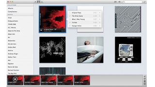
Sonora feels like the app iTunes wants to be. Its album-centric view is reminiscent of iTunes 11's and is just as usable. Albums can be reordered alphabetically, chronologically or by popularity. The app is fast and responsive, and we liked its track-queuing system, from which you can save mixes.
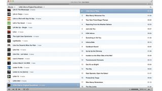
Enqueue and Swinsian ape older versions of iTunes; the former mimics a simplified iTunes 10 with Album List view and is fine, but Swinsian feels like someone described Apple's app to a dev in a hurry. The result is ugly but still broadly usable.
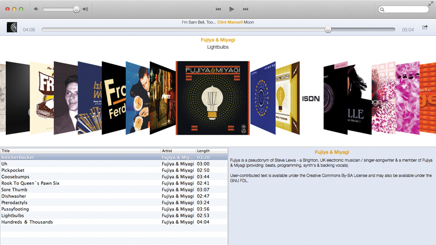
The remaining three are very different. Album Flow resurrects Cover Flow but is oddly clunky. There's no way to jump to an artist or album using the keyboard, making it tiresome to navigate large collections.
Fidelia's main view resembles real-world hi-fi kit, but the library is a separate window; both feel fiddly. Ecoute takes an odd column-based approach; it's initially strange to use, but we warmed to its iPad-app-like charms.
Verdict
Album Flow 1.0: 2/5
Ecoute 3.0.8: 4/5
Enqueue 1.0.1: 4/5
Fidelia 1.2.1: 3/5
Sonora 2.0 (beta): 1/5
Swinsian 1.7.1: 2/5
On the next page we test music search and useful features.
Most Popular


