Material Design: How to use Google's apps on iPhone and iPad
They're different from what you might expect
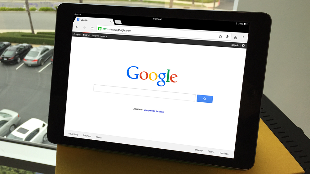
Apple and Google may be rivals, but there's no denying how useful Google's apps can be on iPhone and iPad. There's an iOS app for just about every service that Google offers. Gmail, Google Drive, Chrome, Google Calendar, and, of course, search. There are now 50 and counting, so unless you've completely eschewed Google, there's a good chance you have one or more on your iOS device.
By now you may have noticed they look and perform differently from other iOS apps. That's because they follow a design scheme unique to Google called Material Design. It looks great and allows Google to ensure its apps and services look similar across all platforms — iOS, Android, and the web.
The downside is that many of the little tricks you might be used to when navigating on an iPhone or iPad aren't there, so here's a quick guide that will help you avoid getting lost.
Going back is inconsistent
Let's start with the bad news. In a lot of cases, the familiar gesture where you swipe to the right to go back one screen doesn't work. It largely depends on which app you're using.
With Chrome, the slide-to-go-back feature works, but there's more animation involved. With Inbox you can swipe down to close an email or touch the "X" at the top-left of the screen. With Google Photos, you need to touch the back arrow, which can get problematic on an iPhone 6 Plus.
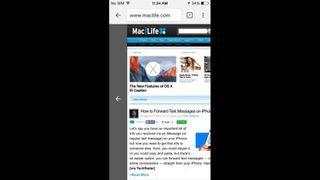
This probably works this way because it's the most platform-agnostic method possible. For example, on the web you click with the mouse and on Android use the back button. So to keep things equal that means no slide-to-go-back motion for you.
Google account details on the left
Google's apps are primarily cloud-based — bringing in your Gmail, Google photos, Google Drive files, and more — so signing in with your Google account is essential. Google has added this necessity with some design sense with a sliding bar on the left.
Get daily insight, inspiration and deals in your inbox
Sign up for breaking news, reviews, opinion, top tech deals, and more.
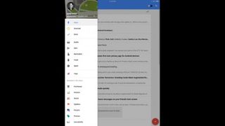
This section also doubles as a main hub for other details from the specific app. It takes you to labels in Gmail, bundles in Inbox, recent files in Google Drive, and for most apps it's where you find the settings. Keep in mind that menu bar is always hiding off to the left, ready to serve you when necessary.
One touch to action
Another key element of Material Design that has made its way into several different Google apps is the Floating Action Button. This puts a button at the bottom-right of the screen that serves as the launching point to any number of actions.

With the Gmail-alternative Inbox, for example, the button can launch a new message or reminder, or email one of your most-contacted colleagues. In Google Docs it will, as you might guess, create a new file. Google continues to roll out this configuration to its suite of apps, so be on the lookout for it.
Following its own beat
Finally, you'll notice that there's an overall design and organizational structure that is definitely different than typical iOS. Material Design organizes information into card-style pieces and relies on images and sharp visuals to differentiate various pieces of the interface.
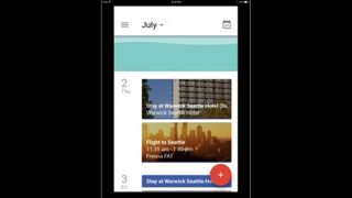
Additionally, you'll find that Google has thrown in a few drops of Android in the Google Search app.
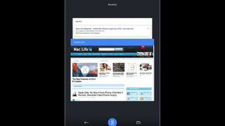
The key is to be mindful that when you use a Google app it's going to work differently from those built by Apple and third-party apps that follow closely to iOS guidelines. The downside is that it leads to an inconsistent interface when compared to what else you do with your iPhone, but if you use those Google services on other devices, you'll feel right at home.
