30 years of Windows package design
A history of Microsoft's OS in card and plastic
Introduction
Software packaging isn't exactly the epitome of great design. When it comes to software nostalgists, however, the big cardboard boxes that surrounded the discs and instruction booklets of years' past are stuff of legend. Y'know, it feels like the money you've splashed out is going further when there's more to show for it, doesn't it?!
As the world's most used operating system - and being from Microsoft - Windows has had some rather dull boxes designed for it to sit within. But it's also had some great packaging designed for it too, so we've gathered together images of the box art from each version of Windows, from 1985's Windows 1.0 to last month's Windows 10. Enjoy...
- Also check out: Windows boot screens through the ages
Windows 1.0
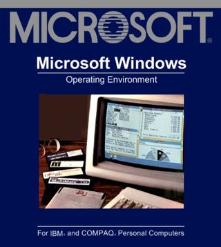
Windows welcomed its first piece of cardboard with the navy blandness that you see before you. It was aimed squarely at businesses and didn't even become an operating system at this stage. It was simply referred to as an "operating environment". There was also that early Microsoft logo which was synonymous with the company at that juncture.
The advertising for the software was a little bit more exciting as it had that now infamous ad featuring Steve Ballmer...
Windows 2.0 (386 version)
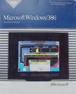
There were two versions of this OS for 286 and 386-powered PCs, and the Windows 2.0 boxes were pretty dull but introduced typical 80s window blinds and images of the now-colourful Windows desktop. Note the new Microsoft logo, too (which was actually only replaced a few years ago).
The 386 version is pictured, but the 286 version had exactly the same box design, except for the number '3' becoming a '2' of course.
Windows 3.0
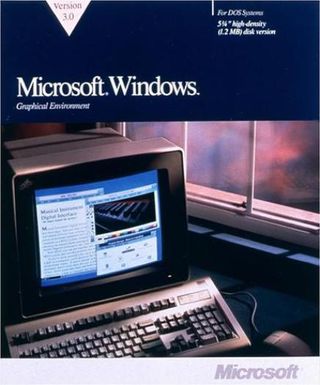
Notice that Windows 3.0 is still on 5.25-inch disks. Windows 3.0 is now called a "graphical environment" - still running atop MS DOS of course. But isn't the imagery still really, really dark and dingy? "Windows 3.0: Underworld Edition"?
Are you a pro? Subscribe to our newsletter
Sign up to the TechRadar Pro newsletter to get all the top news, opinion, features and guidance your business needs to succeed!
Microsoft still had a big obsession with the colour navy blue at this stage, but if you're going to take the darkness theme seriously then something like a night blue feels perfectly appropriate.
Windows 3.1
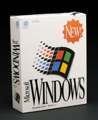
Hold the phone! Microsoft obviously ran out of the famous navy blue paint when Windows 3.1 rolled in, and had to be content with a much bolder design that featured a white background plus the famous Windows flag for the first time.
The flag brought even more colour to the OS packaging and some writing that emphasised the fact that it is 'WINDOWS', something missed on all of those boxes that came before.
Windows 3.1 for Workgroups
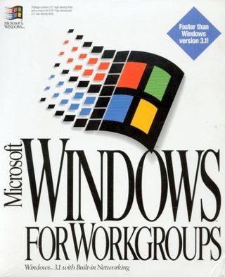
Microsoft got very excited by those fonts from Windows 3.1 and packed even more writing onto the box with Windows for Workgroups. How else was it going to proclaim that this was so much faster than Windows 3.1?!
Windows 95
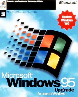
Wow! As well as upping the game in terms of the OS itself, Microsoft went all consumer on us for Windows 95's packaging. Indeed, Microsoft's subsequent reputation for putting too many messages on the box probably started here.
Windows 95 still came on floppy if you wanted it, but most of the versions were on those new fangled CD-ROMs that everyone was getting excited about.
Windows NT
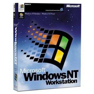
The business-oriented NT version was the first fully 32-bit version of Windows and formed the basis for the Windows we still use today - all "Home" versions after Windows ME (starting with Windows XP) were based on the more stable and secure NT codebase.
As far as the box goes, it has a very space age vibe that actually looks rather neat and beyond that retains all those successful bits that arrived on the Windows 95 box.
Windows 98
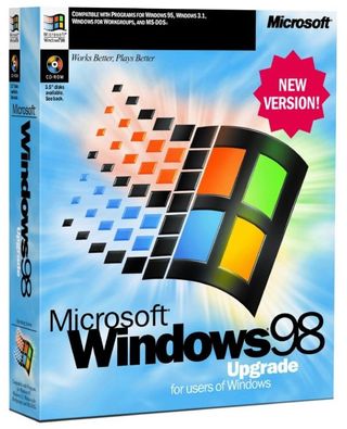
A development on the Windows 95 box but easier on the eye, the Windows 98 packaging continued the "too much information" era. Shame the box was so similar to the Windows 95 one that Microsoft had to stick a 'NEW VERSION!' flash on it.
Windows 2000
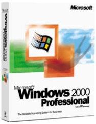
Apologies in advance, as you'll now have to suffer two poor packaging efforts with this and the next slide. Returning to white, Microsoft went back to basics. It's a shame for Windows 2000, as it was a super OS - a leading anti-virus expert said the last of his userbase had only recently upgraded.
Windows XP
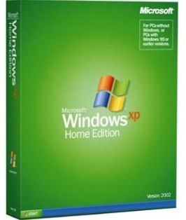
The non-shoutiness of the Windows XP packaging was surprising given the quantum leap forward that Windows XP represented over ME. But it was clever design - the difference between the editions was clear and nowhere near as confusing as the myriad of Vista versions that followed (see the next slide).
Windows Vista
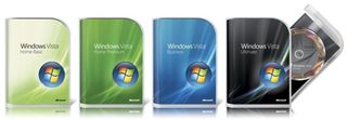
On the Windows blog, Nick White announced the new packaging for Vista and Office 2007. "The packaging has been completely revised and, we hope, foreshadows the great experience that awaits you once you open it."
Hmmm. In a disappointing move environmentally, Microsoft moved to a chunky clear plastic design with a printed inner. Blogger Long Zheng was more positive, calling it "holy freaking super deliciously awesome."
Windows 7
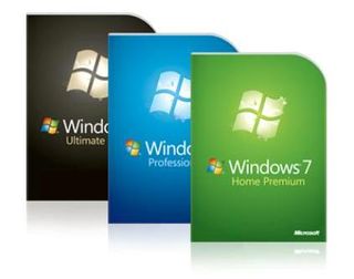
Microsoft simplified the design for Windows 7, with a cardboard outer and plastic inner. "The plastic case protecting the Windows 7 disk is lighter and is recyclable," explained Microsoft blogger Brandon LeBlanc on the Windows 7 blog. "The packaging itself has a 37% weight reduction and the econometrics score has improved by 50% over its predecessor."
Things would have been even better if there was no plastic though. It helped that the OS itself was ace.
Windows 8
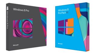
When Windows 8 was launched, we weren't that keen on the packaging, which seemed to be a little dull in comparison to the new Start screen which the OS brought with it.
But the new beginning for Windows that got some folks excited turned out to be a false dawn, and that new Start screen famously bombed, with users reaching for the Start menu mods before you could say '8.1'.
Windows 8.1
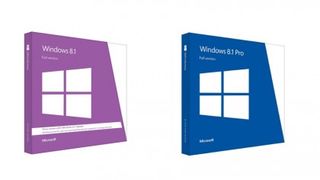
Differentiating itself as much as possible from Windows 8 was the order of the day when it came to Windows 8.1, and the OS certainly did that in the box department. Out with the jazzy colourways of Windows 8 and in with a bold lilac and navy combo.
The box for Windows 8.1 Pro certainly borrows a lot from the earliest versions of Windows that were positioned at the business end of the market, and by bringing back the Start menu, this version of Windows remains firm in the hearts of many a PC owner.
Windows 10

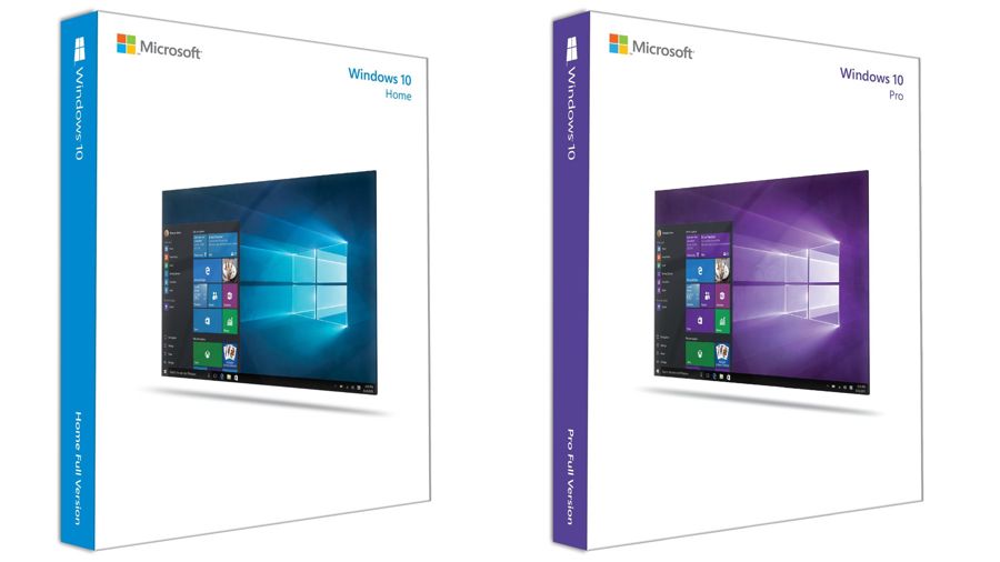
Fast forward to the latest version, Windows 10, and it borrows elements of many of those that came before it. Back is the white background of Windows 3.1 as well as the slanted orientation of the PC window that was first seen on the Windows 8 box.
Similar to the earliest boxes for Windows, it shows what the operating system looks like on the desktop and offers an insight into what it will look like when it arrives on your PC. It even gives a big nod to the Start menu that forms a centrepiece of the OS. In short, it's a sharp looking package that will be around for a long time.
Dan (Twitter, Google+) is TechRadar's Former Deputy Editor and is now in charge at our sister site T3.com. Covering all things computing, internet and mobile he's a seasoned regular at major tech shows such as CES, IFA and Mobile World Congress. Dan has also been a tech expert for many outlets including BBC Radio 4, 5Live and the World Service, The Sun and ITV News.
