You have to admit, Microsoft has taken a sizable gamble with Windows 8.
Some commentators say that the company simply has to change the way it operates if it wants to gain any traction in the tablet and smartphone market, and with the new operating system's touch-oriented interface, it has certainly started down that path.
With the Windows 8 UI, otherwise known as Metro, Windows has undergone a radical rethink in terms of both operation and interactivity.
For us desktop users, it represents a massive change from what we've become accustomed to over the years. Gone is the desktop as we know it and, more jarringly, gone is the Start menu that we've come to love since the somewhat dysfunctional days of Windows 95.
Windows 7, but better
But there's no need to worry, since all we're looking at with Windows 8 is essentially a re-skinned version of Windows 7 with some fancy new GUI components dropped in on top of it. As Microsoft itself says in the reviewers' guides it sent out to the press: it's Windows 7, only better.

OK, Microsoft's developers have done more than just update the graphics, so that glib assessment is rather over-simplifying things, but the basic point is that you won't be losing out on any of the functionality you enjoyed with Windows 7, which has evolved into one of Microsoft's finest operating systems to date.
Some things may seem like they have been hidden, but as soon as you get used to the new layout, it will all become second nature.
Get the best Black Friday deals direct to your inbox, plus news, reviews, and more.
Sign up to be the first to know about unmissable Black Friday deals on top tech, plus get all your favorite TechRadar content.
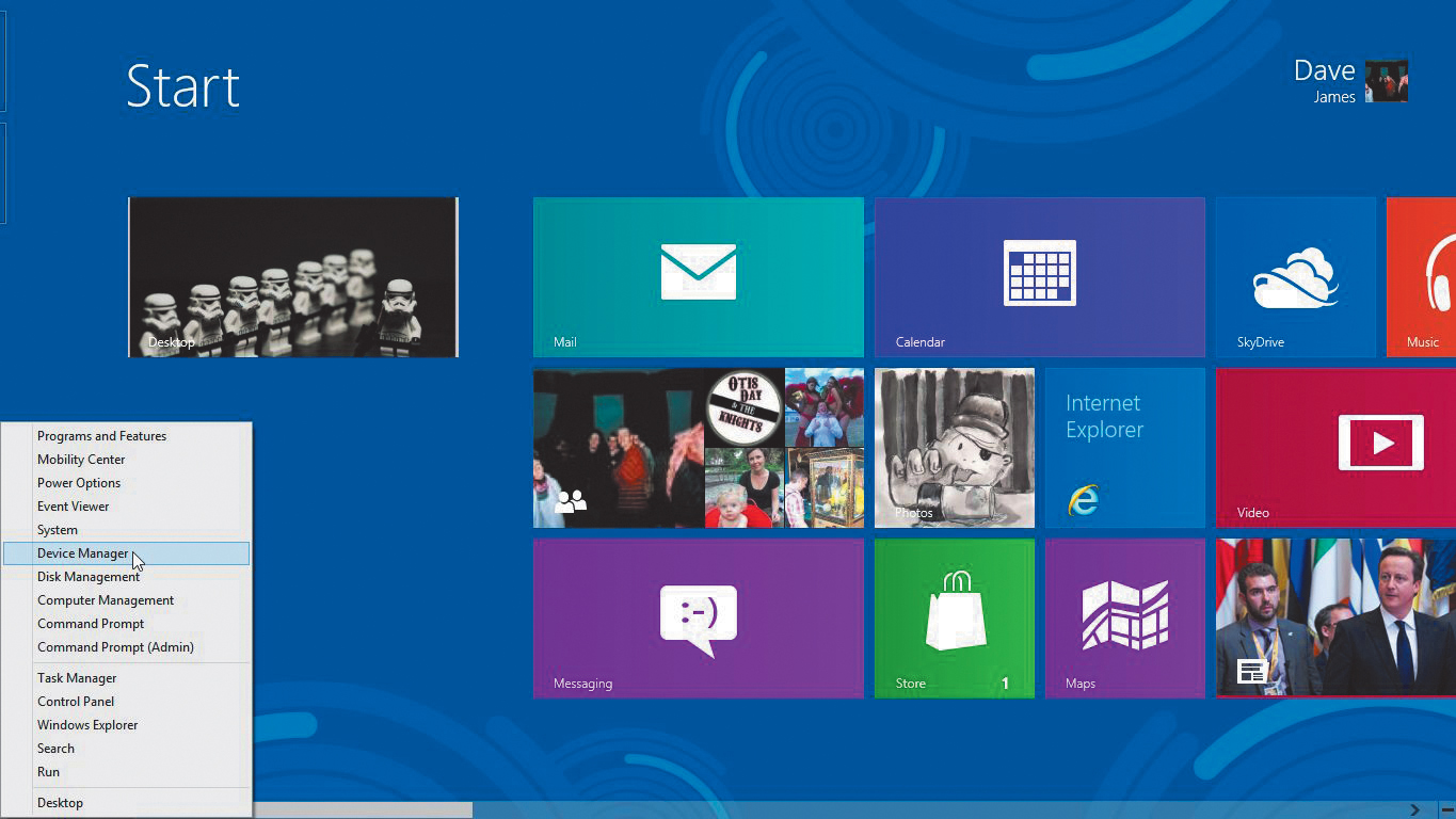
The first thing you need to be aware of is the powerful new user menu, in place of the old Start menu. It's a simple right-click away from any screen, whether you're using the desktop or the Metro interface, and contains quick links to all the most important administrative functions you could possibly need when setting up or keeping your PC running smoothly.
From here you can dive straight into the likes of the Device Manager or Disk Management dashboard, and start tweaking things immediately.
Microsoft has obviously spent time deciding which of the most important services it wants to put in this menu, and if an administrative feature has been left out of the one-click system, it will probably only be a second click away - in the Control Panel, for example.
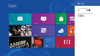
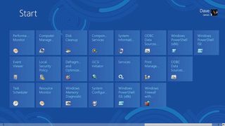
If you prefer, you can drop all the serious admin tools into the Metro interface straight away (we explain how under 'How to bring out the admin tools'), so you can jump directly into whichever one floats your boat from the Metro start screen.

There are a few more tools in this group than there were in Windows 7, but for the most part these aren't new options - just ones that have been moved in from elsewhere.
The System Information option is a particularly useful page, giving detailed specs, locations and builds for the various kinds of software and hardware that make up your PC. Clicking on any of the categories will give you a full rundown of how things are running.
For example, the Disks section of the Components/Storage category shows exactly what make your hard disk is, what partitions are running on an individual storage drive, and how full they are. If you want to know exactly what's making your PC tick, this is the place to go for all the necessary info.
Clean and polish
Speaking of playing around with your machine's disks, Microsoft has also moved two of the most commonly used disk management utilities under the Administrative Tools umbrella: namely Disk Cleanup, and Defragment and Optimize Drives.
These will both be familiar to anyone who's used any of the last few generations of Windows operating systems, though the Defragment and Optimize Drives tools have now been reconfigured to cope with the increasing popularity of solid state drives, and will no longer try to persuade you to wear them down with unnecessary defrags.
Most Popular

