Windows 8 beta: new features to expect
Zooming live tiles, managing Metro apps and more
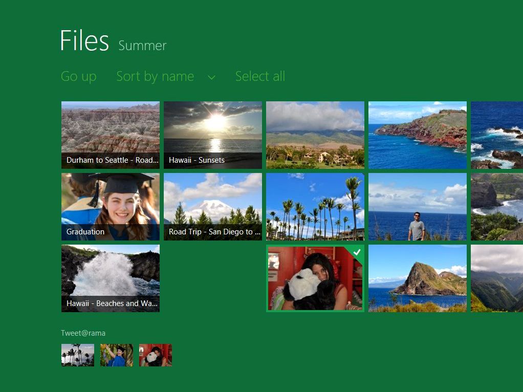
The developer preview of Windows 8 that Microsoft put out in September is very obviously a work in progress; in particular the Metro start screen and charms interfaces.
Here's what we know will change in the next milestone (we expect that to be the beta release and we expect the Windows 8 beta launch to be at the CES 2012 show in January).
The Metro UI, as used in Windows Phone, Windows 8 and the new look for Xbox, is based on modern design and Bauhaus, typographic style and the efficiency of transport signs, according to the Windows user experience design director Samuel Moreau.
That won't change, and neither will the sharp corners and solid colours of the tiles on the Start screen; a look that Alice Steinglass, the group program manager for the core user experience team, defines as "clarity of spacing, solid edges and backgrounds and rectangles". But you won't be stuck with the green background.
Busy photographs might not work when they're covered in tiles and the background is going to have to stretch across many screens' worth of icons. Plus using bold flat colour for clarity and legibility is one of the principles of the Metro design style: "It's about clean, clear, crisp information, bold use of colours, bold visuals for a bold design" Moreau explains.
"It's about reductionism and a focus on function and making function beautiful. So while there will be options for customising the background in the beta, we expect that to be picking different colours or simple background looks."
That still won't be the final look for Windows 8, on the Start screen or the desktop. As Windows chief Steven Sinofsky has pointed out on the Building Windows blog "those details of the visual styling come later in the engineering process".
Are you a pro? Subscribe to our newsletter
Sign up to the TechRadar Pro newsletter to get all the top news, opinion, features and guidance your business needs to succeed!
The Windows 8 beta will have more functionality for organising the Start screen. Instead of having to make a group by dragging an existing tile out of a group, you'll be able to make new groups, give them names (if you want - you don't have to name every group) and rearrange the order of groups without dragging individual tiles around. Drag a group and all the tiles in it will move together.
Zoom and scroll
Groups are key not just for putting tiles where you can easily find them but for moving quickly through a lot of pinned tiles. In the Windows 8 beta you'll be able to pinch with your fingers or use a single mouse click to zoom out and see more tiles and groups on screen at once.
This doesn't just make the tiles smaller, it collapses them into a group that you can treat as a single item, so you can zoom out, scroll to the group you want quickly and then click on a tile to launch a program quickly.
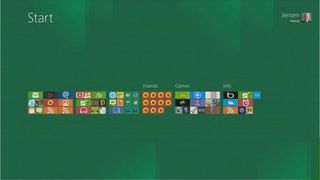
SEMANTIC ZOOM: Zoom out and tiles get smaller, simpler and easier to parse as a group
This semantic zoom isn't in the developer preview but it's the same principle as in the Build conference app; when you zoom out from the list of sessions, you don't get smaller icons for the sessions - you get the time slots and days instead. The same thing could happen in the game explorer; you'd go from groups of tiles to large icons for the category of each group.
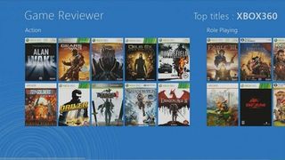
IN DETAIL: A sample Metro app with tiles for individual games…
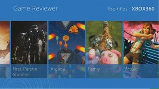
ZOOM OUT: …and you see the categories rather than tiny illegible tiles
Microsoft calls the gap between groups of tiles speed bumps; the idea is that this makes it easier to swipe through the Start screen and stop at a specific group without shooting past.
We're expecting a way to customize speed bumps to make it easier to virtually divide the Start screen to navigate quickly.
There will definitely be improvements for scrolling through the Start screen tiles with a mouse. It doesn't work to treat the mouse like a finger, Moreau says, but there will be a way to scroll without going down to the scroll bar at the bottom of the screen and dragging it along.
Search and switch
Some of these are features that just weren't stable enough to put in the developer preview of Windows 8, but there will also be changes and new features based on feedback from users.
Instead of being one long alphabetical list, the App screen that you can look through for programs you haven't pinned to the Start screen will also be organised into groups in the Windows 8 beta, with the same program group names you'd see on the Start menu in Windows 7.
That way, the uninstall utility for a program will be with the program it's designed to uninstall rather than at the end of the list with six other anonymous uninstallers, and you don't have to remember the name of the tool for organising images that comes with Microsoft Office; you can just look in the Office group.
You'll see the Apps screen as soon as you click the Search charm, even if you're coming from the Windows desktop, to make it obvious what you're searching through by default.
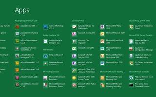
APP GROUPS: The list of all the installed programs will be arranged by groups, not alphabetically
Updates and notifications are a big part of making Windows 8 feel alive and live tiles can use the background notification service to show you updates like new headlines or the number of unread emails even when the Metro app isn't running and taking up memory.
User experience head Jensen Harris said at Build that there wouldn't be "a junk drawer of notifications to clean up" and that "if a notification is suitably important that there's a problem if the user misses it, [the app can] change the live tile".
But enough testers have suggested that the updates could make the Start screen feel too busy and distracting that there will be an option to turn off notifications.
And if you haven't mastered the card shuffling gesture for dragging the next Metro app on screen then dragging the icon back off screen to flip quickly through all the open apps to get the one you want, there will be a way to specifically close Metro apps without having to open the Task Manager or just waiting for them to get suspended, so you don't have to flip past the ones you know you're done using.
The Windows 8 beta should also have many of the apps missing from the developer preview: Windows Media Center, DVD Creator and the Windows 7 games. We might see the Metro-style Windows Live apps and the option to upgrade a PC from Windows 7 rather than do a clean install as well, or we might not get those until the release candidate.
Mary (Twitter, Google+, website) started her career at Future Publishing, saw the AOL meltdown first hand the first time around when she ran the AOL UK computing channel, and she's been a freelance tech writer for over a decade. She's used every version of Windows and Office released, and every smartphone too, but she's still looking for the perfect tablet. Yes, she really does have USB earrings.


