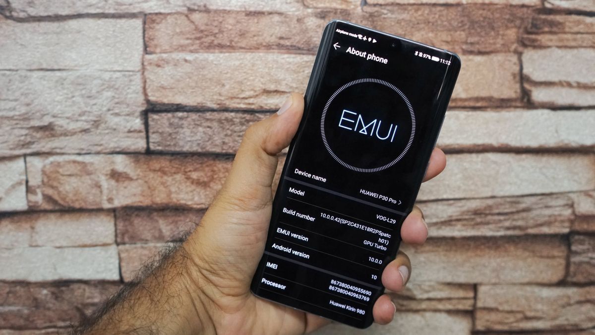
A couple of months ago the experience on the Huawei P30 Pro was elevated with the release of EMUI 9.1 that brought key visual and performance upgrades. It’s about to get even better with Huawei’s latest version of EMUI which is based on the freshly minted Android 10. As we’ve said in our review, the P30 Pro sets a new standard for the entire mobile industry. Its four rear cameras are quite simply astonishing, along with an eye-catching design and plenty of power.
Today we’re going to compare EMUI 9.1 with Huawei’s latest version EMUI 10 which runs on top of Android 10. Now, EMUI 10 is still in beta and it’s not the final version but we have it running on the P30 Pro and we wanted to show you some comparisons between EMUI 9.1 and talk about what’s changed in EMUI 10 and the new features you can expect if you have a compatible Huawei smartphone.
We’ve got two P30 Pros here - one running EMUI 9.1 and another on EMUI 10.0 beta. We’ve seen EMUI go through quite a few design upgrades over the past couple of years but EMUI 10 is perhaps the largest visual overhaul yet.
If we go to Settings, you’ll see that it’s not just one long list anymore as on EMUI 9. On EMUI 10 menu items are grouped into lists, which is overall better to look at and makes it easy to find what you’re looking for. Text is also more spaced out, less cluttered and overall easier on the eye.

Another noticeable change is on the notifications panel. EMUI 10 moves away from the old fashioned cramped rows of notification icons and instead uses a nicer translucent background with larger notification icons that have circular backgrounds and toggle animations so you can clearly see what settings are enabled at a quick glance. It’s still customizable as before and you can add any setting you wish to the notification tray.
But one of the big changes and features of EMUI 10 is an Enhanced Dark Mode which is slightly different from the way it’s used in Android 10. Huawei’s implementation is more system wide meaning once you turn Dark Mode on under Display settings, it’ll force all compatible apps that support it to automatically switch to Dark Mode. You’ll also notice that Enhanced Dark Mode doesn’t just invert colors from black to white which would be quite harsh but uses a variety of grey, black and whites to produce a dark theme that won’t strain your eyes.
Pleasant aesthetics and visual elements being easy on the eyes is a common theme across this latest version of EMUI - one you will see as soon as you unlock the phone. On EMUI 9 you’ll see icons are smaller and close to one another but on EMUI 10, icons have been refreshed. Huawei’s proprietary app icons also have a better and low saturated color scheme. Icons in general have a more rounded look and are spaced out, which gives it a nice, modern feel.
Another small touch we love are the animations that are added to simple tasks like tapping on icons, or closing apps. For instance, when you tap on an icon in EMUI 10, it depresses it into the screen kind of like pressing a button. When you’re closing an app, the app screen minimizes and moves along with your finger and then settles back to where its app icon is. When you’re switching between apps, you’ll see similar animations - tapping on an app screen and moving it around has a springboard like animation which varies depending on the amount of force you apply in each tap. It makes things seem a lot more fluid and responsive and makes the OS look and feel like a premium experience.

EMUI 10 will also tweak the Always On display setting. On EMUI 9 the text that’s displayed is plain white but on EMUI 10 you will be able to add colors and themes that will change according to the time of day. Unfortunately, it’s not available on the beta version, but we expect this feature to appear when the full version launches soon.
The camera app in EMUI 10 also looks different to EMUI 9. The shutter button is revamped and Huawei’s also tweaked the typography. Switching between modes you’ll see that each mode’s name flashes in a big font to clearly show which mode you’ve chosen. On night mode you’ll notice that a countdown in seconds comes on the screen instead of loading wheel around the record button, The zoom slider has also been tweaked to where a tap turns it into a slider and magnified numbers show what level you’re at. In EMUI 9, tapping on the zoom slider just switches between a set of pre-set levels. This way it’s easier to find the zoom level you’re looking for.
Apart from visual changes, there are a bunch of speed and performance boosts that are coming to EMUI 10. Copying files is going to be faster, and you’ll notice next to no lag when multitasking - even while running demanding apps - and gaming remains a smooth buttery experience as ever.
Those are the new features you can expect on EMUI 10. Huawei’s major focus has been on tweaking visual elements and boosting performance to keep things running smoothly. EMUI 10 beta will roll out on the P30 Pro soon and will be rolling out on other Huawei devices like the Mate 20 and Huawei Nova 4 in the coming weeks.
Get daily insight, inspiration and deals in your inbox
Sign up for breaking news, reviews, opinion, top tech deals, and more.
