Twitter updates its look — here's what's new
No, you still can't edit tweets

Twitter is freshening up its look, announcing a new interface currently rolling out to iOS, Android and web users of the social media platform.
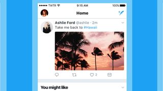
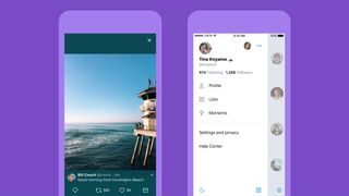
The update, which is mostly cosmetic, streamlines the Twitter timeline by turning square profile pictures into circles and cutting down the toolbar on the bottom to four simple icons.
The profile tab, meanwhile, is now relegated to a sidebar which can be accessed in an Android-style "hamburger" menu that will be a first for iOS Twitter users.
As noticed by yours truly and other Twitter-ers, the new look is strikingly similar to Instagram's big black-and-white update from last year, cutting out a chunk of Twitter's trademark blue-and-white design for something more monochromatic and icon-centric.

Additionally, the update changes the look of interaction buttons on tweets — even swapping the 'reply' arrow for a speech bubble, as Twitter says some newcomers previously confused the arrow for a backspace or delete function.
The new design also also updates the 'like', 'reply', and 'retweet' counts of each post in real time for mobile apps, allowing you to watch those numbers climb right in front of your eyes the next time you tweet out a real zinger.
Tweet it or leave it
While some enjoy Twitter's rounded new profile icons and trendier layout, others have taken to the #NewTwitter hashtag to instead express their distaste for the new-look timeline.
Get the best Black Friday deals direct to your inbox, plus news, reviews, and more.
Sign up to be the first to know about unmissable Black Friday deals on top tech, plus get all your favorite TechRadar content.
Some take umbrage with the aesthetics, claiming the circular icons are visually unappealing on a timeline, as well as restrictive for profiles that use text, logos, or QR codes for an avatar.
A Twitter spokesperson tells TechRadar that the change was to help make the site easier to understand. Previously, both the picture of the person posting an image and the image itself were rectangular, leading Twitter to change the profile images circular to help distinguish them on a person's feed.
Other riled-up users seem to care less about circles versus squares, but rather criticize Twitter for not focusing on technical complaints lobbed against the service, such as issues loading up .GIF and videos on some devices, better tools for combating harassment and spam, and the lack of an editing function for misspelled or inaccurate tweets.
According to Twitter's Dan Jackson, the changes to the service's layout were guided by both research and direct feedback from users. Jackson noted the service is still exploring new ways to improve. As Twitter continues its recent brand refresh, we imagine even more changes are yet to come.
Most Popular

