Early Verdict
There are no surprises about the M10 but it has enough features to make it enticing to beginners and it promises to deliver high quality images. We'll be paying particular attention to performance of the autofocus system when we get a production sample to make sure that it is up to scratch.
Pros
- +
Proven 18Mp APS-C format sensor
- +
Well implemented touch control
- +
Nice build and reasonably small
Cons
- -
No viewfinder or option to use an external unit
- -
No hotshoe for an external flash
- -
Limited lens range
Why you can trust TechRadar
While the Canon EOS M3, which we reviewed back in May 2015, is designed to appeal to relatively experienced photographers looking for a comparatively small camera with a similar level of control to an SLR, the new EOS M10 is aimed at those who are a little newer to photography.
With that in mind, in addition to the usual collection of scene modes for shooting specific subjects it has Canon's Creative Assist mode that enables you to take control of the camera without getting bogged down with technical or photographic terms. Helpfully, you can save preferred setting arrangements for re-use at a later date.
As you gain in understanding and confidence you can progress on to using more advanced options such as aperture priority, shutter priority and manual exposure mode.
Inside the M10 is the same 18Mp APS-C format sensor as is in the Canon 100D, the company's smallest DSLR. This chip is coupled with a Digic 6 processing engine and sensitivity may be set in the native range of ISO 100-12,800 with an expansion setting of ISO 25,600.
Autofocus is in the hands of Canon's Hybrid CMOS AF II system, which is faster than the system in the original EOS, even after its firmware upgrades, but it's not quite as speedy as the Hybrid CMOS AF III system in the EOS M3.
Canon is nicely on-board with the move towards a connected world, and the M10 has both Wi-Fi and NFC connectivity. As well as allowing images to be transferred to a smartphone or a cloud service, the Wi-Fi system can be used to enable a phone to control the camera remotely.
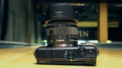
Like the other EOS M cameras, the M10 doesn't have a viewfinder built in so images must be composed on the 3-inch 1,040,000-dot touchscreen. There's no hotshoe or connection port, so it's not possible to connect an optional electronic viewfinder.
Sign up for breaking news, reviews, opinion, top tech deals, and more.
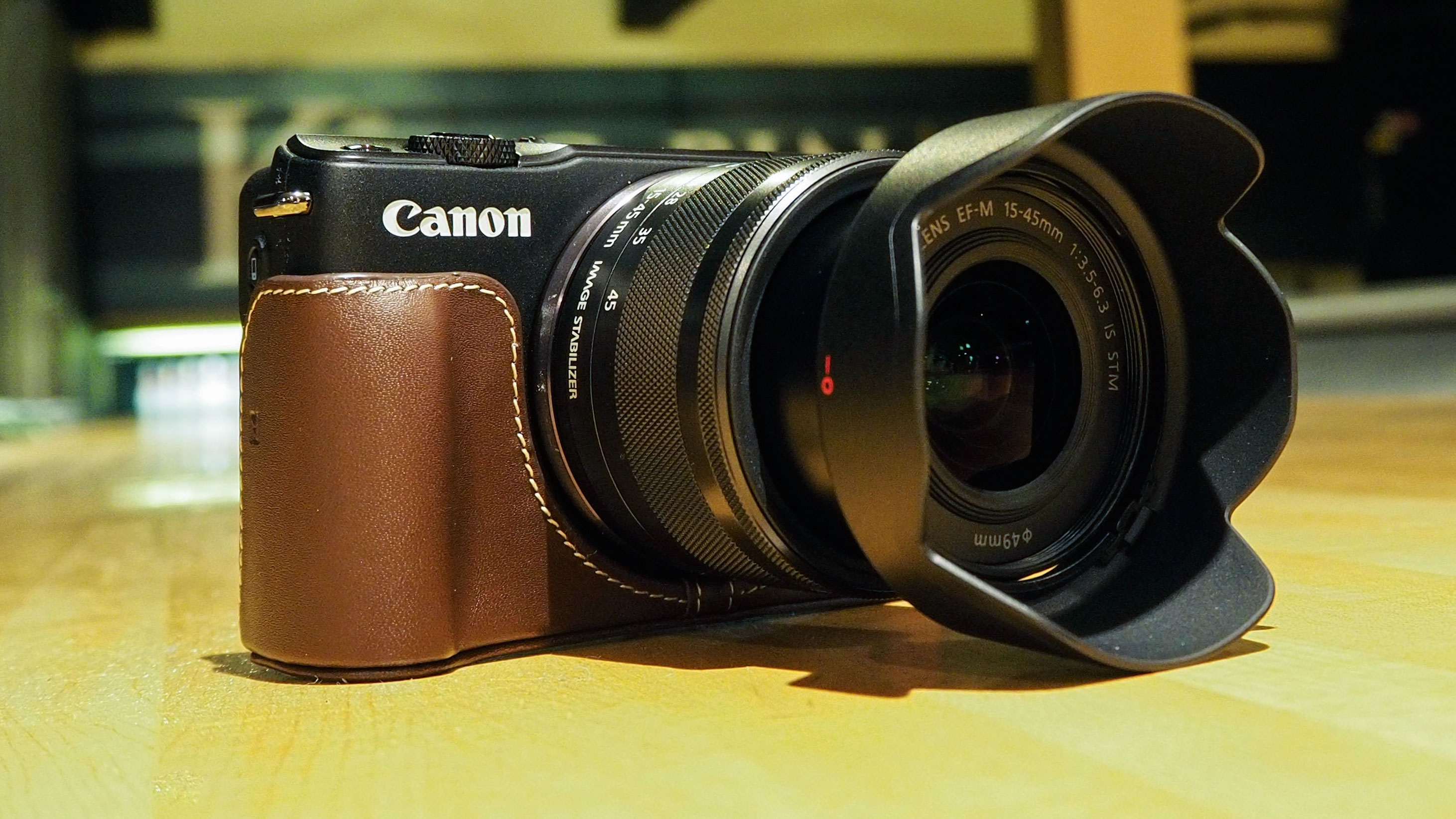
Canon is going to sell the M10 with a new kit lens, the EF-M 15-45mm f/3.5-6.3 IS STM. This is a collapsible lens which means it takes up less space and is easier to transport. It's also an STM optic, which is good news for anyone interested in using the M10's Full HD recording capability as it makes for smoother, quieter focusing.
Build and handling
Like other members of the EOS M line-up, the M10 feels nicely made and is economically sized given that it houses an APS-C format sensor. While the back has a small thumbpad, there's no grip on the front of the camera, which is a slight concern. However, the camera is pretty light (at least with small optics like the new EF-M 15-45mm f/3.5-6.3 IS STM kit lens mounted) and the texture of the coating on the camera gives reasonable purchase. We'll take a longer look at this when we get a full production sample in for testing, but for now I'd say that a wrist strap is a sensible precaution.


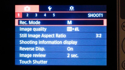
Like the original M, but unlike the M3, the M10 has no mode dial, so the exposure mode must be set via the screen – which is easy to do, but not quite as fast as using a dial. However, there's an option on the shooting mode switch to set the camera to Smart Auto mode, which sets the camera to choose between 58 scene modes). That's perfect for most beginners.
Canon has kept the number of physical controls on the M10 quite low, which makes it less intimidating. In addition to the shooting mode switch on top of the camera, there's the power button, video record button and the shutter release, which is surrounded by a dial for making setting adjustments. Meanwhile on the back of the camera there's just the menu and playback buttons in addition to the navigation pad, which also gives a quick route to four features (exposure compensation, flash, Information and exposure lock) and the central Q Set button.
Pressing the Menu or Q Set buttons reveals a lot more control options which are selected and adjusted via the touchscreen. Any of the options can be selected with a tap on the screen and it's possible to swipe between menu pages, which makes finding the option you want very quick. Naturally, you can also swipe between images in review mode and set AF point with a tap on the screen.
As there's no viewfinder the screen must be used for composing images. It provides a clear view with lots of detail in low light but as yet I haven't been able to use it in bright conditions or to see how it performs in direct sunlight.
What is a hands on review?
Hands on reviews' are a journalist's first impressions of a piece of kit based on spending some time with it. It may be just a few moments, or a few hours. The important thing is we have been able to play with it ourselves and can give you some sense of what it's like to use, even if it's only an embryonic view. For more information, see TechRadar's Reviews Guarantee.
