Early Verdict
Apple CarPlay is off to a rough start. Users will find few apps, a bumbling Siri and a rudimentary set-up. Apple has time to get it right, but the question is, will it?
Pros
- +
UI is agreeable
- +
Physical knob is practical and well placed
- +
There is room for improvement
Cons
- -
Good luck getting Siri to understand you
- -
Extremely basic functions
- -
Needs way more apps
Why you can trust TechRadar
Update: During its WWDC 2015 keynote, Apple announced that CarPlay will soon go wireless – no need to connect to your car's USB port. However, the company didn't specify whether this connection would occur over Bluetooth or another wireless connection protocol.
The firm also announced that CarPlay will soon support a wider range of screen sizes and resolutions, not to mention apps developed by the auto makers themselves.
Original review follows...
Imagine racing to an appointment you're already running late to and suddenly realizing you forgot how to get there. Thankfully, you have Apple CarPlay running, so you can snappily ask Siri to pull up directions.
"I didn't find a place called 'doorstep,'" Siri robotically replies after the third time you ask it to find your new doctor's office. You yell obscenities in frustration, only be coolly met with, "I'm sorry you feel that way."
This scenario never happened, but it's just one of the nightmarish vehicular vignettes I imagine living if I were to use CarPlay in its current form.
I went hands on with CarPlay installed in a 2015 Mercedes-Benz C-Class at the automaker's research and development facility in Sunnyvale, Calif. I need to note the CarPlay shown was an engineering development set-up. The nuts and bolts were there, but the system has a long way to go before it's consumer ready.
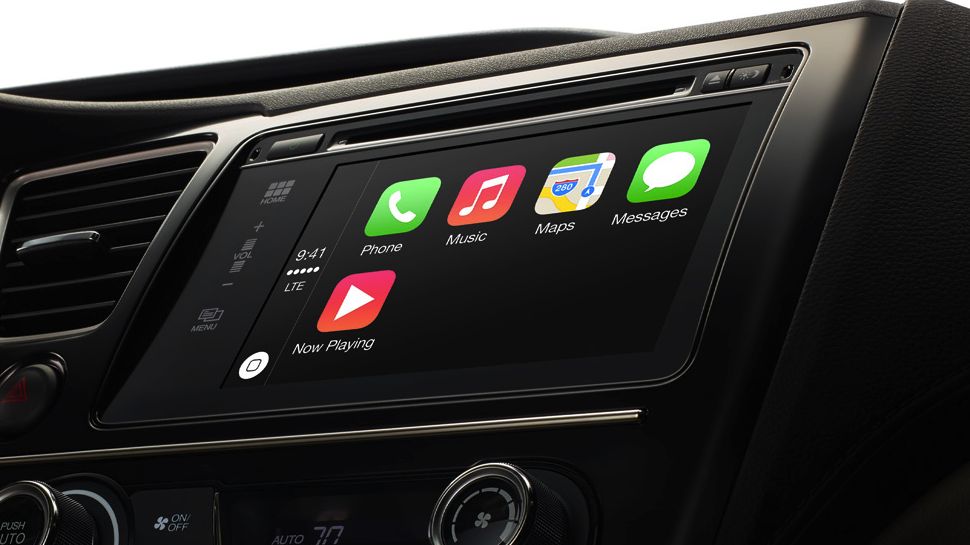
The set-tup as it was left much to be desired and was rudimentary at best. Siri was way off base when it responded to voice commands, and the app offering is limited. A few more apps are due down the road, including Spotify, but for now CarPlay is stuck with Maps, Phone, Messages and Music - the barest infotainment essentials.
Update: On May 15, Apple updated its Podcasts app to support CarPlay, adding another quiver to the system's infotainment bow. The Cupertino company followed that up by tagging MLB.com At Bat as a CarPlay supported app on June 24.
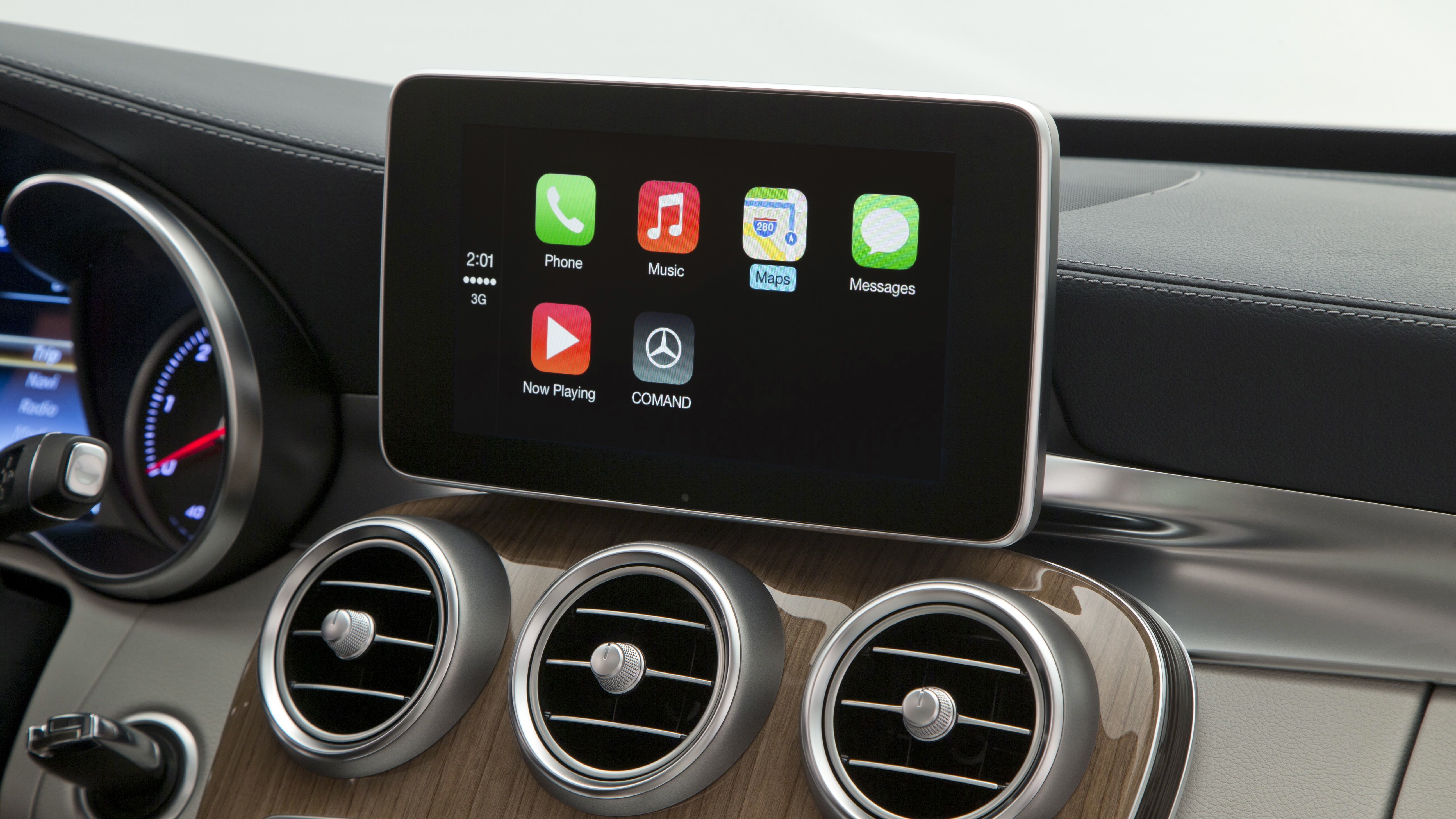
In terms of how CarPlay fits into the in-car experience, it feels more like a frill than an enhancement. It's cool to ask your car to pull up directions to some unfamiliar destination, but CarPlay neither felt absolutely necessary or the best option I could have turned to for my navigation, music or communicating needs.
Simple (too simple?) plug ins
CarPlay requires users to plug their iPhones into the car. It's as simple as that; you're basically tethering your iPhone and accessing a few of its (very basic) apps through your car's system.
My demo involved an iPhone 5S standing up in a disc-shaped port near the cup holders, but Hamza Lakhani, a manager of embedded software at Mercedes-Benz Research & Development, said one day users will likely connect their iPhone via a Lightening cable coming from inside the car's center console. That way, you could store your iPhone in the console without worrying about it falling on the car floor or spilling a drink on it.
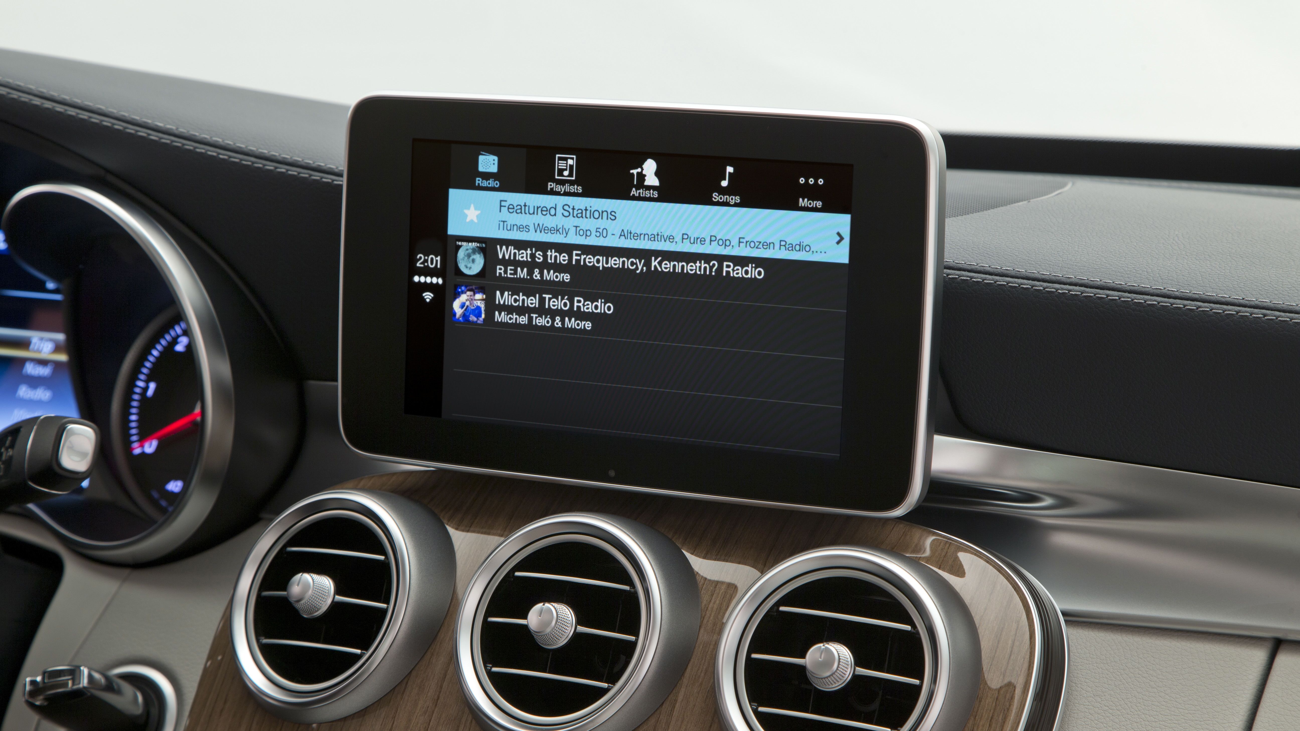
Once your iPhone is hooked up, CarPlay boots up and is ready to rumble. Sound channels through your car's speakers and its interior microphones relay your voice commands.
Other than the medium change, you're not getting a whole lot that you don't already have on your iPhone. Not inherently a bad thing, but it means CarPlay is actually just an extension of your phone, and that's not exactly thrilling.
Siri is not a good co-pilot
One of CarPlay's selling points is that drivers have a co-pilot(!) in voice-controlled Siri. Let's just say that in my time with the digital companion, I would have kicked it to the curb.
To be fair, tech demos on location can often be hindered by poor connectivity and other environmental factors, so sometimes miscues can be forgiven.
Still, Siri was laughably inept at understanding basic voice commands.
A request to find coffee initiated a response of, "I couldn't find a place called 'Call me.'" This was just one of several potholes Siri found itself stepping in. Siri has a bad rap on the smartphone personal assistant streets, and since CarPlay essentially uses the Siri found in your iPhone, you can imagine it didn't have any luck on a larger, car-size scale.
Knob improvements to come
The plan is to eventually optimize when voice commands are used and eliminate touch as much as possible. Lakhani told me that Mercedes plans to implement touchscreen controls in the main control knob you use to control CarPlay, but that feature isn't available yet.
Mercedes' dashboard CarPlay display doesn't support touch either, and Lakhani explained that at least in its case, the company felt it was too distracting to be gazing at and leaning forward to fiddle with a screen at eye-level. Instead, the car maker wants drivers to have a screen they can glance at comfortably while controlling it from a "lean back and drive" position.
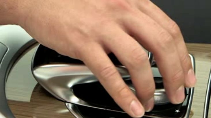
The knob itself is sleek and shiny, and it's situated right where your right hand would rest if you're not a religious 10-and-2 driver. Twisting and pressing the dial makes selections, and differently timed presses do different things. For example, if you're deep in the Music app, a short press will take you back one step while a long press will take you back to the main menu.
Lakhani explained that eventually, drivers will learn how many know twists and turns it takes to control CarPlay. In much the same way you learn where letters are positioned on your phone's keyboard so you can text without looking at the screen, it should become engrained in drivers' brains that two turns of the knob to the right lands on Maps, and so on.
Calls, texts and the dreaded Maps
I found CarPlay's call and text capabilities to be fair, but there's a lot of interaction and a little too much lag time to send a text.
Messages can be read aloud, and then you have the option to reply or leave it alone. Just as you do on your phone, a drop-down alert appears on the dashboard display to let you know who you received a message from, and a red circle with a number in it will stick itself above the Messages icon.
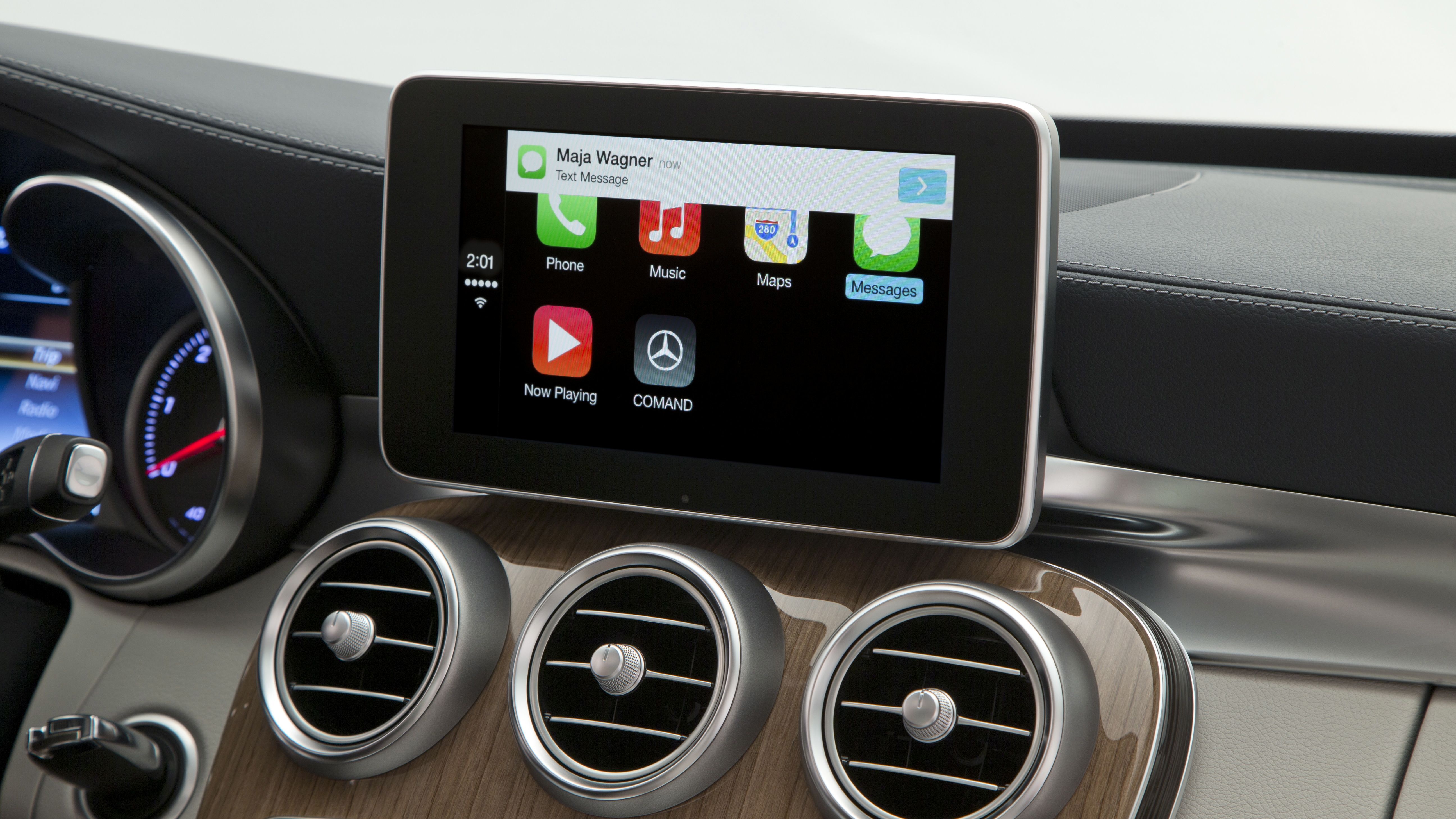
I suppose CarPlay got the communications job done, but it all felt slightly cumbersome and as though Apple didn't put much effort into optimizing the exchange for the car.
We never hit the road with Maps, but with Siri's inability to decipher vocal commands and Apple Maps' shoddy reputation, I wouldn't trust the system to get me where I needed to go, at least not to start.
One nice feature is that a thumbnail image of your Maps route stays fixed to the upper left-hand corner of the tablet screen if you move into other apps. It's a pleasant reminder CarPlay hasn't forgotten it's directing you where you're steering to.
Early verdict
Sticking a spoiler on a car's rear may be a fun accent, but it's not going to make it go faster or the brakes more reliable. In much the same way, CarPlay isn't going to vastly improve life on the road, at least not in its current form.
Apple has time to get CarPlay right, but it has a long way to go. Lakhani said Mercedes is pushing to have CarPlay in its cars as soon as possible, but he wouldn't specify when the first CarPlay-equipped cars would show up at dealerships.
Unfortunately for the system, it's wholly dependent on your iPhone 5S, 5C or iPhone 5. In other words, you don't magically get more car-specific functions just by plugging in your phone. What you have on there is what you get, and at the moment, that's not a whole lot.
To make matters worse, CarPlay itself is wholly dependent on Apple. Lakhani said any new app additions are up to Apple's discretion, and I got the sense car makers are hamstrung by Cupertino's control. It's the company's infamous walled garden, now in your car.
The pervasive feelings of restriction and limitation don't make CarPlay feel sexy or revolutionary. That's a shame when you're sitting in a shiny new Mercedes, itching to hit the open road.
Michelle was previously a news editor at TechRadar, leading consumer tech news and reviews. Michelle is now a Content Strategist at Facebook. A versatile, highly effective content writer and skilled editor with a keen eye for detail, Michelle is a collaborative problem solver and covered everything from smartwatches and microprocessors to VR and self-driving cars.
What is a hands on review?
Hands on reviews' are a journalist's first impressions of a piece of kit based on spending some time with it. It may be just a few moments, or a few hours. The important thing is we have been able to play with it ourselves and can give you some sense of what it's like to use, even if it's only an embryonic view. For more information, see TechRadar's Reviews Guarantee.
