TechRadar Verdict
A rich set of features, great picture quality out of the box and hassle-free setup make the VP2772 an attractive monitor.
Pros
- +
Superb image quality
- +
Good port selection
- +
Build quality
- +
Wide viewing angles
Cons
- -
Boring design
- -
Fiddly menu controls
Why you can trust TechRadar
The increasing availability of cheaper 4K monitors has had our collective fingers waggling excitedly over 'buy' buttons in recent months, placing the onus on manufacturers to up the appeal of panels sporting lower resolutions.
Monitors in the 2560 x 1440 pixel-resolution category may not offer such dizzyingly high pixel counts as 4K monitors, but they still hold appeal for professionals seeking plentiful desktop real-estate and 'Grade A' colour accuracy.
Viewsonic is targeting the professional crowd with its latest 1440p monitor, the VP2772. At £599 ($1,019 or AUS$1096), there are more affordable consumer panels with similar features out there, but Viewsonic is pitching the VP2772 specifically at photographers, graphic designers, video editors and other design and multimedia professionals.
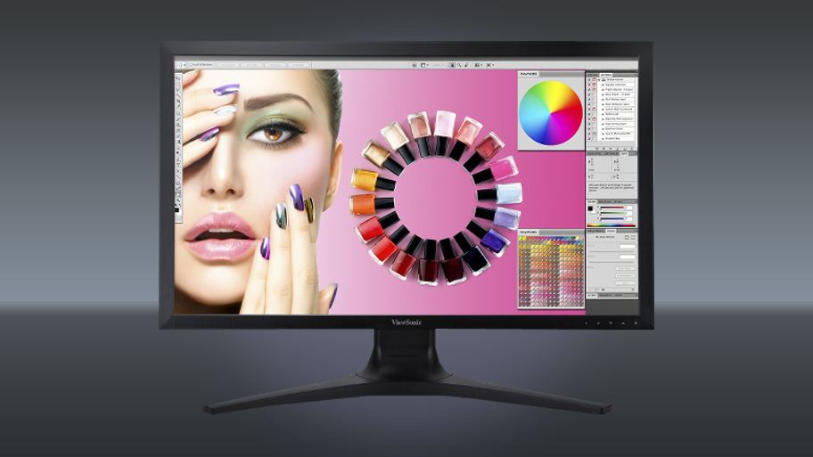
That's because it features a 12-bit colour engine and 14-bit LUT (Look Up Table) that allows it to process, grade and render 1.07 billion colours and grey scales while covering 99% of the Adobe RGB colour space, according to the company.
Design and assembly
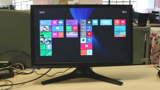
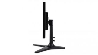
Like its predecessor, the VP2770-LED, the model sports a 27-inch frame with a three-pronged, crows foot-shaped base that juts out in front and behind the screen.
That base demands quite a bit free space on your desktop, but it's sturdy and easy to assemble. The arm comes attached to the panel, leaving the base to be locked in using a single attached screw that handily doesn't require a screwdriver.
That said, attempting to screw it on without laying the display on its front isn't a great idea (trust us on that one). Weighing 9kg (without the base), it's on the heftier side of hefty for one person, so you're best off laying the panel flat on its front or asking somebody else to do the tightening.
The monitor's appearance can best be described as workmanlike (see: not flashy). If you like your displays clad in a matte-black colour and free of magpie-attracting soundbars and other silver bits, you'll favour the VP2772's quietly practical stylings. If not, you might just find it a bit dull-looking.
It comes with an adjustable stand that can be raised upwards by 135mm, which is more of a necessity than anything else as the shape of the base makes it completely unsuitable for balancing on thick books (or whatever else is lying around the average office).
Even when fully raised, the display never feels unsteady, and it can pivot 90 degrees into portrait mode to provide huge vertical space to work with.

Ports and menus
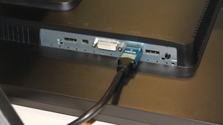
Around the back of the display are a number of ports including Dual-Link DVI, HDMI v1.4 and mini-DisplayPort, in addition to four USB 3.0 ports (two on the side and two on the rear).
It also features DisplayPort v1.2 for daisy-chaining a second monitor. The ports aren't labelled, and are indicated by icons on the ridge above.
The display's on-screen menus are operated using touch-sensitive controls located on the bottom-right hand side of the bezel. Operating them is annoying at best, with jabs at the navigational controls (1, 2, down and up) sometimes going unregistered.
We're used to such controls on consumer panels, but for a professional-grade monitor, a row of tactile or even semi-tactile, touch-sensitive buttons (as are found on the Asus MX279H) would surely have been more appropriate.
Display quality
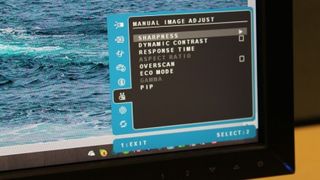
Once you've mastered the menu controls, you can tweak a number of display settings, including contrast, brightness, sRGB and Adobe RGB presets, response times, Gamma, Dynamic Contrast and overscan. You can also choose between a number of colour tone presents - including Bluish, Cool, Warm and Native - and there's also a power-friendly 'Eco Mode'.
The VP2772 offered excellent picture quality out of the box set to 'Native' colour temperature. Brightness is evenly distributed across the monitor, with no overly bright or dark spots. Nor could we detect any backlight bleed along the edges. The monitor produces deep blacks and reds, greens, blues and yellows appear vibrant without having to up the contrast or brightness.
The panel's healthy 2560 x 1440 pixel-resolution is well-suited to its 27-inch size, providing ample room for interacting with applications on the desktop in Windows 8.1. Web page text and images are rendered with excellent clarity, and because the monitor is an IPS variant, everything on the screen is clearly viewable from a 178-degree angle.
However, in OSX, the picture was overly sharp to the point of where text was almost unreadable. This is fixable by adjusting the "Sharpness" setting from the default '50' down to either '0' or '25' to match the text legibility found on Windows.
That's fine if you're not planning on chopping between the two operating systems - but if you are - altering the "Sharpness" using the fiddly touch-sensitive controls would soon become a chore.
It also should be noted that the monitor has a minimum of 12ms response time, which may not bother multimedia professionals but isn't ideal for gamers who are better off hunting down a consumer-focused 27-inch monitor with a 5ms response time or lower - such as the Asus PB278Q - or AOC's Q2770Pqu.
Final verdict
The Viewsonic VP2772 is a solidly-constructed professional monitor that offers excellent picture quality out of the box, making it an excellent choice for Windows 8.1 users seeking a hassle-free option.
Those on OS X should exercise caution, however, as the VP2772 requires Sharpness adjustments to correct the distorted image that's produced. The touch-sensitive controls make this a pain, so it's not something you'll want to do when switching back and forth from Windows 8.1
Featurewise, the VP2772 comes up with the goods. The wide port selection makes it a versatile contender, and the ability to raise, tilt and adjust the panel are practical plus points.
The VP2772 loses points for style - it isn't the worst-looking monitor we've come across but it isn't as enticing as professional panels found in higher price brackets. Appearances and fiddly menu controls aside, there are few areas that the monitor falls short, meaning we can only recommend it those craving impeccable colour and sharp clarity for under £600.
As an alternative, it might be worth checking out the similarly specced and priced Dell U7213H, a monitor set to land on our review pages soon.
