TechRadar Verdict
Pros
- +
Loads of great new features
- +
Hugely improved corkboard
- +
Better outlining
Cons
- -
Some aspects are quite complex
Why you can trust TechRadar
Plenty of writing tools exist, but few are specifically designed for writers. Even fewer are developed by a writer, but Scrivener is a rare exception, designed by Keith Blount to plug a perceived gap in the market.
Rather than joining Pages and Word in the headlong rush towards desktop-publishing-style layouts within word processors, it instead arms you with powerful tools that prove hugely beneficial for dealing with complex and lengthy writing projects.
Although you can use Scrivener to bash out reams of copy in a linear fashion, doing so misses the point. The application is also good for cobbling together articles, scripts and essays.
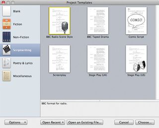
Built-in templates get you started with various kinds of projects, each providing a structural overview in the Binder sidebar; here, you can add further folders and text files, rearranging them by drag-and-drop. When you're done, your masterpiece can be exported in various formats, using Scrivener's initially baffling but nonetheless powerful Compile sheet.

With the writer in mind
At this point, Scrivener probably sounds like a user-friendly outline view in Pages or Word, but its other features take it far beyond those products when it comes to project management. You can dump all manner of research into the Binder, including images, text files and web pages.
Furthermore, the folders within can have context-sensitive icons applied (characters, locations and so on).
Scrivener's views are also well-suited to the process of writing – you can pick between composite, outline, corkboard or Page views. The last of those is new, and is particularly useful for scriptwriters.
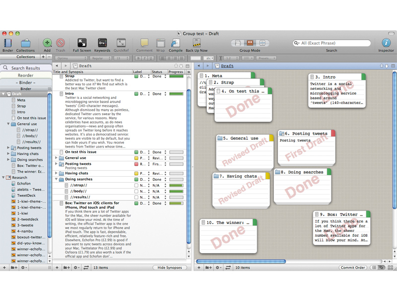
Outline and corkboard have been upgraded; the former now boasts sortable columns, which offer more than a dozen titles (such as Progress and Status) and the corkboard – a digital index board for sub-document synopses and other notes – now provides a free-form mode. This alone will justify Scrivener's $25 (£17) upgrade fee for many, since it provides a wonderfully tactile way to rearrange a project's documents.
Also a new Collections feature in the Binder provides further scope for experimenting with alternate structures, without affecting your main project.
The more you explore Scrivener 2.0, the more you find. Often, you'll think "I wish there was a writing app that could do…" and you'll find Scrivener does it: snapshots with revision comparison; automated backups and sync with mobile apps such as Dropbox; a full-screen mode; quick reference panels (think Quick Look, but with editable content); splitpane viewing; user-definable count targets. It's all there, and, amazingly, it's generally pretty easy to access and use, along with being really robust and stable.
Essential app
As with the original Scrivener, the latest version is perhaps an acquired taste – more so with the new features adding another layer of complexity.
But then this app has never been about appealing to the masses – if you're looking to bang out a letter, stick with Pages; but if you want the best tool around for organising thoughts and writing projects, Scrivener is a no-brainer purchase.
Follow TechRadar Reviews on Twitter: http://twitter.com/techradarreview

I've spent 10 years with Apple Watch, and after 10 minutes with the Galaxy Watch Ultra, I can't believe Samsung skipped this feature

This AI scam detector could save you thousands by stopping scammers before they reach you, but it's only free if you're a McAfee customer

Acer Aspire Vero 16 hands on: I tried the world's first oyster shell laptop
