TechRadar Verdict
Poor performance and sub-par screen resolutions leave you questioning the purpose of these affordable tablets.
Pros
- +
Low price
- +
Impressive speakers
- +
Improved FireOS
Cons
- -
Terrible screen resolution
- -
Sluggish performance
- -
Plasticky design
Why you can trust TechRadar
Prior to the launch of the Amazon Fire HD 10 and the Amazon Fire HD 8, it was tempting to question whether the online retail giant had full confidence in its tablet family.
With all of the aggressive price cuts, near-constant offers, and creative payment plans Amazon seems to come up with to make you buy from its growing tablet range, it makes you wonder.
The Amazon Fire HD 10 and Amazon Fire HD 8 are two new ultra-affordable tablets with almost identical entry-level specs (which is why they're being treated as one here). In an industry dominated by the premium iPad brand, has Amazon finally happened upon a winning affordable tablet formula?
At £169.99 / $229.99 for the Amazon Fire HD 10 and £129.99 / $149.99 for the Amazon Fire HD 8, the online retail giant is clearly intent on remaining aggressive with its pricing.
But Amazon's tablets have always been great value. The questions have always concerned their wider usefulness, and Amazon's own stifling approach to software and apps.
Has Amazon finally got the right balance with its latest tablets?
Design
Amazon tablets have always been well built for their price, if a little functional. The Amazon Fire HD 10 and 8 make tentative steps towards a bolder, slinkier style, but their designs are still primarily focused on being hard-wearing.
Indeed, Amazon is making much of its latest tablets' durability in the accompanying blurb. The new duo "stand up to everyday life", and are "1.8 times more durable than the iPad Air 2", apparently.

It's a curious comparison to make in some ways, but the message is clear: Amazon's new tablets will stand up to daily wear and tear twice as well as the world's most popular tablet.
I didn't put the Amazon Fire HD 10 and HD 8 through my own tumble test, but I can attest to them being solidly built, rugged tablets that you'd back in any couch or waist-height spill onto a hard kitchen or living room floor.
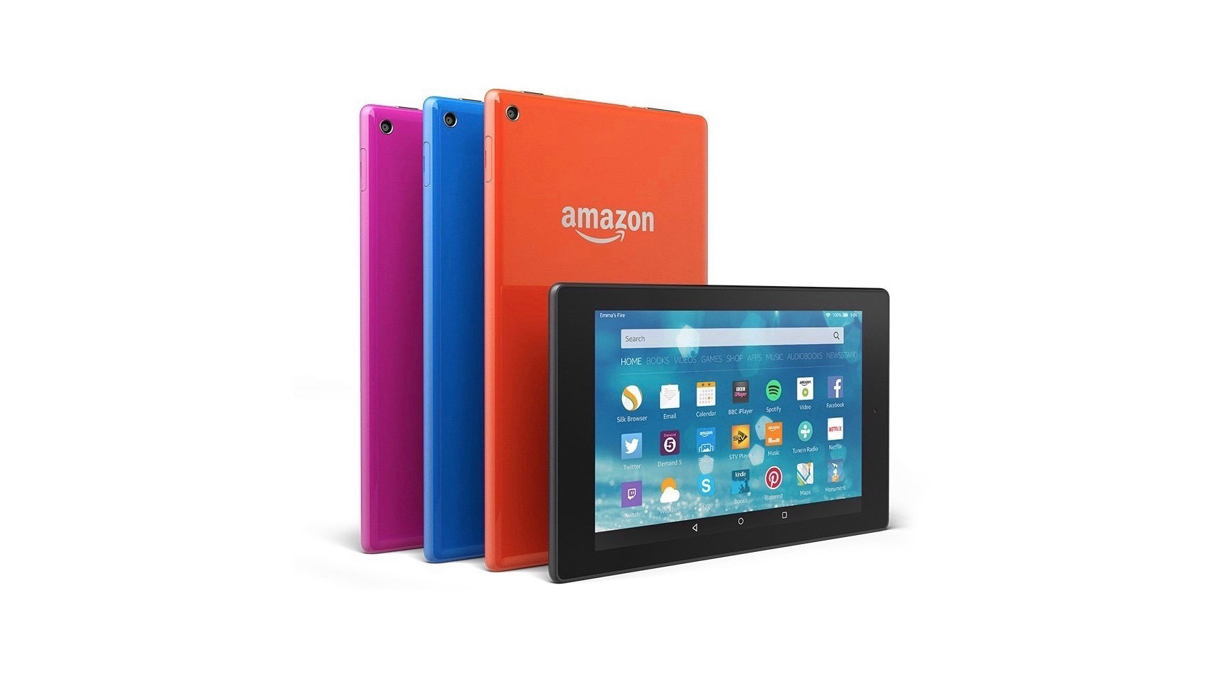
The design here is quite different to older Amazon tablets, though. It incorporates a surprisingly shiny plastic back that reminded me of the kind of smartphones and laptops you used to get circa 2010.
These things are absolute fingerprint magnets, and I can only imagine how horrific they'll look after being placed in the grubby mitts of a small child – as they doubtless will be by many parents.

Turn the tablets around onto their sides, however, and you'll notice a subtle switch to a matte plastic material, which looks a great deal more rugged, and more capable of hiding dirt and nicks.
The overall impression of the Fire HD design is cheap but solid, which is perhaps the kind of description Amazon would prefer we affixed to the tablets as a whole.

Another curious design touch is the decision to relocate the power and volume buttons to the top of the devices as you look at them in portrait view.
The intention is clear: Amazon doesn't want you to view this as the top of the devices, but rather the side. These Amazon HD tablets are intended to be used in landscape mode, in keeping with their primary function as media players.
Or at least, that's evidently the intention with the Fire HD 10. Check out the official Amazon page for the HD 8 and you'll see portrait-orientation and landscape-orientation images in roughly equal numbers.

Still, overall the onus in on landscape usage for the Fire HD range. I can understand this approach, but the fact remains that when I pull a tablet out to check something, I usually do so in portrait mode.
In such situations, reaching to the top of the device to wake it or turn the volume up never feels intuitive – or at least, it hasn't become so in the period I've been using them.

