TechRadar Verdict
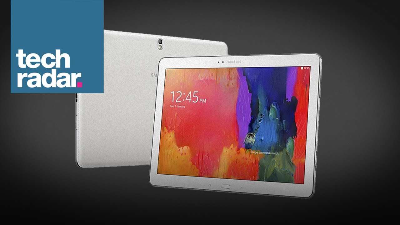
With a huge display and powerful innards, the Samsung Galaxy Note Pro 12.2 makes the best practical use of Samsung's S Pen stylus and productivity apps yet.
Pros
- +
Large, bright screen
- +
Improved Samsung UI
- +
Decent camera
- +
Class-leading performance
Cons
- -
Creaky build quality
- -
Unwieldy form factor
- -
UI doesn't beat stock Android
- -
Expensive
Why you can trust TechRadar
In recent years, the predominant tablet trend has been towards compact ones such as the iPad mini 2, the Google Nexus 7, and the Amazon Kindle Fire HDX 7. Now, with Apple's much-rumoured iPad maxi on the horizon, a new craze for super-sized tablets could be set to take hold.
With Samsung yet to launch a wholly convincing compact tablet of its own, it will be hoping to get a strong foothold in the fledgling maxi-tablet category with the Samsung Galaxy Note Pro 12.2.
This is a formidable tablet in every way, with a premium spec sheet and an extensive list of software features that those familiar with the Note series will already be aware of.
As well as that 12.2-inch 2560 x 1600 display, Samsung has gone big on specs. Sporting a custom 1.9GHz quad-core Exynos CPU, 3GB of RAM, 32GB or 64GB of internal storage, 8MP rear camera and Samsung's integrated S Pen stylus, it's one of the best-equipped tablets I've ever used.
Of course, with a launch price of around $699 for the 32GB variant and $799 for the 64GB model, you'd damned well expect such class-leading components.
That price places it somewhere in between the 128GB iPad Air at $799 and the 64GB Microsoft Surface Pro 2 at $899. Or, to put it another way, the best model of the best tablet ever and the most powerful tablet ever.
No pressure, then.
Sign up for breaking news, reviews, opinion, top tech deals, and more.
Samsung is clearly aiming for the same premium-business end of the market as those two elite tablets. Let's see if it's managed to close the deal.
Size isn't everything
You know those tablet and smartphone reviews where the writer says that a device is deceptively large, and doesn't feel as big and bulky as it is on paper? This isn't going to be one of those reviews.
Make no mistake, you feel every one of the Samsung Galaxy Note Pro 12.2's extra 2.1 inches when you hold it in your hands or – as is more likely – prop it on your lap.
I was quite taken aback by just how broad it feels. It's almost more like holding a small PC monitor than a tablet, despite being just 8mm thick.
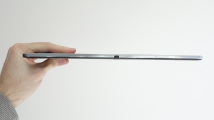
That vast expanse of glass takes its toll on your wrists, too. Weighing in at 753g, the Galaxy Note Pro made my chunky iPad 3 feel light. With a difference of 100g, it's plain to see how.
This actually forces you to modify how you hold and use the tablet. If you like to support a tablet in one hand while using the other to interact with the screen, well, that's not going to be possible here. Not over an extended period, at least.
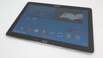
You'll want to prop the Galaxy Note Pro 12.2 on a table or wedge it on your lap. This isn't necessarily a problem, just as it's not a problem that you can't quite view full websites comfortably on a 7-inch tablet.
It's a byproduct of the design. But you should know that this isn't a tablet that you'll want to take out with you and whip out at a bus stop or cafe.
Samsung has stuck with the design approach it took with the Samsung Galaxy Note 3 and the Samsung Galaxy Note 10.1 2014. You get the same glass-covered front, the same metallic-looking (but defiantly plastic) outer rim, and the same slightly tacky (but reassuringly grippy) faux-leather back covering.
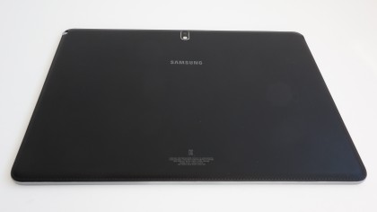
Samsung's typically iffy design is ever so slightly tougher to swallow here given the above-premium price tag – especially when held against those aforementioned premium rivals, the iPad Air and the Surface Pro 2.
What's more, the added size and heft makes the Galaxy Note Pro 12.2 feel less solid structurally, with added flex and audible creaking when the unit is gripped and twisted.
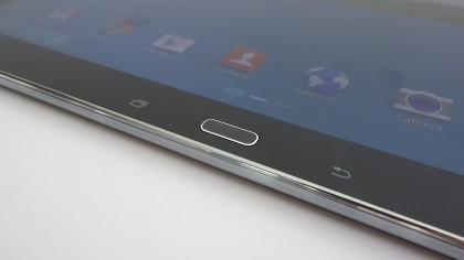
Port and button placement is also standard Samsung issue, for the most part. You get that familiar lozenge-shaped physical home key right below the screen, flanked by capacitive multi-tasking and back-up keys.
More and more manufacturers are moving over to Google's buttonless approach, but there's still something to be said for the surety of a good set of physical controls.
Like the Galaxy Note 10.1, the power button and volume rocker are quite flat and situated on the top edge, right near the left hand corner. This is assuming you're holding the Galaxy Note Pro 12.2 in landscape mode, as intended.
I would have liked these controls to be slightly more defined, but their location makes them easy enough to find in a pinch.
To the right of these buttons is an IR LED, which allows the use of the tablet as a universal remote control with a handy piece of included Samsung software called WatchON.
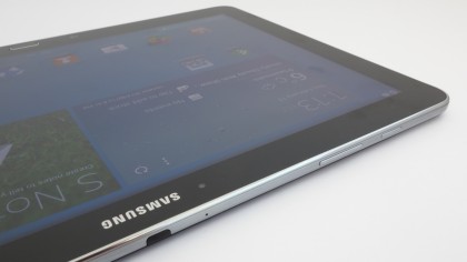
The one major change here when compared to the Galaxy Note 10.1 is actually a very thoughtful one. Samsung has relocated the microUSB to the right hand side, alongside the microSD hatch (which allows for up to 64GB of additional storage).
This leaves the bottom of the Galaxy Note Pro 12.2 completely free of controls and ports. As I mentioned, you'll be propping this tablet up an awful lot more than with smaller tablets, so anything you need to access here would inevitably lead to annoyance and discomfort. Smart move, Samsung.
Going back to that microUSB port, you'll notice that it looks a little different to that of most other Android devices. That's because it's actually a microUSB 3.0 port, which resembles previous versions, but with an extra component to the side. You can still use your existing phone or tablet charger with it, but it will take much longer to charge.
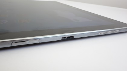
The new standard also boosts file transfer speeds when hooked up to your PC, provided you have a USB 3.0 port handy.
Also well placed is the Samsung Galaxy Note Pro 12.2's camera. By positioning it at the top and centrally on the rear of the tablet, it means your fingers won't be anywhere near it when you pull the trigger. Or rather, push the virtual shutter button.

Jon is a freelance journalist who has been covering tech since the dawn of the smartphone era. Besides TechRadar, his words and pictures have appeared in The Telegraph, ShortList, Tech Advisor, Trusted Reviews, Expert Reviews, and more. He largely covers consumer technology, with a particular focus on smartphones and tablets. However, he's also been known to dabble in the worlds of entertainment and video games.
